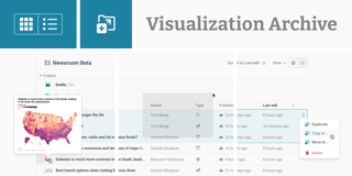
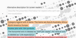
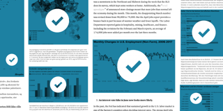
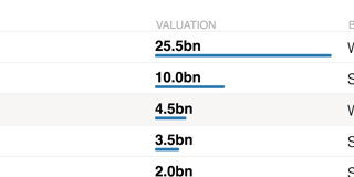
Datawrapper News All blog topics >
All about our latest big new features. To learn about small improvements in the Datawrapper app, visit our Changelog.

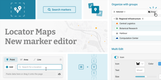
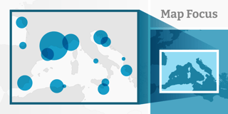
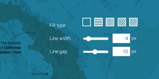
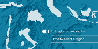
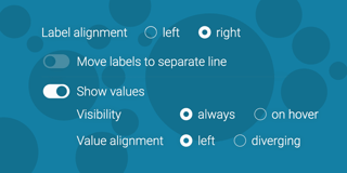
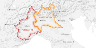
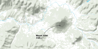
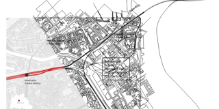
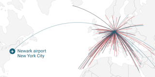
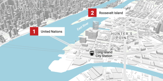
New: Draw arrows in locator maps
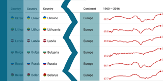
To show the movement between two locations, you can now draw line and flow arrows directly in locator maps.