New: Datawrapper has a new website

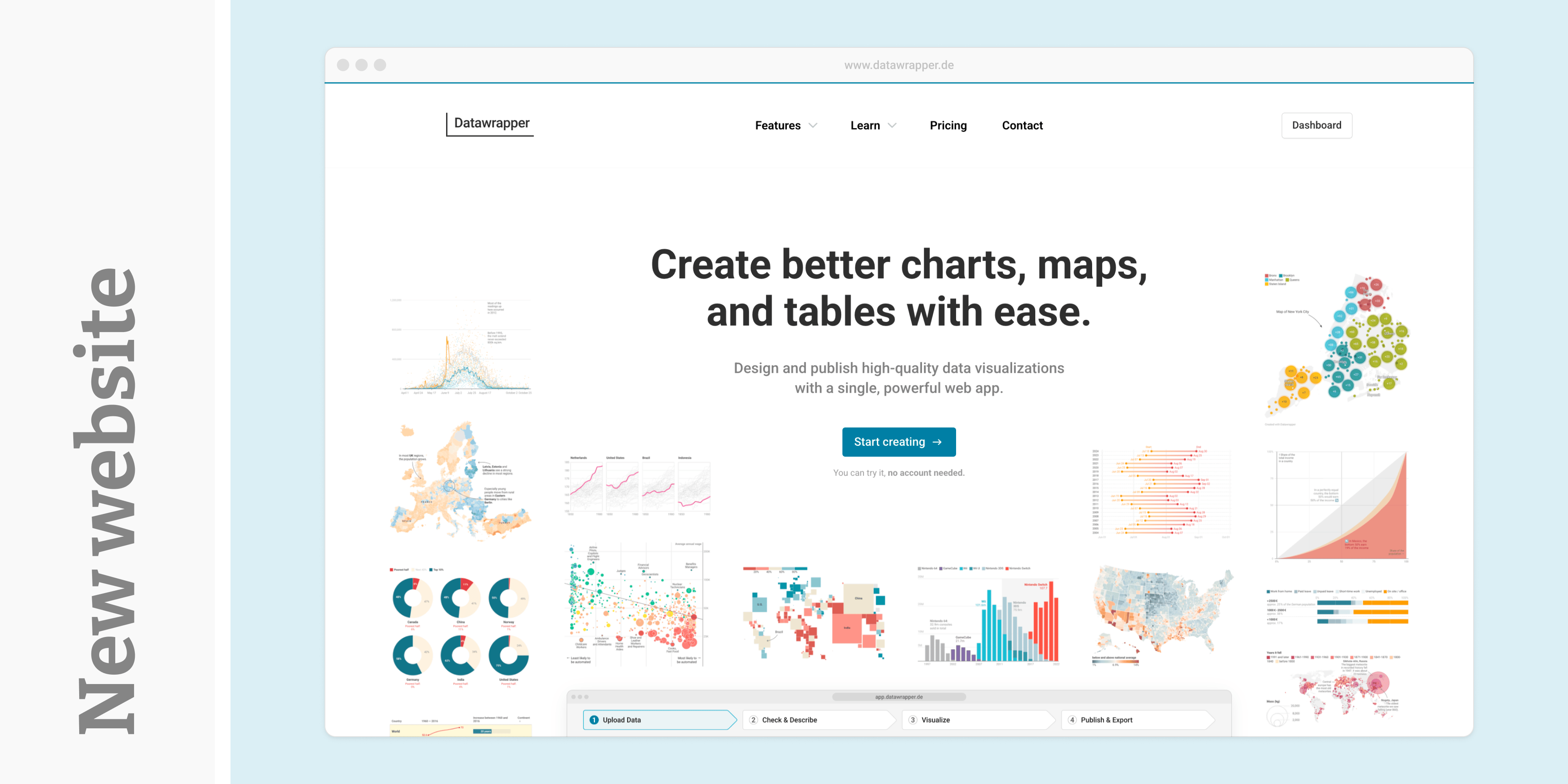
Some of you have already heard the news: Datawrapper has a freshly redesigned website! It features hand-picked examples of beautiful visualizations created with Datawrapper, a new Learn page that gives you all the resources you need to get the most out of the tool, and a unified navigation between our homepage and the blog.
What's new?
We’ve put our visualization features more front and center than ever — from dark mode and accessibility support to exporting charts for PowerPoint. These are the tools many of you use every day, and the new site makes them easier to explore and understand.
In the Learn overview, you will find quick links to the numerous resources we've created to help you make great visualizations with Datawrapper: from your first chart tutorial in the Academy, to regular webinars, and data vis tips and best practices on our blog.
You’ll also find a growing collection of visualization examples from both our team and our customers, showing you how Datawrapper charts, maps, and tables are used by real newsrooms, companies, and organizations around the world.
So go ahead: have a look around, and let us know what you think!