Journalism professor Adam Marton: “The students don’t have any trouble picking it up.”
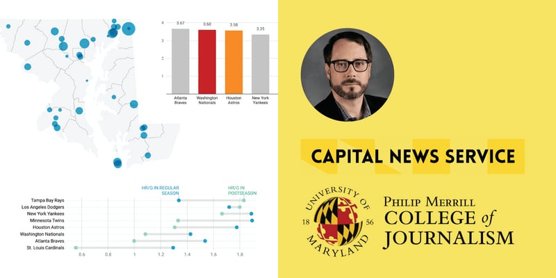
How Adam Marton, a journalism professor, used Datawrapper to help students from the Philip Merrill College of Journalism learn data visualization.
How Adam Marton, a journalism professor, used Datawrapper to help students from the Philip Merrill College of Journalism learn data visualization.
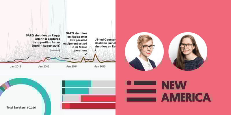
Read why New America, a US-based think tank, switched from their in-house charting tool to Datawrapper, and how their entire team became more productive.
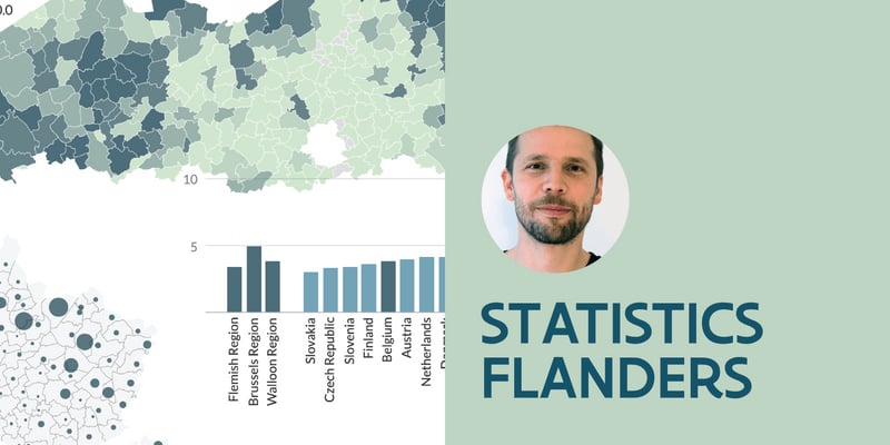
Learn how Statistics Flanders, a network of more than 60 Flemish government agencies in Belgium, makes statistics a public good with Datawrapper.
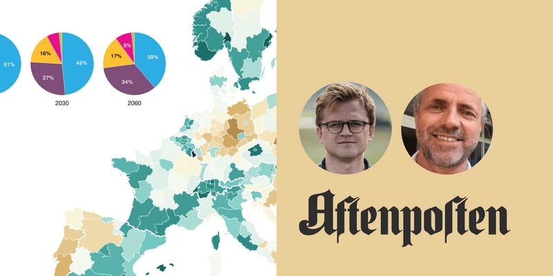
Learn how Aftenposten, Norway's largest printed newspaper, was able to transform its ad-funded print newspaper into a solid subscription-based digital resource.
How one graphics editor, and his newspaper, went digital-first and stayed "in the game" with Datawrapper's quick, interactive, mobile-friendly charts.
How Mike Brondbjerg, a "design team of one," uses Datawrapper to improve his workflow.

Ten languages, five scripts, two data journalists — one charting tool
How Datawrapper went from one person’s discovery to an organization’s tool of choice
How Datawrapper is helping a big public health department to meet the challenges of the pandemic.
How Datawrapper keeps 20 years of charts looking beautiful, consistent, and up-to-date.