Aftenposten: “An article with a chart feels like a better article.”

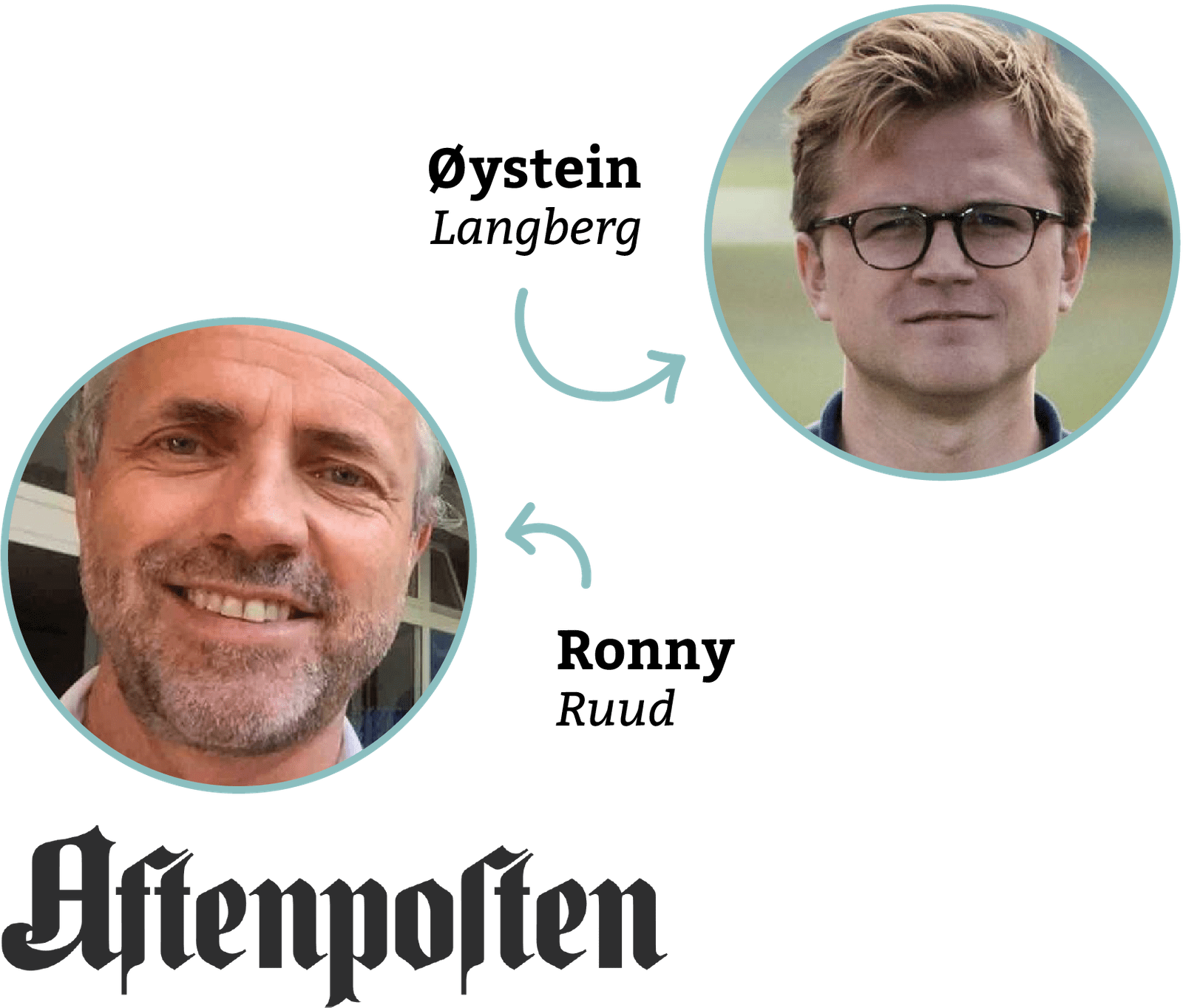
“Aftenposten” (Norwegian for “The Evening Post”) is Norway’s biggest newspaper and one of our customers with the most active users. Incredibly, 100 of Aftenposten’s journalists have created more than 10 Datawrapper charts – and a quarter of those have created more than 100 charts. What did this newspaper do right? We interviewed journalist Øystein Kløvstad Langberg and product developer of editorial tools, Ronny Ruud, to learn which role Datawrapper and data visualization has played in Aftenposten’s transformation from an ad-funded print newspaper to a subscription-based digital newspaper.
“I think we started using Datawrapper 6 to 7 years ago,” Øystein tells us. “We tried several charting tools and ended up with Datawrapper.”
“Today it’s one of the most popular tools our journalists use,” Ronny adds. “If you create charts at Aftenposten, you use Datawrapper.”
Two transitions“From paper-focused to digital first”
Around the time the newspaper signed on to Datawrapper, Aftenposten was at the beginning of two transitions. “Approximately five years ago, we went from being a major conservative paper-focused newsroom to being digital-first,” Ronny explains. At the same, they shifted from “being completely ad-driven” to making user payments their biggest income.
In both transitions, Datawrapper proved to be helpful.
“Digital-first” isn’t just a buzzword for Aftenposten: Choosing Datawrapper as a charting tool means Aftenposten charts are optimized for all screens, even smartphones. Additionally, readers can discover the underlying data when hovering over the chart.
But people are only interested in content if it’s, well, interesting – which is important to convince them to pay. “We measure our reader’s engagement. How much time do they spend on an article? Which paywalled articles are they willing to pay for? We discuss this in our morning meetings, in our weekly summary meetings, everywhere.”

How charts can drive engagement & evidence“A story with a chart just feels like a better article”
Charts and maps can further engage readers into a story. Ronny says: “We want to make our stories more interesting for readers, more story-driven instead of text-driven. Datawrapper is very important for that mission.”
“When you scroll through an article, you always stop at the graph,” Øystein adds.
But he also points out the benefits to stories once charts make it more fact-based. “I think all newspapers should use more graphs, to prove the claims in their articles. If you explain a trend, it’s often better to show it with a line. Charts not just make stories more engaging and interesting, but also more credible. A story with a chart just feels like a better article.”
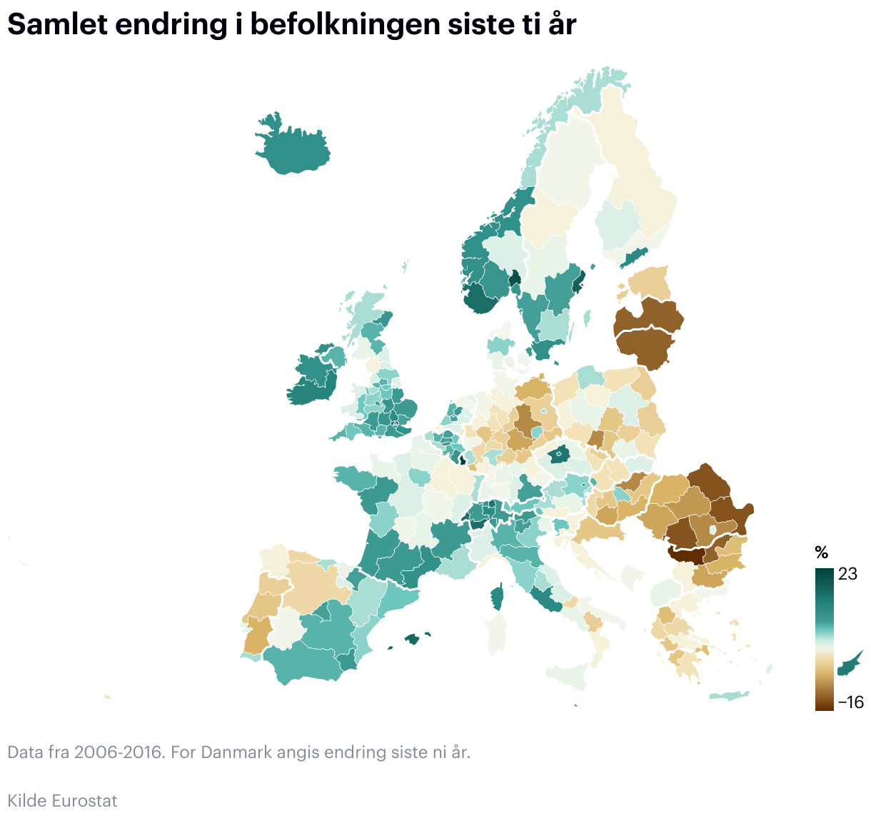
Øystein points to his article “Det grenseløse EUROPA” as an example for an engaging, fact-based story: “I used Datawrapper to map the population change in all European regions. The largest decline was in a region in west Bulgaria, so we actually went there, filmed the empty villages with a drone and talked to people. It was great. I want to do more of these stories.”
That engagement is what’s driving Datawrapper’s popularity among the newsroom staff today. “A few years ago, only a handful of people created charts and maps in the newsrooms. Now we’re more than 100,” Ronny explains.
Teaching Datawrapper“The standard thing to do for a journalist is to write a text. That’s it.”
Hearing these numbers made us wonder: How did Aftenposten increase the number of chart creators within their organization by so much? Øystein is responsible for internal Datawrapper training. “I give two kinds of courses, a beginner course and an advanced course. In the beginner’s course, we start from scratch, creating a very simple line chart or bar chart.”
But Øystein’s job is often to show journalists what’s possible. “The standard thing to do for a journalist is to write a text. That’s it. They often don’t think that their statements can be illustrated with a graph.” Øystein doesn’t just teach Datawrapper, he introduces journalists to the idea of creating charts and maps in the first place.
What changed?“We build more interesting graphs now.”
Datawrapper, Øystein’s training and other internal initiatives brought visible change to Aftenposten. “In the old days, we had one desk making all the print graphics. It was a bottleneck to our increased demand,” Øystein explains. Ronny adds: “Now we can create nice-looking charts and maps without having a department doing it. We can create them ourselves. Datawrapper solved that for us.”
“From the beginning, Datawrapper has had one of the easiest-to-use interfaces,” Ronny tells us.
That enables people like Øystein to play around with data. “I often end up with something completely different than I thought I would when I started out. All these different styling options in Datawrapper are great. They help us think in new ways, and they help us illustrate different points.”
They also help to make charts more readable. “We want readers to look at a chart and think ‘Yeah. Makes sense,’ quickly. And sometimes, small pie charts can show a dataset better than a bar chart. In Datawrapper, you can try things out and do quite advanced things.”
As journalists at Aftenposten get better at creating charts and maps, they start thinking about different aspects. “There are definitely things we talk about now more than before. Like that graphs should not come at random places, but read like a sentence. We’re experimenting with not using titles anymore in charts, but just a short intro,” Øystein explains. “We build more interesting graphs now than a few years ago.”
And it shows. We’re very impressed by how well Datawrapper is integrated in almost all departments of Aftenposten, enabling journalists to publish charts and maps for their articles on their own.
A big thanks to Øystein and Ronny for taking the time to talk to us. If you want to find out more about Aftenposten, visit their Norwegian site aftenposten.no, or find Ronny and Øystein on Twitter (@olangberg / @ronnyruud) and LinkedIn (Øystein / Ronny).