Journalism professor Adam Marton: “The students don’t have any trouble picking it up.”
A few weeks ago, we released free training slides that you can use to teach Datawrapper. Graphic designer and journalist Adam Robert Marton (@adam_marton) immediately used them to create Datawrapper tutorials on YouTube for his students at the Philip Merrill College of Journalism. We were thrilled and wanted to learn more about his motivation and his experiences with teaching Datawrapper.
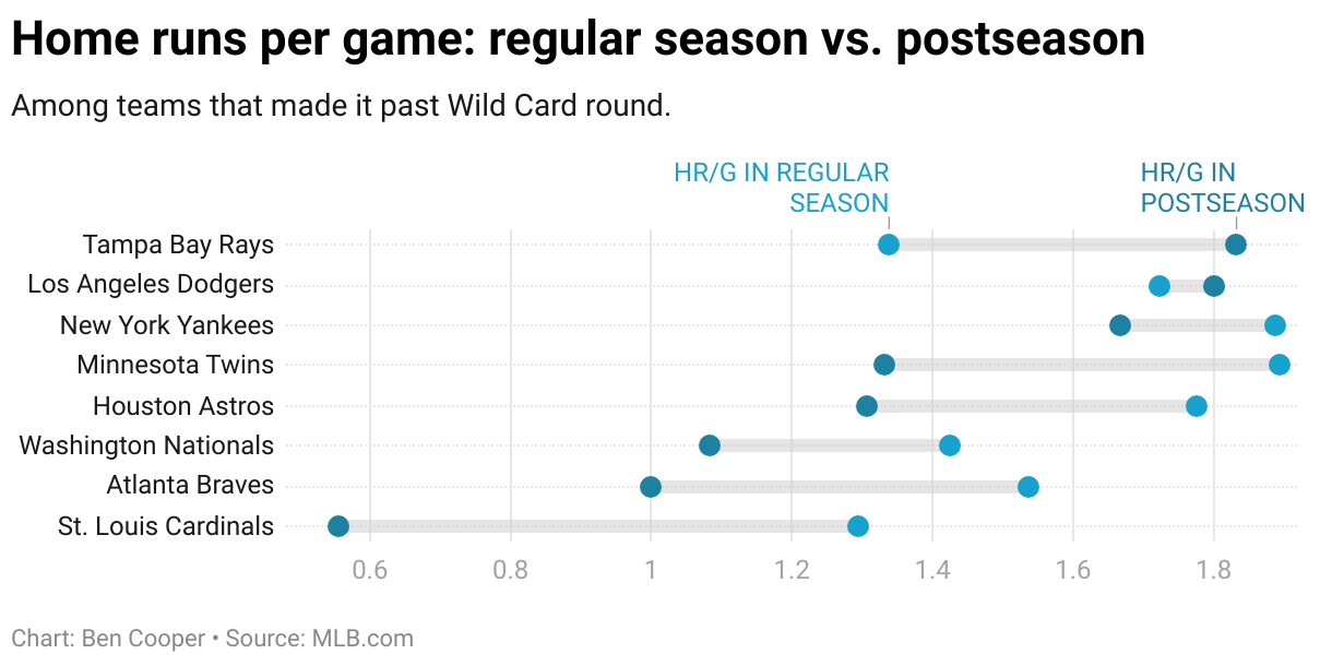
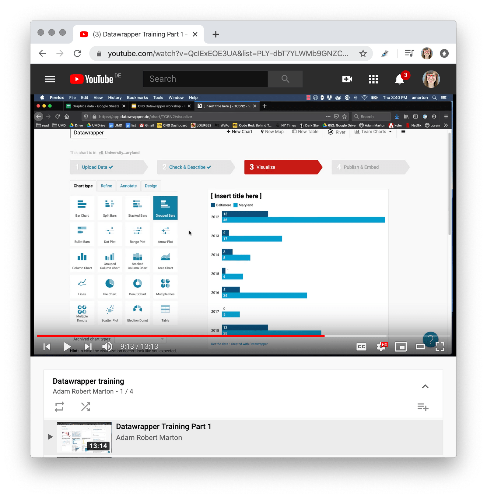
If you just want Adam to teach you how to use Datawrapper, you can jump in right here. Click on the ☰ in the top right to access the other three tutorial parts of Adam’s playlist.
Let’s find out why and in which context Adam created these tutorials:
From The Baltimore Sun to the University of Maryland“I could have saved so much time”
Before teaching others how to create data visualizations, Adam created them himself. For 13 years, he worked as a visual journalist and editor at The Baltimore Sun, creating interactive infographics for news stories and heading up the data and graphics team eventually.
“I loved working in the newsroom and telling stories about Baltimore, a beautiful and misunderstood city. A few years ago I left The Sun to start teaching design and coding to journalism students at Philip Merrill College of Journalism at the University of Maryland.”

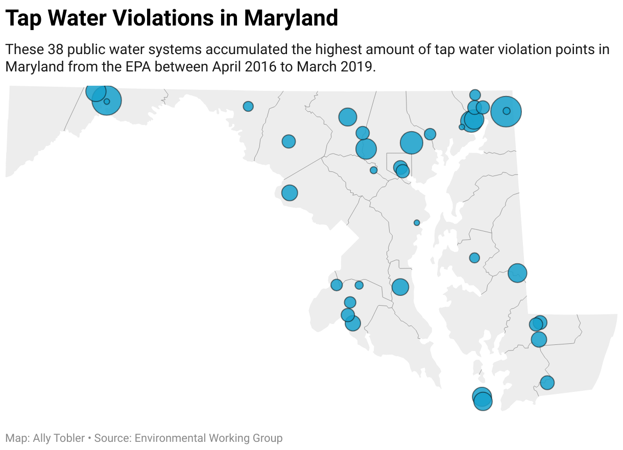
Adam only got to know Datawrapper after leaving The Baltimore Sun: “Datawrapper came across my radar as more and more newsrooms started using it. My friend Christine Zhang at The Baltimore Sun uses it and the LA Times has used it to streamline their graphics production.”
“If I had access to Datawrapper when I was in the newsroom, I could have saved so much time. I spent endless hours making charts in Illustrator and D3, not to mention hunting down shapefiles for maps and writing code to interact with them. Really, the mapping capabilities alone in Datawrapper are kind of mind-blowing. Datawrapper is the first tool I have found that produces professional-quality graphics ready for publication.”
Teaching Datawrapper“Many people are excited to learn data visualization, but are intimidated by the steep technical learning curve”
Now at the University of Maryland, Adam can pass on what he learned during this time at The Baltimore Sun. “I want to help teach the next generation of journalists how to tell stories with code, data and graphics.”

“Some of my students plan to be beat reporters or investigative reporters or videographers, so they’re not on the data track. I teach them to use Datawrapper so that they can still create clean and powerful graphics, without knowing JavaScript or Illustrator,” Adam explains. “Many of them love infographics and data visualization and are excited to learn it. But they are intimidated by the sometimes steep technical and design learning curve. Datawrapper takes a lot of that out of the equation.”
However, Adam also points out the advantages of teaching a simple charting tool like Datawrapper to advanced students: “It frees up my ‘Data and Design’ students to focus on larger visualization projects. Instead of spending lots of time coding basic charts and maps, they can use Datawrapper to make really nice infographics quickly and focus their time on more complex data visualization and interactive storytelling.”
The student-run Capital News Service“In many ways we’re just getting started”
Adam teaches Datawrapper not just to students in his class, but also to those working in a student-run newsroom at The University of Maryland called Capital News Service. “We operate an Annapolis bureau that reports on the state legislature, a D.C. bureau that focuses on the Federal Government, a broadcast bureau that produces a newscast, and I run a digital bureau that focuses on data journalism, infographics and digital storytelling,” Adam explains. “The Capital News Service is a capstone course for students at our journalism school.”
And Adam has big plans for the future. “In many ways we’re just getting started. Last semester I made Datawrapper available to reporters without providing much training and many students were able to pick up the basics on their own. Starting this semester, I teach Datawrapper to all reporters. Every beat reporter is required to create at least one graphic to accompany their stories over the course of the semester. And the video journalists are experimenting with using Datawrapper in their broadcast and video work.”
The teaching materials“They don’t seem to have any trouble picking it up”
Part of Adam’s success is that students like the tool. “I have found both students and editors to be really receptive to Datawrapper. The students are excited to be able to create visualizations themselves and don’t seem to have any trouble picking it up.”
That might also be thanks to Adam’s teaching skills. “When teaching Datawrapper, I create graphics in front of the class and then customize them to help emphasize data storytelling and making choices that help readers understand the data. I talk about the importance of headlines, chatter and sourcing. Then I have students create the same graphics I just made.”
And that’s where Adam’s Datawrapper YouTube tutorials come in. “I created the YouTube videos so that anyone who can’t make it to the training session can watch on their own time. And as a resource in case someone wasn’t paying attention during class!”
It’s been great to interview such a motivated teacher like Adam who passes on a lot of enthusiasm to his students. “I am really excited to see what my design and data reporters are able to do with Datawrapper this semester,” he tells us. We’re excited, too – keep us updated, Adam.
Thanks to Adam for answering all our questions! He and the reporters at the Capital News Service use the free version of Datawrapper that allows everyone to create unlimited charts, maps, and tables, work in shared folders, or download visualizations as PNG. Are you a teacher at a journalism school like Adam and want to use Datawrapper to teach data visualization? Get in touch with us at support@datawrapper.de and we’ll happily enable our SVG export for you, for free. Are you also teaching Datawrapper? Let us know! We’re always happy to hear about your experiences.