SWI swissinfo.ch: “Datawrapper is the perfect tool for our work”
SWI Swissinfo.ch is a national public media outlet with a distinctly international mission: to offer reporting on Switzerland to readers around the world, and connect Swiss expatriates with the news from home. As part of the Swiss Broadcasting Corporation, it goes without saying that swissinfo.ch publishes in the national languages of German, French, and Italian. But to reach a truly worldwide audience, their journalists are also at work reporting and translating articles for Arabic, Chinese, English, Japanese, Portuguese, Russian, and Spanish-speaking readers.

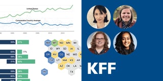
Pauline Turuban is one of two dedicated data journalists at swissinfo.ch, and their role is only getting more important. “We use a lot of graphics at swissinfo.ch because it supports our standards of credibility and international comparison,” she explains. “It’s something that’s really spread in the minds of our journalists: the fact that with data, you can have a better story and make your statements more understandable and more credible.”
But Pauline doesn’t mind admitting that fluent Chinese isn’t one of the skills she brought to the table when she joined swissinfo.ch in April 2020. So how does she manage up to ten translations of every chart, in five different scripts, without so much as a tick mark out place? We gave her a call to find out.
According to Pauline, four things made Datawrapper a natural fit for swissinfo.ch: it’s accessible to all reporters, supports a variety of alphabets and characters, automatically translates chart elements, and is easy to teach to new colleagues.
Accessible to the whole staff 1. “Every journalist at swissinfo.ch uses Datawrapper”
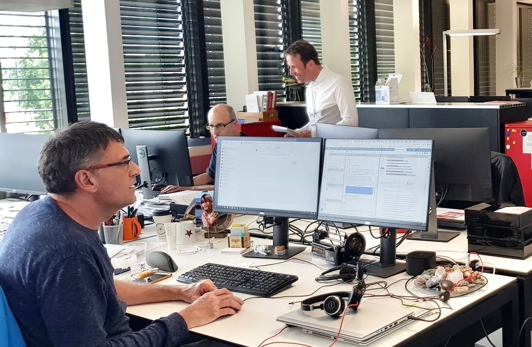
The first piece of the puzzle is getting colleagues from every language team involved in the chart-making process. “It’s not our own private garden,” Pauline says. “Every journalist at swissinfo.ch uses Datawrapper.”
With no software to install, sharing a Datawrapper chart with colleagues is as simple as sending them a link. Swissinfo.ch chooses to organize their team accounts by language. “Every French-speaking person, for example, will use the account ‘French Datawrapper,’” Pauline explains. “We have access to every graphic in the house, but this way we know which language has been creating which graph. We also use folders to organize the charts by topic.”
To keep things orderly, each translation goes through a standard series of steps. “We try to have a fixed process for the translations: start by duplicating the original graphic and change the title into your language so that everyone knows which language is working on which graph.” Making the task simple and accessible means that Pauline can draw on the language skills of all her colleagues — not just those who have training in data or design. “It’s important to keep the graphics looking similar in every language, so we ask people not to change the colors,” she says. “But we trust everyone to make the best translation to their language.”
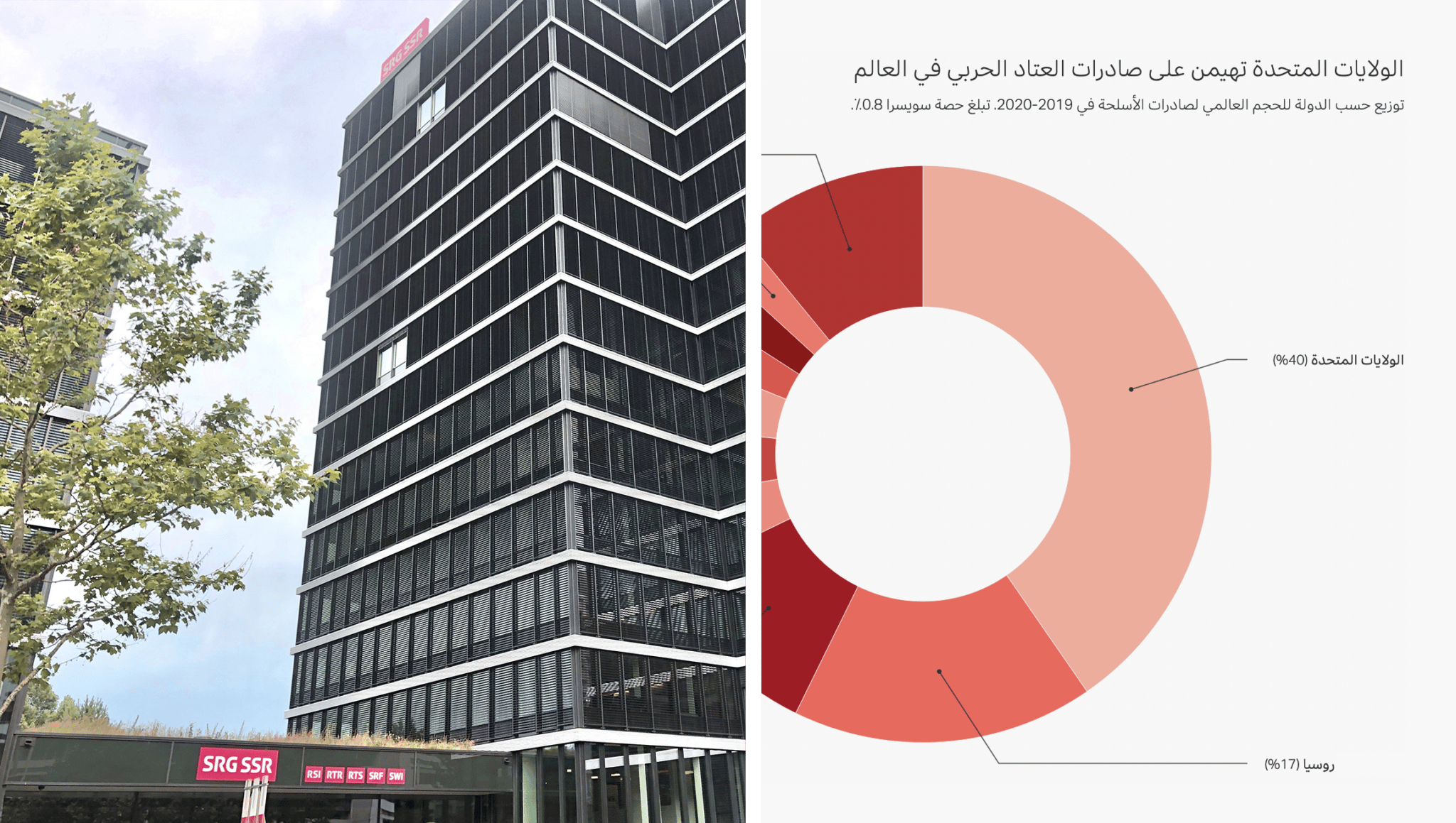
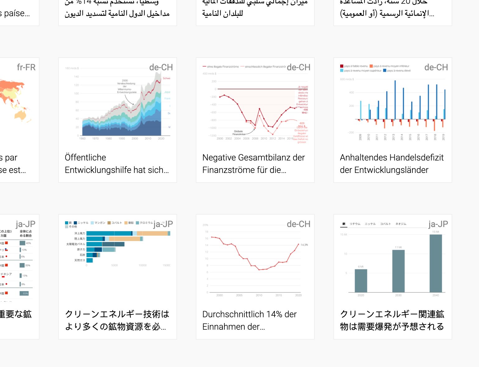
Supports other alphabets and characters2. “I’m amazed by how well Datawrapper supports these alphabets”
Support for non-Latin characters was nonnegotiable at swissinfo.ch, Pauline tells us. “One of the reasons why Datawrapper was picked in the first place is that, in our ten working languages at swissinfo.ch, we have four languages that don’t use the Latin alphabet — Arabic, Chinese, Russian, and Japanese. I’m always amazed to see how well Datawrapper supports these alphabets and characters. It’s never been a problem to translate the graphics in any of those languages. And that’s not the case with other tools, to have this wide spectrum of languages that are supported.”

Automatically translates chart elements“It’s like magic”
Datawrapper charts come with a lot of text built in: names for months and weekdays, words for “page” and “search” in tables, or labels like “Source” and “Get the data” in footers. Luckily, users can translate these automatically using the “Output locale” setting. By letting them select a language and country whose standards to use, it also converts numbers to the right local format (for example, 1,000.00 instead of 1.000,00). According to Pauline, setting the output locale is the very first thing translators are taught to do after duplicating a chart.
For her team juggling so many translations, output locales also provide a big organizational benefit: the locale label in each chart’s thumbnail makes it easy to tell the versions apart. “It’s great to see, just by looking: this is the Russian version, this is the English version, the Japanese version. You see it at the top right. And so you can tell immediately which is your graphic, which one you’re supposed to work on.”
With basic chart elements translated automatically, all that’s left for journalists to do by hand are titles, tooltips, and annotations. “A simple chart can be translated in five, ten minutes,” Pauline reports. “Once the graphic is translated in Datawrapper, the person who was translating just has to copy the embed code into the content management system, and the story looks exactly the same as in its original version.”
Easy onboarding for new colleagues4. “So easy to teach”
All the technical tools in the world won’t help to create a Japanese chart if no one using them speaks Japanese. Swissinfo.ch’s most important translation asset is its multilingual staff — most of whom have no background in data visualization. As a result, Pauline explains, the best tool for their needs will always be one that’s easy for coworkers to learn and use.
“Datawrapper is great because it’s simple,” she says. “It’s easy to convey the message to our colleagues that Datawrapper is easy to use, that everyone can do it, that they don’t need to be afraid of this tool. After one hour or two hours of training, people mostly know how to use it. It’s great to have a tool that’s so easy to teach, because I couldn’t translate every graphic into 10 languages myself!”
Seeing results with Datawrapper“Something we can all be proud of”
With everyone pitching in together, a visualization can really travel the world. “I like it when I see one of my graphics, for example, in Arabic,” Pauline says. “I can’t understand anything, but just to see it and see that it looks fine, perfect, exactly the same — but in Arabic! That’s something that we can really all be proud of.”
The teamwork and flexibility that Datawrapper enables are a perfect fit for swissinfo.ch’s international staff and outlook. “Datawrapper is the most suitable tool for how we work and what our audience is,” Pauline reflects. “It's perfect, really. Knowing how we work at swissinfo.ch, I couldn't think of another tool to do what we want to do.”
A big thanks to Pauline for taking the time to speak with us! To see more charts, go to swissinfo.ch or follow Pauline on Twitter @PaulineTuruban.