Create once, for web and print
Print colors, fonts and layout just a click away
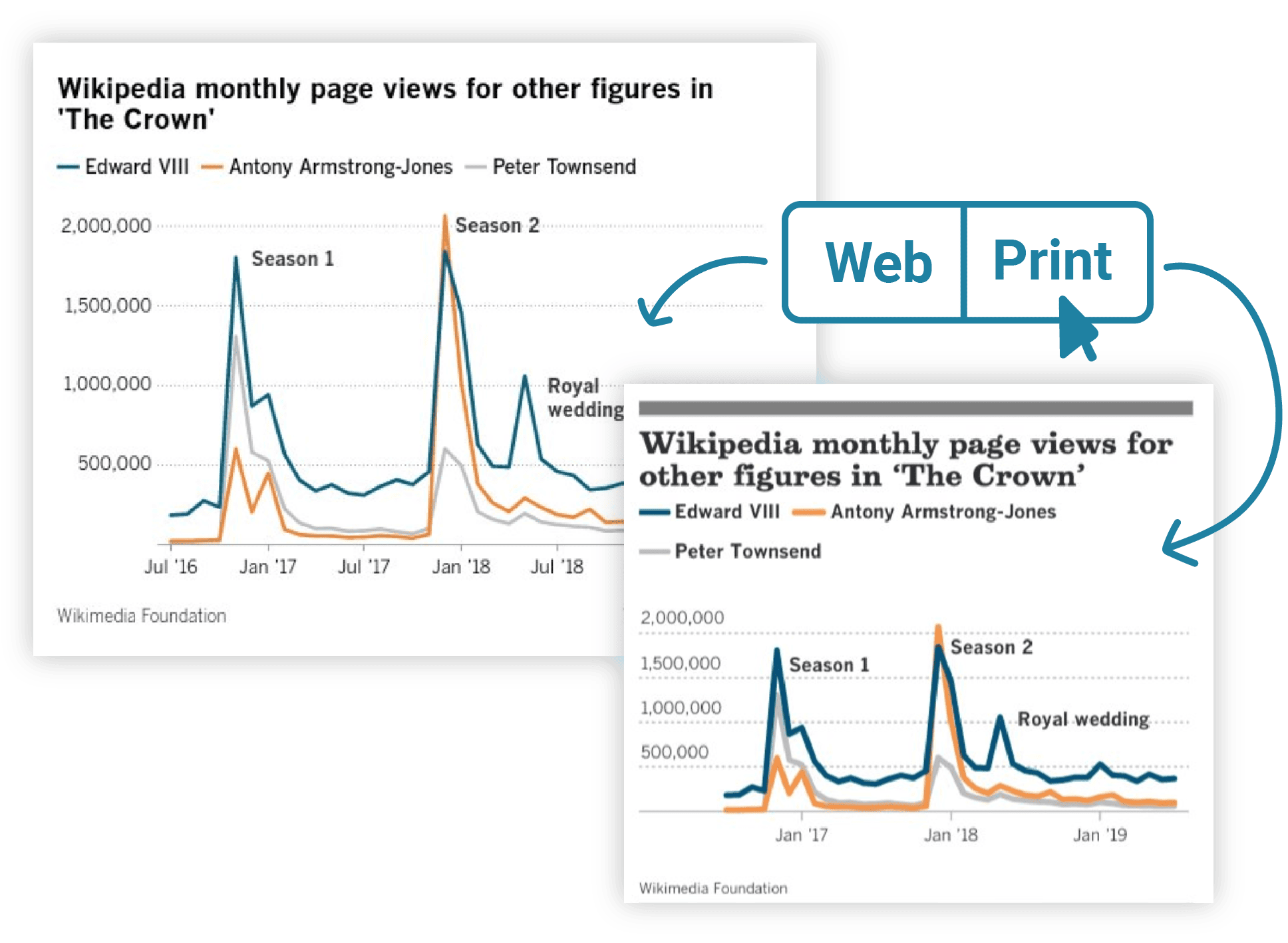
What works best on the web isn’t always right for paper. That’s why Datawrapper lets you define custom layout elements, margins, colors, fonts, and font sizes specifically for your print output.
Design your visualization once, then create web and print versions with the click of a button.
Precise CMYK colors made simple
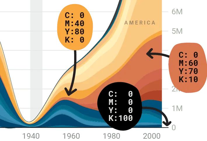
For professional printing your visualizations should be in the CMYK color space with true (or rich) blacks, whereas web charts shine in RGB. That’s why you can define both RGB colors and CMYK alternatives in Datawrapper.
Export a chart for the web, and it uses RGB colors. Export the same chart for print, and you’ll get a PDF with the exact CMYK colors you defined. There’s no need to change the colors in graphics software after exporting.
Presets that make your life easier
Everyone in your team can use the same presets for their visualizations. You can define
👉 the width and height of visualizations (in mm, px, or inches)
👉 whether their background is transparent or filled
👉 whether the exported PDF should have a margin
Then name the presets as you like (e.g. “2 columns”).
100% vectors, 100% editable PDFs & SVGs
When you download a Datawrapper visualization as a PDF or SVG, you’re downloading vectors only. That means you can tweak your visualizations in software like Adobe Illustrator, or use them as a starting point for animations.
Text boxes remain text boxes (instead of outlined text), so you can fix that typo in the title even after downloading your chart, map, or table.
Lines and areas can be recolored; gridlines can be moved.
And because vector graphics look sharp no matter what size they are, you can fill billboards with Datawrapper visualizations. (Tell us when you do!)
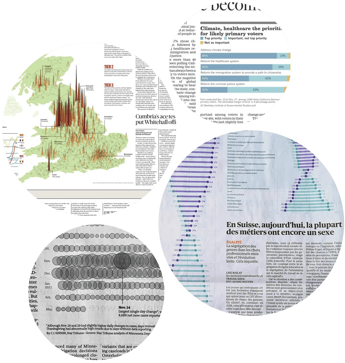
Having visualizations adjusted for print is a huge time saver
Our customers love the Datawrapper print export, because they save time manually adjusting their visualizations. Here’s what they say:
👉 “This is the first chart we’ve been able to export in our new print theme in @Datawrapper and put *directly* on the page without any fiddling in Illustrator. This is a *huge win* for us!”
– Courtney (C.J.) Sinner, Star Tribune
👉 “I think anyone who has worked in a print graphics department will get what a big deal it is.”
– Ben Welsh, L.A. Times
👉 “We have since yesterday at Le Temps a Datawrapper chart template for print. We used for p.3 of today’s issue. Our prod team is thrilled (and so am I).”
– Duc-Quang Nguyen, Le Temps