Getting Started
Learn how to get started with Datawrapper to create your first visualizations.
Hello! This is a tutorial on how to create and play around with your very first chart in Datawrapper. In this exercise, you will create a stacked bar chart – which is a normal bar chart that comes with different parts in each bar. On the way, you will also try out other chart types, like a multiple donuts chart, split bars, stacked column chart, and dot plots. But first, you'll need to open Datawrapper. To do so, go to datawrapper.de in your browser. Now click on the big green Start creating button. You can use Datawapper without being signed in, but you will need to sign up to publish the chart you build.
Read more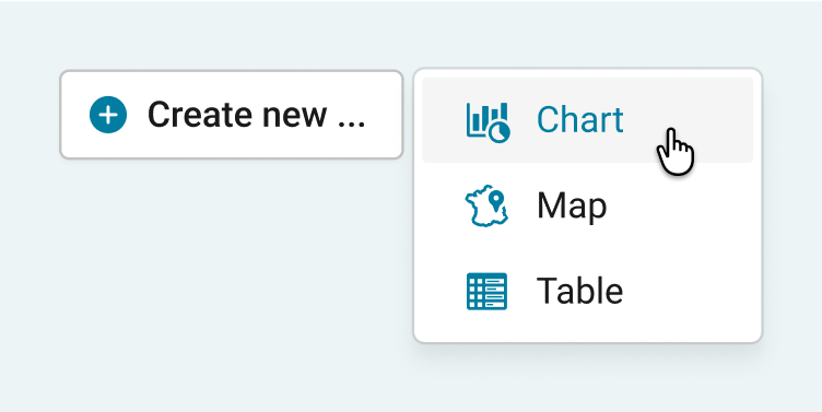
You just signed up to Datawrapper and opened it for the first time. Great! A warm welcome from the whole Datawrapper team. We're happy to have you on board and we hope that Datawrapper will help you…
Read more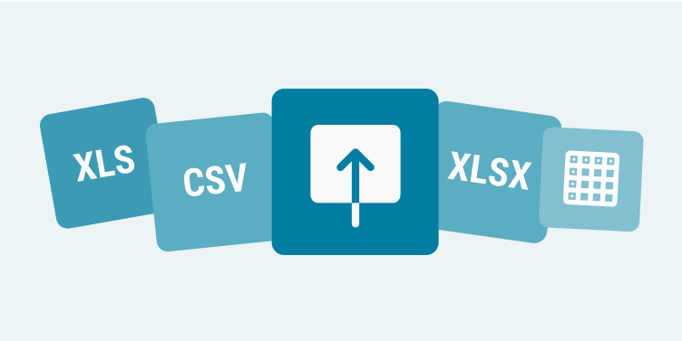
Before creating a chart, you need data. This is the first thing Datawrapper asks of you, in Step 1: Upload Data. Here we cover how your data needs to look like to be accepted by Datawrapper without pro…
Read more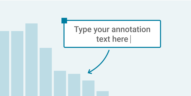
You can create text annotations in many of our visualization types: In choropleth map and symbol map, e.g. to point out certain regions or spatial patterns, or to give context information. In column chart …
Read more