A friendly guide to choosing a chart type

When you're just starting out with data visualization, the number of visualization types can feel overwhelming. You know pie, line, and bar charts – but when to use what? And what about all these extra chart types with their fancy names, like small multiples, Sankey diagram, and Marimekko chart?
This article is supposed to give you a first overview of the most important chart types to communicate to a mainstream audience – meaning, I won't touch on niche things like violin plots and dendrograms.
In boxes like the one below, I'll also answers more meta questions you might have about choosing chart types. Let's start with the most obvious one:
The good news: Depending on your data and your goal, there are always lots of chart types you can simply ignore. If you're trying to show how something changed over time, you don't need to wander into pie chart territory. You can safely ignore scatterplots, too (and pictogram charts, and symbol maps, and treemaps, while you're at it).
That's why it's so important to know what it is you want to show with a chart. The chart's main statement becomes a compass that helps you not just when picking a chart type, but also when choosing e.g. the title and colors for your chart.
I categorized the chart types I chose based on the different goals you might have:
Showing developments over time
Showing shares
Showing absolute numbers
Showing correlations
Showing flows
Showing geographical patterns
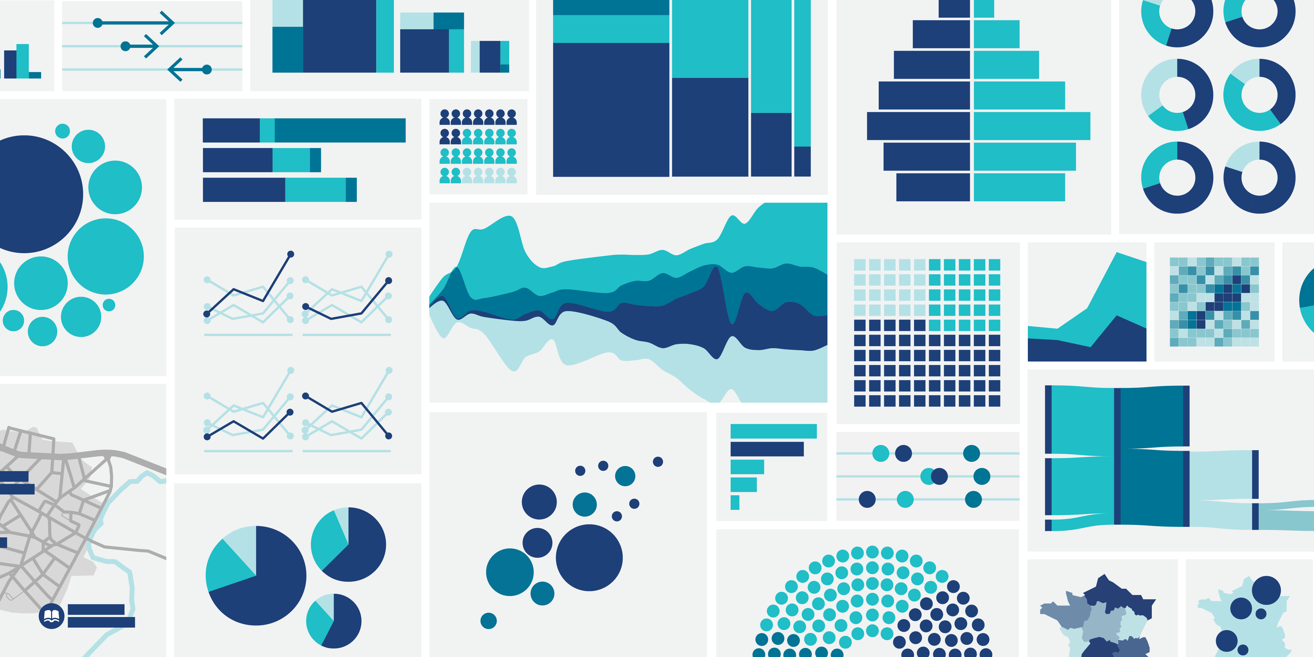
Here's everything the article will cover (download this poster as a PDF here):
Alright, let's have a closer look at all of them:
Showing developments over time
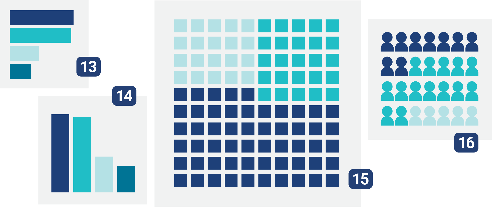
Many (most?) data visualizations show how some number – or several numbers – has changed over months or years. Whether it's temperature, Olympic medal count, average rent, interest rates, inflation, poll numbers, the classic line chart 1 is intuitive to read and usually a solid choice. Examples ↗ | How-to ↗
When you've got lots of categories to compare (especially when they overlap like crazy and turn into a spaghetti monster!) the “multiple lines” chart 2 can help. It gives each line its own little panel. This kind of layout where one chart type gets split up in a grid is often called “small multiples.” Examples ↗ | How-to ↗ | Do's & Don'ts ↗
Area charts 3, on the other hand, are a good way to intuitively show how the internal breakdown of something has changed over time – like the share of oil, gas, wind, and solar in total energy consumption. Examples ↗ | How-to ↗ | Do's & Don'ts ↗
If you're working with just a few points in time (like “wildfires in the past five years”), a column chart 4 is usually a good fit. Examples ↗ | How-to ↗
For more nuance, consider adding subcategories – the stacked column chart 5 is the most obvious choice here. Examples ↗ | How-to ↗ | Do's & Don'ts ↗
A grouped column chart 6 gives your readers an easier time comparing such subcategories. Just don't use it if you want readers to compare totals with each other. How-to ↗
All of these chart types so far are… well, a little too familiar, maybe even boring? Maybe the stream graph 7 can make you happy. Yes, it's hard to read any exact values in one of those. But stream graphs can serve as a stronger visual metaphor than regular area charts, and they'll grab attention just by looking different. Examples ↗
The same goes for the slope chart 8. Think of it as a line chart where everything between the first and last date has been erased. They can be a good choice if the ups and downs of how a line evolved are just not that interesting. Similar to small multiples, they can also help tidy up an otherwise-messy line chart. Examples ↗ | How-to ↗
If you have to show lots of categories and don't have the space for a slope or multiple lines chart, an arrow plot 9 can help. It's trickier to read for a mainstream audience, but nicely compact. Examples ↗ | How-to ↗
There are dozens of chart types out there – but most of the time we just see the same old line, column, and bar charts. The reason is simple: These basic chart types make comparing data really easy. And readers are already used to them, whereas fancy types like stream or slope charts require a bit of a learning curve.
Read on: Why “boring” charts aren't bad, and how to make them more engaging ↗
Still, it's worth knowing more than just the usual chart types. For some data and goals, they can be perfect. And a slightly less intuitive arrow plot can be a good way to mix up a report with fifteen line charts.
Showing shares

Whether it's a household budget, gender split, or market shares, proportions are a huge part of data visualization. The classic contestants here are:
The pie chart 10 Examples ↗ | How-to ↗ | Do's & Don'ts ↗
The donut chart 11 Examples ↗ | How-to ↗
The parliament chart 12, the donut chart's political sister (also known as an election circle/donut) How-to ↗
All of these chart types are very obvious in stating: “We're not talking about absolute numbers here; we're showing percentages.”
That said, circle sections aren't exactly easy to compare. That's why the most important percentages in the news, like election results, are almost always shown as bar charts 13 Examples ↗ | How-to ↗ or column chart 14. A 3% difference between two categories can be easy to spot in a bar chart, but practically invisible in a pie or donut.
If you're after something a little more eye-catching, waffle charts 15 Examples ↗ and pictogram (unit) charts 16 Examples ↗ can offer a more illustrative approach to showing proportions. They do often sacrifice some readability for being more fun.
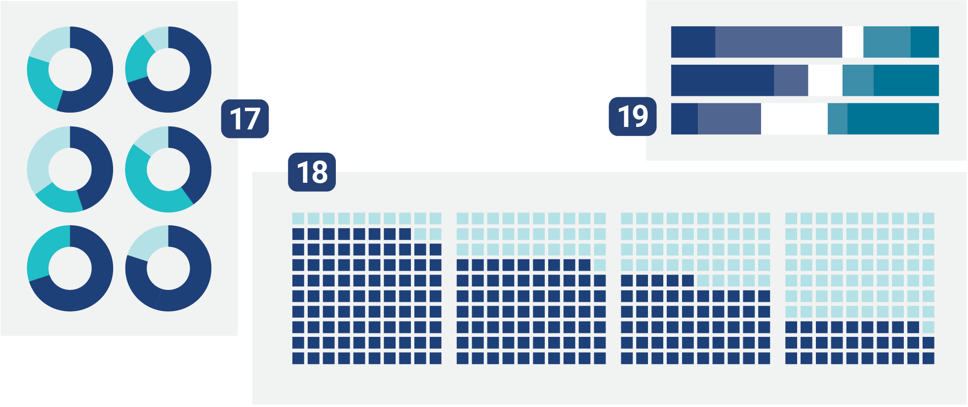
If you want to represent multiple dimensions — such as how shares have changed over the years — you can turn to small multiples, showing multiple pies, multiple donuts 17, or multiple waffle charts 18 side by side or stacked on top of each other.
However, stacked bar charts 19 might be your best option. They're often used to visualize survey results ("How satisfied are you with the work of these parties?") with multiple response options ("CDU, SPD, ...") and Likert scales ("very satisfied, somewhat satisfied, not satisfied, not at all satisfied"). And they're nicely space-efficient. Examples ↗ | How-to ↗
(We already met their cousin, the stacked column chart 5, further up – they're especially good for intuitively showing proportions over several time points.)
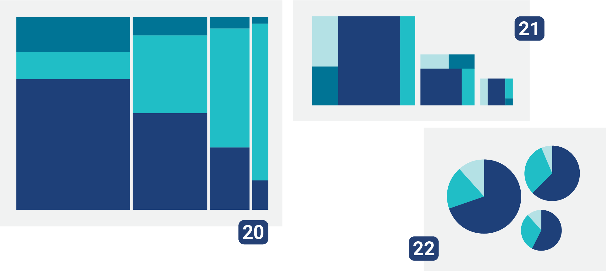
If you think it's worth challenging your readers a bit, consider using a Marimekko chart 20. This chart type allows them to compare both absolute and relative values – for example, the shares of different age groups in the populations of various countries. In a Marimekko chart, the U.S. would have a wider column than Canada, due to its larger population. Examples ↗ | Explanation ↗
A less easy to read alternative is treemaps 21. Their big plus: They can be nested and hence show hierarchical data well. Examples ↗
Also visually interesting but hard to read are proportionally sized pie charts 22 and donut charts.
Showing absolute numbers

Let's move on to what might not be the most common, but one of the simplest forms of visualizations: the ones that are showing how much of something exists. How many cookies did your 3-year-old eat every week? How much wealth do the richest people own? How much CO₂ is emitted on average by different energy sources during electricity production? Bar charts 23 are perfect for these kinds of comparisons. Examples ↗ | How-to ↗
If you're a fan of the "harder to read accurately but more fun visually" chart types, consider proportional area charts 24 with circles, squares, and other fun shapes. Examples ↗
Pictogram charts 25 fall into this category, too. Usually in these charts, one pictogram represents several units of the same thing (for example, one icon = 1,000 people). They'll get your reader's attention. Examples ↗
When choosing a chart type, it's worth thinking about how well it can adapt to different screen sizes – and how much work you need to put into making it useful on smaller screens.
For example, a column chart with 30 bars might look good on a wide desktop monitor. But the moment it gets squished down to smartphone size, labels start overlapping (or end up turned sideways awkwardly). A bar chart is often a safer pick for small screens than a column chart, since it grows vertically rather than horizontally.

Things get more interesting when absolute values are stacked or split, for example when comparing domestic vs. international revenue. Good options for this kind of data:
Stacked column charts 26 Examples ↗ | How-to ↗ | Do's & Don'ts ↗
Stacked bar charts 27 Examples ↗ | How-to ↗
Split bar charts 28 Examples ↗ | How-to ↗
The popular population pyramid 29 falls in the same category: It's a split bar chart with one side mirrored. It shows the number of people in different age groups, split into male and female. Examples ↗ | How-to ↗

If you want to compare two or three values within a category, grouped column charts 30 or grouped bar charts 31 are a great option — for example, to show the absolute CO₂ emissions of different energy sources across various countries. Examples ↗ | How-to ↗
Dot plots 32 can help with that, too, especially when you've got more than just a couple of values per category to compare, and/or not much space for a chart. Examples ↗ | How-to ↗
Showing correlations
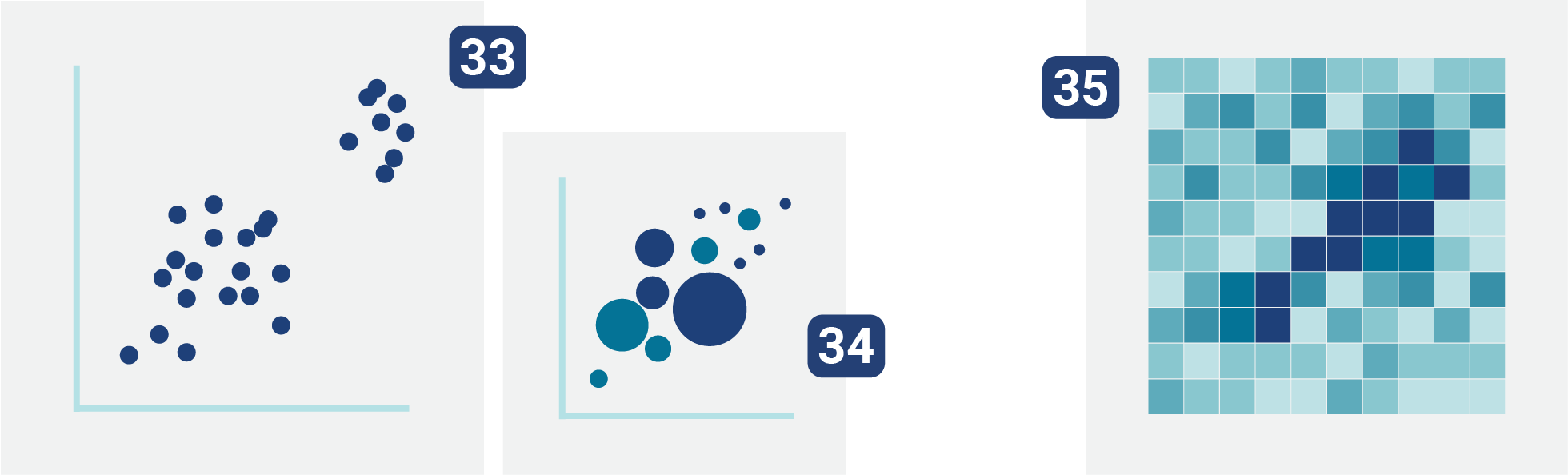
Do countries with higher tax rates have higher life expectancies? Was voter turnout lower in districts where support for extremist parties was higher? To first explore and then show how different categories relate to each other, scatter plots 33 work well. (If its symbols are sized differently, they're sometimes also named bubble charts 34.) Examples ↗ | How-to ↗
If your message gets lost in a sea of overlapping dots — and if you want to bring out your science-y side — consider a 2D histogram 35. It's sometimes also simply called a heatmap, but that's a name for many different visualizations.
Scatter plots and 2D histograms feel complicated to you? Well, that's because they are. Many of your readers will find them overwhelming. Consider introducing readers to a topic with simple visualizations and statements, and only then increase the complexity of your charts.
On CO₂ emissions, you could show the following:
First, a line chart 1 with a single downwards-trending line and the clear statement: “Europe emits less CO₂ than it did 30 years ago.”
Then a look at the percentages with an arrow plot 9: Which European country has reduced its per capita CO₂ emissions the most; which the least?
Finally, the more complicated scatter plot 33 which puts the change in CO₂ emissions in relation to the CO₂ values of 30 years ago and concludes: Countries reduced emissions more when their starting values were higher.
Even if only very interested readers make it all the way to the last chart, everyone will take away the most important message: “Europe emits less than it did 30 years ago."
Showing flows

To visualize how people change their opinions or how things move through a system, flow diagrams are your friend. The most common ones are the alluvial diagram 36 Examples ↗ and the sankey diagram 37 Examples ↗
They can look almost the same, and even data vis designers can't agree on the exact difference between them. Some argue that sankey diagrams are used to show flowing volume (like money, energy, or traffic) while alluvial diagrams are more about categories (highlighting e.g. which jobs people switch to or how they change (voting) preferences). As long as you and your peers know what you're talking about, use whichever term you feel more confident pronouncing.
Showing geographical patterns
People like maps — especially if they can find themselves on them. If you want to show that there are more clubs in East Berlin than in West Berlin, or simply where your friends can find the ones with the best music, maps are indeed a good choice. There are many different types that visualize data. Here are three:
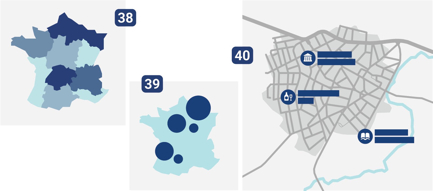
Choropleth maps 38 are suitable for data that is available in administrative regions, like voter turnout in different municipalities or crime rates in different provinces. In these maps, regions are colored lighter or darker depending on their value. Examples ↗ | How-to ↗ | Do's & Don'ts ↗
If you have lots of specific locations you want to map (e.g., all universities in India), symbol maps 39 are the right choice. Examples ↗ | How-to ↗
And if you want to show where a few points are located or where events unfolded over a smaller area like a city, consider using locator maps 40 (also called pointer maps). Examples ↗ | How-to ↗
I hope this article gave you a first inspirational overview of which chart types are possible to use, depending on your data and goals. Do you have feedback or questions? Leave a comment below or get in touch with me at lisa@datawrapper.de.
Further reading
Here are some collections of visualizations types I enjoy:
Visual Vocabulary from the Financial Times. Probably the most popular overview of chart types. Great to print out as a poster.
Data Viz Project by ferdio. The most complete overview of chart types I know of (with 160 chart and map types), and maybe one of the best-looking, too. Can be searched through and filtered by shape, function, and more.
From Data to Viz by Yan Holtz and Conor Healy. An interactive decision tree that focuses on the type of data you want to visualize. More science-y chart types. Each one comes with an explanation of common mistakes and examples.
The Chart Guide by Storytelling with Data. In-depth explanations of a few less commonly used chart types, such as the Gantt chart and spider chart.
Xeno.graphics by Maarten Lambrechts. "A collection of unusual charts and maps." Nicely shows that there’s no limit to the number of chart types humankind can come up with.
And last but not least, here's an opinionated article on the topic: "Choosing a chart type is harder than you think" by data vis book author Nick Desbarats, who built lots of different decision trees for picking chart types (the first image in the article shows one of them).