Fix my chart: Turning donuts into bars

Welcome back to Fix My Chart, an advice column for all your data visualization questions. We look at real charts, maps, and tables, and figure out how to solve their problems together. Does your chart need a tune-up? Write in here!
Dear Rose,
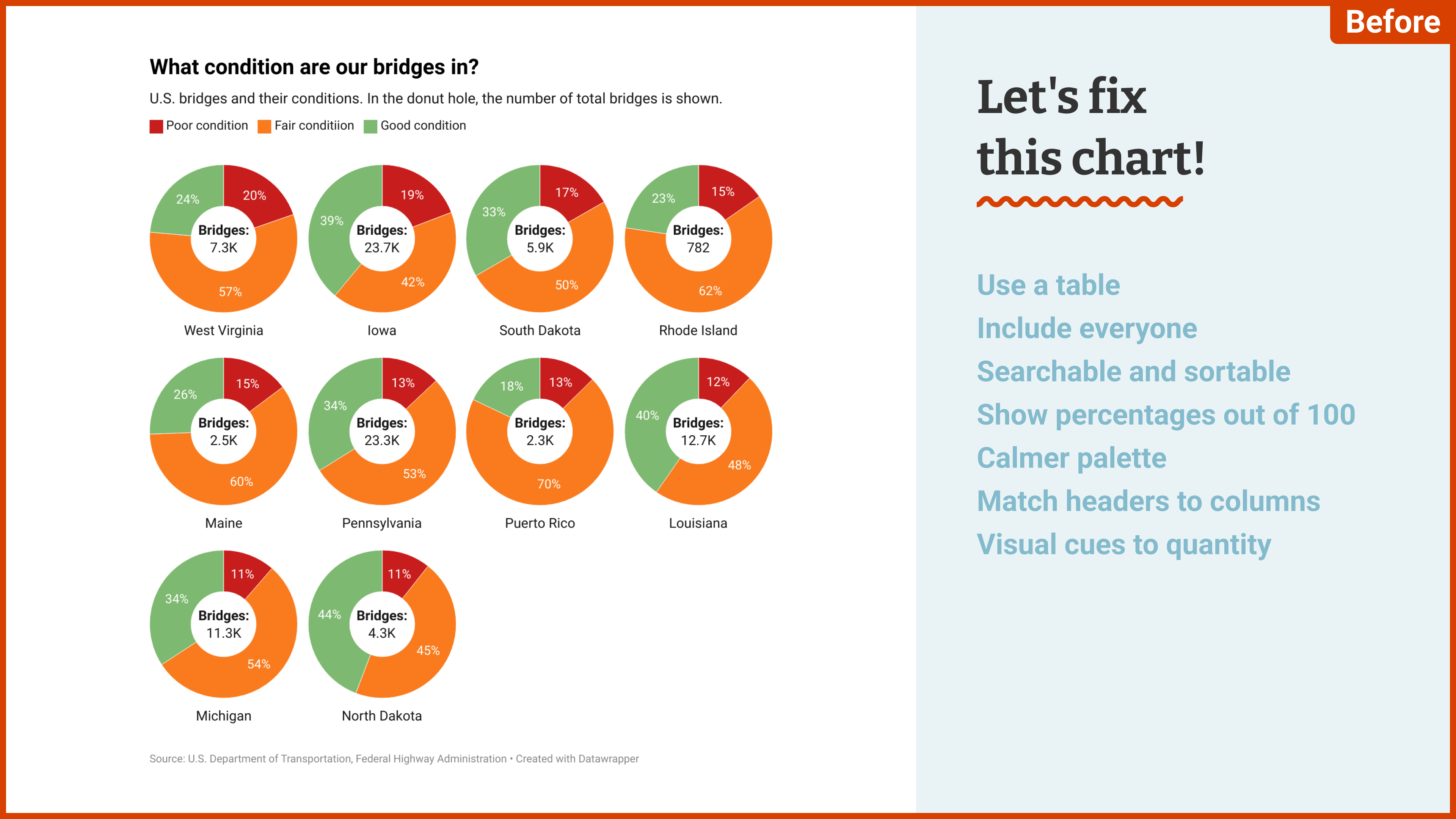
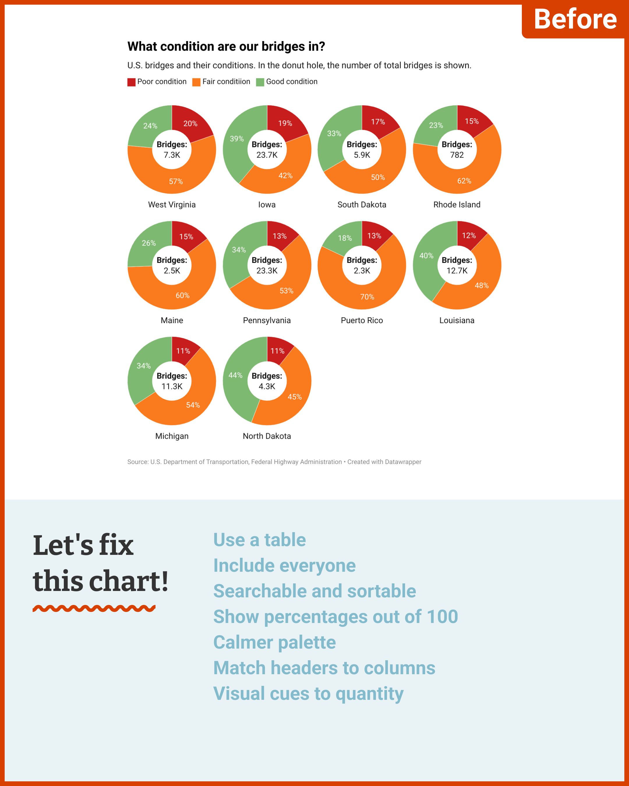
Please fix my chart. I saw an Axios map showing shares of bridges in poor condition. It just visualizes the bridges in poor condition. I wanted to show how many bridges are in fair or good condition. So I created the following chart:

But it really doesn’t look that interesting? Every one of these donuts looks the same. I tried to bring some nuance in it by showing the number of bridges. But I’m not sure if that worked well.
And then there are the colors. I don’t like the stoplight colors. They work well to show what’s what, I guess. But they’re too in your face. What would you advise? Maybe I should just call it a day and move on to the hopefully more interesting and better-looking next chart?
Without much clue,
Tom
Dear Tom,
A clear pattern or trend can weave lots of data into a single, understandable story. (”Bridges in the Northwest are especially bad!” “Every state has good bridges except South Dakota!”) But when your data doesn’t add up to anything in particular, readers can’t be expected to take it in all at once.
At this point we might just say, forget it, there’s no story here.1 Or, we could stop trying to create a big picture and just help readers to focus in on one strand of data — the strand that describes their own life.
I think two big changes can help make this chart more interesting and approachable. The first is to unroll your donuts into bars, which will make it easier to compare bridge categories both within and between states. The second is to make it possible for all your U.S. readers to find themselves in the data.
We can achieve both of those changes by using a table:
With all the mini bar charts on an equal 0–100 scale, we can choose to scan the table either horizontally (seeing the breakdown of bridge conditions in one state of interest) or vertically (seeing how the share of poor, fair, or good bridges varies between states). Adding a search bar and the option to sort by any column allows readers to find their own state and see where it stands compared to others. We'll keep the spirit of your original chart by still having "poor condition" as the default sort.
Since you mention your colors: I agree that a stoplight palette works well to “show what’s what” here. In fact, the symbolism is so strong that you can afford to take a very light touch — even a much softer, less saturated, less “in-your-face” palette will still activate the same associations. And the main disadvantage of this palette, which is the difficulty it poses for red-green colorblindness, is already taken care of with our new table format.

Here's my final table! If you're reading along, you can get a copy in your own Datawrapper account by clicking "Edit this chart" in its top right corner.
See you next time,
Rose
My mailbox is open for your data vis questions, struggles, and consultations. I’m looking forward to hearing from you!