New America: “Dammit, why didn’t we just pay for Datawrapper a year ago?”

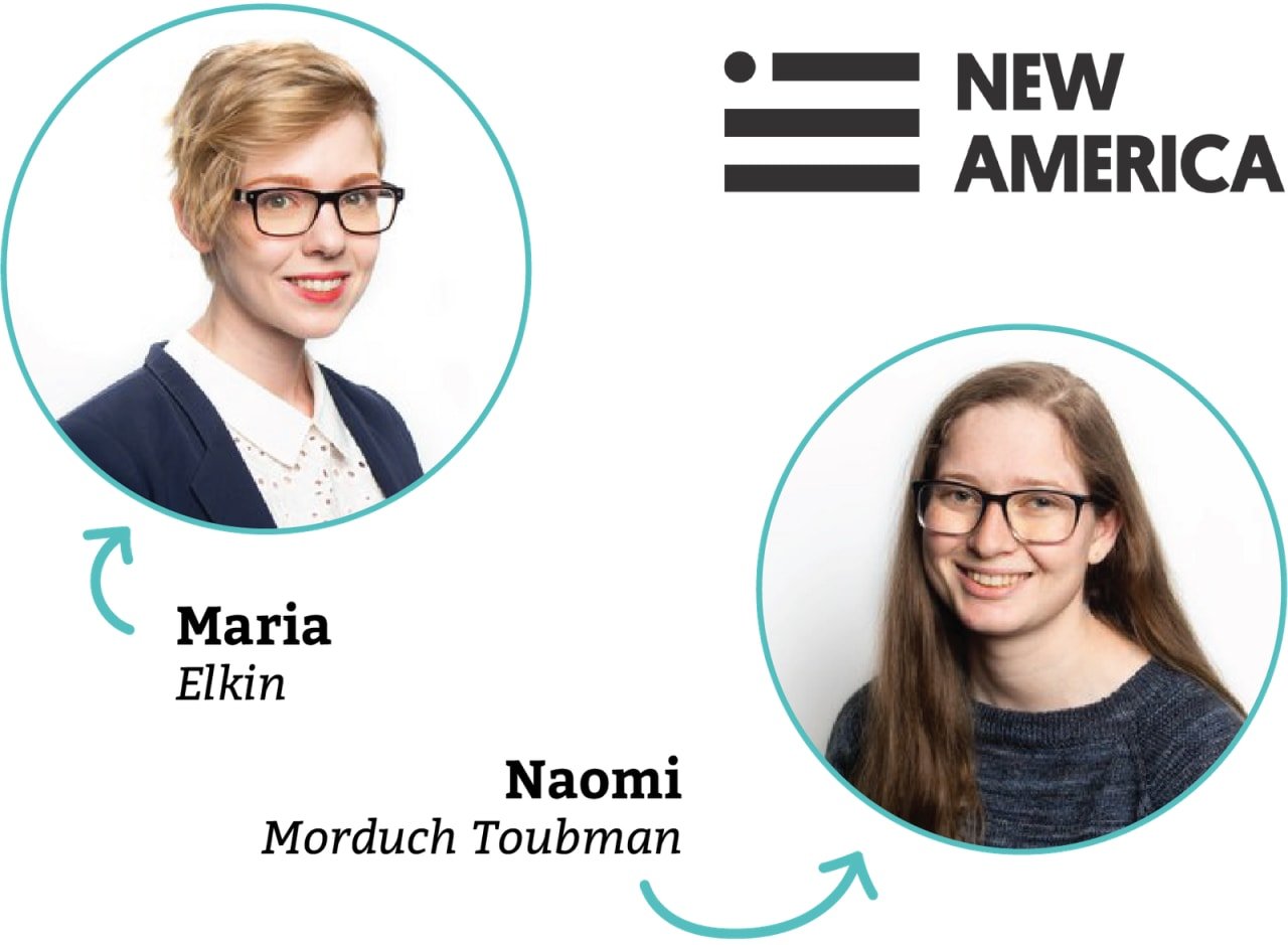
When multiple people throughout your organization need to visualize data, there are two options: Build a charting tool yourself – or use an existing charting tool like Datawrapper. The designers and developers at DC-based think tank New America went through both approaches. We called deputy director of communications Maria Elkin and data visualization developer and designer Naomi Morduch Toubman in summer 2019, to hear their story about how Datawrapper changed things for New America’s teams, even those who don’t use the tool.
New America focuses on how the world is changing around us, often with technology as a common thread – “the way we work, the way we access education, the way we fight wars, and, ultimately, the way we live,” as Maria explains. Naomi adds: “I think of us as journalism/academia adjacent.”
Why does New America visualize data?
Due to the many publications generated by New America, data
visualization is an important part of Maria and Naomi’s work. Maria
tells us, “Many of our scholars and analysts are conducting original
research around things like: how many civilians being killed in drone
strikes in the Middle East are not being documented by the US
government? Our scholars will look at publicly available data, do their
own data collection, or they’ll use the Freedom of Information Act
(FOIA) to request data.”
“We’ll have datasets that they want to show in a more interesting way than a data table – something that tells a narrative. Charts and graphs help build that narrative.”
Maria jokes, “And then other times people are like, ‘my report is too long, I need some graphics to help break it up.’ Those requests are frustrating, but there is a fair chunk of them.”
“Why buy an off-the-shelf thing if we can just build it ourselves?”
The growing need forced Maria to choose either an existing software
or have developers build an in-house tool. “About a year ago, we did
briefly look into off-the-shelf tools we could use to democratize the
data visualization creation process. Datawrapper was one of the
tools we found, but $6000-$7000 seemed like a lot of money at the time.
We hadn’t budgeted for that cost, so we scrapped the idea.”
Instead, New America developed their own tool. “Our team had a mindset of ‘why buy an off-the-shelf thing if we can just build it better ourselves?’
So we built an internal data viz tool – kind of a components library,
built-in React and D3, of all the most common chart types,” Maria
explains.
“This ended up being our undoing. We
ignored that a developer still had to manually hand-code everything. If
someone just wanted a simple bar chart, a developer still had to build
it for them.”
“I think there was a fear of becoming obsolete”
Committing to Datawrapper wasn’t easy, even knowing that it would
make it much easier to make simple charts. Maria recalls, “When choosing
Datawrapper, I think there was a fear of becoming obsolete – of our team’s work being devalued because the new product would make the workflow so much easier.”
Maria
compares it with a product many of us know from podcasts and YouTube
ads: Squarespace. “People are so used to Squarespace that they tell web
developers: ‘It’s so easy, just drag and drop; why can’t you just make
our website do exactly what Squarespace does?’ I think there was a
similar fear on the team that integrating an off-the-shelf tool like
Datawrapper would lead to a ‘Squarespace-ification’ of data viz – that
the scholars and non-designers would value the efforts of our team
less.”
What has happened since is actually the opposite. Maria’s
communications team and the research staff are now working together
better than ever. For New America, Datawrapper has affected
everyone in the company: Data viz beginners, Maria’s team, and the
people who rely on them.

1. Data viz beginners are empowered to build graphics themselves
For the beginner who wants to make their own charts and graphs, Datawrapper empowers the curious mind to make professional data visualizations.
Maria was happy to see her colleagues at New America start using the tool: “Datawrapper made it possible for people to work on the low-hanging fruit and frequent asks themselves – like creating a choropleth map or plugging their data into a chart.”
Maria follows up with, “When letting people create graphics themselves, a fear of any organization is a lack of control over the brand. Are they representing the New America brand well? Are they using our fonts and colors? Datawrapper solves that by making the templates very on-brand and very easy to use.”
2. Writers relying on the communications team to visualize data get a “Yes” more often
For the scholars and analysts focused on writing, Datawrapper improves their collaboration with the communications team.
When it comes to data viz requests, Maria says, “Instead of ‘No,’ the answer is now more often ‘Yes’ or ‘Yeah, that’s super easy. Just send me the data you have and we can plug it in.’ Articles that would have only had static charts made in Excel or Adobe Illustrator a year ago, now have interactive Datawrapper charts.”
The communications team can now work more effectively with their colleagues when it comes to data viz needs: “Datawrapper makes consulting colleagues a lot easier. We can quickly show people a mock-up of the final visualization, or show them examples of their data plugged into a couple of different chart types. Previously, our scholars had to take it on faith from us that we would visualize their data the way they want. Now the chart making process is far less prescriptive and our scholars trust us more.”
3. Data viz developers and designers can create simple graphics quickly, build trust with colleagues, and spend their time on big projects and ideas
Maria points out how the new workflow with Datawrapper makes her job easier. “So much of my job relies on building relationships and trust with our internal clients. Datawrapper has been incredibly helpful in terms of helping us build those better relationships, get buy-in, and build more trust between the research staff and the communications team.”
She further explains: “Datawrapper has freed up Naomi’s and other developers’ and designers’ time to work on the bigger custom projects by spreading out the work and reducing the time needed for smaller data viz requests. At the end of the day, we’re building more charts in total, which makes us more credible throughout the organization.” Naomi adds that Datawrapper allows her to prioritize design decisions rather than technical limitations. “I get to focus on ‘What should we be doing?’ instead of ‘What can we do?’”
“Four years ago I had to walk up a hill in the snow both ways”
New America’s journey to find a solution to their data visualization
needs took several years and caused a few headaches. “I remember at some
point I was manually dragging the bars that I made in Illustrator up to
the correct size based on the axis that I had manually created. I feel
like this is me being like, four years ago, I had to walk up a hill in
the snow both ways, but it kind of felt like that.”
“Datawrapper has been a really great addition to our workflow. I’m surprised by how flexible the tool has been,” Maria
says. She’s satisfied about all the different ways Datawrapper has
positively impacted her day-to-day work, from the better quality of
charts to the improved team relationships throughout the organization.
At the end of the interview, Maria laughs: “Dammit, why didn’t we just pay for it a year ago?”
Thank you so much to Maria and Naomi for taking the time to talk with us. If you want to find out more about New America, including how you can support their work, visit newamerica.org. Next week, we’ll explore how the stats office in Flanders, Belgium has built more than 2000 Datawrapper charts, but never from scratch.