Our simpler, tidier & more consistent bar chart editing


Right: What you now see when creating stacked bars.
Maybe you’ve noticed it already: Since last Friday, Datawrapper comes with a redesigned user interface that helps you refine how your bar charts look like – and we’re very excited about that. This change concerns all bar charts, split bars, stacked bars, grouped bars and bullet bars.
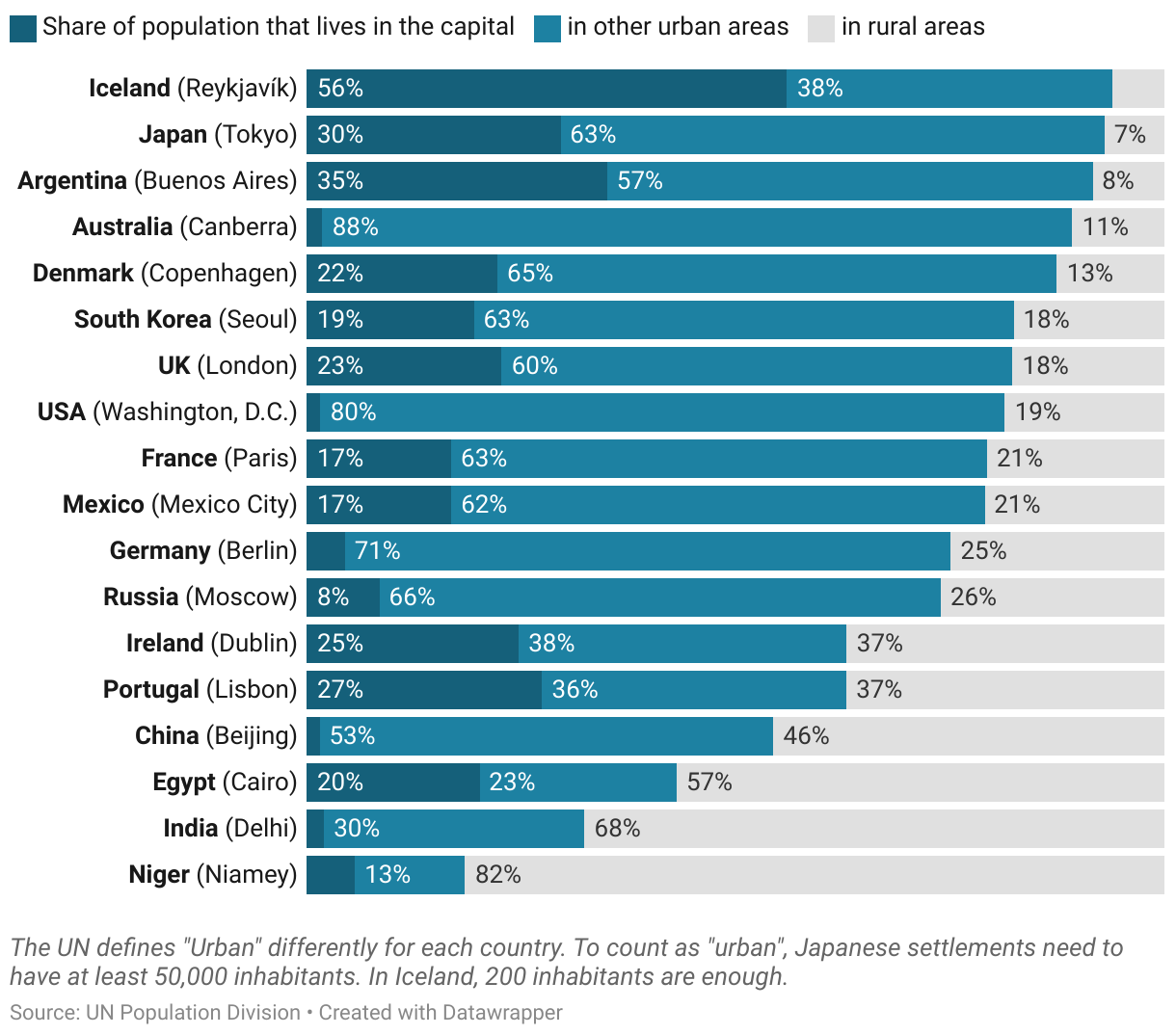
This blog post explains why, and what changes exactly. If you want to dive in immediately, simply create a bar chart here or hover over the stacked bar chart below and click “Edit this chart” in the top right:
“Customize colors”: Drag & rename categories
You can still create the same great-looking bar charts with Datawrapper. We changed the user interface for the bar chart options, but we haven’t changed what you can do with them. With one exception: the “Customize colors” feature. You can now
- change the order of colors in the color key by dragging & dropping the items in the list
- change the text of the category in the color key. If two categories have the same color and the same text, they will show up as one category.
See how it works in practice here:

With these new options, there’s no need anymore to drag columns or rename them in Excel or in step 2 of the Datawrapper chart editor (“Check & Describe”).
The same options with a cleaned-up look
Besides adding options to the “Customize Color” feature, we did a thorough spring-cleaning of the bar chart options: Categorizing them in a new way, gently rephrasing them where needed and aligning them more properly. All of this hopefully makes creating bar charts more intuitive; more simple. We believe that our new interface is easier to “read” than the old one, so that you spend less time searching for options.
We also made the structure of the options more consistent across our bar chart types where possible. It doesn’t make sense to offer the same options in all chart types. But you will now find similar features in similar places, be it in stacked bars or bullet bars.
Also new: Our interface now only shows the options that are relevant for you. If you don’t want to show values, for example, there’s no need for options such as “Value alignment” or “Number format”. So we don’t show them if you turn off “Show values”.

Behind the switches, you will find more specific settings when needed. This makes for a cleaner look and enables us to add new, specialist features in the future without overwhelming data vis beginners.
More helper texts
Last, but not least: More helper texts. We want to help you as best as possible along your journey to create a beautiful chart – be it with our Academy, little question marks next to options or our support. We’re thrilled to now offer more explanations directly in the interface, e.g. to answer the question why you can’t use a certain option in a specific case:

There’s more to come
If you’ve used different Datawrapper visualization types before, the helper texts and switches are nothing new. And indeed: Our locator maps, pie and donut charts, column charts and our tables already have the new interface. Soon you’ll find the blue switches in our dot plots, range plots and arrow plots, and in the next coming months in all our visualization types.

Thanks to our software engineer Simon Jockers for working on this project for weeks on end! We hope you like the result. For some of you, the new interface might be a bit of a change. If you’re a heavy Datawrapper user, it might take some time to get used to the new placements of your favorite settings. We believe it will be worth it. If you have any feedback, question or worries about this change, do let us know at support@datawrapper.de. We’re looking forward to hearing from you.