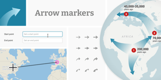
New: Arrow maps

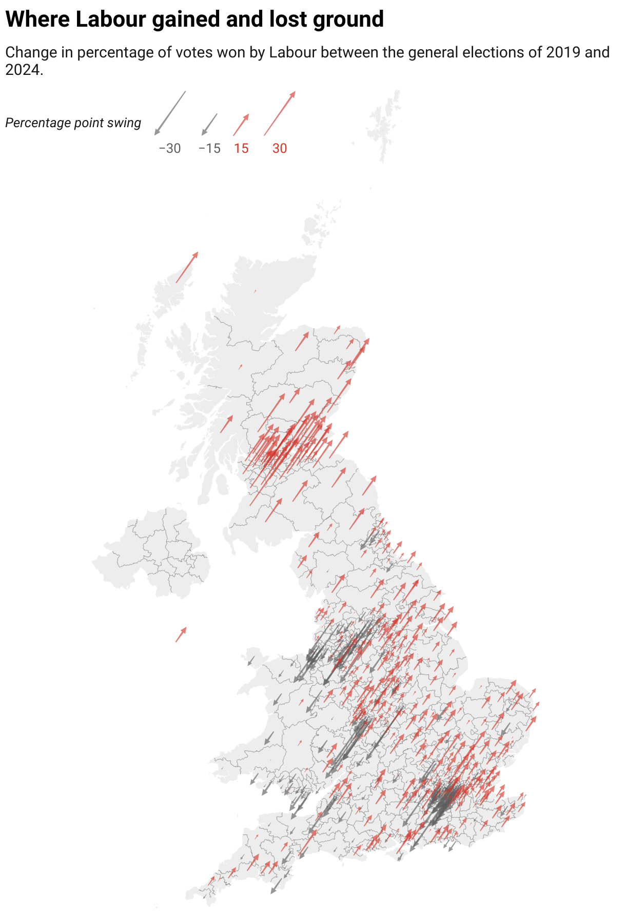
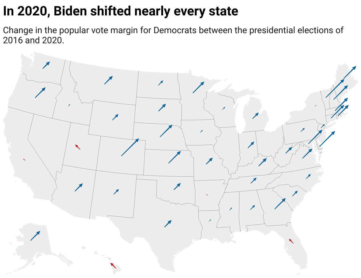
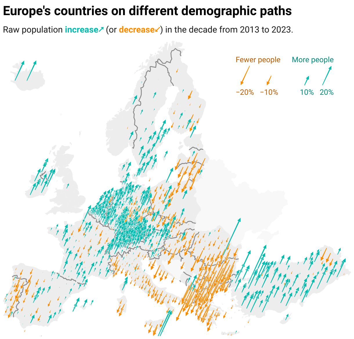
You can now use Datawrapper to create arrow maps, a much-requested map type that's particularly useful for election coverage. This type of map, also known as a swing map or hedgehog map, is a helpful option when your data shows the direction and size of a change, such as:
- "Swing" between two opposing categories, like support for political parties (especially in a two-party system!)
- Geographic distribution of increase and decrease in some key metric, like population or housing prices.
How to create an arrow map
To create an arrow map, create a new symbol map in Datawrapper, then choose Arrow in Step 3: Visualize. Datawrapper will assign your positive and negative values to distinctly colored categories, representing them as arrows pointing in different directions.
After selecting the arrow map type, you’ll see new, arrow-specific settings designed to help you fine-tune your visualization:
- Have your arrows pointing left and right, or up and down. Up and down arrows are a great choice for visualizing increases and decreases; left and right arrows make sense for contrasting two categories (like Republicans and Democrats).
- Tweak the arrow angles and sizes depending on what works best for your particular map and dataset.
- Easily choose colors for positive and negative directions.
Explain it all in the legend
The arrow legend explains the meaning of your arrows' direction, color, and length. For a more customized legend, you can configure exactly which values are shown, or even opt to disable Explain arrow lengths entirely.
Comes with everything you expect from Datawrapper
As with all our features, you can expect arrow maps to automatically convert to dark mode, export to PNG, SVG, and PDF, and be customizable via your custom theme. The size of arrows adjusts proportionally for mobile devices when "Reduce size on smaller screens" is enabled, for an ideal display at all sizes.
We're looking forward to seeing all the maps you create this week and beyond! Questions, problems, suggestions? Write to us any time at support@datawrapper.de.