Customizing your symbol map
After importing the data for your symbol map, you can now choose the data for the symbol size and color and style the map to your liking in step 3: Visualize. You'll find three tabs at the top: Refine, Annotate and Design.
Contents
- Refine: Symbol shape and size
- Refine: Color
- Refine: Legend
- Refine: Map extras
- Refine: Appearance
- Annotate
- Layout & Publish
In this tutorial, we'll walk you through all these steps to create the following map:

Let's start with the options in the Refine tab:
Refine: Symbol shape and size
In the first panel, your first action is to choose that you want to create a Symbol map, not a Spike or Arrow map. Then you have four options:
- Symbol shape: Here you can decide which geometric shape your symbol should have. Circles are the default, as they are used in most symbol maps and area easy to read. Squares, diamonds, and hexagons are great options for clustering, as we'll see later. Triangles (up and down) can be used to show a development (e.g. a city with a shrinking population). And markers are especially great if you don't choose a column for "size"; meaning if all your symbols are exactly the same size.
- Size by: Select which numeric column should define the size of your symbols. For our map, we use the population of the cities we show. If your symbols should all have the same size, select -- from the dropdown menu.
- Max size: Decide how large the symbols should appear. You can try around a bit to find a good solution: Too small, and it's hard to see them. Too big, and they're overlapping each other too much. Check your map on mobile screens with the preview options below the chart to decide if you want to Reduce the sizer on smaller screens.

Choosing the last option, Group nearby symbols, will cluster your symbols together. That's helpful if you have a lot of smaller symbols and it's important to see for your readers how many they are in an area.
👉 Grouping nearby symbols comes with lots of options that are helpful to understand. To learn more about them, visit our article "How to group nearby symbols".
Refine: Color
The next panel lets you define which colors your symbols should have. By default, they're all in the same color. Click on the color swatch to change this one:

In our case, we want the symbols to shows us how much warmer a city has gotten. So we choose our numerical column "regionalwarming". As soon as we do this, we get a lot of new options.

Datawrapper automatically maps our values between the lowest and the highest number in a linear interpolation. You can choose another kind of interpolation or range and change the colors of your gradient. For our map, we changed the palette to a yellow-red-purple gradient. We also rounded the minimum value down to 1 and the maximum value up to 3.5.
The Advanced options let you decide if your symbols should be more or less transparent (=opaque), have outlines, or multiply when they overlap.

Depending on the colors of your symbols and how much they overlap, you might need to make some changes here. Often, a combination of all options works best:

👉 To learn which interpolations to use, visit our Academy article "How to choose stops for choropleth maps".
👉 To learn how to work with these color options, visit our Academy article "How to use the color palette tool".
If you want to visualize categorial values (e.g. "yes"/'no" or "Republican"/"Democrat"/"Independent"), you'll see all your categories. Click on them and then on the color swatch to change their colors:

Now that we chose our colors, let's make sure readers can make sense of them with a legend:
Refine: Legend
By default, Datawrapper shows a legend for your symbol size and the color you chose. You can customize both in the next panel, Legend. The first settings are for the size legend that explain to your readers what they size of your symbols mean.

You can
- decide on the position and layout of your legend
- define which values the legend should show in which number format, and if the values should be placed below or next to the symbols
- put a title above, below, left or right of your size legend and decide how wide the title should be able to get (meaning, when a long title should break to the next line)
Below the size legend, you'll find the settings for the color legend:

Here, too, you can choose the position and how wide it should get ("Size"), and decide on a title. If you enable highlighting on hover, your readers can hover over either the legend or the symbols on your map to see symbols in a similar value range.
👉 To learn which legend types exist, how to use them, and how to position your map legend, visit our Academy article "How to customize your map legend".
We gave our map legend the title "Warming since 1960 in °C per century". We also used used custom labels to make visible that our legend shows degree celsius.
Refine: Map extras
The next panel lets you add extras to your map: A zoom button and an inset map.
Like the legend, you can place the zoom button in all four corners of the map. It's a great way to let people see the symbols in exactly the region they're interested in.
An inset map is a miniature version of your main basemap that highlights the visible region, helping your readers orient themselves. You have two type options: The main map and a globe. The main map is a good choice if you crop to data (see next panel).
Whichever type you choose, you can define the inset map's position, make it bigger (size), and add a horizontal and vertical offset to it as a share of the whole map width.

Refine: Appearance
The last panel in the Refine tab is the Appearance panel. Here you have the following options:

Map view lets you hide the parts of your map that don't have data if you choose Crop to data. This can be helpful if a big part of your map is empty. Give your map Additional padding to "zoom in" less in the part of your map with the data; to keep more context around the regions with data. Learn more about this in our article "How to hide regions on a map."
Map max. height is often not needed, but becomes important if your basemap has an unusual aspect ratio. By default, Datawrapper will automatically adjust the height according to its width to reduce any unnecessary white space around the map. But when you have a long map like Chile, for example, you might want to set a maximum height to avoid all the scrolling:
Map alignment: determines the positon of the map on the background. Often, a map fills the background completely, like an US map. If you work with such a map and the map padding is set to zero, this option won't have any effect.
Hide region borders is the last option and does just that: The borders on your map (e.g. country borders, state borders, or district borders) will disappear when you turn this on. This is especially useful if you have lots of tiny regions that get in the way of the symbols, but are not necessary to show for your readers.
These are all the settings you can find in the Refine tab. Let's move on to the Annotate tab:
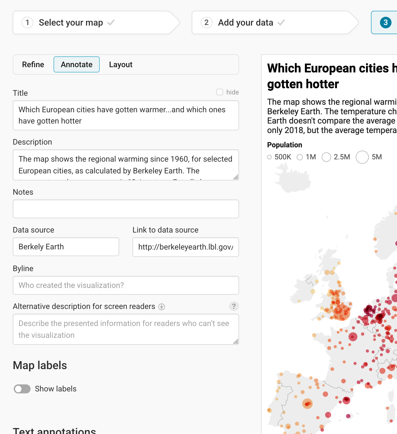
Annotate
In the Annotate tab, you're first asked to give your visualization a title, description, notes, source, byline, and an alternative description for screen readers. You can find a detailed explanation of all these Annotate options here.
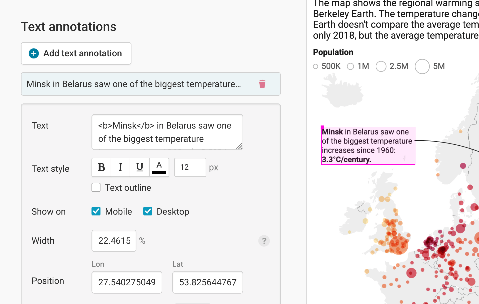
Then there are three panels left: Map labels, text annotations, and tooltips.
To learn more about map labels (regions and city names directly on the map), visit our article "How to add map labels."
To learn more about text annotations (in our maps, that's the text on top that points out Minsk), visit our article "How to create text annotations."
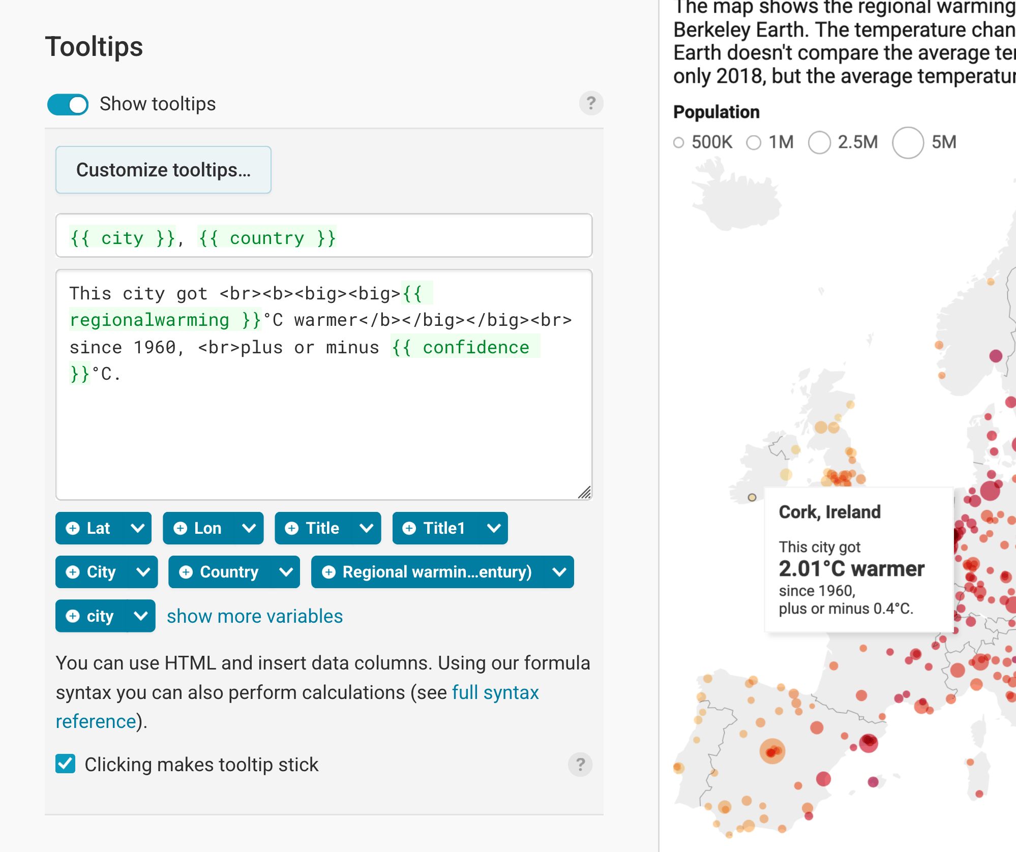
Finally, you can add tooltips. They're great to let your readers explore the map, see the underlying value of each symbol, and to add context information. Learn how to create them in our article "How to create tooltips", and learn how to customize them here. To learn how to create tooltips for your grouped/clustered symbols, visit our article "How to create tooltips for grouped symbols".
Layout & Publish
After annotating your map, only one tab is left in step 3: Visualize: The Layout tab. You can find all Layout settings explained in this Academy article.
And once you're happy with your settings, it's time to publish! We prepared other detailed Academy article about publishing, embedding, and exporting your visualization as a PDF, PNG, or SVG here.
And that's it! You successfully customized your first choropleth map. This is how it looks in the end:
In this tutorial, we gave a quick overview of all the options that you have to customize your symbol map. You can find more detailed explanations about the color palette, tooltips and custom map keys in other articles.