How to customize your color legend
This guide applies to symbol maps and choropleth maps. It also applies to heatmaps in tables, but not all options will be available.
Once you set the colors in a symbol or choropleth map or a heatmap, Datawrapper will automatically create a color legend for you. This key is crucial for your readers to understand what the colors in your visualization mean.
Depending on if you use a stepped or a continuous color scale or categories, you have different ways to customize it. This article explains all of them.
Contents
- Position your legend, change its size & orientation
- Give your legend a title
- Enable highlighting on hover
- Reverse the legend/how items are ordered
- Label options for categorical color legends
- Label options for stepped color legends
- Label options for continuous color legends
Position your legend, change its size & orientation
The color legend settings come with lots of options:
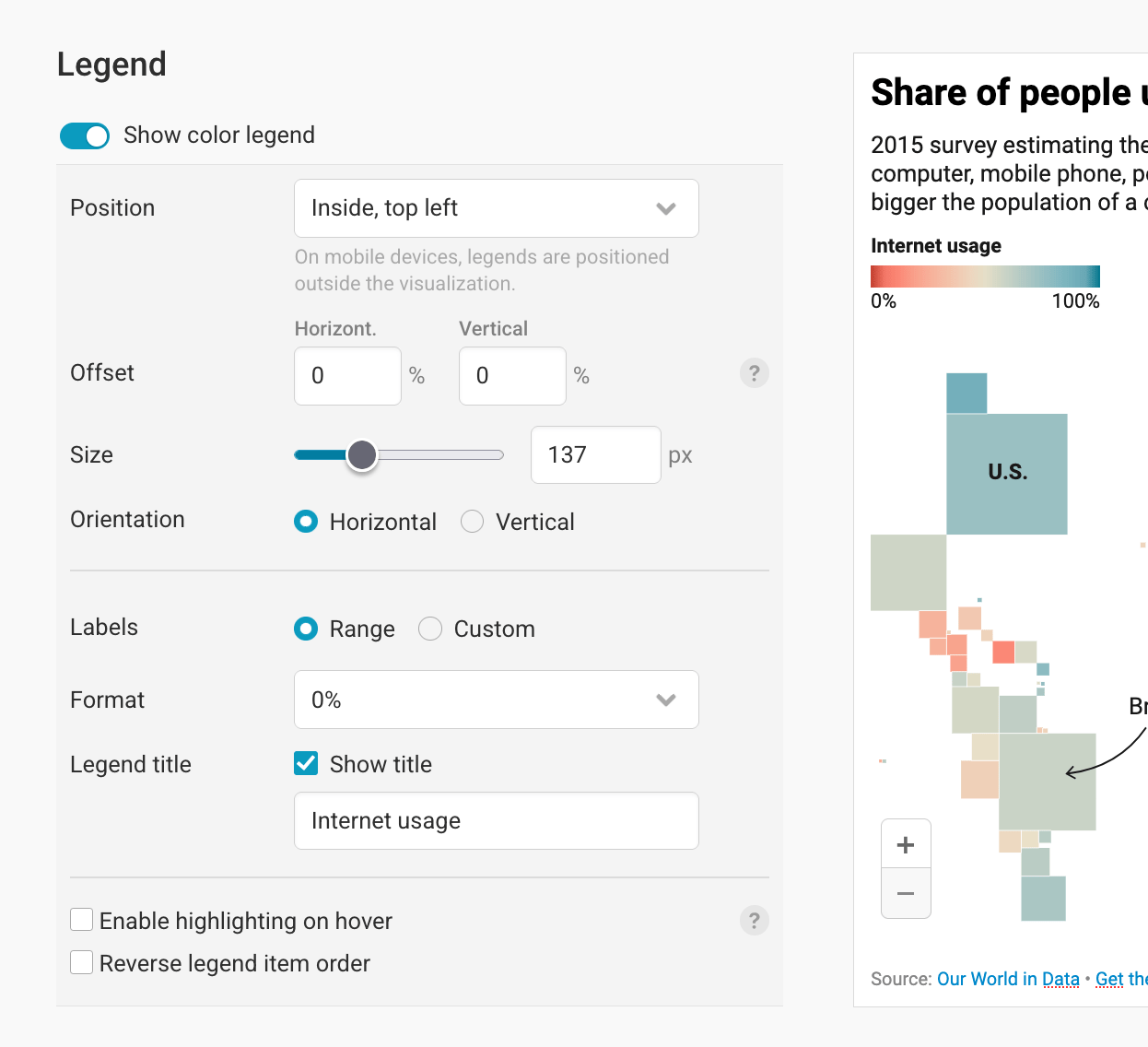
In the Position dropdown, you can choose if want to set the visualization above or below your visualizations, or in one of the four corners inside the visualization. If you choose one of the four corners, then the color legend will move below the visualization when it's viewed on mobile devices. If your color legend clashes with the map, consider adding some map padding (scroll down to Appearance > Additional padding).
To move the color key more inside the visualization, use the Offset option. You can define how much the legend will move inwards horizontally or vertically, in percentage of the total visualization width or height:
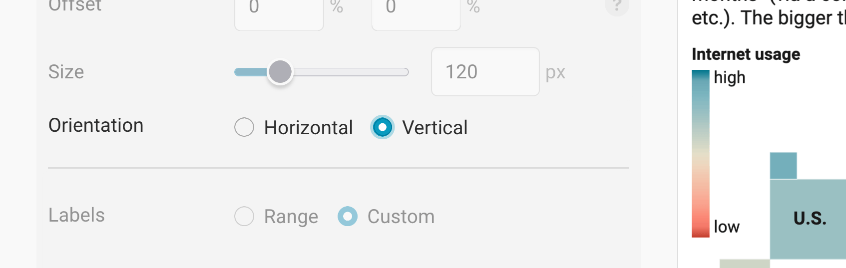
As you can see in the video above, you can also change the size (=width) of the legend. This is especially useful when you want to place the legend inside the visualization, but space is tight.
Last but not least, you can adjust the orientation of your legend. By default – and always if you're positioning your legend above or below a visualization – the legend reads from left to right (horizontal). If you want to rotate the legend by 90 degrees, choose a vertical orientation.
Below the orientation settings, you'll find the label options. We'll cover them further down. First, we'll cover the rest of the settings that are always the same, no matter which kind of color legend you're creating:
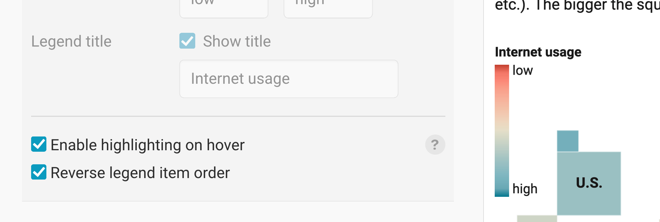
Give your legend a title
To give your legend a title, click Show title, then start typing. The title will appear directly above the color legend.
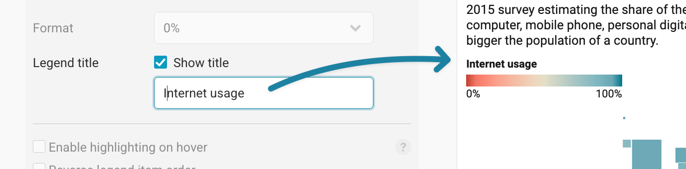
If your titles are too long, you can add HTML tags in between that break the lines. E.g. "Share of <br>people using <br>the internet". Where you write <br>, your title will break.
Enable highlighting on hover
This is an option that adds some extra interactivity to your map. Turn it on and your readers will be able to explore the regions that correspond to certain parts of the legend, and the other way round:
Reverse the legend/how items are ordered
The last option in the legend settings is to Reverse legend item order. If you check it, then your legend will "turn around" – for instance, if it went from low to high so far, it will now move from high to low.
The number format should match the format you're actually using. If you use percentages, set the number format to "0%" instead of writing "...in percent" in your title.
Now, let's cover all the possible label options for your color legend:
Label options for categorical color legends
If you want to map categories (e.g. parties or industries), the legend options are fairly simple. You can change the order of legend items by dragging them where you want them to be. To change the label text, click on it and start typing:
Note that a horizontal orientation for categorical collor legends means that your items are next to each, while a vertical orientation means that the color key items are stacked.
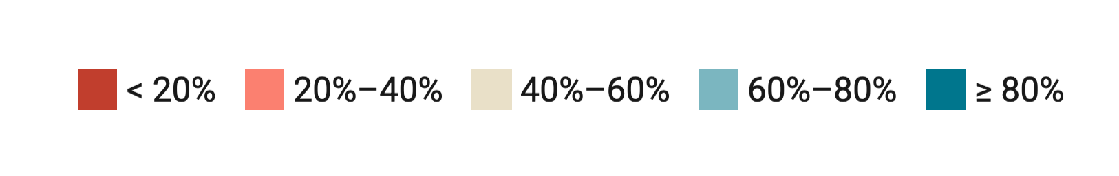
Label options for stepped color legends
To change the number of steps, the size of the steps or their colors, visit our article "How to customize stepped map colors".
If you choose "steps" as your color scale type, you'll find three ways of labeling your map legend:
Ruler

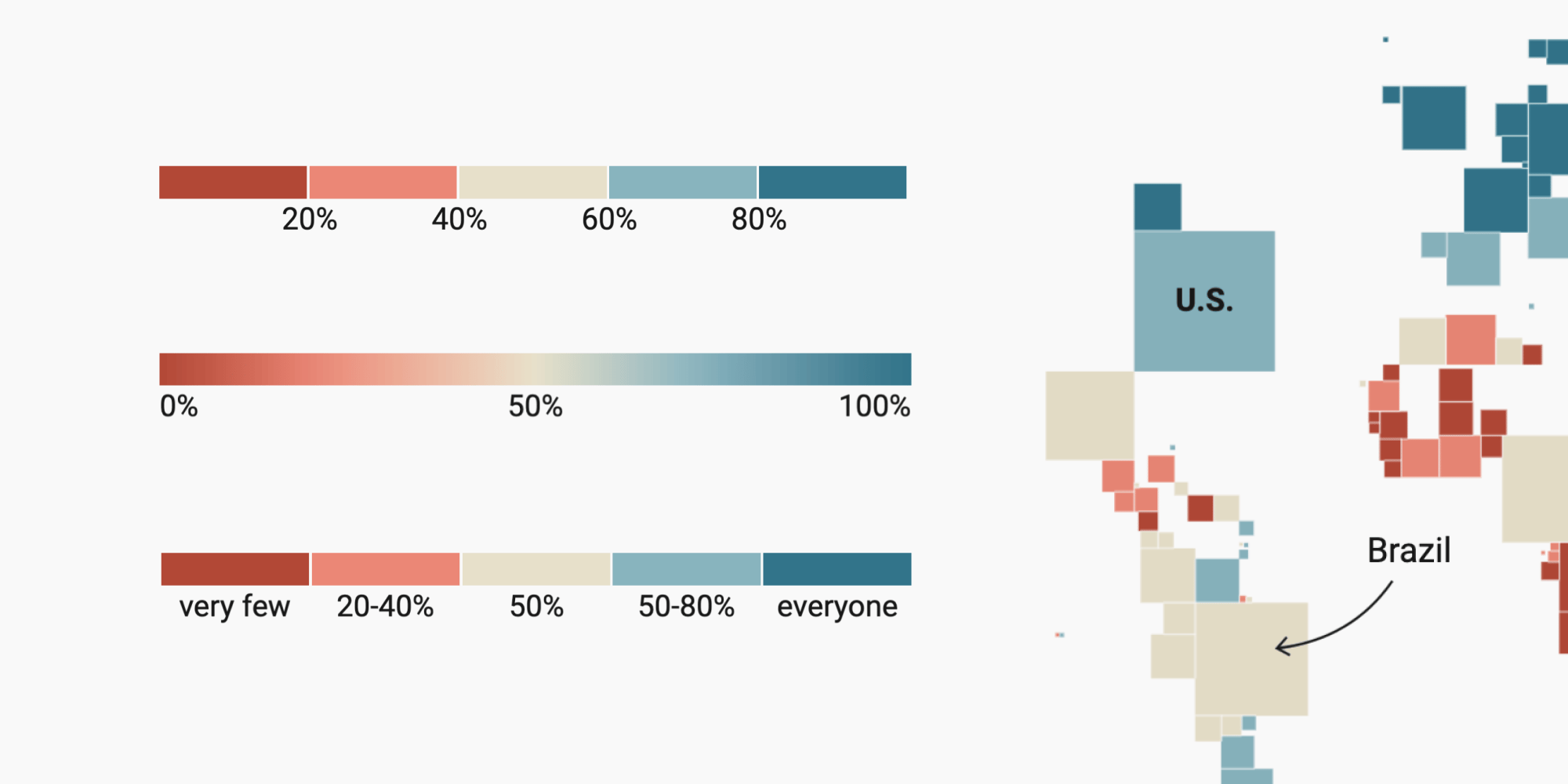
The ruler shows your step colors next to each other and the numbers below. Note that the smallest and highest value are not shown.
If the numbers would overlap — for example, because you set a lot of steps, have large numbers (like 10,000,000), or decreased the legend size — they will rotate 90 degrees:

Ranges
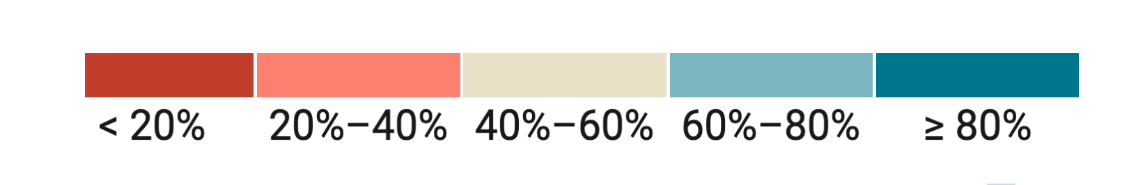
Ranges make it easier than rulers to see which color shows which range. When you position them in one of the corners of the map and your legend size is sufficient to show all numbers, they look similar to rulers, with numbers below each color swatch.
If you position the legend below or above your map, or if it isn't wide enough to show all numbers without them overlapping, the ranges color legend will display color swatches with the number range next to each one:
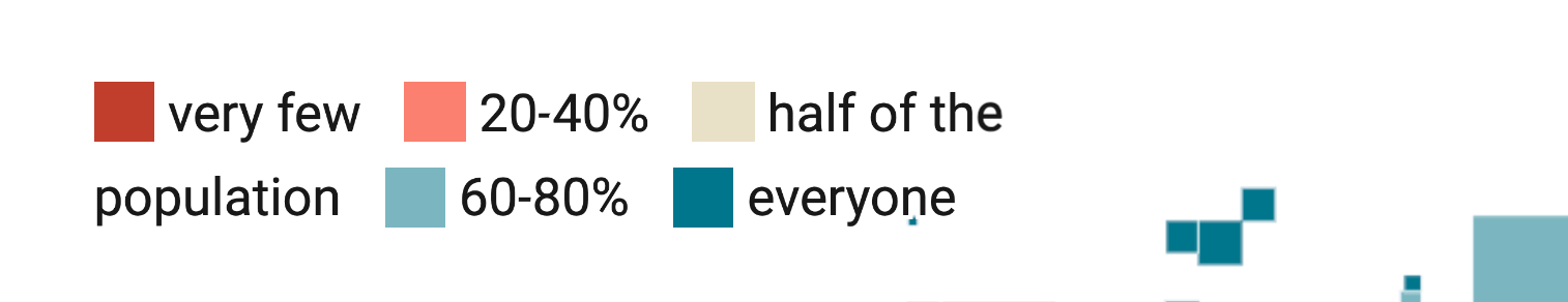
Custom

The custom legend works like the ranges legend regarding how it shows up. The difference is that you can change the labels to your needs. To do so, click on the labels to rename them:
If you position the legend below or above your map, or if it isn't wide enough to show all labels without them overlapping (for example, because your labels are long), the custom color legend will also display color swatches with the label next to each one:
Label options for continuous color legends
If you choose "continuous" as your color scale types, your labels can show the range or can be custom:


Range
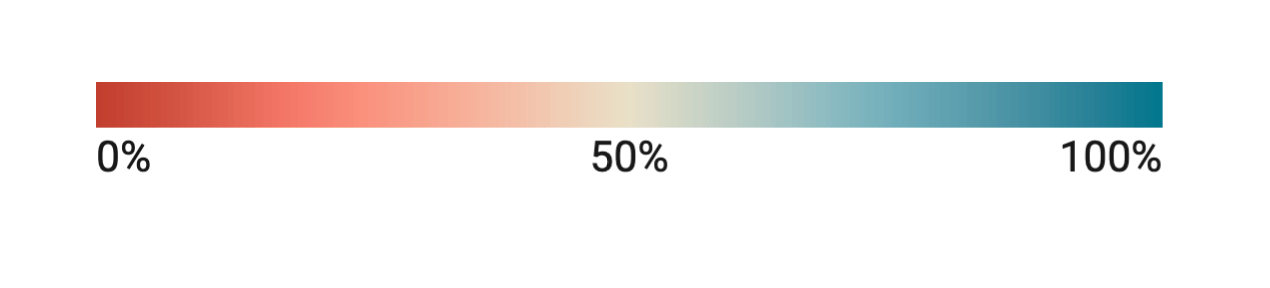
The range shows the min and max numbers you defined in Colors > Custom range further up in the Refine tab. If you set a center value there, it will show up, too:
Custom

In a custom legend, you can define the text that will appear at the beginning and at the end of the scale. If you defined a center value in Colors > Custom range further up in the Refine tab, you'll be able to set a label for the middle of your color legend, too.