Customizing your choropleth map
After importing and matching the data for your choropleth map, you can now refine, annotate, and design it in step 3: Visualize. In this article, we'll walk you through the different options.

Contents
- Refine: Colors
- Refine: Patterns
- Refine: Legend
- Refine: Map extras (Zoom and inset map)
- Refine: Appearance
- Annotate
- Layout & Publish
In step 3: Visualize > Refine you can find the following panels: Colors, Patterns, Legend, Map extras, and Appearance. Let's go through them step by step:
Refine: Colors
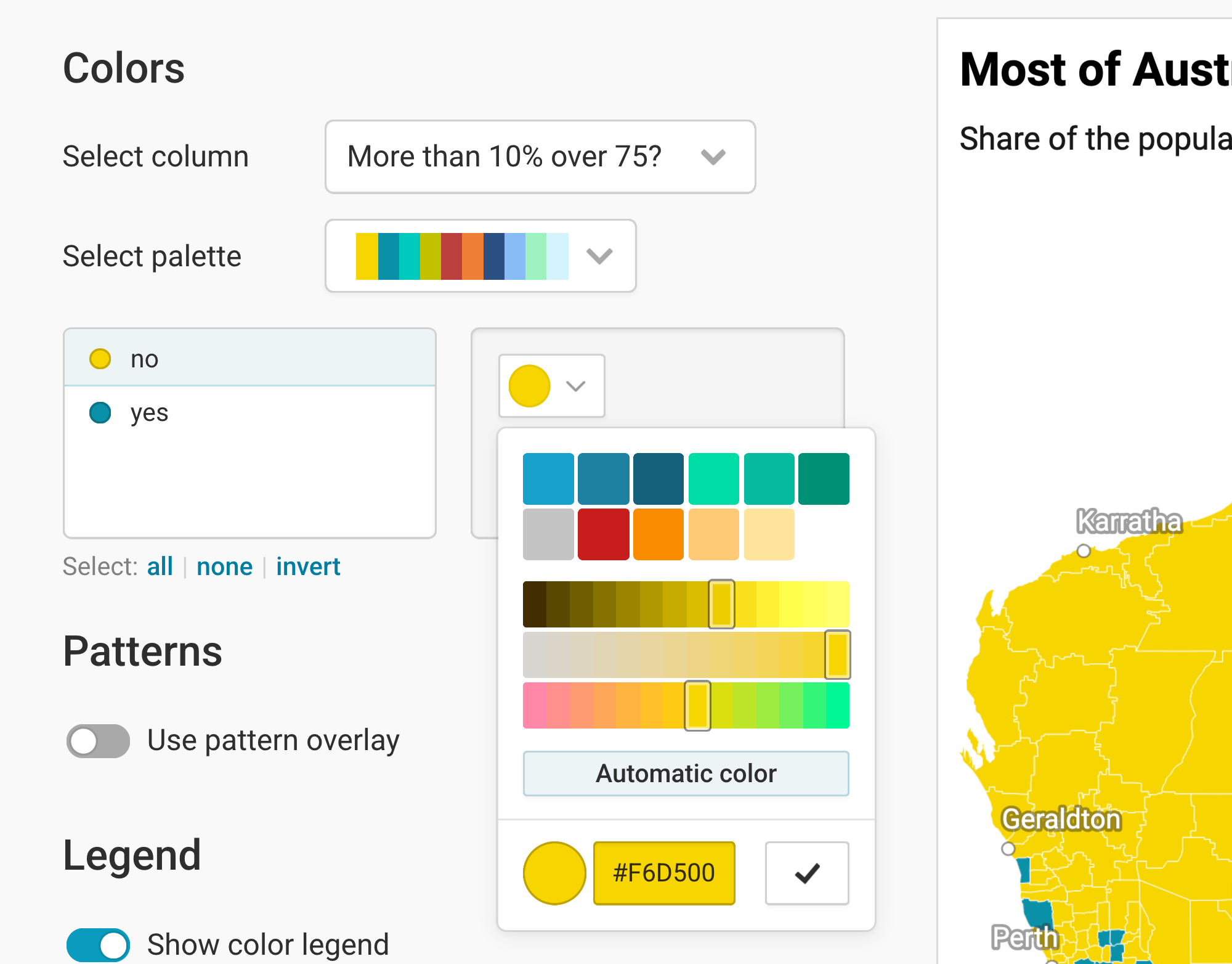
With the Color panel, you can decide which colors the regions should have on your map. If you imported multiple columns, you can choose which ones you want to visualize on your map at the top.
If you imported numerical values (e.g. percentages or population numbers), you'll see these options:

Here are the options you have:
- Select column lets you choose which of your uploaded columns you want to assign colors to in your map. Numerical columns (like our "75 and older" column) will be shown by default with a gradient. Text columns will be shown with different hues (red, yellow, blue, etc.).
- Select palette gives you a few gradients to choose from. We picked a yellow-to-red gradient instead of the default yellow-green-blue one. Click on the pen symbol next to the gradient to change the colors within a gradient. To learn more, visit our article "How to use the color palette tool".
- Type: You can decide between steps (where each color covers a range, e.g. yellow covers 5-10%), or a continuous gradient. Learn more about when to use which type on our blog, or learn how to customize stepped color scales in this Academy article.
- Interpolation: Datawrapper uses a linear interpolation by default. For our map, we chose a natural one, to bring more focus on higher values. To learn which interpolations to use, visit our Academy article "How to choose stops for choropleth maps".
- Custom range: Datawrapper automatically maps your values between the lowest and the highest number, without a center value. You can change this and enter your own values here. If you have both positive and negative values, we recommend to set "0" as a center value.
If you choose a text column (e.g. with the values "yes"/'no" or "Republican"/"Democrat"/"Independent"), you'll see all the distinct categories in your column in a list. Click on them and then on the color swatch to change their colors:
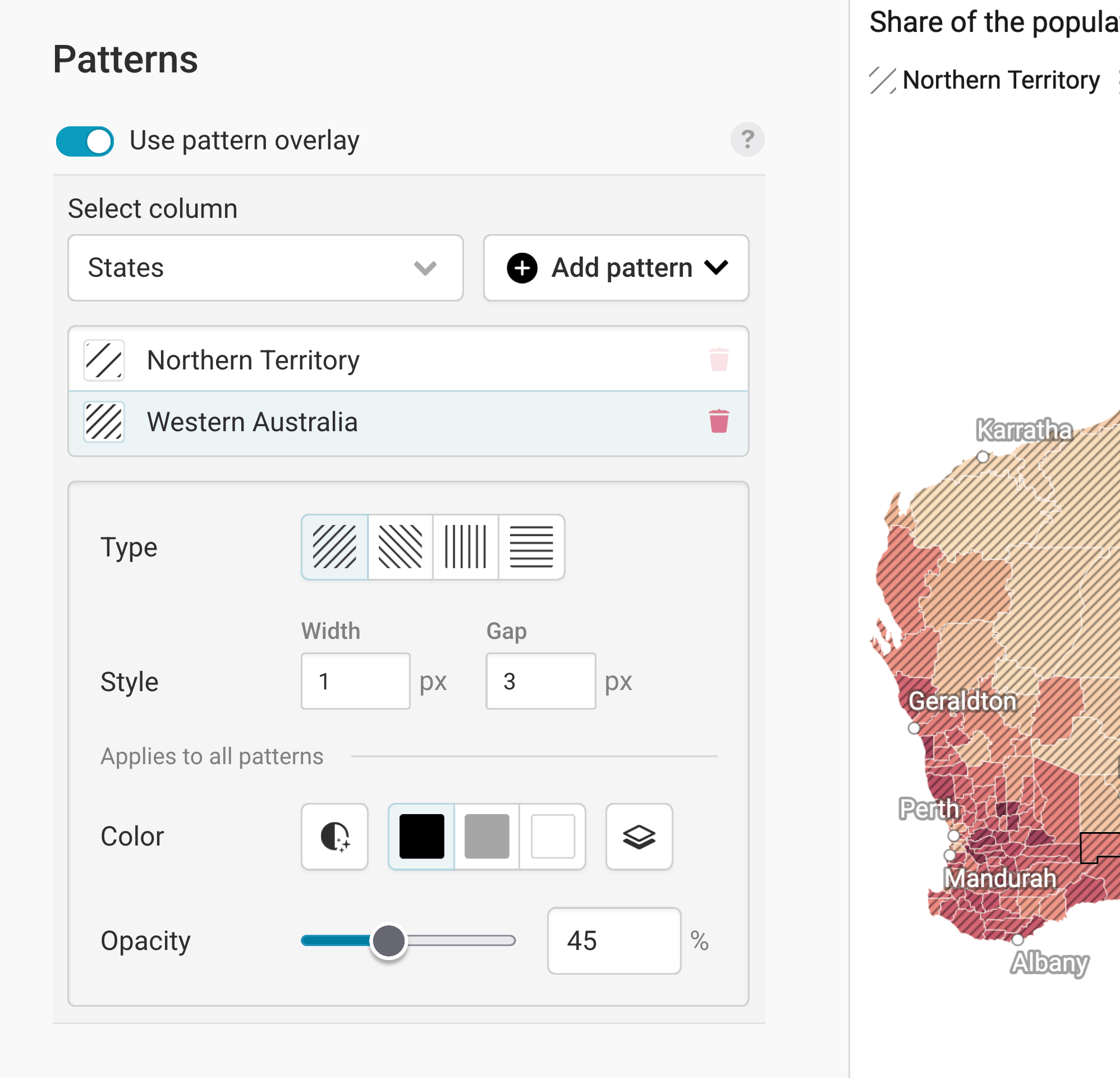
Refine: Patterns
To add some additional information to your regions, you can show different patterns on them. Learn more in our article How to add a pattern overlay to choropleth maps.
Refine: Legend
Now that you settled on some nice colors (and maybe a pattern), let's make sure your audience can make sense out of them. That's what a legend is for.
By default, Datawrapper shows a legend for your colors. If you add a pattern, Datawrapper will also automatically show a legend for those pattern. You can customize both in the second panel, "Legend".
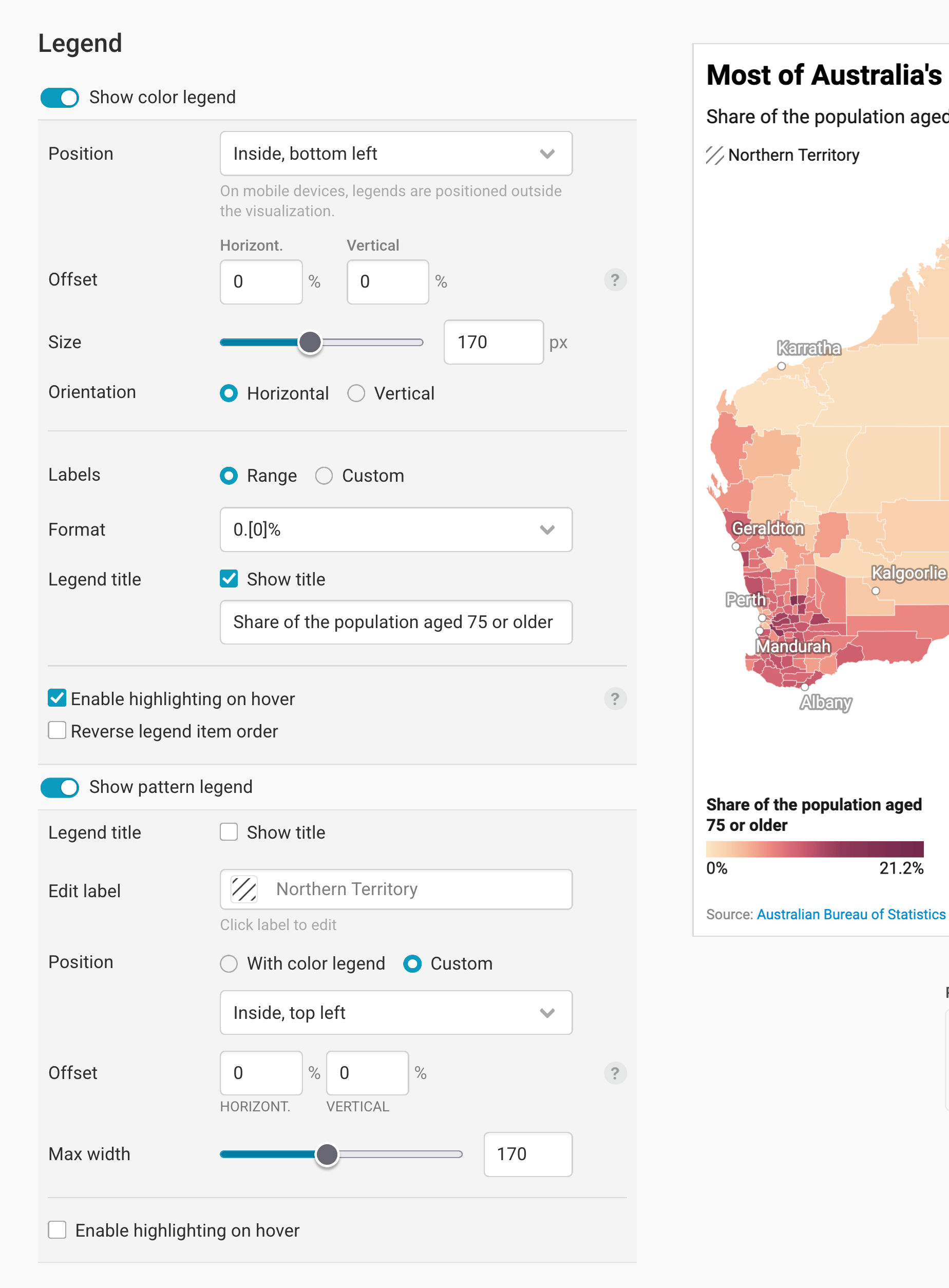
Learn more about the color legend options in our article "How to customize your color legend."
Learn more about the pattern legend options in our article "How to add a pattern overlay to choropleth maps."
Refine: Map extras (Zoom and inset map)
Next up, we can add extras to our map: A zoom and an inset map.
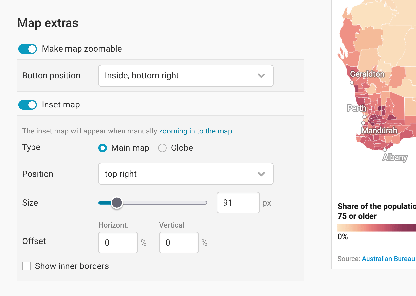
Make map zoomable makes...well, the map zoomable. You will see that this succeeded if your map gets a gray minus and plus button. You can define in which map corner the zoom buttons show up with Button position. Here, the button is in the bottom right:
Adding an inset map means adding a little map to your map that shows more context. You can choose between two types:
Globe: A good option if your audience might not immediately know where a country is located. (Hopefully Australia doesn't fall into that category, so a globe isn't necessary here.)

Main map: Useful when you're hiding certain map regions (learn more in this Academy article). It also works well alongside a zoom button: When readers zoom in, the inset appears and helps them keep track of where they are:
You can also choose the Position and Size of the inset map, and can decide how much it should move away from the map edges (in percentage of the whole map width and height).
Show inner borders shows the region borders of your map – in our case, the Local Government Areas (LGA):

Refine: Appearance
In the Appearance section, you can decide how your map looks like within the available space:
Map view: By default, the Full map is shown. Choose Crop to data to zoom into all regions for which you uploaded data. You'll get the extra option to hide the regions without data, too. Learn more in this Academy article.
Additional padding moves the map inwards, away from the map edges. This can be useful if you need more space for your map extras or legend(s) (see above) or annotations (see below).
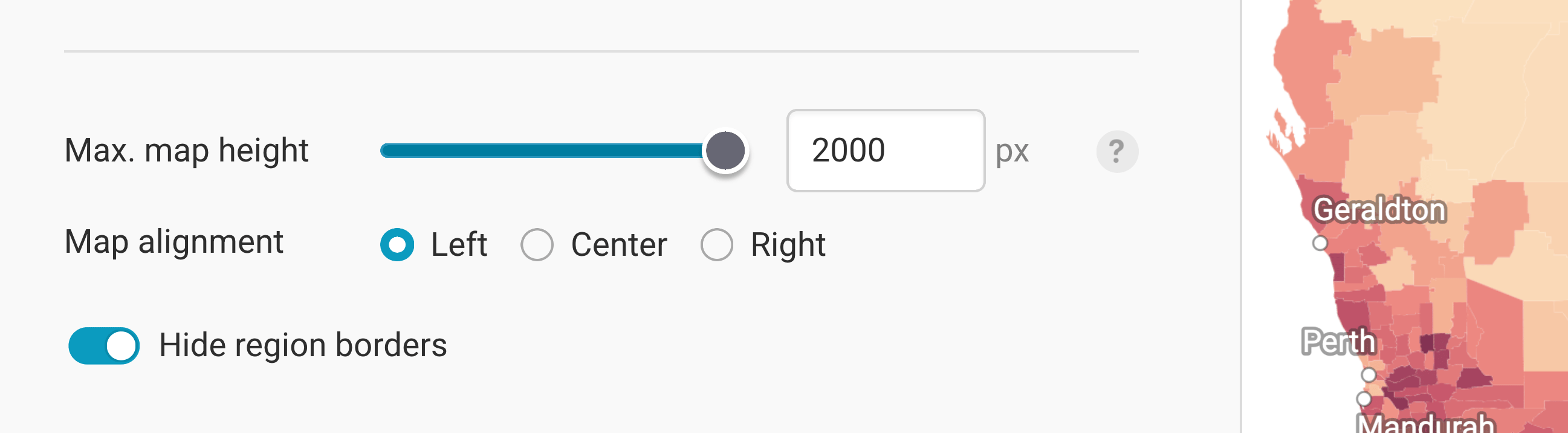
Max. height (px): By default, maps will resize to fit the full width of e.g. the article where you embedded the map. But for tall, narrow maps like Chile, you may want to set a maximum height to avoid all that scrolling:
Map alignment: If you add a maximum map height and hence add extra whitespace to your map, you can choose to move your map to the left or right. Again, this can be useful to have more space for map extras, the legend(s), or annotations.
Hide region borders: This removes the white outlines around each region. The downside is that it becomes harder to tell regions apart, particularly when they share similar values. The upside is a cleaner map where borders don't get in the way of labels, patterns, and annotations.
These are all the settings you can find in the Refine tab. Let's move on to the Annotate tab:
Annotate
In the Annotate tab, you're first asked to give your visualization a title, description, notes, source, byline, and an alternative description for screen readers. You can find a detailed explanation of all these Annotate options here.

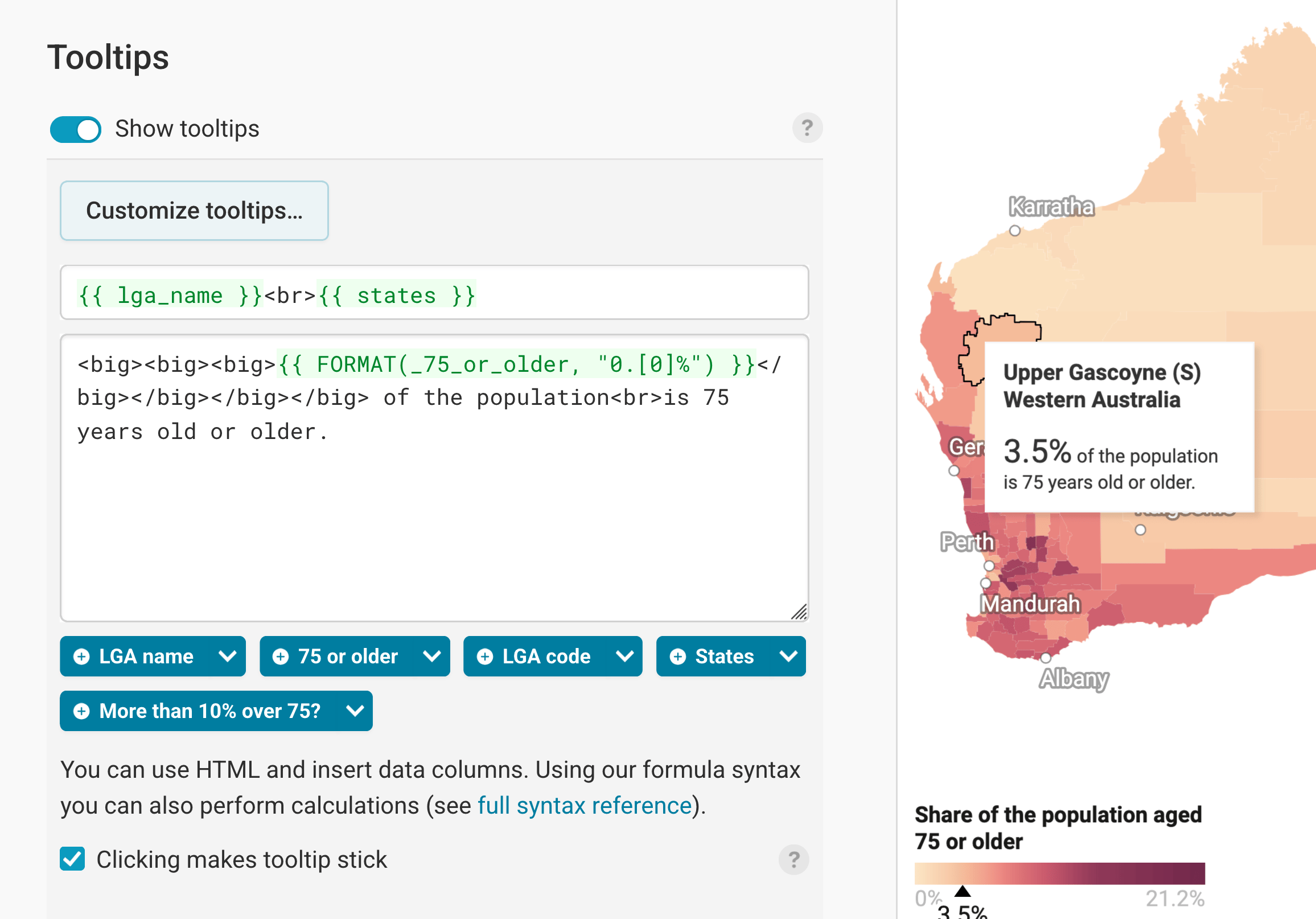
Then there are three panels left: Map labels, text annotations, and tooltips.
To learn more about map labels (in our maps, those are the city names, e.g. "Perth" or "Sydney" on top of the map), visit our article "How to add map labels."
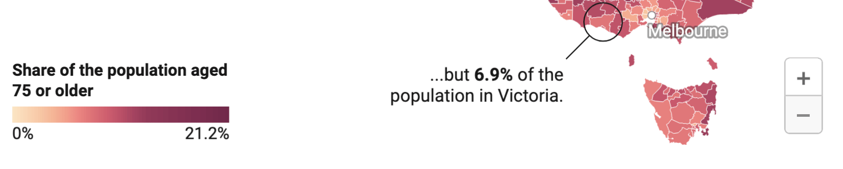
To learn more about text annotations (in our maps, that's the text on top of the map that explains the difference between the Northern Territory and Victoria), visit our article "How to create text annotations."

Finally, you can add tooltips. They're great to let your readers explore the map, see the underlying value of each region, and to add context information. Learn how to create them in our article "How to create tooltips", and learn how to customize them here.
Layout & Publish
After annotating your map, only one tab is left in step 3: Visualize: The Layout tab. You can find all Layout settings explained in this Academy article.
And once you're happy with your settings, it's time to publish! We prepared other detailed Academy article about publishing, embedding, and exporting your visualization as a PDF, PNG, or SVG here.
And that's it! You successfully customized your first choropleth map. This is how it looks in the end: