Customizing your split bar chart
After uploading data and selecting the chart type split bars chart, it's time to make some changes to the appearance of your chart. This article covers all the available options.
Contents
- Refine: Labels
- Refine: Horizontal axis
- Refine: Appearance
- Refine: Sorting & Grouping
- Annotate: Title, description, source, etc
- Annotate: Highlight elements
- Annotate: Text annotations
- Annotate: Highlight range
- Layout & Publish
When you are in step 3: Visualize, you'll see four tabs: Chart type, Refine, Annotate, and Design. In the Refine tab are five sections: Labels, Horizontal axis, Appearance, Sorting & Grouping. Let's start with Labels:
Refine: Labels

In the first panel, we can decide if we want to align the bar labels to the left or the right and if we want to show the values on our bars.
The most interesting setting if we decide to do so (it's on by default) is the Number format. With it, we can decide how our values are shown. Here are three examples:
- Choose the number format "123.4k" if you have big numbers like "1,303,428" that you'd rather want to display as "1.3m"
- Choose the number format "0.0" if you have very detailed numbers like "0.1922302" that you'd rather want to display as "0.2"
- Choose the number format "0%" or "0.0%" if you have a number that is a relative number, like in our case. This setting will add a percentage sign.
You can also decide to replace the country codes with flags, and to show a color legend. In most split bar charts, a color legend isn't necessary because the labels show up directly above the columns, so this is turned off by default.
Refine: Horizontal axis

The next panel lets us customize our x-axis. Here we can choose which element in your chart shows which data.
First, with Custom range, you can decide which value range your x-axis should cover. By default, the x-axis for each column will be as long as your biggest bar. But if our chart shows percentages close to 100%, it makes sense to extend the chart to 100%. Readers will then be able to see how much is "missing" to achieve the ideal 100%. So we can write in a "100" in the "max"-field.
If we have tiny values in certain columns and huge ones in others, we can also check the option Use independent scales for each column. Note that this will make it harder for our readers to compare the values across the columns with each other, and that it can lead to misread information. We will leave this option turned off for our chart.
Refine: Appearance
In the third panel in the tab Refine, we can decide the design of our bar chart. Let's focus first on how to choose colors for our bars. After clicking on Customize colors, you can either color each column differently (the default) or each row (after clicking on Select column and then choosing the column in your data set that contains the categories). Here's a video showing how:
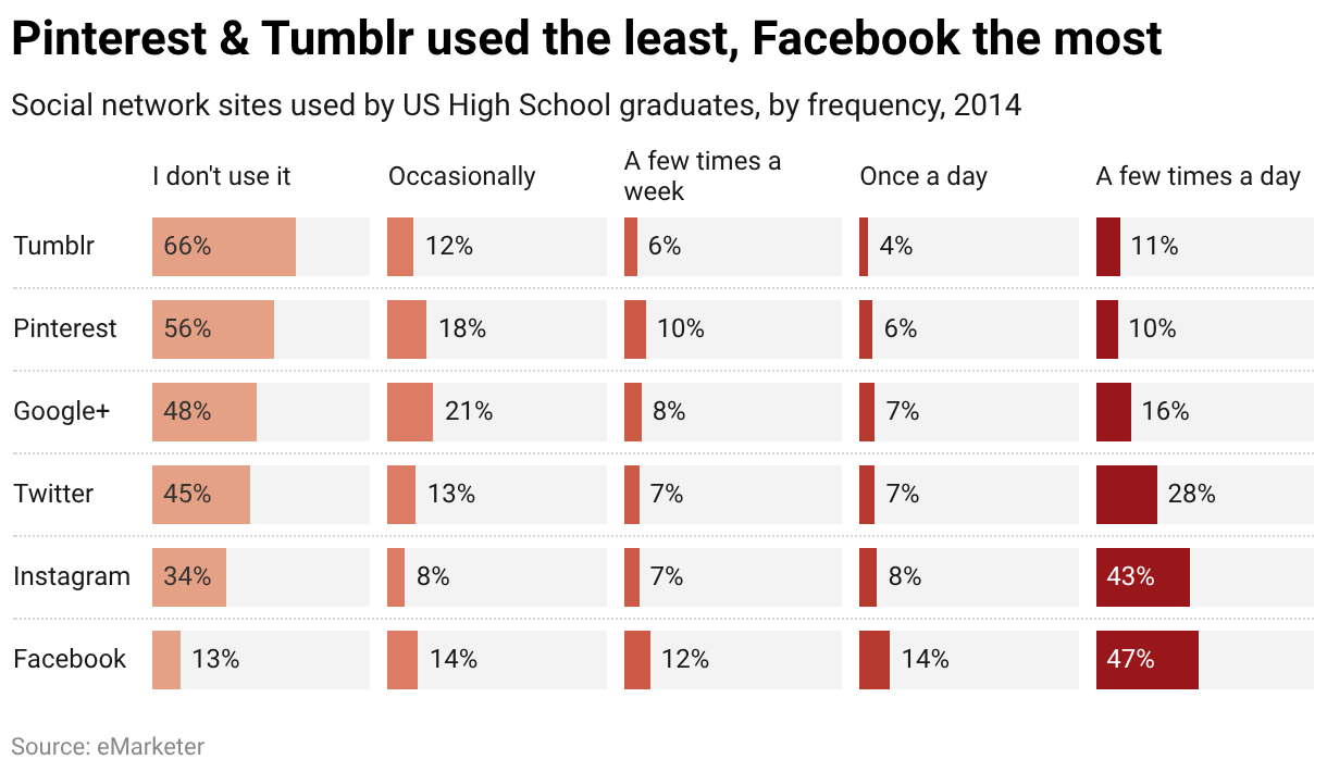
In our chart, we decide to give a higher usage of a social network a darker color.
You can select and give the same color to multiple bars at the same time by highlighting them together. (If you want to highlight multiple items that are listed consecutively, hold down the Shift key while selecting. If the items are not in consecutive order, hold down the Ctrl (Windows) or Command (Mac) key while selecting.) You can also select colors by clicking on the colored boxes.
Below the color options, you can see the following:

Here you can decide if your bars should be thicker, separated with a dotted line, and if there should be a grey background for each bar. This can be useful if you're showing a share and want to show "what's missing" between your values and 100% (make sure to set the custom range to 0-100). You can also increase or decrease the space between the columns. A cluttered chart can be cleaned up with these settings.
Refine: Sorting & Grouping

In the fourth and last panel, we can decide how to sort the order of your bars and labels and decide how you want to group them.
- Sort bars: You can keep the order of your spreadsheet by leaving this option unselected. If you select this option, you can choose the column you want to sort the bars by. In our chart, we can choose to sort the bars by the first column "I don't use it" which will make the biggest value come at the top of the chart.
- Reverse order: If you select this option, you will have the largest bar at the bottom.
- Groups: You can upload an extra column to put categories into extra groups. In our case, we could have a column that states for each social network if it's been around "before 2010" or "after 2010". If we choose that column as our "Groups", the chart would make a separation between the bars showing the "old" social networks and the younger ones. Learn more about grouping bars here.
And that's all for the Refine tab! Let's continue with the Annotate tab.
Annotate: Title, description, source, etc
In the Annotate tab, you're first asked to give your visualization a title, description, notes, source, byline, and an alternative description for screen readers. You can find a detailed explanation of all these Annotate options here.
Annotate: Highlight elements
In the 2nd panel in the "Annotate" tab, you can choose to highlight elements: The label in front of these bars will appear in bold. You can revert the highlight by clicking on the x in front of the label:
Annotate: Text annotations
You can add annotations to your split bar bar chart by clicking on Add text annotation. You can then style and move the text, add an arrow and circle to it, and adjust how it will appear on mobile. Here's an in-depth explanation of all the options.

Annotate: Highlight range
You can add a range or line highlight by clicking on Add range highlight and then dragging on the chart where you want the highlight to be. You can then change its position, color, opacity, and line width and style, or delete it again. Here's an in-depth explanation of all the options.

Layout & Publish
In the Layout tab, you can select an output locale, change the design theme and footer options, and enable social sharing. Find a detailed explanation of all the Layout options here.
In the final step 4: Publish & Embed, you have the option to publish the chart either by sharing the URL or by copying the embed code directly on your website or CMS (recommended). You can also download your chart as a PNG (available to all users regardless of the type of subscription plan they have) or as an SVG or PDF (available only to users of Custom and Enterprise plan). For more information on the different pricing plans, click here.