Which chart types did our users create in 2025?

Hi, and happy holidays! It's Veronika here. Today, it's my honor to take on Datawrapper's tradition of the year's last Weekly Chart, where we turn our attention to what you, our users, created this year.
Let's begin with the star of the show: our big colorful overview! A stacked column chart showing the proportion of visualization types created each year since 2013. Like adding candles to a birthday cake, the chart gets its 13th column for 2025.
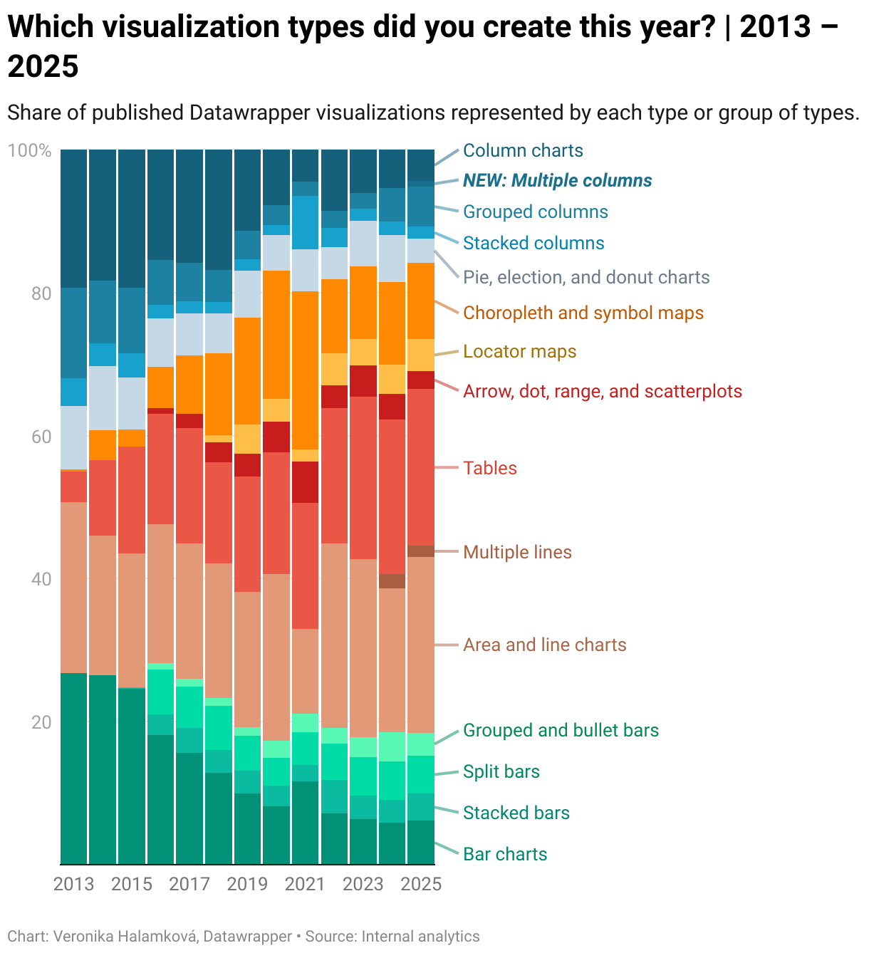
Tables may be the single most popular visualization type of 2025, with line charts coming in second, but when counted together (as we like to do), line and area charts take the first spot.
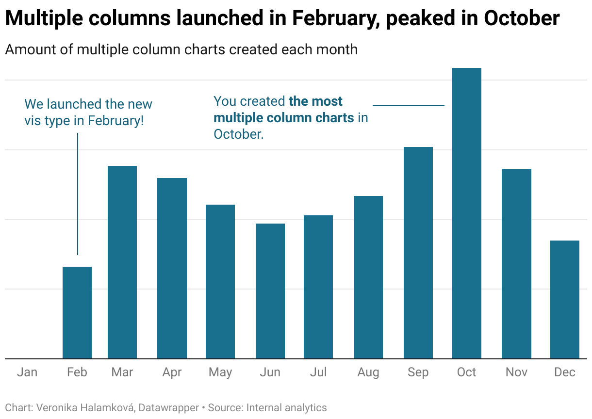
As you may notice above, apart from other big Datawrapper news this year, we launched a new visualization type — the small multiple column chart! Since its introduction in February, you've published lots of multiple columns, with October being their biggest month so far.

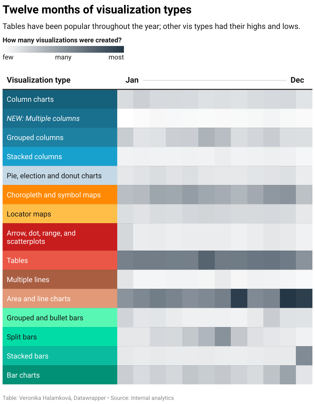
You might assume, like I did, that chart-making ebbs and flows throughout the year: maybe a busier spring and autumn, with downtime in the summer months, as many of us go on vacation, and at the end of the year?
Not quite! In total numbers, February was the slowest month and November the vis-iest overall. However, the popularity of each visualization type seems to follow its own seasons. (No wonder our support team is busy all year long!)
Just like your chart-making, our year was also a collection of big and small moments, from new features added to line charts, column charts, and locator maps (globe projection and a new marker editor), to the launch of workspaces and our brand new website. And as usual, there's plenty more to look forward to in 2026.
Here's to more beautiful charts, maps, and tables next year!
That's it for now — I'll see you again next Thursday for the first Weekly Chart of 2026.


