Where Europe needs cooling (and heating)

Hi, this is David W., the head of the design team at Datawrapper, where we think about the design of our app, visualizations, and everything around it. After last week’s heatwave in Western Europe, and the increased demand for everything that cools one down, I take a look at how that need to cool down differs across Europe.
As global temperatures rise due to human-made climate change and we experience more and more extreme weather, the need to respond also rises. Cooling down our buildings to a comfortable room temperature is one of the most immediate challenges. But what is that temperature threshold and how much energy does it take to reach it?

For answers, we can look to the cooling degree day index, a measure that tracks how much cooling is needed to reach a comfortable temperature each day. As long as the temperature stays below 24°C, there is no need for cooling (the index equals 0). But once it reaches 24°C or above, the index gives us a number to represent the cooling need (the index is equal to real temperature − 21).
As expected, we can easily see a clear north-south divide, but the granular map of small regions, known by European mappers and statisticians as NUTS 3, also shows us the impact of mountains, coasts, and cities. Parts of the Alps have similar cooling needs as Scandinavia. The north of Spain, by the Atlantic Ocean, needs less cooling than the center of France. And the area around London requires more cooling than the rest of England.
Let’s take a look at the change in recent years:
1985

1995

2005

2015

When heating is needed
At the other end of the spectrum is the need for heating. The same logic is used to calculate the heating needs of buildings on the colder days of the year. The heating degree day index measures how much heating is needed to bring buildings up to an acceptable room temperature.
The relative need for heating across Europe is shown below:
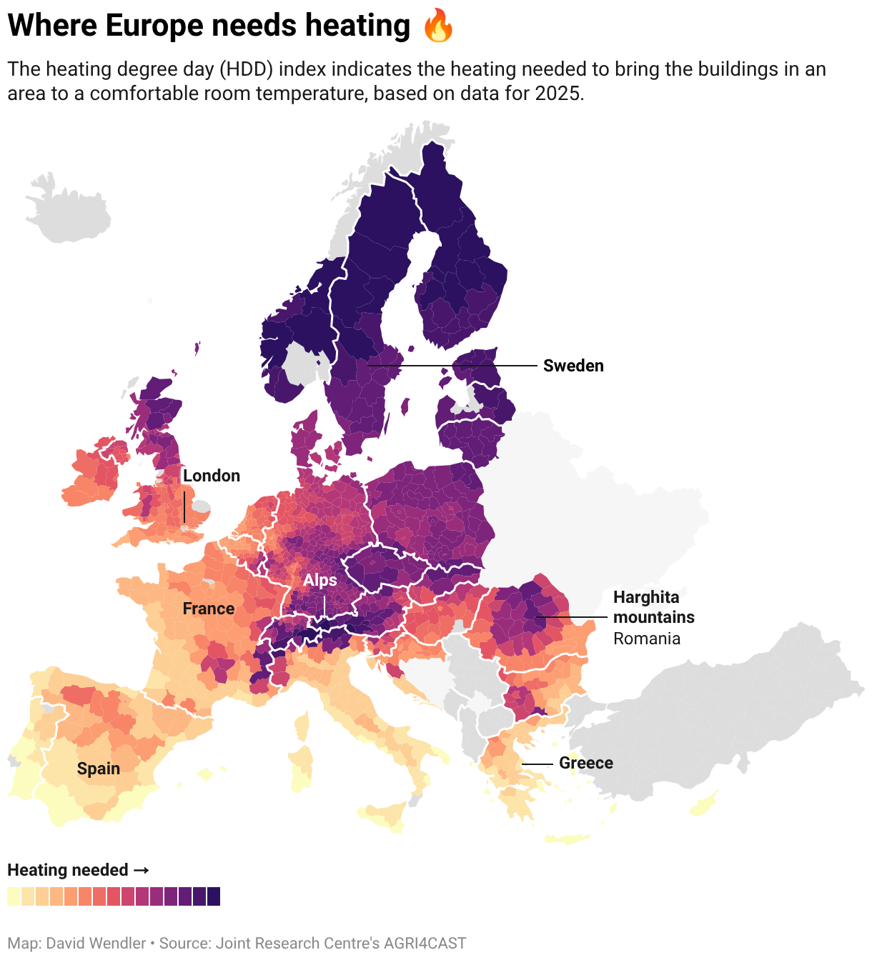
The map looks almost like an inverted version of the cooling needs map, and the latitude and topography play a big role here as well. For example, while the north of Spain is cooled by the Atlantic Ocean in the summer, we can see it stays warm in the winter.
Let’s take a look at the change over the last few years:
1985

1995

2005

2015

That’s it for this week’s Weekly Chart. Depending on when and where you read this, stay cool or warm. We'll see you next week!


