How we make sure our charts, maps and tables are accessible

Accessibility means that people with (temporary or age-related) disabilities can still access the same information as non-disabled people. If you care about the fact that as many people as possible can read and understand your content, you care about accessibility. We do, too.
Naturally, accessibility is a tricky issue for charts and maps. Data visualizations are visual by default. But we do our best to include as many measures as we can to ensure that no one is excluded from reading a Datawrapper visualization.
Below we outline the features that we have implemented towards accessibility:
Contents
- Colorblind check for users
- Automatic color contrast
- Alternative descriptions & automatic fallback descriptions
- Screen reader support
- Data download for readers
- Browser support
- Dynamic font sizes
Colorblind check for users
To keep your charts and maps legible for readers with color vision deficiencies, we offer a colorblindness simulator and an automatic checker. It warns you when colors in your chart or map would be hard to tell apart for any of the three main types of color vision deficiency. Learn more about the colorblind check in this article.
Automatic color contrast
Datawrapper makes sure the text in your charts and maps is always readable, whether it sits on a bright or a dark background. For example, if a category color is too bright to work as a label color, we darken that text color:

Datawrapper also automatically turn labels white when they sit on dark colors, like those in stacked column or bar charts, heatmaps, and choropleth maps:

And if text might sit on different backgrounds, for example white text on a dark column that gets thin on narrow screens, we make sure it stays readable by giving it a subtle shadow.
Alternative descriptions & automatic fallback descriptions
For every Datawrapper chart, map, or table, you can write alternative text descriptions that screen readers will read out. You can find the option in step 3: Visualize > Annotate.
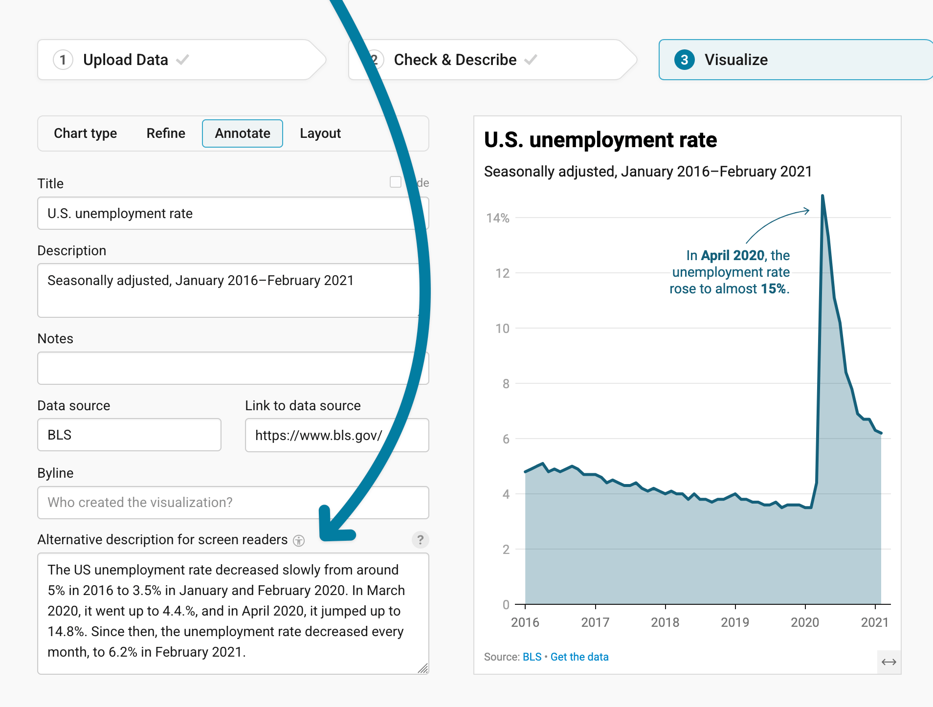
Writing an alternative description won’t take more than a couple of minutes, but it will be a tremendous help to readers with visual impairments. We put together an Academy guide on what to consider when writing alternative descriptions.
If you don't add an alternative description, our chart, maps, and tables read out information and annotations automatically:
- The visualization type will be announced by screen readers, including how many e.g. lines/symbols are shows (e.g., “Line chart with 7 lines”).
- Axis and grid labels are not spelled out on most screen readers anymore. Instead, there is a summary about the axis (e.g., “Horizontal date axis, ranging from January 2019 to March 2021“).
- Categorical color legends are declared as such. Instead of just reading out the category labels, screen readers will announce them with “Category legend with x items. The items are…”
- Annotations will be announced with “This chart has one annotation.” before they’re read out.
Learn more in our announcement We’re improving the accessibility for Datawrapper charts and maps.
(If you do add an alternative description, Datawrapper doesn't read out this extra information. It places the alt text inside the HTML code of the chart and sets the chart body, including annotations, to aria-hidden.)
Screen reader support
If your readers are navigating your charts, maps, and tables with their keyboard (instead of a mouse) and screen readers (like VoiceOver, NVDA, or JAWS), they can access all the data in all your embedded visualizations. Once they navigate inside the plot areas of a visualization, a chart explorer lets them explore all data points.

Keyboard users can then use the arrow keys →, ←, ↑ and ↓ to move to the data point they’re interested in, and let the screen reader read out the values.
Depending on the chart type, keyboard users can navigate…
freely in any directions to find the closest data point (in scatterplots and maps). In zoomed-in maps, the map view moves to the focused regions, so that it’s always visible.
through data points along one axis and within series (in lines, areas, dual-axis, stacked columns, and bar charts).
through data points along the horizontal axis only (in waterfall, small multiple charts, columns and grouped columns charts)
Data download for readers
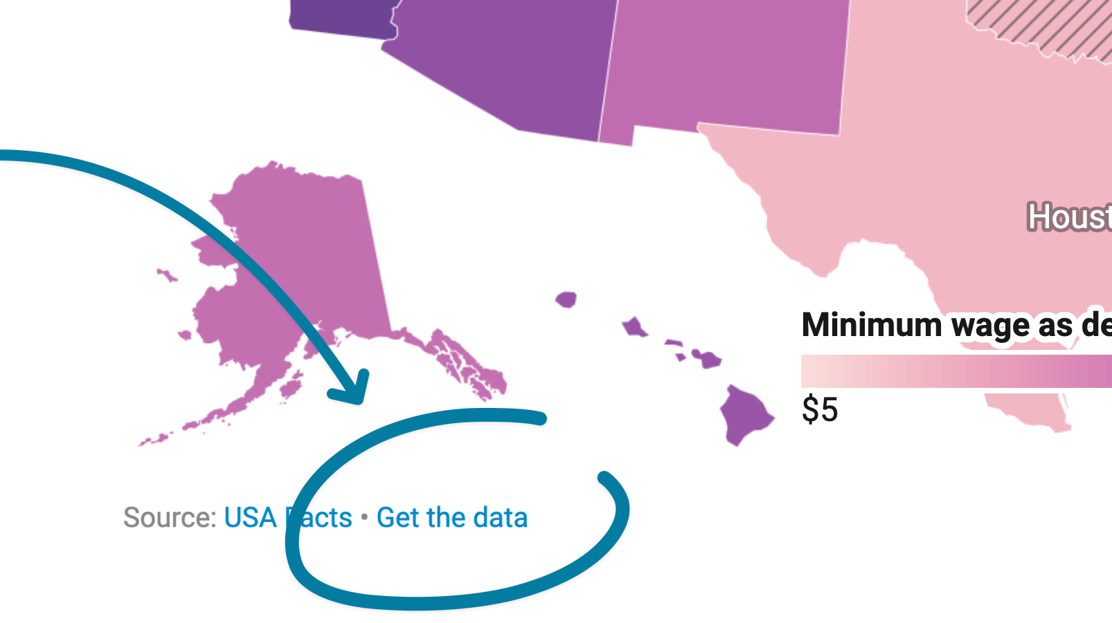
For charts, maps, and tables, you can choose in step 3: Visualize > Layout to show a footer link that lets readers download the data. The link reads "Get the data" in your chosen language. Readers with visual impairments can use it to get the data into a screen reader and explore it the way they prefer.
Browser support
We take care into making sure that our visualizations show up correctly even in very old versions of Chrome, Firefox, and other browsers.
Dynamic font sizes
Some users set a larger default font size in their browser to improve readability. If you have a custom theme for your Datawrapper visualizations and it uses relative font units (rem, em, %), your visualizations will scale accordingly so labels stay legible for those users.
These are a few accessibility features we've implemented so far. If you have any particular needs or requirements or suggestions on how we could improve, let us know at support@datawrapper.de. Thank you!