How to get a custom design theme for your visualizations
The charts, maps, and tables you create with Datawrapper can be fully customized to fit in with your organization’s design style guide. To do so, we will create a custom design theme for you that is selected by default every time you or your coworkers create a new visualization with Datawrapper.
This custom design theme is included in both the Custom and Enterprise plan. If you need more than one theme, you can add as many as you want for an extra fee. Visit our Pricing page to learn more.
Contents
- What does the custom design theme entail?
- What do you need from me to create my custom theme?
- Can I also customize x in my custom theme?
- Colors
- Logos
- Text sizes and spacing between elements
- Additional elements
- Locator map styling
What does the custom design theme entail?
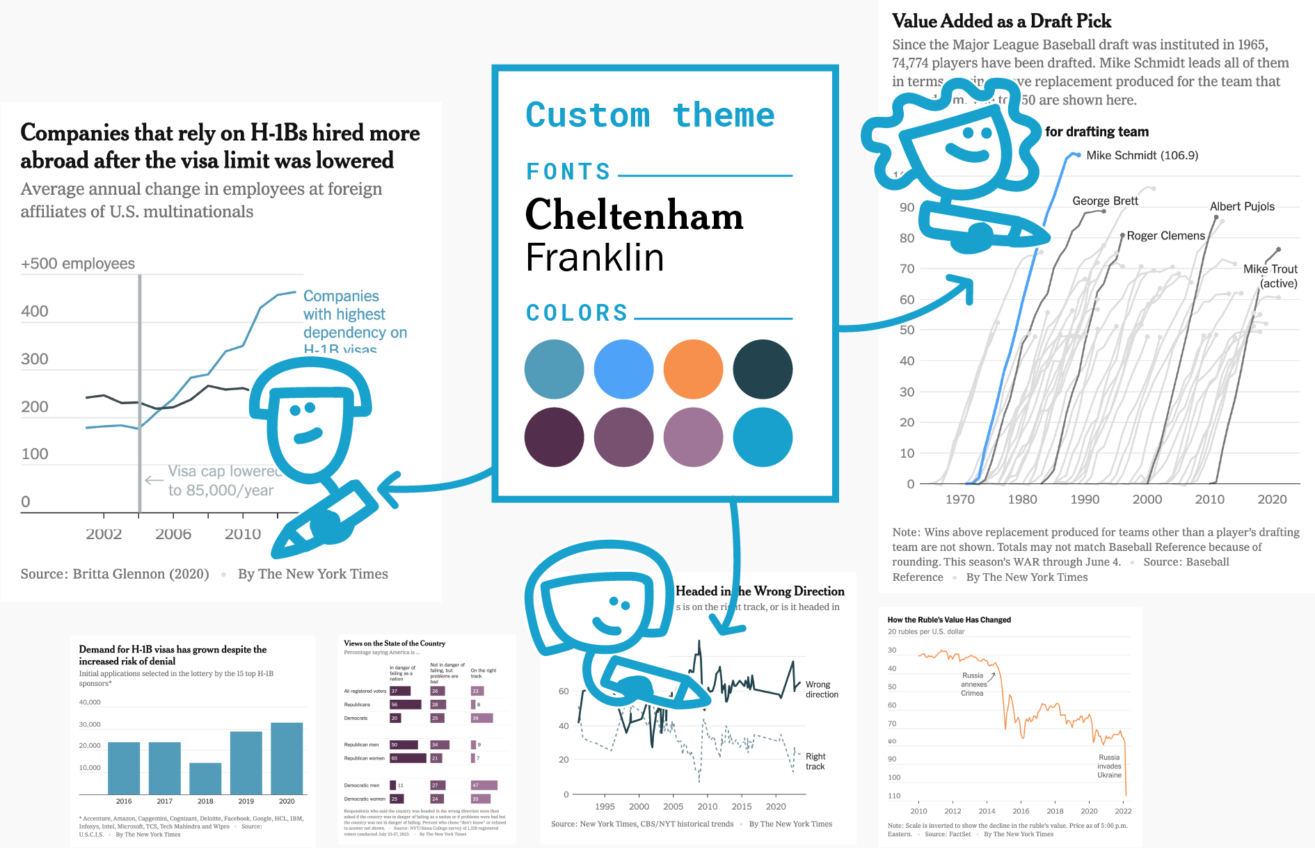
The custom design theme can mean a change in font family, size and color, in background color and the color palette of all visualizations, extra borders or padding or adding a logo. For example, The Times asked us to add a black line on the top of their charts, De Tijd wanted a logo, and both of them requested a change in background color and custom typefaces.
Visualizations created with your custom design theme will look like they're internally produced by your graphics team. They won't even include a Datawrapper attribution.
To learn more about the beneifts of custom themes and what's possible with them, visit our website.
What do you need from me to create my custom theme?
Once you’ve signed up for a Custom or Enterprise plan, our support team will reach out to you to begin the customization process. Please send us at least the following:
- Typography specifications, including font files or links to access your fonts
- Colors to fill out the color palette options
- Your logo, if you want it included
Your fonts, color, and your logo will already go a long way in making your charts feel like your organization/brand. Often, that's all it needs. Feel free to send us your official style guide, or visualizations you created, and we’ll work directly with you to incorporate it into your custom theme.
Can I also customize x in my custom theme?
Yes, very likely.
We offer hundreds of customization options: A border around your visualization? A rectangle at the top? Different fonts for title and axis ticks? A center-aligned color key? Custom colors for oceans and streets in locator maps? Special palettes for dark mode? It’s all possible. Just tell us what you’re envisioning.
Many options that are available in the editor interface can have a default configuration saved in your theme, so that when you create charts in your theme, those settings are already applied — think vertical grid lines automatically being on for line and area charts, or the PNG download option always being shown to readers.
Colors

You can define a basic palette of categorical colors and gradients for all visualizations, then group the colors as needed and add labels to guide your colleagues’ choices. Let us know if you want to hide the option to pick new colors to restrict your team to using only your palette (see the top right example in the image above).
You can use as many categorical colors as you like, in as many groups as you like. You can also define an unlimited number of gradients for choropleth, symbol, and heat maps. That said, we recommend keeping your palette to a manageable size.
You can also the color of every non-data element in your visualizations: background, text, gridlines, and much more:

If you want, you can also define CMYK equivalents or dark mode equivalents for all colors in your color palette.
For a really in-depth guide on how to create colors for a data vis style guide, read our blog post here. We also put together a guide on how to find & create good color palettes.
Logos
You can let us place your logo in the size and position you want — or let your team choose from a selection of different logos for each visualization.
Text sizes and spacing between elements
You can coose the typeface, weight, size, color, and style for every text element in your visualizations — including titles, descriptions, axis labels, tooltips, sources, bylines, and map labels.
You can send us your preferred fonts directly, give us a link to a self-hosted font, or use a third-party tool like Adobe Fonts or Google Fonts.
You can also specify the spacing between elements (see the right side of the image below), for example: "The space between the title and description should be 20px."

| Element | Example specs |
|---|---|
1 Title |
Roboto Medium 22px #1a1a1a |
2 Description |
Roboto Regular 15px #313333 |
3 Color legend |
Roboto Regular 13px #313333 |
4 Y Axis labels |
Roboto Regular 12px #acb2b3 |
5 Axis lines |
1px #d3d3d3 |
6 Annotations |
Roboto Regular 13px #acb2b3 |
7 Baseline |
1px #acb2b3 |
8 Axis ticks |
1px #313333 |
9 X Axis labels |
Roboto Regular 12px #7a7e7e |
10 Notes |
Roboto Regular 12px #313333 |
11 Source |
Roboto Regular 11px #313333 |
Additional elements
You can add decorative elements above or below your visualizations that make it easy to recognize that a visualization is built by you – for example rectangles, lines, images, etc. If you want to give your team more freedom, you can tell us that they should be able to toggle those on or off for each visualization.
You can also define new fields for complete control of your visualizations’ header and footer, like an extra subhead, copyright block, figure number, additional source, or timestamp — whatever your readers should know. Learn more about custom fields here.

Locator map styling
You can use our built-in locator map styles – or you can create your own:
Define the colors of streets, buildings, parks, forests, mountains, bodies of water, and other regions on your maps.
Choose fonts and typefaces for text elements such as country labels, city names or marker texts.
Use your own set of symbols to mark key locations.

Frequently Asked Questions
How long will it take to set up my custom theme?
Setting up your custom theme will take us around one week. Once the first version is completed, it will be enabled for you in Datawrapper and can be fine-tuned based on your feedback.
How can I make sure that my colleagues use the custom theme?
Once your theme is ready, our team will activate it for your workspace. Your custom theme then gets applied automatically whenever members of that workspace create a new visualization. It’s also possible to restrict your theme to certain teams within that workspace, if you need to separate work between brands for example.
Can I apply my custom theme to older visualizations?
Yes. You can apply your new custom theme to any existing Datawrapper visualization. To do so, go to Step 3: Visualize > Layout and select your theme under the “Theme” menu.
If you'd like this change to apply to visualizations that have already been embedded on a website, you'll have to republish them for the embeds to update.
What if I want to redesign my custom theme?
Just let us know. Any changes to your custom theme, no matter how big, are included in your plan at no extra cost.
Turnaround times depend on the scale of the changes. A full redesign should take one to two weeks. If it’s just a change in the typography, we’ll be quicker.
For big redesigns, we ensure a seamless transition: We’ll work with you on a draft implementation of the updated design until you’re satisfied, and only roll it out to your team once the changes are final.