How to create a GIF of your chart/map
Datawrapper does not offer an out-of-the-box solution to create a timelapse of your visualizations. However, there is a workaround to put together your own animated GIF by stitching together multiple Datawrapper visualizations.
How to create a time-lapse of maps
Even though there is no out-of-the-box solution to create an animated GIF with Datawrapper maps, you can create multiple maps with different time-stamps and stitch them together into a GIF using a free online tool like the ezgif.com Animated GIF Maker. Here's how:
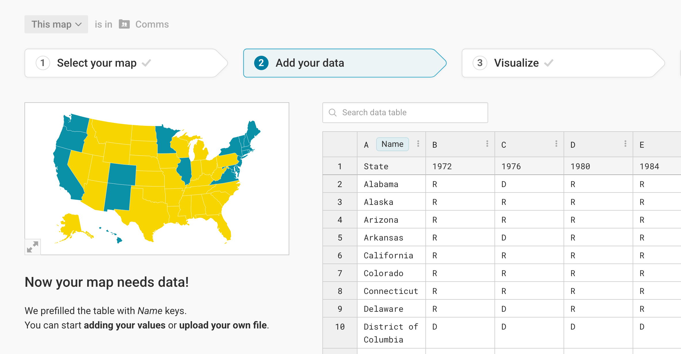
Upload all your data together
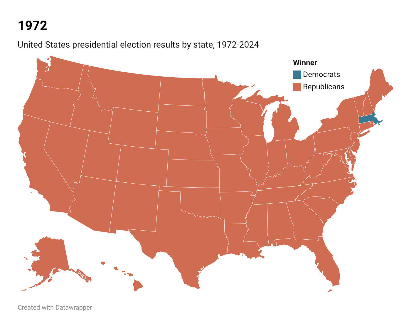
To not having to create a new visualization for each of your GIF frames, upload all the columns you want to show together. For the GIF of historical US election results, that means uploading one state column, and then one column for each year with the election results:
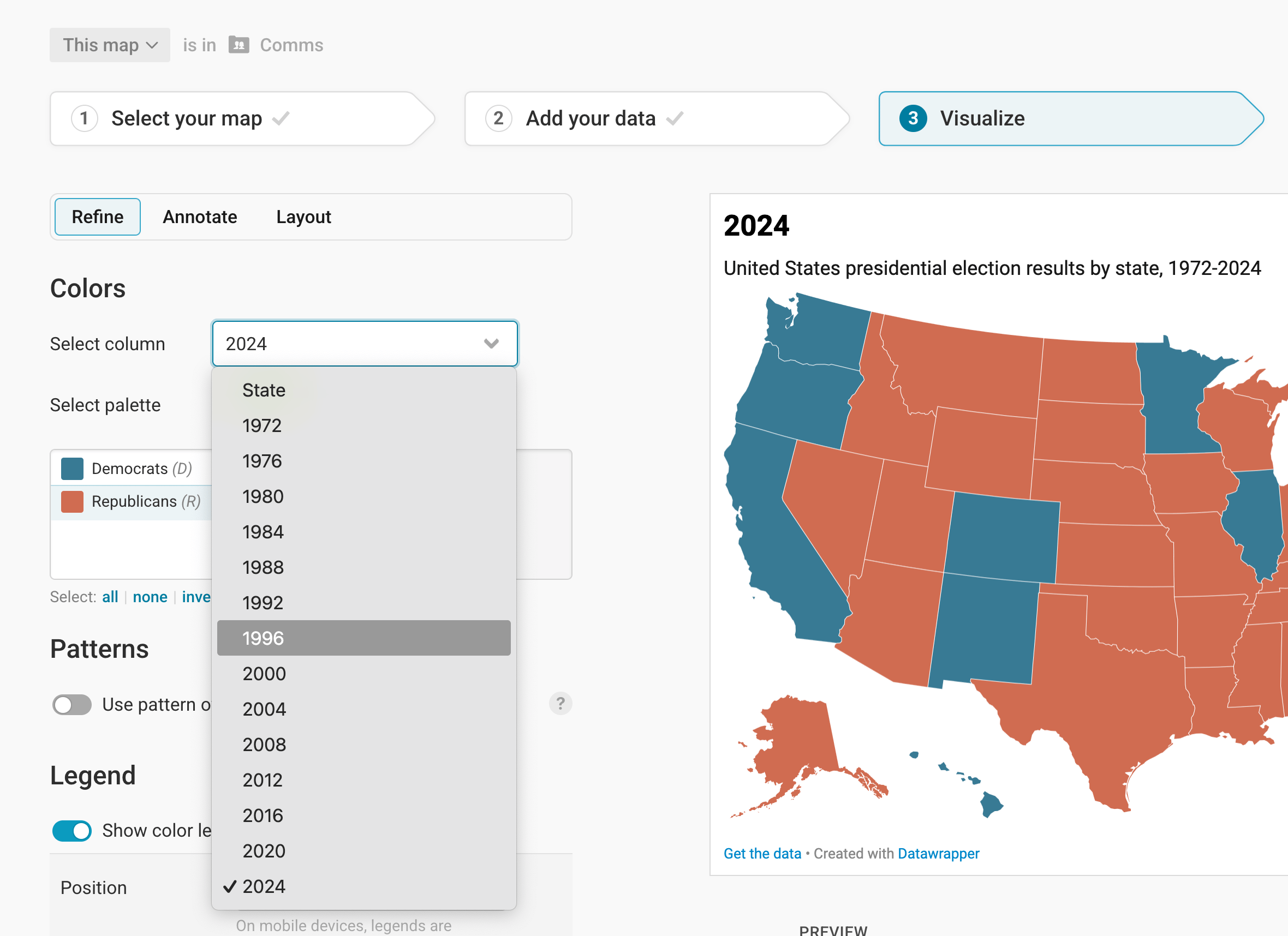
Switch columns and export as PNG
Now all your columns will show up when you go to step 3: Visualize > Refine > Colors and click on Select column. Now you can easily create each frame for your GIF. First, choose a column:
Then change the title or description (optional), and go to step 4: Publish and download your visualization as PNG:
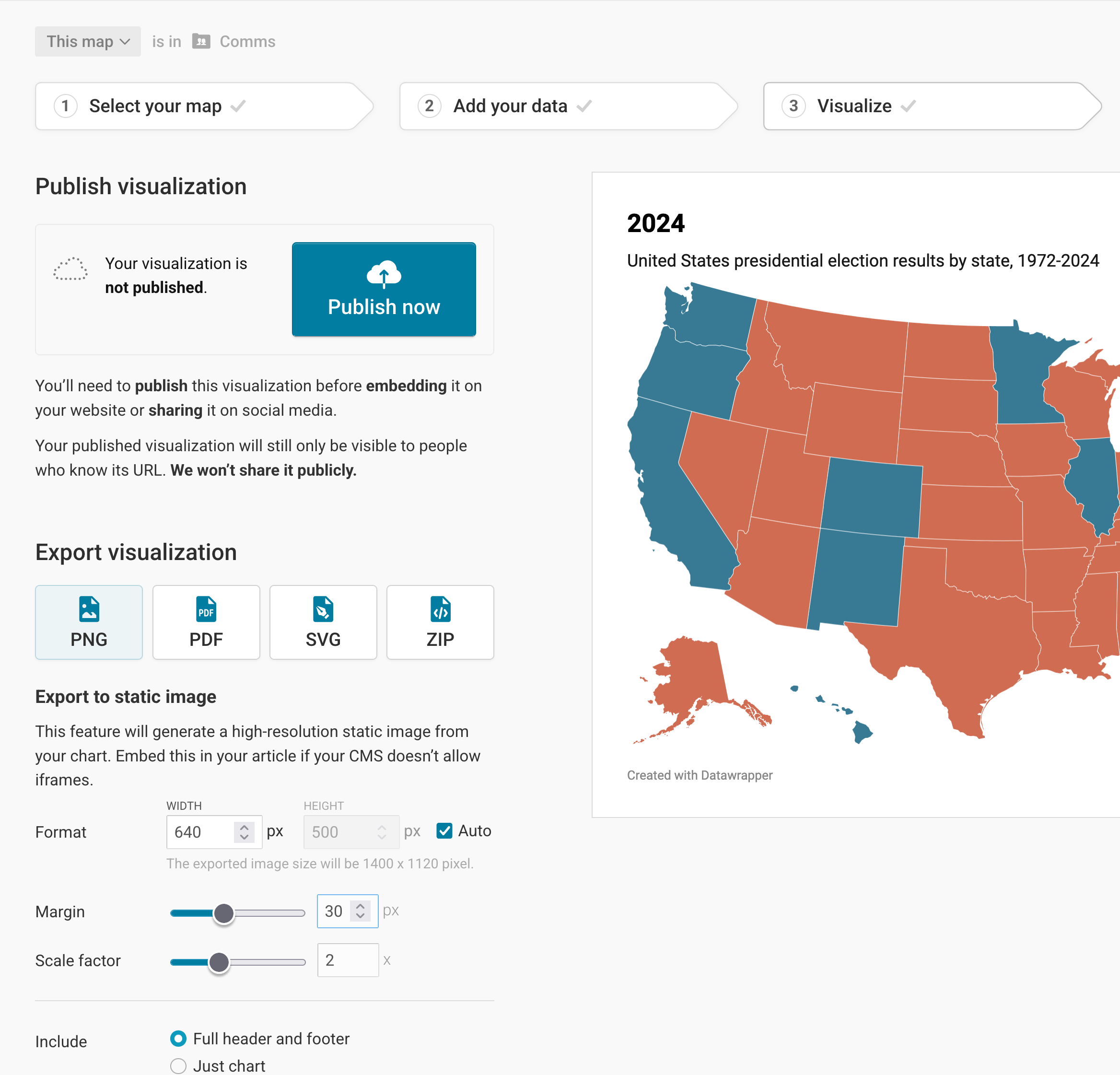
Consider giving your visualization a margin and a different scale factor, if necessary.
Create a GIF out of your frames
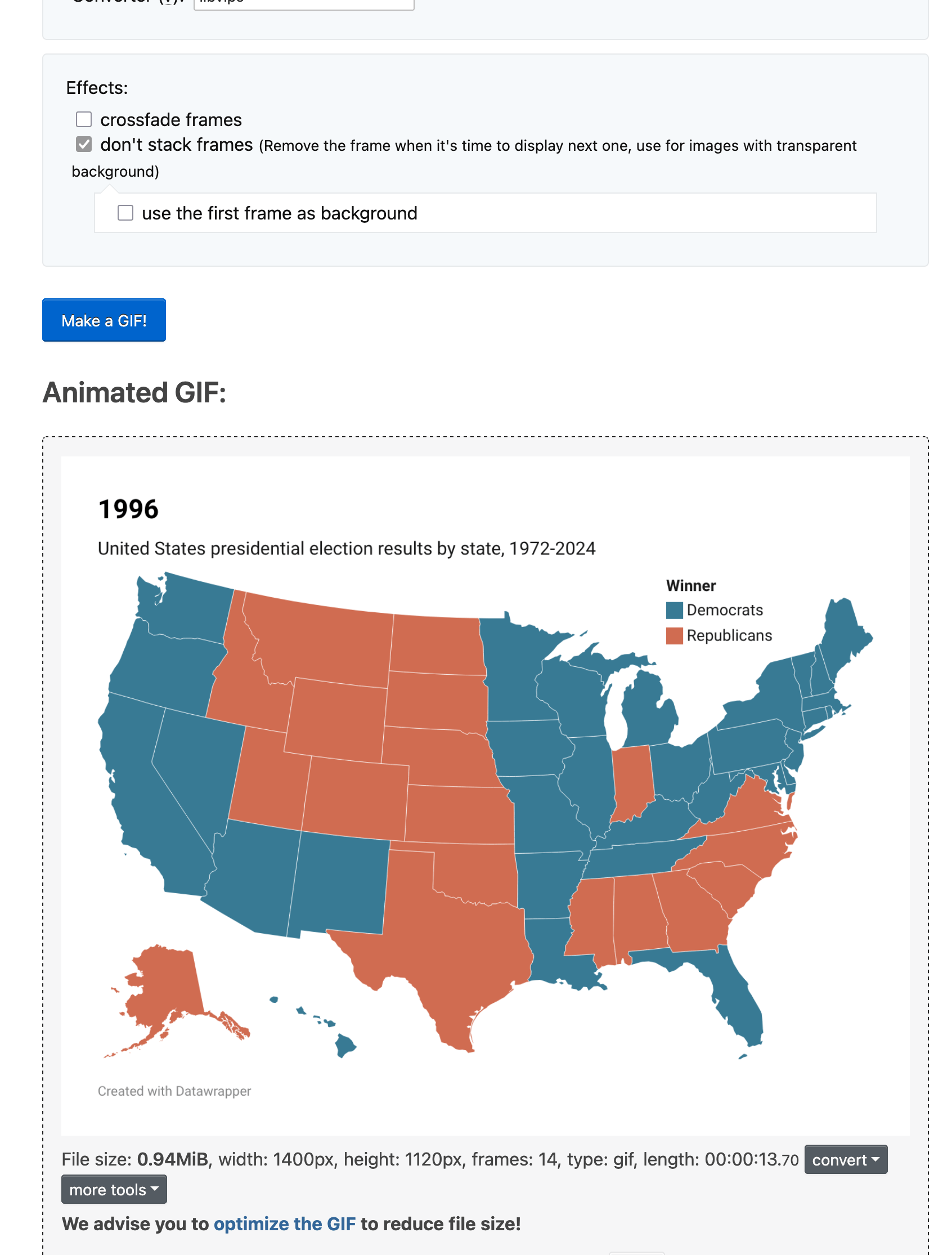
Now that you have one PNG for each of your columns downloaded on your computer, it's time to turn them into a GIF. There are many tools to do so, on your computer or online. We find the ezgif.com Animated GIF Maker most convenient.
Upload all your images (=frames) and adjust the time you want to see each frame. (Consider giving the last frame a bit more time, so that it doesn't loop without a pause.)
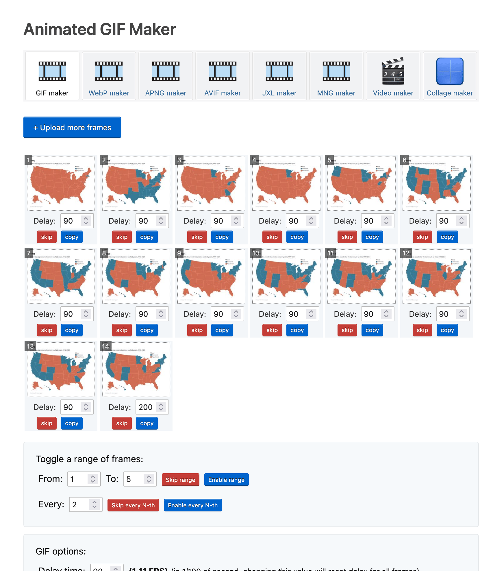
Then scroll down and click on Make a GIF!, and voilà, your GIF will appear within seconds. From there, you can right-click to save it to your computer, or simply drag it into a folder or on your Desktop background.
You can also automate this process by making use of Datawrapper API. There are also a Python library and R package that help you use our API.
Here are some other examples of multiple Datawrapper visualizations that have been stitched together into an animated GIF:
- Sex and census - GIF of choropleth maps showing the number of women for every hundred men by county over the past 2 centuries
- Game of Life - GIF created using multiple Datawrapper tables
- Making waterlines in locator maps move: an experiment - GIF created using multiple Datawrapper locator maps