Matthew Montesano, NYC DOHMH, about a revolution in government data communication strategy


Matthew Montesano from the New York City Department of Health and Mental Hygiene (NYC DOHMH) spoke at our Unwrapped conference about "A revolution in government data communication strategy."
Matthew is a public health professional with over 10 years of experience working with local, state, and federal agencies to shape how they communicate data and build usable, engaging, and effective data communication products.
For several years, Matthew worked on the NYC Department of Health’s COVID-19 data websites, leading data visualization and building and maintaining webpages and data flows.
Currently, as the Director of Data Communication at the NYC Health Department’s Bureau of Environmental Surveillance and Policy, Matthew manages the Environment and Health Data Portal, one of the agency’s marquee data communications platforms. This work synthesizes user research, data visualization, and health communications to create a novel data communication website.
Watch his talk here:
02:02 – Telling the story in the data with Datawrapper
04:38 – Publishing charts quickly within a government agency
08:18 – Using tables for accessibility
09:14 – Benefits of relying on simple technology
11:11 – Just data, no stories
12:03 – Democratizing access to data about the public
Full transcript
Introduction
[00:00:04] Matthew Montesano: All right. Thanks so much. Brief moment before I get started to thank the Datawrapper staff, and also express some appreciation for the other speakers. I've really been enjoying the opportunity to learn from other people's practices in these talks. For those of you who don't know, the New York City Health Department, my employer, is a local government public health agency.
And it's responsible for monitoring and improving the health of New York City residents. All 9 million or so of us. And as that great introduction said, I manage web-based data communication products at the agency. In my talk, there are a few things in particular that I want to do. So first, I want to speak from my position within a government agency.
There are unique constraints to working within government, and I want to make sure that I communicate that I'm speaking from that context. And with that in mind, I also want to speak to other government workers who are here. We share unique responsibilities and missions, right? So I want to connect based on that.
And lastly, I want to speak to people who use public data, and I want to talk about our collective responsibilities around working with public data. But overall, the purpose of my talk is to talk about how we've made major changes to our online data communications over the past five years or so, and how Datawrapper has supported and fit into that.
And I want to start with a little bit of history. So before COVID, I was working on a project called the Environment and Health Data Portal. And it's a website that we use to publish data on ways that environments shape health in New York City. You can find it by googling New York City Environment and Health Data Portal.
The URL is on the screen. It's a really messy URL. That's okay. And so with this website, we had done a bunch of user research on the sort of previous version of this website, and from our users, from talking to people who were trying to use our data, we heard some really interesting things.
Telling the story in the data with Datawrapper
[00:02:02] Matthew Montesano: And we found that people wanted data less than they wanted the story in the data. Even when our users had proficiency to analyze a dataset and draw conclusions, they still didn't necessarily want to do that. They wanted us to tell them what our conclusions were, or they wanted to know why something was the way it was, right?
So this is less about the data. This is less about the asthma rate for a certain neighborhood than it is about people asking us, why is this the way it is? What's going on? What's connected here? And so what we took from this, from a lot of user research that we had done, was that our users, what they wanted out of data was something, frankly, more than data, more than the numbers.
And so we started to develop strategies to communicate more meaning and more information, more than just the data. And so one of these strategies was narrative data stories. So we started creating these brief reads using conversational language to communicate insights into the data. Explanation, nuance, interpretation, the why.
Why something is the way it is. And so for this, we use Datawrapper heavily. I'm gonna just throw a quick couple of examples onto the slides here. With Datawrapper, of course, we could quickly prototype things and test them with our internal partners. We could embed them into our web products, right?
And of course, Datawrapper, as we know, has all these great sort of meaning and message-focused features. They let us highlight aspects of the data and annotate charts. You all know why it's a great feature. So here are a few examples, right? So we're writing these flows right from copy to visualization and back to copy, using a variety of information design techniques in both our text and visualizations to highlight key points. And overall, we're using this to explore really interesting and important findings in our colleagues' research, right? So that we're taking that in-depth research and delivering it in a way that's easy to access, understand, and use.
And so overall, again, this is about telling a story, and it's about making access to the information, making understanding a really core part of our data communication strategy. So you can explore all of our data stories on the website. Again, the website is called the Environment and Health Data Portal.
We have dozens, about air quality, about housing, about inequality and injustice, about violence, extreme heat, and climate change, and so on.
Publishing charts quickly within a government agency
[00:04:38] Matthew Montesano: And so this is all to preface what we were doing before the COVID-19 pandemic hit. Because when COVID hit, we found ourselves with a great need to publish data and to do it fast.
We wanted to publish our data in ways that people could use, right? We wanted to carry on those constructs that we were implementing on the Environment and Health Data Portal and bring this over to this new situation. And so when we were early on, in March, April 2020, when we were thinking about how to publish COVID data in ways that people could use, we started working with a strategy that, for some people, that means gaining a visual understanding of what's happening.
And for others, it means being able to download the data, right? And there's both the need to balance both the exploratory and the explanatory data and provide data for different people's use cases. Also at this time, we needed to be able to spin something up really quickly, and we needed to be agile. We needed to build and change and iterate and evolve as the pandemic conditions shifted. And this is where we ran into a few interesting limitations about how government usually operates. With this need to be quick and iterative, we hit some limitations about how government usually operates. Government agencies are designed to be durable, reliable and long-lasting. And sometimes this means being resistant to change, and this means not always being agile and flexible, right?
So there's a little bit of a sort of tension in the process here. But because of our experience doing this more innovative, agile, and iterative work on the EH data portal, we decided early on to use Datawrapper for the COVID data reporting. Because it was something that we could do now, right?
We could grab the data that our analysts were producing, make epi curves, get quick approval and drop Datawrapper's iframes into the health department's website via its content management system. And over time, this changed a lot and we wound up building a fairly extensive set of pages, a dashboard if you will, with a whole bunch of custom interaction, and at its peak over a hundred different charts that were being updated seven days a week.
A few notes on what we did with this. We published our data files on GitHub, so each chart was reading a CSV file that was publicly available on GitHub as its data source. And so this let us, first of all, let us track and make available every version of every file through all the updates.
It was really easy to update these, right? So we spent two years working seven days a week updating these data. And it also let us add in the GitHub repository, a lot of documentation for the power users who were just grabbing this data and downloading these data. We were also using simple JavaScript to power interaction on the pages.
So for those of you who don't know about the sort of website of things, we're basically putting buttons on the page and each time you click a button it runs a little script that says, oh, you click the hospitalizations button, we're gonna hide the cases and the deaths charts, and we're gonna show the hospitalizations chart on the page, right?
So this let us go from Datawrapper's sort of single charts to a more structured system of interaction choosing which charts are displayed. JavaScript is the web language that powers interactions, and we had limited options to bring in new technology, right? So this leveraged CSS, HTML, and JavaScript, which are the web's sort of three core languages that the agency's web content management system could deliver to users.
Using tables for accessibility
[00:08:18] Matthew Montesano: Another thing that we did is that we used tables extensively for accessibility, right? Screen reader technology doesn't really work very well with visual charts, but a properly structured table, a screen reader can go through it in an organized way and read off the values associating the values with their labels in a proper way.
So what we would do by bringing all these Datawrapper tools into a larger system in a web context, we would hide the visual charts from screen-reading devices, which are used for people who have visual impairments or are blind. The screen reader would not encounter the visual charts.
And instead, there would be tables that were visible or exposed only to the screen reader technology for the same data. And that would allow users using screen readers to access those data.
Benefits of relying on simple technology
[00:09:14] Matthew Montesano: And so as I mentioned, we built a fairly extensive dashboard out of these parts. At its peak, like I said, it had over 100 different charts on several different pages, and all of these were getting updated daily.
And in retrospect, I'm not entirely sure that this is the best way to build a dashboard. But it used our existing platforms and internal capacity, right? Tools that were already at our disposal. It leveraged free services and free accounts that we could start using now. And when I say now, I mean early April 2020.
For staff internally, there were no new technologies, right? There were no downloads, no installations, no permissions. Those of you who work for government agencies might know that it can be very difficult or a non-starter or at least very time-consuming to get a new piece of software that you can use.
And with this reliance on more simple technology, we could train new staff to manage visualizations or manage the GitHub repository or do page content management as people rotated on and off assignments to do this emergency work. This was really important because, in an emergency situation, people aren't doing their regular job, right? They're recruited into these emergency operations. And some people are doing that as their whole job, and other people are rotating on and off of assignments, right? So by relying more on this simple collection of interoperable tools, we could ensure continuity of operations. We can ensure that something didn't rely on really limited knowledge internally. We can make sure that we were training staff coming on and off of this work.
Overall, it let us build and deploy something fast too. And so those of you who worked any job perhaps through COVID, you are probably familiar with that feeling of building the plane while flying it, right? So this approach helped us do that. It helped us meet the moment under those circumstances.
Just data, no stories
[00:11:11] Matthew Montesano: So stepping back again out of the specifics and into the big picture. Before COVID, within government, it was my experience that a lot of the opinion, a lot of the perspective, about communicating data was saying that, yes, data are great, but who uses data?
Probably a minority of people out there. Some wonks, some professionals, data science people, et cetera. COVID changed that. it was a situation where data mattered to a much wider audience, and we've seen that repeated again. Last summer, New York City was blanketed in smoke from faraway wildfires, and we saw a massive volume of web traffic going to our web pages with real-time air quality data updates, right?
So there are these situations where a lot of people, the general public, if you will, are interested in data.
Democratizing access to data about the public
[00:12:03] Matthew Montesano: So with COVID, we saw the opportunity to lean on our experience from prior work on the Environment and Health Data Portal and the data stories and these other explanatory data features, to focus on explanation, to focus on a variety of specific use cases for data and use data to draw people in, build trust through transparency and also see opportunities to connect them to other resources and health information. And that's a big change in how we think about data. It's a move from an older paradigm, where we might say our job is to present data and let people draw their own conclusions.
And it's moving to a new paradigm, where explanation, accessibility, usability, and understanding are core components of this work. And with data, we try and visualize for impact and explain it and hope that in doing so, we're creating a tool. We're putting a tool into more people's hands and more people can use that tool to improve health.
And so the last point that I want to make about why this is important, is that in a government agency, we're working with public data. It's data about the public. We're funded by the public. And so in a way, the public are the owners of these data. I think it's vital that we make sure that we democratize access to data about the public.
And that means that we release it in forms that people can access, understand, and use, that we explain the knowledge that we use the data to create, and that the end users of our information are our highest priority. Half a bridge doesn't get us there. We need to take the extra step and make sure that the public can make use of the knowledge that we generate by and about them.
So this is how we do it at the New York City Health Department. I think my time is up, but I'm extremely open to continuing to talk about this. If anyone wants to reach out to me, I'll put my email address in the chat. Friend me on LinkedIn. I really welcome questions and comments and inquiries and just talking with people who are engaged in similar work. Thank you so much.
[00:14:07] Michi (host): Matthew, thank you so much for that talk. I think it's super impressive, A, how you broke down such a complex process into a very understandable, very simplified presentation in the sense of easy to grasp, but I'm also very impressed by what you managed together with your team to build during a very wild time. As you said, you were building the plane as you were flying it. But given that you built a very impressive plane, also with the free Datawrapper and everything that kind of went into there, the consideration that you also had for accessibility, Dan in the comments pointed that out. So thank you very much for that. Thank you.
[00:14:42] Matthew Montesano: Thank you.
We asked him some additional questions before his talk:
Matthew, what will you talk about?
A lot of government agencies face challenges releasing data in meaningful ways. Capacity, technology, and culture can pose barriers to designing and delivering data in ways that help people understand it: Design and development skills are uncommon in the public sector, and prioritizing those areas can be a blind spot for many agencies when they're not common parts of the organizational toolkit.
But this work is crucial to data communications. Many government agencies, especially health departments, collect data about the public and create knowledge with public funds. This knowledge, therefore, should be public — meaning that agencies should shoulder the task of publishing it in ways that the public can use.
At the NYC Health Department, work incubated on the agency’s Environment and Health Data Portal led to agency-wide uptake of Datawrapper for COVID-19 data visualization and communication. This has lead to new agency-wide commitments to communication-focused data visualization — a commitment to publishing data in ways that the public can use.
We’ll talk about initial work to use Datawrapper on the Health Department’s Environment and Health Data Portal; how we used Github and vanilla Javascript to power a comprehensive dashboard for COVID-19 data using Datawrapper; and the strengths and limitations of this approach. And, we’ll cover how Datawrapper’s unique product helped focus agency strategy and product around making data easier to access, understand, and use.
Can you show us some charts you and your team created?
When we first published tables and maps with COVID-19 case rates by ZIP code, in spring 2020, New York City was one of the first jurisdictions in the world to provide information at this level of granularity. New York City is the largest city in the U.S., and it was hit with a severe wave of COVID in the early days of the pandemic. The findings from the data were crucial for saving lives across the country and around the world.
While this map (with its current data) has changed significantly, the original maps from Spring 2020 showed a disproportionate impact on New York City’s poorest neighborhoods. These neighborhoods are shaped by a history of racist real estate policies that drive today’s patterns of poverty. Those original maps suggested lessons beyond the details of viral transmission, about the ways that our social and economic environments drive disease patterns.
For another example, here are two charts on the health effects of power outages:
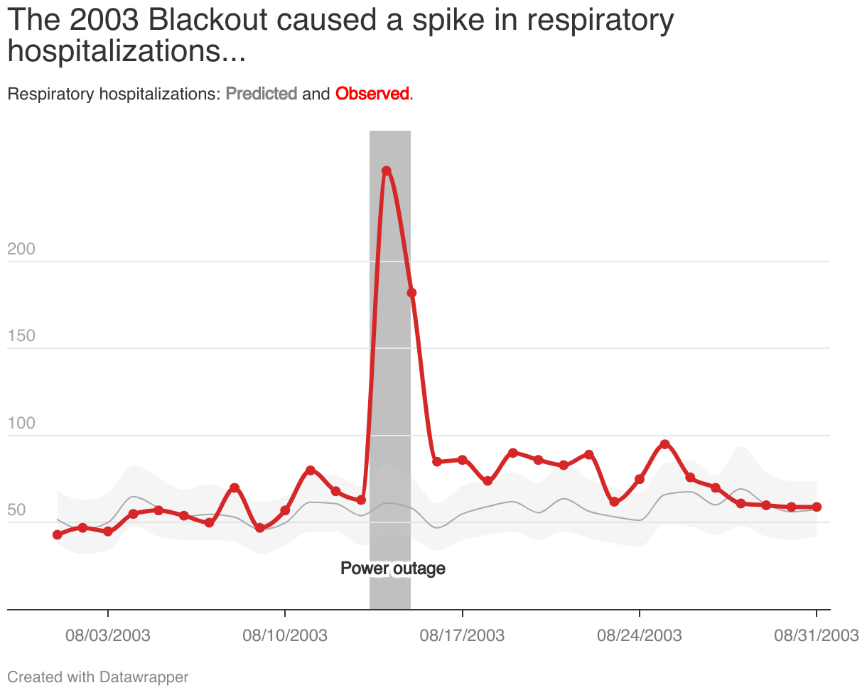
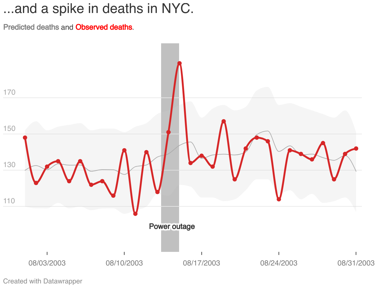
These are part of a data story on ways that climate can affect health — particularly, how power outages can threaten people who rely on electric medical equipment. My colleagues’ analysis showed that hospitalizations and deaths spiked during and after major power outages. As climate change drives more frequent and severe weather, we see how infrastructure is a fundamental piece of public health.
On these charts, I really like the gray fill between lines to show a range of predicted values, the powerful red to provide a focal point on the observed effects exceeding the predictions, and the use of annotations to help pull the story together — all with a great economy of copy and a strong visual message.
Datawrapper has these great meaning- and message-focused features that let us highlight aspects of the data and annotate charts. Matthew Montesano, NYC DOHMH, in minute 3:28 of his talk at Unwrapped 2024
What's your guiding principle when working on data visualizations?
It has to be clear and easy to understand. We’re really interested in the effectiveness of data visualizations, and that mainly boils down to: Can people understand them? Often this points to simplicity, but it doesn’t have to — we can incorporate complexity in thoughtful ways, as long as we have an explanation of our main messages, a hierarchy of information, and design techniques that reinforce that hierarchy, like focal points and annotations. We think it’s important to bridge the gap between our knowledge and our audience’s knowledge. Half a bridge isn’t a bridge.
We started developing strategies to communicate more meaning and more information than just the data. One of the strategies was narrative data stories. We started creating brief reads using conversational language to communicate insights into the data. Explanation, nuance, interpretation, why something is the way it is. And for this, we use Datawrapper heavily. Matthew Montesano, NYC DOHMH, in minute 2:50 of his talk at Unwrapped 2024
What aspect of data visualization/chart design would you like to explore more, and why?
I’m interested in exploring how data visualization can be used to promote health behavior change, integrating data communication into a broader health communication strategy. For example, there’s a theoretical model in health communications called the Extended Parallel Process Model. It involves showing somebody that they are at risk of a certain health outcome but then giving them the tools they need to protect themselves. It involves a careful balance of information — making somebody too afraid risks triggering resigned inaction rather than motivating action. I think that data visualization can be a tool to help this balance of information — it can provide an accurate sense of susceptibility and severity, and it can also provide that sense of relief in the effectiveness of action. Under what circumstances is this most likely to be effective? What types of data and visualizations can be effective, and what techniques may be ineffective or do the opposite of what we want? We know that people are interested in data, and that data can provide a foundation of trust if it’s communicated correctly. But I think that there’s still a big gap in knowledge and practice about how to use this in health communications contexts.
We loved Matthew's talk at Unwrapped! You can find him on LinkedIn. To learn more about Unwrapped and hear other great speakers, visit our blog.


