Erkka Rautio, The Finnish Parliament, about customizing Datawrapper tables


Erkka Rautio from the Finnish Parliament spoke at our Unwrapped conference about "Customizing tables: sort and search by dates and uniform bar range."
Erkka is an information specialist at the Library of the Finnish Parliament. As such, his bread and butter is to (visually) communicate parliamentary affairs to the larger public. After three years of experience with Datawrapper, he has gotten familiar with its versatile powers.
Watch his talk here:
01:04 – Example: Absences of MPs
03:06 – The report and statistics view
04:45 – Problem 1: Searching for dates in tables
05:41 – Problem 2: Uniform bar chart range?
06:13 – Solution 1: Adding @-signs to dates
09:08 – Solution 2: Define the bar length with the API
13:05 – Summary
Full transcript
Introduction
[00:00:04] Erkka: Greetings from rainy Helsinki. And thank you for this opportunity to give this talk. It's nice to be a part of the first Unwrapped conference. I hope there will be more in the future, as there have been a lot of inspiring talks before me.
But strict to the point. My short presentation will focus on two rather technical details and how to use them to customize tables. I want to show these to exemplify the versatility of Datawrapper. Although at this point of the conference, this has become clear even to those who haven't used this tool beforehand.
Example: Absences of MPs
[00:01:04] Erkka: And both of these details are based on a single user case: the absence statistics. It's, I believe, needless to say that there's always great interest in what politicians are doing all around the world, and Finland is not an exception from that. The 200 members of the Finnish Parliament are under great scrutiny by the media, by the voters, and in order to answer that information need, the parliament publishes various statistics on what is happening in the parliament and how the MPs are doing. And one example of these statistics is the absence from the plenary sessions or sittings that happen basically from Tuesday to Friday.
And previously, these statistics were collected manually, with Excel, by putting the data in Excel sheets. And when they published them, they converted them into PDFs. And now we have built a pipeline. On the other end of the pipeline, there's R, which is used to mine the data and tabulate the data, and then pushed into Datawrapper, thanks to the API that's already mentioned many times before this speech. So basically, it's not only a huge leap for my colleagues who have been doing this manually, but also for the accessibility of this data.
The report and statistics view
[00:03:06] Erkka: Next, I'm going to show you what these statistics look like. Basically, the statistics is table view. The one showing now is the so-called report view, where there's every sitting of the parliamentary term, answering: Who of the MPs have been absent? What is their group? And what is the reason for the absence? And you can, for example, switch the date from newest to oldest, or vice versa. You can search for a specific MP, or the political group, or even for a reason type. And you can search for certain dates or the date of the sitting.
So this is the report view. Then there's this actual statistics view, where the actual numbers of every MP that has been at least once absent from any sitting of the term. And here again, you can sort or reorder by if there's a personal reason for the absence or other reason, and also the total number of absences. And here the bars are in a uniform range.
Problem 1: Searching for dates in tables
[00:04:45] Erkka: But when I was building this pipeline, there were some challenges I encountered. And one of them had to do with the plenary dates or dates in general. When you upload dates into Datawrapper, they are usually recognized as a date format. They work fine when you want the report or the rows to be re-orderable, from the oldest to newest, or vice versa. But in the dates, it isn't possible to search for a specific date. So, is there anything you can do? You can switch the dates into text, but then again, the ordering of rows wouldn't work.
So there was a problem to be solved.
Problem 2: Uniform bar chart range?
[00:05:41] Erkka: The other challenge was in the statistics view. By default, the bars have an independent range, although you can change them into a uniform range. But how can you keep the range up to date when you have live updating data? So the maximum value is a moving goal. Luckily for these both challenges, solutions could be found.
Solution 1: Adding @-signs to dates
[00:06:13] Erkka: For problem number one, the solution was reformatting the date. And when I contacted Datawrapper support with my challenge, I was given this, I quote, "secret workaround". I believe it was Elana back then who told me that there's a secret workaround to tackle this problem.
And the solution is that the date itself needs a little reformatting. And what do you have to do, in this case, for example: you have the dates, you make it double and add two @-signs in the middle. And this works so that the date before the two signs is the one that is visible in the date, that's in text, and also that works for the search. And the latter date, the tool understands it as an order of things and sorts the rows on that case. And the double @-signs and anything after it won't be visible in the table.
And this is very useful because there's a couple of examples of how you can present the date with double-digit or one-digit only, but if you want to use month names or abbreviations like January, February in the date, you can use this one in the former date and use the latter as an example.
And you can also use this in other data types. So you just need to know that the text data is before the double ads, and the order of things is the latter.
And this is very useful, for example, in text cases where there's an intrinsic order for that. And for example, in the statistics, I have the name of the MP in order of first name and then the last name of the MP. But if I would like to give the order to go from last name to first name, I could make this same into the name field. And once more, it wasn't that much of a secret workaround at all. I hadn't found it in this Datawrapper Academy article, but there was this very helpful article on how to do this in different types of data.
Solution 2: Define the bar length with the API
[00:09:08] Erkka: So, problem 1 solved. And then there was this other problem. I show this part of the chart again to show what kind of problem there is if the columns have independent ranges. Like here. Although the actual numbers on how many times one MP has been absent differ, the bar lengths look similar to each other.
And maybe for someone who is just looking fast or skimming, the view may give a false impression of how different things are in proportion to one another. So the bar length should be proportioned to max value. So, how to do this with live updating data? Luckily, there's always the API. I use R and the DatawrappR package to update some of my charts and tables.
And with the R package at least, you can access the metadata or properties. Part through the API, and with the help of the package. So, everything you do in the Datawrapper software, you can also change through the API.
There is a developer documentation on how to use the API and where there's a guide to do all these properties, it only states that it's impossible to, in detail, tell every single property from over 20 charts, because the properties vary in all the visualization types. I advise you to try this one out.
This, this screenshot is an example where you can find, or I found, the actual bar length property. And this doesn't even show all the different things you can change within the properties. So you just have to dig a little deeper into the data you can get from the interface.
Lastly, this is how it's done in R. So basically, I have this maximum value that I want to put into these columns bar range. As Kiko just showed, there are these comments on how you can retrieve chart metadata. Then you have to find it from that list, or a bundle of lists. And then when you edit a chart, you can choose that you want, that metadata, put it back into the chart.
Actually, this is basically how we have been using Datawrapper in a live updating table. I haven't used this automatic way in that many other things. So it's been very insightful to see how people from different industries use this tool and also R in order to keep their tables and charts in order.
Summary
[00:13:05] Erkka: To sum up my presentation, I do love how versatile and powerful Datawrapper is as a visualization tool. And also this philosophy that, although there are some limitations on what you can do in the tool, there's a whole archive of different secret or hidden workarounds. If you just have time to take a good look at the Academy and the blog posts, there are plenty.
So thank you for this tool. It has been a great relief in the parliament for doing less manual work. Thank you. This is it. I'm happy to answer any questions now or later on social media. Thank you.
[00:14:10] Gregor (host): Thanks so much, Erkka. It's very interesting to see what you've been doing. We successfully managed to use up all of our buffer time for this block, as Lisa asked us to. So we're going to have to move the questions into the chat or social media, as you said.
We asked Erkka a few questions before his talk:
Erkka, what will you talk about?
Dates in tables can be tricky if you want to let readers both search by date and reorder rows in chronological order. Luckily, there's a "secret workaround" for this problem. Bar charts in table columns are also convenient - but how do you set a uniform range in multiple columns with live-updating data? In my talk, I'll show how I tackled these challenges using Datawrapper's features and API.
Why/how did you start using Datawrapper?
When I started working at the Finnish Parliament in the spring of 2020, one of my first tasks was to choose a visualization tool. I had previously used Tableau, but had read many of Datawrapper's insightful blog posts, so I took a closer look. Many features of Datawrapper – such as ease of use, mobile-friendly graphics, accessibility – tipped the scales in its favor.
I love how versatile and powerful Datawrapper is as a visualization tool. And also this philosophy that, although there are some limitations on what you can do in the tool, there's a whole archive of different secret or hidden workarounds. If you have time to take a good look at the Academy and the blog posts, there are plenty. Erkka Rautio, Finnish Parliament, in minute 13:09 of his talk at Unwrapped 2024
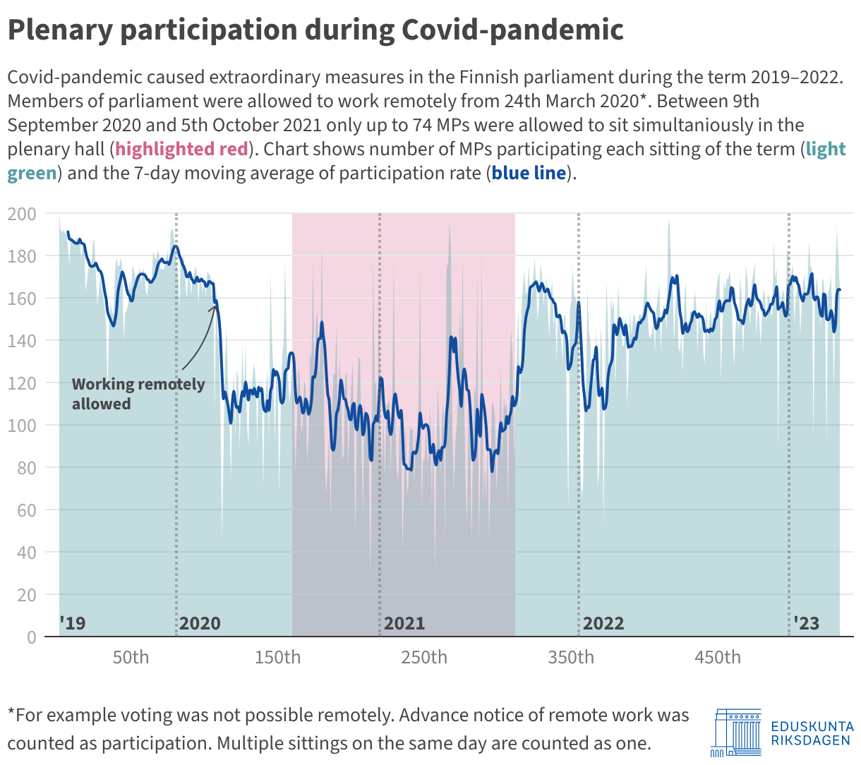
During those first months, working mostly from home thanks to the pandemic, I had plenty of time to study the various features and tricks that Datawrapper had to offer. One of them was the combination of line and bar charts, which I later used in this chart to highlight the extraordinary measures taken in the wake of the Covid outbreak:
How do you use Datawrapper in the Finnish parliament?
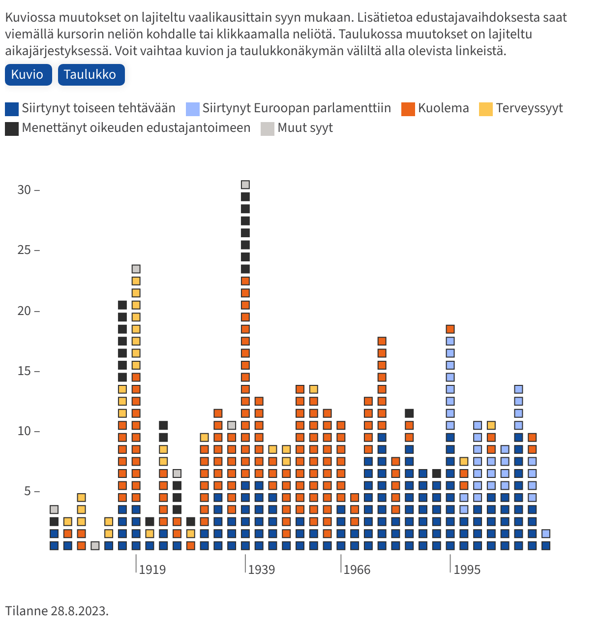
Mainly for two purposes. The first is to communicate in an efficient way what is happening in Parliament, as in the previous example. Another example is the following chart, for which I've analyzed every case since 1907 where a member of parliament was released from office or otherwise did not sit until the end of the term:
The second purpose is to select and follow legislative reforms before they are introduced in Parliament. We publish so-called "information packages", which provide background information on the reform in question. I usually produce a visualization to point out some detail, like this scatterplot showing the gender pay gap in selected professions when the pay transparency reform was underway:
What's your favorite Datawrapper feature?
Recently? The API. I do most of my data mining and number crunching in R, so the interface (and the DatawrappR package) has helped a lot. I work with a lot of tables, and keeping them up to date would be impossible otherwise. In my talk, I'll be demonstrating a few tricks with the tables and the API that I've found handy.
We loved Erkka's talk at Unwrapped! You can learn more about him on X, Bluesky, and LinkedIn. To find out more about Unwrapped and hear other great speakers, visit our blog.