Sean Greene, Los Angeles Times, about their use of the Datawrapper API to power a drought tracker


Sean Greene, Los Angeles Times, spoke at our Unwrapped conference about "How we're using the Datawrapper API to power our drought and water supplies tracker."
Sean Greene is an assistant editor on the Data & Graphics desk at the Los Angeles Times, where he focuses on visual storytelling and environmental journalism.
Watch his talk here:
01:18 – Smarter, not harder
07:44 – A chart for every occasion
09:36 – Going deeper
14:18 – Q: Dynamic annotations in live-updating charts?
Full transcript
Introduction
[00:00:04] Sean: Okay, cool. Yeah, this is a tough act to follow. Hi Ben, if you're still listening. Ben was my editor at LA Times in his last job. And unfortunately, I'm still not a great programmer. So I hope that sort of the theme of this talk can be how you can get started automating a chart without being the best programmer. Or the fastest. So let's see what happens here.
So yeah, how we built our drought tracker on the back of the Datawrapper API. The main things I want to talk about are how I learned to work smarter and not harder. Meaning less JavaScript, more Python. How this process really benefited us in terms of what we were left with: a chart for kind of all these different news events that we experienced weather-wise in the last year or so in California. And then we'll take a kind of dive into how I did it. And maybe if there's time, you'll see some of my weird and bad Pandas code. So, look forward to that. Stick around, let's get started.
Smarter, not harder
[00:01:18] Sean: Smarter, not harder. This is something that one of my colleagues, Iris Lee, said to me one time, and I'm trying to take it to heart. So our first version of the drought tracker, it had a lot of Svelte JS graphics. It was designed at a different time. I'll talk about that later, maybe. But we had some bar charts showing reservoir trackers. Maybe if you live in the US, you've seen the US drought monitor has these splotchy maps that show where the severe droughts are in the US and in different states.
So in some ways, JavaScript and D3 and Svelte can take you places that Datawrapper can't go. I tried in vain to make a map like this work in Datawrapper and either I wasn't trying hard enough or it can't be done or I'm just not smart enough. So there's a place for D3 and JavaScript.
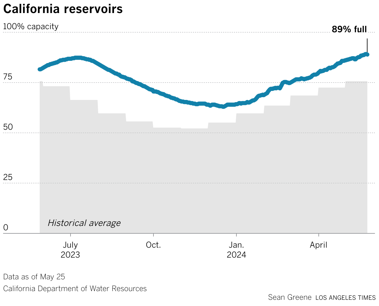
But in other times, I was working too hard, I think. So in our first iteration of the drought tracker, we wanted to track reservoir levels serving California. So showing these bars of like current water levels or percentages of various reservoirs and what the sort of like normal level would be for that time of year.
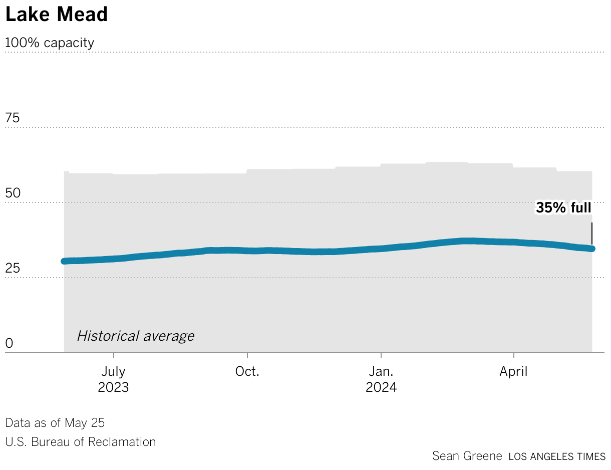
So whenever I made this screenshot, Lake Mead was 27 percent full and 59 percent average. And this type of chart, I think, was really a product at the time where California was in a crisis. It hadn't rained in, what felt like forever. And we really couldn't imagine that it would ever rain again because we had these apocalyptic photos and headlines of a 1200-year mega drought.
Yeah, we didn't expect it to ever rain again. But then it obviously, it started to rain. And it started to rain a lot. And it just kept raining for months and months. And pretty soon, those bar charts I showed you, they just didn't make any sense anymore because no one really needed to know that the reservoirs were very full, but what was more important was how things were changing. Basically, we needed to pivot the drought tracker to something that showed a longer tail.
And all these other stories kept coming up like a massive Snowpack. We needed to rebuild this with a lot more features and something that tracks these things over time rather than just give the snapshot.
So in looking at it, I could have, or I remember thinking about drawing some line charts and multiple charts of those reservoirs, showing that over time. And then I realized, I'm really not good enough at D3 and Svelte to figure this out. And we need it now or maybe even like weeks ago.
So I looked at Datawrapper, or maybe someone said, try doing it in Datawrapper. So we threw our hands up, we let Datawrapper take the wheel. And I think our first version was a single reservoir chart for the state total, and then we used the API to duplicate that chart and just swap the data, swap the title. And pretty soon I had 14 versions of a reservoir chart, for Lake Mead, for Lake Powell, for Lake Berryessa up in northern California, Lake Shasta, I think, is our biggest one.
And the upsides of this: It was way less code. It was basically a single Python notebook running and updating all of these charts. And importantly for me, changing the chart type if we needed to, is relatively painless. If you make a bar chart in D3 or Svelte, and then you decide, "actually, I need this to be a line chart over time", that's tragic, right? I guess you have to start all over. Datawrapper, it's just: change your data and click the button.
And I'll talk more about this later, but the charts are also portable. If you're writing a lot of stories about a record snowpack or the state of your area's reservoir levels. Then you have this on your tracker, but then you also have this chart ready to go everywhere else. So here's that reservoir chart. This is the one that, I think, started it all.
California state government publishes a sort of aggregation of all its main reservoirs. So we started with this and then quickly were able to duplicate it and make many more, and arrange them all on our page. And yeah, so news was going really fast and we also needed to add the snowpack chart, which has become really important and really useful for us.
Also, you can see what kind of a wild year we had. A while back with 250 percent, 300 percent of average snow up in our mountains. It was tremendous. The Datawrapper API really let us respond to news and keep our tracker up to date with all of these things. For better and not for better, naively, we didn't consider ever seeing snow again. It was really that bad that we thought snow was extinct in California.
A chart for every occasion
[00:07:44] Sean: So a chart for every occasion. This just means: once you've made an automated chart, it's there, it's ready. So, for example, these are the US drought monitor graphics showing the percentage of the area in various levels of drought in California over the years. And these two charts were made by hand by one of our graphics reporters.
And every time we needed to do this chart, someone would have to do it by hand. And I think these were made actually before we, as the LA Times, used Datawrapper. But now, this is our new version, built in Datawrapper. It's always ready to go. Whenever we write a story about drought, we can just add this chart in and boom, we have that extra value on our story.
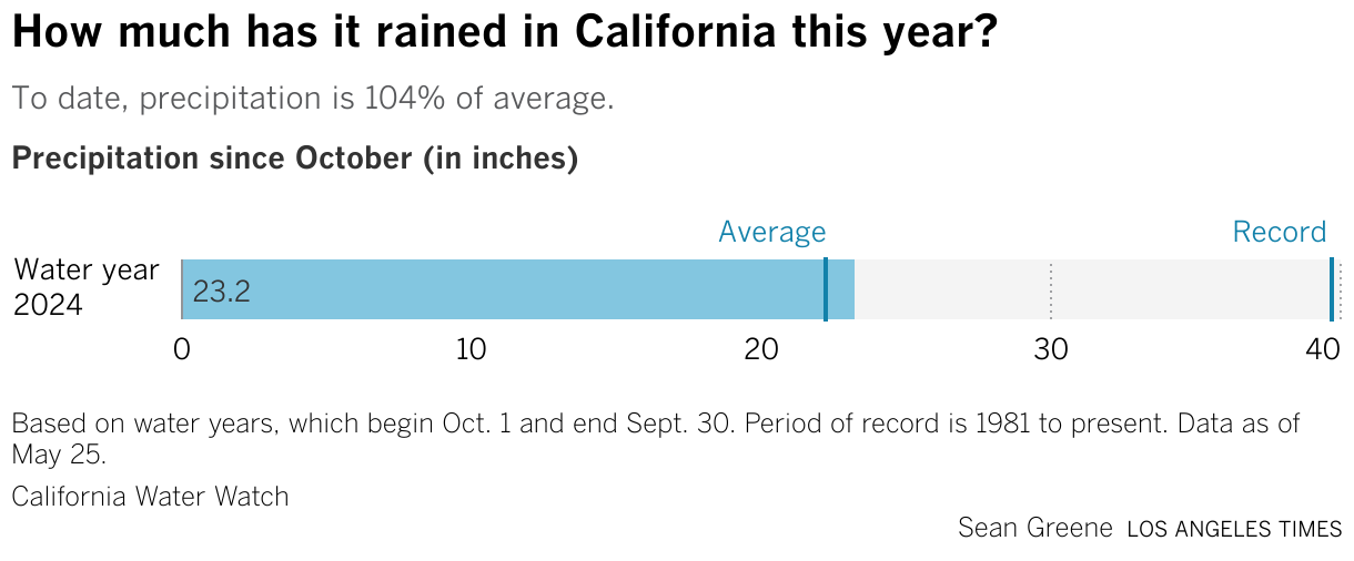
And here's some other examples of charts that we just have ready to go. So one day, an editor came into our channel and asked: "Hey, how about we do a precipitation gauge?" So I've used our drought tracker pipeline to pull this data in, process it. And I just added it basically to our rig. And now we have it. Same with the snowpack chart, and all of my favorite little reservoir charts.
And they're so easy and so ready to go that they even land in print sometimes, like they did last week. Anytime we write about the Colorado River, the graphics request is already fulfilled before it comes in. And that makes me very happy.
Going deeper
[00:09:36] Sean: We can dive in a little bit. So let's unpack how we did the snowpack chart. First things first, someone asked me, "What's the difference between using the Datawrapper API and having an auto-updating chart?"
So you probably are all familiar enough with Datawrapper. You know you can connect a Google Sheet or connect some kind of spreadsheet with live data, and you can get your chart to update on its own. But it only gets you so far. There are all these other little things on a chart that are important to add. Such as the last date of the data. Or maybe your description has some dynamic variables. Or even an annotation that you want to track across the chart, or update a number there. Normally, you could easily do that by hand on the website, right? Anything you can do by hand on the Datawrapper website, you can also do in the API.
All you need is... Well, this isn't a beginner's talk, even though I would call myself a beginning coder. We have some Python notebooks that download the government data, we clean it, and we shape it into a format that Datawrapper or some of our Svelte charts need. A GitHub action helps us automate that. So we time it to run around the time that we know the departments and the agencies post new data. And then we have another set of notebooks in a private repo that handle the Datawrapper stuff. So it updates the chart. It runs new dynamic variables and it republishes the graphics so that we have new stuff across the website.
And here's an example of some of the code. So I actually marked it up. We just set some variables, like little calculations, like the percent of average. The "April 1st", which is the noted traditional maximum of the snowpack, it's percentage of normal. We also set some dates and then we build it all in these JSON objects and we push it into a little Python request. And we publish it and pretty much everything's all done.
So can't really explain everything about the Datawrapper API. Their docs are better than anything I could ever explain and they taught me everything I know.
That's kind of it. It showed you how I was able to really throw my hands up and say, "I don't need JavaScript" and skip the whole development process and go straight from a Datawrapper prototype to scaling up really fast, and really evolving our drought tracker in a matter of days instead of weeks.
And that had a surprise benefit of never having to make the same chart twice. Which is really great because I like to tell people that data journalists are lazy. And so if you've got these charts, if you know you're going to have to make it more than twice, then you might as well try and automate it. It's not too hard, give it a try. It's actually fun, I would say. And again, any customization you can think of doing by hand, you can also do in the API. It's just a little bit of JSON parsing, which I would argue is also a little bit fun to play with.
So with that, I will actually give a shout-out to my colleague Paul Duginski, who recently retired and lends a lot of illustrations to this drought tracker. Here is his version of California in a sort of green and happy, happily watered state. I'll answer questions in the chat if you have them.
If not, thank you.
Q: Dynamic annotations in live-updating charts?
[00:14:18] Shaylee (host): Thank you so much, Sean. It was great to hear a process that is probably going to become, unfortunately, more and more salient as people have to change charts based on climate data, which is changing more and more these days. Really excellent processes that you went over, and great to hear all of these considerations and everything.
I do have one question for you that I have right at the top of my head: You mentioned dynamic annotations, and those are really interesting to me. I haven't seen them much in use. I wanted to ask if you could talk a little bit more about those. How do you choose the points to talk about? What is the editing process for those look like? And so on.
[00:15:05] Sean: So the dynamic annotations. Really, I think we're just using them in the snowpack chart. And I'd say honestly, just specific to that one, it was a compromise. So you could visualize a snowpack in two ways, like a percentage of its April 1st peak. So we're building toward this almost hypothetical moment in time. April 1st is the time of year when officials typically say the snowpack is at its peak. So it's a goal. We want to be at a hundred percent. So we're following this kind of slope up. You could also visualize it as a percentage of... It's the average for this date. Which would produce a kind of up and down, noisy, hard to read and not very informative graphic.
It's probably because a line chart isn't appropriate for that. But both numbers are important. So we wanted to put them in somehow. This produces a nicer chart and one that's more familiar. So we wanted to have that description reflect both numbers. Because both are newsworthy in different ways.
For this annotation, it's just helpful to get the number directly labeled. But it can't be done in an automated way without updating it through the API. I don't think it's possible. I think this annotation has to be hand-placed. Datawrapper doesn't automatically place a number at the end of the line.
And it was an interesting hack because it's a multi-line chart, but made to look like this shaded area is... I should have showed you the Datawrapper part, but...
[00:17:14] Shaylee (host): No, I think I understand. It's the area fill underneath the line.
[00:17:17] Sean: Yeah, exactly. I don't remember the words. Actually, Shaylee, you'll know that I frequently break things in Datawrapper, ask the team why it's broken, and then they quickly and easily point out that I've done something silly. So I really appreciate the Datawrapper team.
[00:17:35] Shaylee (host): Always interesting questions, though. You get those points. It's always something that, "oh, I didn't know you could do something like that." That's why you ran into something.
[00:17:44] Sean: Leave it to me to break things in unexpected ways. I hope I answered the question, though.
[00:17:54] Shaylee (host): It's fantastic. You did a great job. It was wonderful hearing you speak. Thank you again for your presentation. Great to put a face to the name on Slack.
We asked Sean a few questions before his talk:
Sean, what will you talk about?
You don’t have to be that good at coding to automate your charts with Datawrapper. See how the L.A. Times re-built its drought and water supplies tracker using a few Python notebooks and Datawrapper’s simple API.
Anything you can do by hand on the Datawrapper website, you can also do in the API. Sean Greene, Los Angeles Times, in minute 10:31 of his talk at Unwrapped 2024
How do you use Datawrapper in your team?
The Los Angeles Times Data & Graphics team uses Datawrapper for a majority of our charting and mapping needs. We’ve also trained much of the newsroom to use the platform, empowering reporters and editors to draft their own graphics with our team’s guidance.
What advice would you give to other Datawrapper users (or data visualizers in general)?
Datawrapper is a deep well. It’s great for quick and easy charts and maps, but you can also customize and “hack” it to create some truly weird and wild graphics.
We loved Sean's talk at Unwrapped! You can learn more about him on X, LinkedIn, and his L.A. Times author page. To find out more about Unwrapped and hear other great speakers, visit our blog.


