Pearl Kyei, University of Ghana, about showing regional trends with tables


Pearl Kyei from the University of Ghana spoke at our Unwrapped conference about "How Datawrapper helped me present disaggregated data at the subnational level."
Pearl is a lecturer at the University of Ghana Regional Institute for Population Studies and has created over 1,000 visualizations in Datawrapper since discovering the tool in 2021, including in five census thematic briefs. Her charts have inspired colleagues to "wrap" their own data whenever possible.
Watch her talk here:
01:38 – 5 takeaways
03:29 – How to create the table
07:33 – Final thoughts
08:38 – Q: Other visualization types?
09:59 – Q: Favorite visualization type?
10:36 – Q: Interest in Datawrapper training?
12:07 – Q: How much of data vis is cultural?
Full transcript
The challenge: Bring many trends in one graphic
[00:00:04] Pearl Kyei: Hello, everybody. My name is Pearl and I'm here to share how I use Datawrapper tables to present regional trends in Ghana.
So I discovered the tables because the challenge we were having is we needed to present inter-census trends for 16 regions and the options we had were to present 16 different charts or to have one line graph with 16 trends, which was really overly messy. And these were... We needed this for reports. So we actually needed something where you could see everything in one place.
And neither of these options really worked for us. Of course, the caveat is that this was before Datawrapper brought the multiple charts option. But I still love the trends table because it really allows you to see everything in one place. So when we had this challenge, we started to explore. So I was already using Datawrapper and I really do love the tables because they are so versatile.
I think the previous session really shows the things you can do with the tables. Probably about a quarter of my visualizations use the tables because you can really customize them and when you're done it doesn't even look like a table anymore. The sparklines option is especially great because it allows you to present all the trends in one place and then simultaneously, if you are somebody at the regional level making decisions with this data, you see where you are, you see where you rank relative to others and in terms of the trend you see whether you have improved or regressed relative to the other regions.
5 takeaways
[00:01:39] Pearl Kyei: That was the solution. So they are really five things that I would say if you have the regional trends table, as I like to call it, you would normally see. At first glance, you see, where their region is ranking relative to the others. So you see this region is ranked third. The second thing, I always like to add the national level, because sometimes regions want to know not only how they are performing relative to other regions, but how are they doing relative to what's happening nationwide.
And so when you have national, you can again see that, okay, this region, this is their rank, and this is where they are relative to their national. You also get to see where you started from. So you see the starting value, and then you also see the trend. So in that period, did the indicator trend up or down, or did it stay stagnant?
And then one thing I also like to add is the change in the rank. Because this way, tables were put in a report. So it already comes ranked by the ending value, but sometimes we want to know where you were at the beginning. And so with the change in rank, you get to see. If you relatively outperform other regions during their period or less.
And this is because even though you see their starting values, it's difficult to ask people to look at their starting values and figure out how they were ordered.
And so when you add their ranking, it also gives that additional information. And then when you have the interactive version, the great thing is you can decide to rank by any of these if that is what interests you. And not the ending points as this chart has been run.
How to create the table
[00:03:29] Pearl Kyei: To create the regional trends table, I usually set up all my tables in Excel before I export them into Datawrapper. And each time points is in there. So not just the beginning and the end, because sometimes over the period, there may be fluctuations that you also would like them to see.
So each different time period is a column on its own. And then in this case, you see the national added there. Datawrapper tables can automatically run for you. But when I add the national, I don't use automatic ranking. I manually do is because I don't want the national to be ranked. So you see here, I have manually added a column to the ranking.
And then you also see that I add the change in the values. Because again, it's just easier for your reader if you've already done the calculations. So they easily get to see, okay, what was the change over the period? And then how did the change in, how did the regions rank change over the period? To create and customize the table, normally, I'll just, as I said, I'll copy and paste everything, from Excel into the Datawrapper.
So I choose the table option and then I paste the data and then I just check to make sure everything looks good before I move on to the visualization. And so then now it's time to refine it. So the first thing I do in this case, I haven't added the national, so I choose to automatically rank it. To create the spark lines, I just select all the columns.
So those columns should be, I mean, next to each other. So you just select the first one, you hold Shift and then select the last column. So you see all those columns are highlighted. You scroll down and then you select the Convert to small chart option. You can have a column or a line. I prefer the line so I can have the starting and the ending values shown.
I also always put in a fixed range so that all the rows would have the same range. And then I edit the title because it automatically would pick the first and the last column names. And sometimes that may not be informative. With the small tables you see at the end, there are options to convert it back into the regular column.
So if you want to change something or remove one of the columns, you can easily change it back into the columns. But the good thing is it remembers. whatever charts you had before. So once you convert back to the small charts, it just keeps whatever you had done before, which is quite nice. So once I have done that for the indicators, I do the same for the rankings.
Typically with a rank, I'll just present the beginning and the end, and not the trend, because I think it's just simpler to show where you started from, where you ended from, and not so much the fluctuations over the period. I mean, the charts are great. You can customize it if you feel like there are regions that need to be highlighted or put in bold or different colors.
All those are options that are available in the table. And then of course, I always like to name my charts properly because I have so many visualizations and searching for them if the chart isn't named properly is a problem. So if you create a lot of static charts like I do, then it's good to always name it with something you can search easily for.
So that's basically the charts. And as I mentioned earlier, if you actually have the interactive version of the chart and not the static one, like we've been putting in the report, then you are able to sort it so you can decide to rank it by the starting value, or you can rank it by the change over the period or the starting rank.
So it really gives you the option to play around and see how things have changed over the period. So that's how I create and customize the regional trends table.
Final thoughts
[00:07:33] Pearl Kyei: So in conclusion, I would just like to say that the sparklines in tables is really a great way to show trends for variables that have many categories.
So it doesn't have to just be a region. I've used this for a number of other variables, like this is a different table that I've created. It's not at the regional level, but again, it allows me to see trends over time. And the other thing is, personally, my preference is to focus on one indicator in the table.
Yes, you could theoretically have five or six different small charts in one table. But for simplicity and really to make the messaging clear, I would advise that you keep it to one indicator. So in the one that we showed, we had the trend in the indicator, we had the change over the period, and we had the change in the rank.
So it's really all around the same indicator and it's quite simple. So that's my experience with the sparklines in Datawrapper tables and I thank you for your attention. Happy to take any questions.
Q: Other visualization types?
[00:08:38] Guillermina (host): Thank you so very much. That was a great presentation. I wanted to ask you, what other types of visualizations besides tables, do you make? You say that tables probably comprise most of them. The rest, what other types of visualizations do you make?
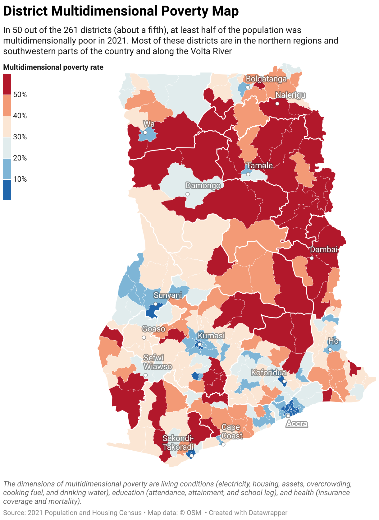
[00:08:56] Pearl Kyei: So related to showing the disaggregated data, I also use the maps a lot. And I actually, and one of the things I, we didn't have, we split our district, so actually reached out to Datawrapper and somebody responded, you know, so quickly with the shape file. So then now we could be using the 2 61 district.
So I actually do also a bit of showing, not trends, but just indicators using the map. And I also like the dot charts because I think they're also another way that I've tried to look at changes over time, particularly because, with my research, sometimes we use data that doesn't fall neatly into the same time period.
So, at least with the dot charts, some of them may be missing, but it's still a nice way to show the trends. And of course, I mean, bar charts and the regular charts. I think now I do all my, even like things I can do in Excel, I do in Datawrapper now.
Q: Favorite visualization type?
[00:09:59] Guillermina (host): Do you have a favorite one?
[00:10:01] Pearl Kyei: Oh, the table is, seriously, the table is my favorite. Like, if I can put anything in a table, that's always my first preference. But I really do like the multiple chart option now, because that's another way that you get to present. I was so excited the day that I saw it because it's really a nice way, again, to present trends.
And I think before, when I was trying to use trends, you know, I'd have to have like three or four pages of the small charts, but now you can actually fit everything in one page and it's really amazing.
Q: Interest in Datawrapper training?
[00:10:36] Guillermina (host): Great, thank you. We're taking questions from the audience. We have one here from Marie. Let me show it there.
Marie Allegret, she says, Our organization intends to train women's organizations in Sub-Saharan Africa in Datawrapper basic use. Do you think there might be an interest?
Needless to say, this would be based on funding. No charge to NGOs.
[00:11:05] Pearl Kyei: Definitely, I think there's a lot of interest and one of the things... I get a lot of interest in data. People want to know how it's done and how you can learn how to do it. And again, I really want to commend the team because a lot, it's easy to self teach yourself because all these resources are online, but I realize not everybody is as adventurous as I am.
So sometimes they do need to be sitting in a seminar session for someone to take them through their training and then they will do it. And I think it's really important. Now here in the Sub-Saharan context, at least here in the Ghanaian context, we really are looking at ways that we can make statistics interesting and appealing.
And so it's important to equip as many people as possible so that people can realize that the numbers don't have to be intimidating and there are really simple, nice and fun ways you can show statistics for people to use. So I see there's a great interest. There should be great interest for that.
Q: How much of data vis is cultural?
[00:12:07] Guillermina (host): Great. Thank you. And one last question. How much of data visualization do you think is cultural? That was a follow-up question also by Marie.
Is there a way that you can relate or you can find a relationship between data visualization and cultures? How is your experience?
[00:12:32] Pearl Kyei: No, I don't think it's, culture. I think probably maybe we have less data than maybe other settings because, of course, you need data to even start thinking about visualizing. And then the more data you have, the more you need the visualization because you need to present it in ways that don't overwhelm, you know, the reader.
So I wouldn't maybe say it's culture so much as maybe it's now that, we're actually getting that amount of data. And so we see that there's a need to, I mean, the visualization is an important skill to have.
[00:13:10] Guillermina (host): Great. Thank you so much, Pearl.
[00:13:13] Pearl Kyei: Thank you.
We asked Pearl a few questions before her talk:
Pearl, what will you talk about?
Ghana has 16 administrative regions and 261 administrative districts. Following Ghana's first census since the inception of the Sustainable Development Goals, there was considerable demand for disaggregated data at the subnational level for policy and planning. The challenge was finding simple ways to present patterns and trends in one visualization without having 16 different charts for each region or one overly messy chart.
Using Datawrapper tables, I can present regional trends in one streamlined graphic. This allows regional-level decision-makers to simultaneously see their own statistics and where they rank in comparison with other regions. I also used Datawrapper to generate interactive district league tables for district-level decision-makers.
The sparklines in tables are really a great way to show trends for variables that have many categories. Pearl Kyei, University of Ghana, in minute 7:35 of her talk at Unwrapped 2024
Why/how did you start using Datawrapper?
I started using Datawrapper when I got involved in disseminating census data for the first time. Censuses produce a lot of important data that needs to be synthesized and communicated to various audiences. I had no coding skills but knew I needed to be able to produce more sophisticated data visualizations than I had before, so I did some research online. I chose Datawrapper because it created beautiful charts, was user-friendly, had a plethora of charts and customization options, had a free version, and — very importantly — kept visualizations private until published.
How do you use Datawrapper?
I am a faculty member at the university, so data visualization is not really part of our routine tasks. For the first couple of years, I primarily used Datawrapper for census reports and presentations. This academic year, I've begun using Datawrapper for teaching: I present visualizations to the PhD students in my policy class and ask them to tell the story and its implications. I'm also using it more now for research papers where I present some of my findings with charts instead of only tables as I did before.
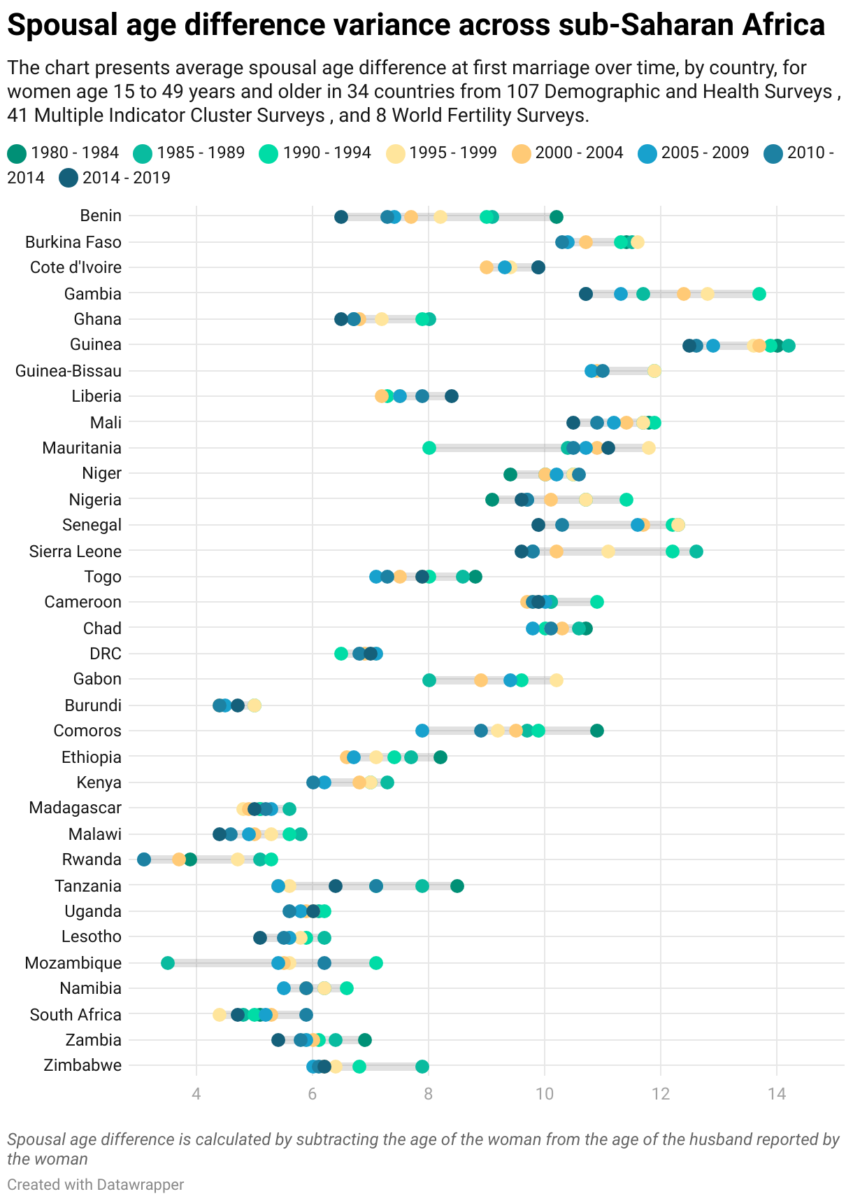
What's your guiding principle when working on data visualizations?
To keep it as simple as possible. That ensures that the one key message I have developed and want to communicate is very clear. This is particularly important if visualizations are to be made meaningful to all types of audiences regardless of their background.
What's your favorite Datawrapper feature?
I love the kind of Datawrapper tooltips where you can add a lot of helpful information, e.g., from additional columns. I use them a lot in choropleth maps. Hopefully, they'll be made available for all visualization types eventually.
What advice would you give to other Datawrapper users?
Be prepared. Datawrapper requires an internet connection, which I sometimes don't have when I’m out in the field — if you're in the same situation, you'll need to plan accordingly. I would also encourage other users to take advantage of all the available resources. I’ve personally learned a lot from the blog, River, and webinars.
We loved Pearl's talk at Unwrapped! You can find more about her on LinkedIn or the IGC website. To learn more about Unwrapped and hear other great speakers, visit our blog.