Sören Müller-Hansen & Markus „fin“ Hametner, Süddeutsche Zeitung, about their use of the API


Sören Müller-Hansen and Markus „fin“ Hametner from Süddeutsche Zeitung (SZ) spoke at our Unwrapped conference about "Quick Prototype to all the bells and whistles: how the SZ uses the Datawrapper API."
Sören is a data journalist at the German newsroom SZ. His work focuses on in-depth election coverage, climate change, and public health reporting. Fin has been working as a data journalist since 2014 and freelancing for SZ since 2021. His work for SZ focuses on data analysis, writing and researching stories, and supporting larger-scale, automated stories.
Watch their talk here:
02:04 – Forget Datawrapper's main selling point
03:46 – Live-updating charts
05:16 – Dyanmic text annotations
07:25 – Trend arrows
08:11 – Interactive dashboards with Datawrapper
10:53 – 2100 charts for election night
20:13 – Q: Other long-running data projects?
Full transcript
Introduction
[00:00:04] Fin: Thank you everyone. As just said, we're gonna briefly talk about how we use the Datawrapper API for everything from quick prototypes to charts that play basically all the bells and whistles. I am Fin, I freelance with Süddeutsche, and this is Sören.
[00:00:25] Sören: Yes. Hi, and sorry for our names, which are really hard to pronounce, especially mine and Süddeutsche Zeitung as well. But that's the way how names work here in Germany or in Scandinavia, where my first name is from. But let's move to the talk. Thank you for having us. And we want to show you four things, four key things you might take away from our talk.
The first thing is that you should forget about copy and paste and use the Datawrapper API whenever it's possible. The second one is how Datawrapper fits in our automated pipelines and that you should use that too if you can. The third one is that it's even possible to use Datawrapper to fake interactive dashboards. And the last point we wanna make is if you don't have time for custom charge front ends, then just use a lot of Datawrapper. And we want to do a little shout out to Benedict Witzenberger, who worked with us some years ago at Süddeutsche Zeitung and created the DatawrappR package, which we built our work heavily on.
And it's very helpful, but don't be afraid. All these examples we show here are in R, but are of course transferable to other coding languages you might use.
Forget Datawrapper's main selling point
[00:02:04] Fin: All right. And on to our first point, the almost heretical point that you should forget Datawrapper's core main selling point to just copy paste data into Datawrapper and you have a chart in a couple of minutes. We say, sometimes forget about copy and paste. Use the Datawrapper API to create your charts.
Why would you do that? What we often do is: we create a chart in the user interface, copy the ID from our URL, paste it into our development environment, our tidyverse pipe, directly in our analysis. And then design our chart in Datawrapper, basically refresh the browser window and go pick a scatterplot, change the size to the variable. Then we have a first prototype. And can go on either doing other charts, or, why we do this in the first place, the profit in what comes afterwards. You can continue using the pipe in your notebooks, which gives you synchronization between analysis and charts for free, which gives you reproducibility.
Or even for automated data updates, you can expand your pipe or the script around it to also update the metadata, for example.
Live-updating charts
[00:03:46] Fin: And Sören will talk more about our metadata in our automatic pipelines.
[00:03:54] Sören: Yes. Thank you. I think this is really great to do to have reproducible code. Because I sometimes forget where my data is coming from I did maybe a year ago or two years ago. And to build on the work I did previously, I like to have it somewhere in my code. And that is something we also used to do a lot, automatic pipelines. Because we have tons of charts which we update on a daily basis. During the COVID pandemic, we even did updates several times a day. And that's all possible using the Datawrapper API. One thing or the first thing I want to show is the most simple one: That we can just upload new data to our charts using the API, like Fin already showed us.
And what we then always place in our chart is some kind of date. Because we want to know when the chart was last updated. Our readers should know that. And that's something we put in there. And you can also use the API to change, for example, the color or the width of lines, if that's necessary.
Dynamic text annotations
[00:05:16] Sören: Some more advanced things are, for example, text annotations, which we use and even move where we need these text annotations. One example here is, the Republican delegates for the primaries now. How many delegates are already elected, how many are missing. This is what the chart here shows. And we want to lead our readers eyes to that point we want to make there, which is that 1,354 delegates are now elected. And on the left side, you can see the Datawrapper front end where you can put in your text, put in the exact position where you want to have that label and all that you can also find in the metadata file, that file you can adjust using the API.
Here is some of that metadata in RStudio, where you can find this x field, the y field, so all the coordinates. You can find the text and you can adjust all that. And that's something we show on the next slide. There we just use that part where we have the text annotation, the x and y axis, and where to put that label, and we just exchange it every time we publish the chart and push new data there and then can just easily create chart with great annotations.
And to show you some more examples why we need that. It's especially to lead our reader's eyes. If we publish charts on a daily basis, we mostly want to highlight the current status of the data. That's something we can greatly do with these text annotations which we push via the API.
Trend arrows
[00:07:25] Sören: One last thing which is also possible and which we used during the COVID pandemic, were these trend arrows, where we wanted to highlight in which direction the pandemic is leading. And that is something we, once figured out how this SVG code has to look like to create these arrows, we could put them in here parse the markdown button in the Datawrapper field. And then we could use these arrows even for our print version, and that was very helpful.
Interactive dashboards with Datawrapper
[00:08:11] Sören: And now I'll talk about how we can use all that to even build interactive dashboards with Datawrapper. Some of the speakers before us already talked about HTML buttons, which can be introduced into charts to build some fake interactivity. Or it's interactivity, but to fake loading new charts. And we can also use that and adapt that using the API.
The example here is a map of the risk of infection, depending on group size and vaccination status for all counties in Germany. This was close to Christmas time and we wanted to show how risky it is to meet smaller or bigger parts or groups of people, depending on their vaccination status.
And they're just four quite simple steps to create such interactive dashboards with Datawrapper. The first is just create a chart as we already showed in Datawrapper, customize it as you need it. And the second step is that you can build in these fake hyperlinks. That's shown on the next slide. We used a lot of code provided in this Datawrapper Academy blog post and just adjusted it to our needs, adjusted some colors to highlight which button is selected at the moment and which chart the link should lead to. And we build this first with some fake hyperlinks, and then we copied the chart, this is the third step, and repeated that. And it's definitely better to do that using the API because then you can easily store the ideas and what it should show directly in your code in a data frame. And the fourth step is then to insert the correct data and exchange the hyperlinks. Because you can find this intro field where all of these HTML buttons are written into, and write in there whatever you need and exchange easily the IDs, the colors and so on for every chart. And if you need to change something, it's quite easy to do it in your code. And you don't have to get manually into every chart and change that.
2,100 charts for election night
[00:10:53] Fin: All right. Thank you, Sören. And the last and slightly absurd point is, if you don't have time to program chart yourself, you might just get away with just creating lots of Datawrappers. Our challenge was, in our election reporting, we had one article per election district, and we wanted to show a scatterplot showing all results in all districts, but highlighting the current district. So the district that was written about in the page the Datawrapper chart was embedded in. We did not have resources for a custom program solution because our resources who could have programmed it were busy programming the 300 articles and the infrastructure for that.
So what did we do? We created a Datawrapper prototype and scaled it up. We had one prototype and copied that basically 300 times with the same settings and style, but different annotations in each chart. We had a custom view, on the data for every chart. What you can see here, for example, is the result of the conservative party in comparison. So we have the amount of votes on the x axis and the wins and losses on the y axis.
We really like this view on the election results. But it gets a bit overwhelming, so we want the annotations. And you can see here the chart versions for Munich East, Munich North, and Ingolstadt. And you can see very different positions for the Conservative Party in the same cloud.
And, of course, we don't only have to do this for three or three hundred districts, but also for each party. So here you can see the same, repeated for the SPD, for the Social Democrats, for the AFD, Germany's more right wing party, and not shown, even more parties.
And then, of course, we created a chart showing all parties. And here again, you can see annotations for, on the left bottom, Munich East, one for each party in Munich East. On the top we have Ingolstadt again. And on the bottom right, we have Munich North.
And that's, of course, not the end. We also had to connect those charts with buttons, so that our users could decide what party they might want to focus on. Since it's such a complicated chart, we did want to provide different views on the data.
Alright, so that's already the chart with all the bells and whistles. What did we need for that? We needed an overview, of course. We had to create all the charts and have an overview of all chart IDs and what content is supposed to be in them. We had to have labels, text labels and annotations, depending on the selected districts, which Sören has shown before how you can do that.
We had to align the limits of each chart, so the transitions between the charts worked out. We were lucky that we basically chose limits before the election that worked during election night, but we could have fixed that using the Datawrapper API as well. We faked the dashboard using the HTML buttons, as Lalon Sander noted that there are Python examples from his previous talk as well.
And, we actually published the first versions of our election night articles without the scatter plots and only slowly filled up our 2100 charts. We then added them to the articles, because we wanted to be nice to the server, especially because we didn't warn the Datawrapper team that we would do this. Not that we had any reason to doubt the service because everything went smoothly, but no one wants that additional risk on election night.
Alright, would we do this again? It's complicated. Our most current version is a custom graphic created by our Visual Desk. In the next election, we did have some resources. And we could have a custom graphic that was just passed the district ID and which parties to show. We had those over 2000 Datawrapper charts as a workaround for a lack of development capacity. But of course we'd do it again. It's not the first choice, but if it was the choice between no charge because of no capacity or this hack, we would take the hack any day.
[00:16:49] Sören: Thank you, Fin. So, just to wrap up, let's repeat the key takeaways you should take away from our talk. First, don't use copy and paste too much, use the Datawrapper API if it's possible.
Use the Datawrapper API to automate pipelines because this can help a lot to report on current topics.
Use Datawrapper to fake interactive dashboards if that's necessary. It's very helpful.
And the last part is don't hesitate to build lots of Datawrappers. That's especially possible with the Datawrapper API. So if you don't have time for custom charge frontends, then use this solution.
And that's it from us. Thank you for having us. If you want to reach out, you'll find our contacts here. You can write me an email or visit Fin's website. And thank you for listening.
[00:17:55] Shaylee (host): Thank you both for such a wonderful speech or talk. It was great to get a peek into the process on your side and see what features are helpful, what kind of hacks you've used. Very interesting, especially the faking a dashboard. And I do have one question of my own, just... I have a couple of questions of my own, but I want to leave with one of these. The idea of putting up a dashboard for those vaccination rates in counties in Germany, that map looked very intricate. And you mentioned it went up right around Christmas, which I think was not that long after vaccinations started. How long did it take for that process to go up in terms of start to finish, if you remember?
[00:18:47] Sören: The time we needed to build that chart, I think, it wasn't that much time. Because we already used those buttons before and we built heavily on the Datawrapper Academy blog posts, and that helped a lot. So we just had the idea that we wanted to show the risk of meeting different groups of people, because it depends a lot on how many people you meet, how big the risk of infection was. And at that time we had some rules in Germany, how many people you might even be allowed to meet at a time. So, yeah, I think from the initial idea to the end of that story, it was maybe two weeks. But to build that chart, it was a day, maybe, I'd say.
[00:19:46] Shaylee (host): I mean, incredible.
[00:19:49] Fin: And I think to be clear, it was about a year after the first vaccinations in Germany. Vaccination rates were relevant at the time. But yeah, it was not like, "We have the first vaccination in two days. We need to have a data story on that."
Q: Other long-running data projects?
[00:20:13] Shaylee (host): Yeah. Makes more sense. I got my dates wrong. Corona, I like to block it out. But I also did want to ask: Sören, you mentioned at the top that you use this pipeline method to maintain and keep track of data that spans back years. Are there any specific projects that have been that long running that you'd like to mention beyond the usual Corona projects?
[00:20:46] Sören: In my work, most of the time it's climate related data, because this comes up again and again. And sometimes I want to build on some reporting we already did a year ago or two years ago. And there are a lot of data sources out there. And to remember where my original data is from is quite hard.
So I tried to always write that into my code and then use that information. If it's possible, even to download the data in the code, then push it to the chart, and work that way, so it's greatly reproducible. And that's what I try to do. It's not always that I do that. And I think that's quite bad that I don't, but, I try to do it.
[00:21:43] Shaylee (host): It's definitely a best practice from the sounds of it. Oh, sorry, Marcus.
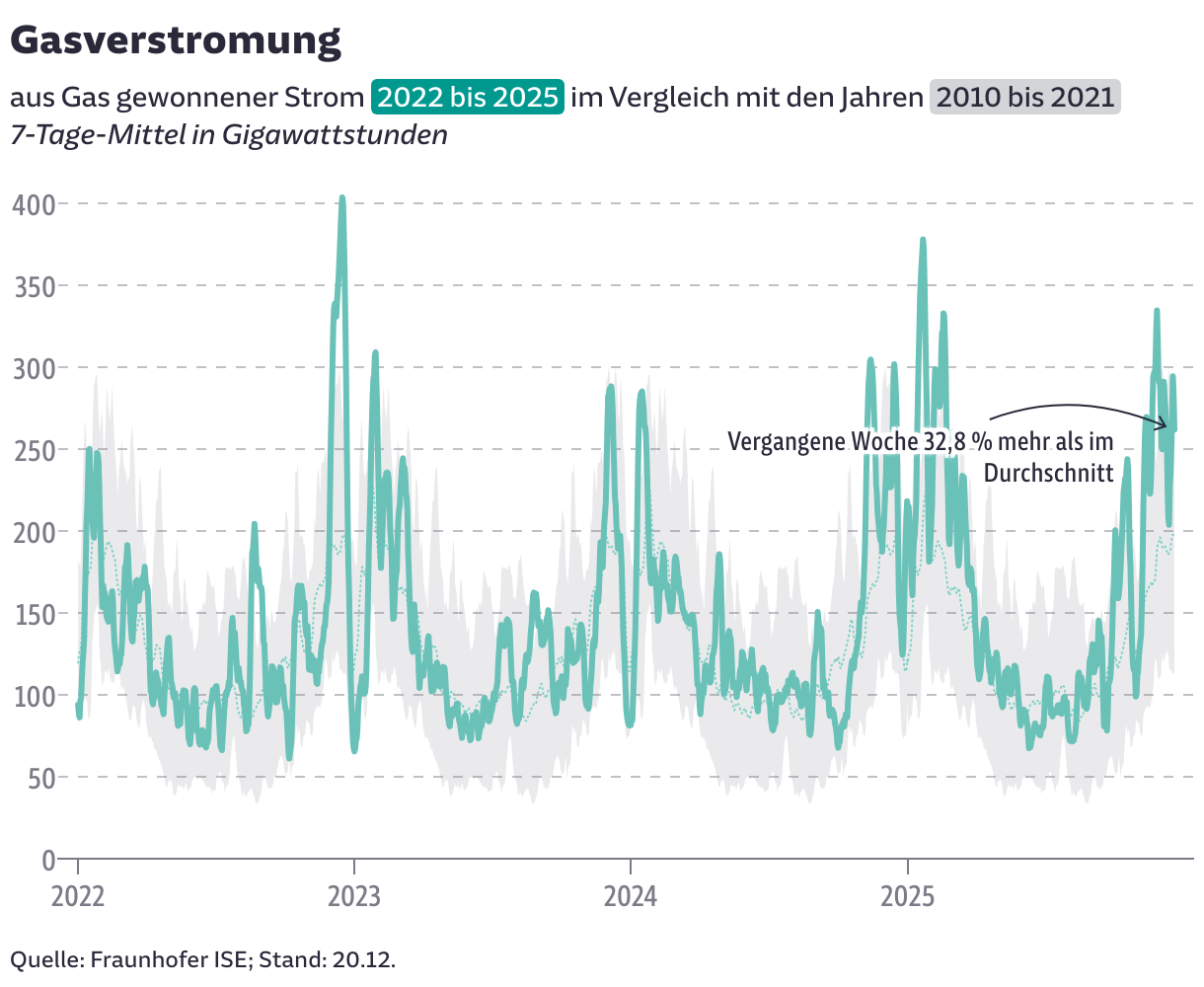
[00:21:46] Fin: All good. I think the other long running dashboard-like article is about the status of natural gas in Germany. Which also was where many of the screenshots from of our examples came from.
[00:22:10] Shaylee (host): Yeah, both very relevant topics. Fantastic. I think we're right about time. Thank you both once again. It was a wonderful talk.
We asked them some additional questions before their talk:
Sören and Fin, what will you talk about?
Keeping charts up to date? Publishing thousands of plots in just seconds? Copying annotation and color styles in a heartbeat? All of this is possible by implementing the Datawrapper API in your workflow. We’ll show how we use it programmatically in R at Süddeutsche Zeitung, Germany. From simple prototypes to automated labeling and complex tricks and tips with buttons and tooltips. From climate charts to COVID-19 and elections.
We have tons of charts that we update on a daily basis. During the COVID pandemic, we even did updates several times a day. And that's all possible using the Datawrapper API. Sören Müller-Hansen, Süddeutsche Zeitung, in minute 4:27 of the talk at Unwrapped 2024
How do you use Datawrapper (in your team)?
Fin: At SZ, Datawrapper is in heavy rotation, creating charts quickly for small and current stories. We also often use the maps feature and do lots of prototyping of different charts in the tool. And we frequently rely on Datawrapper and its API when we automate charts.

Sören: We usually use the DatawRappr package in R to send data directly to our graphics. This helps us to update graphics frequently and automatically.
How did you start using Datawrapper, and what has changed since then?
Fin: When I started my first data journalism job at derStandard.at, the paper's first data journalist Florian Jungnikl-Gossy had already established Datawrapper as a tool that was in regular use.
Fin: The improvements in Datawrapper's annotation tool over the years can hardly be understated. I have finally come around to Lisa's philosophy of chart descriptions, which I interpret as: the title needs to tell you what you should take from the chart.
What's your favorite Datawrapper feature?
Sören: We love the metadata. With a few tricks, styles and designs can be transferred from one graphic to many others via the API. Labels can be placed in the right place in automated graphics. We can color important areas. And even install buttons with links to other graphics.
Fin: The annotations feature. Swoopy arrows are great!
We loved Fin and Sören's talk at Unwrapped! You can find more about Fin on his website, X, and Mastodon; and about Sören on X, Mastodon, Bluesky, and his SZ author page. To hear other great Unwrapped speakers, visit our blog.


