C.J. Sinner, Star Tribune, on making four unique charts with Datawrapper scatterplots


C.J. Sinner from the Star Tribune in Minneapolis, Minnesota, spoke at our Unwrapped conference about "Secret Scatterplots: How We Made 4 Unique Datawrapper Charts." C.J. is the Director of Graphics and Data Visuals at the Star Tribune, known for leveraging Datawrapper charts to the fullest.
Watch her talk here:
02:59 – Example 1: Calendar view
05:56 – Text annotation as labels
07:28 – Example 2: Time line
08:35 – Example 3: Grouped lollipop chart
10:39 – "Experimental" lines & areas
12:35 – Example 4: Beeswarm chart
14:23 – Example 5: Unit (column) chart
17:26 – Different labels for desktop and mobile
19:09 – Q: Wish for the Datawrapper app?
22:01 – Q: Adjustments for mobile?
23:36 – Q: Code or sheet formulas to be more efficient?
25:24 – Q: How to come up with these chart designs?
27:40 – Q: System for annotations as labels?
28:57 – Q: Hover interactivity?
29:44 – Q: Time spent?
31:22 – Q: Correct Swiftie predictions?
32:18 – Q: Permission or forgiveness?
Full transcript
Introduction to scatterplots
[00:00:04] CJ: Okay, yes, I am here to talk about scatterplots. I'm going to talk about four that we have done here that didn't look like scatterplots, really, not the traditional way that you might think of them. So yes, I live in Minneapolis, Minnesota, which for some folks who don't know where that is, I made a little Datawrapper map to show you. We're the largest local newsroom in the upper Midwest in the US. And our team of about five graphics reporters and then a handful of other data and developer folks use Datawrapper, probably like every day, for a lot of different things. But my favorite hobby lately, actually in the last couple of years, has been trying to make as many different types of unusual charts as I can in there. And so that's what I'm going to talk about a little bit today.
So I'm here to talk about scatterplots. And this is the traditional thing I think we think of when we think about scatterplots, where you've got two meaningful, numerical, quantitative dimensions of a dataset that we want to compare against each other. And we're looking for trends and correlations.
And scatterplots are really great for that. But this is not the kind of scatterplot I'm going to talk about today.
What I'm going to talk about is how we've used the flexibility of that tool to make things like calendar grids and timelines, a lollipop chart, and then this lovely colorful one in the upper right there, which is like a souped up column chart, which we use to show individual songs in Taylor Swift's song catalog, which was a pet project of mine last year.
So I won't go through all of these, but these are just some examples. And actually, the Datawrapper blog, which is fantastic, I'm sure other people have talked about it, was the first place that I saw some of these unusual uses of the scatterplot tool, including this one, which is a periodic table of elements.
And then this one. This was the one with all these dots aligned on lines with the ELO rating, along one axis, that made me realize something very key about what you'll hear me say probably multiple times today, which is: it's just a grid. And this was a revelation to me that if you arrange your data in a way that creates coordinates out of the data, and then you remove the axes, you just end up with this blank canvas to play in.
I'm going to try to cover four of these different charts that we've used this blank canvas for, and I'm just going to spend a few minutes on each one, so bear with me. Hopefully, we'll get through all of them.
Example 1: Calendar view
[00:02:59] CJ: Okay, so this was probably the first chart that I did to experiment with this. And as you can probably tell based on the topic, which was COVID cases in Minnesota, this was looking at data for the first year of COVID. So this was about three years ago exactly, where we wanted to show that first year of cases and the rise and fall in Minnesota.
And I really wanted to do it in some kind of calendar type of view, but I couldn't really quite figure out at first how to make this work. This was the data, and this is the data in Datawrapper. And so we had the date, you know: month, day, year. And what we did is split them out into the year, month, and day columns, and you'll see that this is the case on the right.
And the days were pretty straightforward. Those are just the day of the month, but the months ended up being a little tricky because we were starting in the third month, March, and then going four, five, six, seven, and then it would circle back around to one. So we had to convert these into some kind of other number to be a proxy for the month.
And because I wanted my calendar to start at the top and go down, I just started to actually start my data at zero and then go into negative numbers. So zero, what you'll see here for month, was March. And then negative one for April, negative two for May, etc. And then the cases, the daily change, were each of my dots.
So this was how we set the axes with the day on that horizontal and the month on the vertical. And when you do that, just by default, what you get is just this lovely grid of dots. We've got our axis on the bottom, our axis on the left side. Just a bunch of dots plotted.
But what really changed this for me was just turning off the axes. So turn them off on both. And in this case, which in hindsight, I'm not sure that I really had to do, but I also turned off the grid in the background. And just doing that opened up this like I said, this sort of like blank playground where then we get this empty slate of dots where I can control the positioning and the spacing based on the size.
So that was the realization for me that I thought, ah, this can work.
So then of course we can adjust the size of the dots for the number of cases. We reduce the opacity so that we've got controls for the overlaps and the circles. And then did some color adjustments there. But then we use the annotations to replace all of those default labels, and then you can have a high amount of control over what they say, how they're styled, and the position of them in the grid.
Text annotation as labels
[00:05:56] CJ: So instead, to replace the grid and have a little more control over where I wanted it, we use the highlight ranges tool. But you can see here that instead of using for the days of the month, like the 5, 10, 15, 20, replace them then with annotations that were a little bit more almost like human readable, logical, like the 5th, the 10th, the 20th of each month. And those were just text annotations.
So you can see here where those annotations live. Normally we think of annotations really only in those kind of highlighted dots on the chart, like the November 14th and the March 21st with the pointers. But we've found that using the annotations even just to replace labels is actually also a fantastic use of this tool.
The other nice thing that I'll say about the annotations, if you've used them before, and this again took me, I think, a little while of using annotations a lot to figure this out. But because those are placed based on the x and y coordinates on the canvas, they can match up exactly to the coordinates in my data.
So I didn't really click and drag them around the canvas and just hope they would look close. I actually set the x and y coordinates for each one to align exactly with each month or day, exactly where it would fall on that canvas. So that they would be very precise and aligned.
Example 2: Timeline
[00:07:28] CJ: This one was a project that we were doing on arrest and suspected teens in a particular type of crime, carjackings, which we had a bit of a rash of a couple years ago in Minneapolis. And this was a really similar concept, so I won't go too in depth of how we did this one. But the difference here is that we had those dates along more of a continuous x axis along from left to right. But then each of the lines this time are individual people. So we're converting each person into a number, basically assign the number from 1 to I think about 40.
And then we also wanted to have a line at the top that would act as a key, which you see there at the top. You'll see this come up again later. But what we did there is actually add a little bit of most faux data into our data set so that we could have that render in the same canvas and then again used annotations as our date labels.
Example 3: Grouped lollipop chart
[00:08:35] CJ: This one is actually for that same project where we wanted to show racial disparities for teens who were either put in or failed out of these juvenile sort of recovery programs. That's what the EJJ is here. And a lot of times for racial disparity type charts like this, we would use a regular bar chart.
But for this, that wouldn't have allowed us to use some of the really helpful annotations that we have on the chart. At least at the time, I think annotations for bar charts weren't as available. So we decided to try this sort of lollipop chart approach, which is like a version of a bar chart.
So again, this is one where I could envision... And the data had already one dimension that I could leave as is, and that was the percentage, the X there, column C, the percentage of each of these categories for each of the racial groups. But the Y axis was more of this qualitative category that we needed to convert into some kind of number so that they would be placed in the canvas in order. And this can really, I think, be arbitrary as long as the relative distance between each number is where you want it, and sometimes this actually takes a little bit of trial and error. But you can see how for each of the racial groups here, the distance between each sort of subcategory is just one.
So it goes 28, 27, 26, 25. And then when I get to the next racial group, I'm actually skipping a few numbers. So we go to 22, 21, 20, 19. So just building in a little bit of space there between the numbers actually is part of what helps us then relatively build these hierarchical spaces between the groups when it renders on the canvas.
So from there, here you can see I've adjusted those axes again, turned the x axis off, and added a color for each category. So this only plots the dots, right? This places the dots on the canvas, but it doesn't give me the lines. The lollipop handle, as it were.
"Experimental" lines & areas
[00:10:39] CJ: And that's where this fun feature that I have started to use a lot in Datawrapper scatterplots, comes in. And I love that they still call this "experimental", because it's been around for a while, and I think there's nothing experimental about it. It works really well. But the lines on this chart were drawn with this.
This takes a little practice. But in effect, each of the lines have a pair of x and y coordinates that correspond with the start and end of the line on the chart. The zero line at the beginning, and then the percentage where my dot was placed. And then a lot of copy and pasting for the color and width, since I wanted them all to be styled actually exactly the same. They all just get their black and they're a very slim 0. 5 pixel width.
So you can see here, at least for these bottom ones, how they line up with the lines on the chart. So they all start at zero, and then 0.1, 0.2, 0.3, 0.4.
And then the second pair of numbers there is what corresponds to my data. So the 13%, 14%, 14%, 20. And actually when I was doing this, I had my data in Excel or Google Sheets or whatever up in one screen and Datawrapper up in the other, so that I could very easily either copy and paste, or quickly say "here are the percentages where I want them all to land".
But that's how we drew the lines.
And then once again, I used the annotations to position these kinds of category labels exactly how and where I wanted them: off to the left side there.
So that's that one. Let's see, we've done two so far. Let's try to squeeze in a couple more.
Example 3: Beeswarm chart
[00:12:35] CJ: Okay, moving on. So I have two from this little bit of a crazy project where I tried to predict what Taylor Swift would play during the acoustic set of The Eras Tour when it came to Minneapolis. And, these were songs from her past shows in Minneapolis that I downloaded from setlist.fm, and these were songs that she had not played yet on the tour.
So the idea here was like a Beeswarm chart, except without the sort of forced randomness that a Beeswarm chart typically has, like this one. This is a sort of traditional Beeswarm that we had attempted once in Datawrapper, as you can see here, and it didn't quite work as well as we wanted. That's much harder to figure out how all those plots should be arranged if you're not using code to do it.
So the data for this one is actually really simple. On the x axis, we just had a date. And then on the y, again, I assigned each song a value either above or below zero, so that they would stack in each direction.
So you can see, there's like -1, 1, -1, 1, 2, 3. So it was a little bit arbitrary. Again, it took a little bit of trial and error to figure out how that would go.
But then, tell me if you've heard this one before: I removed the axes and the labels. Or I kept them in just select places. But removing them just gave me more control over the final labeling. And then, of course, we added the color by the album or era, as she says, and then sized it by the number of times it had been played. And then we used annotations for the labels. So I bet, you're sensing a theme here of how we've done this.
But yeah, that one was pretty simple and ended up being this kind of fun, linear little timeline of her past songs.
Example 4: Unit (column) chart
[00:14:23] CJ: Alright, last one. This is one more of those Eras Tour ones, and I think, I'm saving this one for last because I think it brings together a lot of the things that I've already talked about.
So you'll notice we don't have an axis or a grid in the background here. There's a custom key in the top right corner that is actually part of the data. And then a custom line there on the right, which is pretty pale. You may not even be able to see it. But that was to delineate her records from other records she's appeared on.
And then we used a lot of fun emoji in this one, too. But the idea was basically just to show all the songs in her catalog, what she had already played. Because, if you're not familiar with this whole thing, she had said that she was going to play every song once throughout the tour.
And so we were trying to track what has already been played and what's left. So I had envision this one. Like I could see it in my head before I even started getting the data for it. I was really thinking about how we could achieve this and how the data would have to be structured to do it.
And when I was doing these slides, I was like, "Ooh, do I even want to show them how the data is structured?" Because it's a lot. But basically every song is a row. And then all the columns are a number assigned to each album in chronological order. And then they ascend on the y axis depending on whether it was part of the set list or had been or was like already unplayed.
And this, I think, I said somewhere else that it was meant to be a tracker. But it's not really a tracker because we actually just used it as like a snapshot of sort of the state of play right before her Minneapolis shows. But we very easily could have made it live-updating. And that actually would have been really fun.
I actually should also say that I did not compile all of this data. I found a lot of it on Reddit, actually, and some fan threads. And then just adapted the data to fit the needs of the chart that I wanted to build. So here's a little bit of a snapshot. And actually, a lot of this is not for the charting itself. It's for the tooltip, which included a lot more information that I just happened to have in the Reddit data. And I thought, let's use all of it. So the album number and the error account, which is further to the right, is what is defining each of the axes technically.
And then the size column is what I had to add later. Once I tried to figure out how to do that legend, I realized that I wanted the legend to be smaller, so I had to set some kind of size parameter and I just grabbed 15, for all the charted songs. And then to find a smaller size, about half the size, for all of these legend items, which also appear in the data.
So they're just more dots, or diamonds in this case, plotted on the canvas. But since they're half the size, that gets defined here in the data. And then I could pull that in on the front end.
Different labels for desktop and mobile
[00:17:26] CJ: So the last thing was the labels and again, text annotations here helped a lot. And one thing I do a lot with this kind of thing is because this was going to get really tight on mobile, we did different labels for desktop and mobile.
So they were similar. Where the desktop had the full name of the album, and then on mobile, we just showed the emoji, which is definitely not accessible really for some people, but it was a fun way to do it. And the audience for this was probably people who already could put that together anyway.
So the axes here were pretty similar to what I've already shown. Where we had the album count on the horizontal axis. The error count on the Y. And then removed all those axes so that I could just play only with the annotations and the color palette that we had defined.
And then even all those little pointers for the legend up in the upper right, like those are all actually just annotations as well. But that's about it. That's how we made this little rainbow masterpiece. So that's four.
That's about all I've got and I'm happy to take questions. Down there in the lower left is where I'm at on most socials. And I'm happy to respond there, have a conversation in the future about that. So happy to take questions.
Q: Wish for the Datawrapper app?
[00:19:09] Gregor (host): Thank you so much, CJ. Really impressive work. Please leave your questions in the chat. I have one that I'm very curious about. In your pre-conference interview, you said something that I found really interesting: that a good graphic should be either immediately conveying a point or should be visually compelling. Or ideally both, of course.
And, I feel in the past days, we've heard a lot about the first part. Especially in Amanda's talk yesterday, how to convey your point using font size, et cetera. But I'm curious about this other part, this visual compelling part. Is there anything that you like... Maybe to phrase it like this: if there's one thing you could change to make it easier to make these custom charts, and more compelling, or is there something in the way that you would like to see change. If you could just make a wish for something.
[00:20:14] CJ: For the Datawrapper product?
[00:20:15] Gregor (host): Yes. Yes.
[00:20:17] CJ: Oh my gosh, you're putting me on the spot.
[00:20:18] Gregor (host): Sorry.
[00:20:21] CJ: I don't know that there's anything that would be changed about the product. Cause to me, a lot of the things that make something visually compelling are a lot of the things that Amanda talked about. Like the type hierarchy, and even like design things like color and stuff like that, which Datawrapper already has.
And sometimes you just have to wait, too, for the right data to be available, so that you can put it into a form like this that makes it visually compelling. And it's just like unusual enough to people with some annotations or, like Amanda was talking about, having verbs in your headline or some kind of way to draw the reader in and say, okay, beyond just seeing sort of the point you're making, I really want to dive in a little bit and hover over this dot.
And we don't do hover stuff all that often cause so many studies have shown that a lot of people don't use them. But there are cases, I think, in which someone wants to find themselves in the data, or they are a really big Taylor Swift fan and they want to see every song. And so the nice thing is, Datawrapper allows that when you have the opportunity to do it, you have the data to do it, there are ways to leverage it already.
So I'll think more about that, Gregor, and I'll get back to you if I think of anything. But right now I think: That's what I love about Datawrapper. It's got a low barrier to entry, but actually, it is a super flexible tool in that way.
Q: Adjustments for mobile?
[00:22:01] Gregor (host): Yeah, I also found it very funny: this "experimental feature" that has been sitting there for seven years. Maybe we should change that label at some point. There is one question by John Duchneskie, I hope I pronounced his name correctly, about mobile adjustments to these custom scatter plots. Do you make mobile adjustments? You talked about the annotations already.
[00:22:28] CJ: Yeah, that's probably the biggest one. There are some little toggles in there for reducing the size of your dots for smaller screens, and sometimes we do that. But the biggest one is probably just adjusting those annotations and doing like a desktop version and a mobile version if we need it. So that we're adjusting those for different screen sizes. That's probably the biggest one that I can think of. Or sometimes reducing the number of grid lines for mobile, that we're showing. Or something like that.
There have been definitely times where we create something for desktop, and it looks beautiful. And then I go, "Oh, we should preview it for mobile" and I'm like, "Oh crap, there's definitely some stuff we have to fix here." Or sometimes it just doesn't work at all together. And maybe we do a different version for mobile that turns it 90 degrees so that it's more of a vertical experience rather than a horizontal one. Sometimes we'll write a little code to just display a different chart on mobile. So we've done that, too.
Q: Code or sheet formulas to be more efficient?
[00:23:36] Gregor (host): Yeah, that is a good segue to this question: Do you use any code or sheet formulas to make computing these areas for the scatter plots or annotations, to make that go quicker? Or is there anything?
[00:23:55] CJ: Yeah, what's funny is, a lot of the sessions before me have talked about Python and the APIs and all of it, Svelte, to leverage some of this stuff. Sometimes for these custom ones, I'm the kind of person who likes to see it so that I can understand what it's doing. So probably the biggest thing that that I could recommend is: I use in Google Sheets or Excel, if I know that I want the tooltip language to be in a certain format, especially if I want it to be in a sentence, I will often use the concatenate function in in Excel or Google sheets, to pre-create exactly what I want that tooltip to say. And then I can make some little adjustments if I need to, individually. But that is one way I've used to pre-populate in the data exactly what I want.
Or similarly, if I need to convert something that's a qualitative data dimension into a number, I have used if statements in Excel and Google Sheets to look for certain categories or something like that, and convert them into numbers. So that's probably the closest one for these.
Q: How to come up with these chart designs?
[00:25:24] Gregor (host): There's another interesting question about the aesthetics of these charts by Yuriko Schumacher. How do you come up with those unique chart designs? Do you have your own system of trying different types, or does the design come to you in your…
[00:25:41] CJ: "...to my mind, magically." I would love to say that it's magically. Although maybe, I don't know. I think I've been doing this for so long, and using Datawrapper for so long, that it is a little bit magical. Sometimes I'm like, oh, I can just see it in my head, and create it. Yeah, I mean, it's very typical, especially with some of our bigger projects, that if we have a lot of data, that we will go through many iterations of different chart styles and different sort of levels of summarizing charts before we land on just the right one.
And we often do that in Datawrapper. Especially if we can just toggle very simply between a line chart versus a column chart versus a bar chart. Sometimes, to get them to work just right, we do have to go back and reformat the data or disaggregate it or re-aggregate it in a different way.
But it's a lot of trial and error. It's a lot of, I think, practice in using this tool and understanding what data works for a custom chart. The key, I think with these kinds of custom scatterplots is that you do have to have pretty disaggregated data because ideally you want lots of points on the canvas, to make it look rich and compelling. And sometimes that's just hard to find, or you don't have that in your data. Probably the easiest way to try something like this would be with a timeline where you can align all your dots just along an axis with one numeric. Maybe it's just a date. That, to me, is maybe the most common situation, where something like this would be useful to get your feet wet.
Q: System for annotations as labels?
[00:27:40] Gregor (host): Yeah, I have another question myself: When you remove the axis from a chart, how do you make sure that the annotations you put on as an alternative axis... Do you have any kind of system to double-check them? Or to make sure that you're not accidentally putting in...?
[00:28:00] CJ: We're just being very careful. I don't remove any of my data from the spreadsheet. I don't overwrite it. The raw original data is still there. I'm just not displaying that field, if that makes sense. So what I will often do is, I often have my data up on one screen and Datawrapper up in the other, so that I can cross-reference them very easily and make sure, okay, this one is August. Am I sure that this one is also August?
But I think that's where those X and Y coordinates come in handy in making the annotations. Because, if you're putting those in alignment with the actual data, it will appear in the right spot. The 2009 is not going to appear in 2012. If you put it in as 2009, it's going to appear at 2009. I don't know if that helps.
Q: Hover interactivity?
[00:28:57] Gregor (host): There is one question about the hover interactivity, by Rhea R: can you turn on the hover for just some points? Like in the tool tip, in the legends, you don't want to have the hover, but in the data points, you want them?
[00:29:14] CJ: Yeah, that's a good question. I don't think we can't turn them off for some data points, but what we can do is just leave that field blank. So if there's nothing in the data for the key, it's not going to render anything. It's just going to look blank. So it's not that we can turn it off or on for some, it's just that there's no data that it's pulling in. Maybe that's a good feature request for you, Gregor.
Q: Time spent?
[00:29:44] Gregor (host): Selective tool tips. Or how about automatic legends for custom scatterplots. There's one interesting question by Patricia: How much time do you spend on a project like the Swiftie one?
[00:30:04] CJ: There's a little bit of a story behind that, which is that, I had knee surgery last year around the time that I had this idea. And so I was spending a lot of time on the couch away from my day job to begin with. So that's part of the reason that I was looking for something that would occupy my time. That would be like just really fun. And so the data collection and cleaning up the data to fit this type of chart was actually the most time-consuming part. The building of it in Datawrapper was the fastest. Once I had the data there, it just all came together.
And how much time did I spend on that project? A few weeks, but also I wasn't working on it totally for a few weeks. It was like I would work first on the data, and then on the chart, and then we would adjust as we got a little closer to publication time. So the actual charting of it and doing all of the annotations and the colors, probably didn't take too long. Maybe in total, a day? I don't know. But that's also because I'm very adept in it. And I think if you're starting, if you're a little newer to the tool, it would probably take a little longer.
Q: Correct Swiftie predictions?
[00:31:22] Gregor (host): That's pretty impressive. There's one question about the data collection also for the Swiftie piece. Oh no, that one...
[00:31:31] CJ: Oh, we're going to get to that one last. Okay. Yeah. Okay. Sorry.
[00:31:35] Gregor (host): This is, did you collect the data for the surprise song predictions?
[00:31:42] CJ: I got none of them right. I went 0 for 4. None of my predictions were correct. Because I think in hindsight, I had a bit an oversight in my methodology. We did discuss whether we should update this chart to show going forward or what happened in the Minneapolis shows.
But we decided to just leave it and leave it as a little time capsule for the shows. But I was not correct.
Q: Permission or forgiveness?
[00:32:18] Gregor (host): Yeah, I, was confused by this question at first, but then I saw in your background, you have this...
[00:32:23] CJ: Forgiveness over permission.
[00:32:26] Gregor (host): You rather ask for permission or forgiveness?
[00:32:34] CJ: Forgiveness. I think there's... You can look at an experimental data viz, and this is the great thing about editors or showing other people, they might look at it and go "I don't get any of this. And it doesn't make any sense to me". Okay. Maybe you've learned something and maybe it's not for public consumption. But we definitely look for opportunities to try something new or different, or stretch the audience and make them think a little bit.
And there are definitely opportunities to do that. And we ask for forgiveness over permission, I would say.
[00:33:11] Gregor (host): All right. Thank you very much for your time and for showing your amazing work.
[00:33:17] CJ: Thank you.
Before her talk, we got to ask her some questions:
C.J., what will you talk about?
They’re not just for regressions and correlations — scatterplots in Datawrapper can be for anything that lives in a coordinate field. We made a timeline, a lollipop chart, a beeswarm chart, and a Taylor Swift Eras Tour surprise song tracker from this one chart type. My session will take a behind-the-scenes look at how each one was built.
That's what I love about Datawrapper. It's got a low barrier to entry, but actually, it is a super flexible tool. C.J. Sinner, Star Tribune, in minute 21:53 of her talk at Unwrapped 2024
What's your relationship to Datawrapper?
I’ve has been dabbling in data and graphics in news contexts since 2012, but moved fully into a graphics role in 2018, and began managing the team at the Star Tribune in 2021.
I’ve been using Datawrapper specifically since its very early days, around 2013 or so, and feel like I’ve become extra fluent in the tool because I’ve worked with it in every stage of its development as it added features and staff and became the go-to fast charting tool for newsrooms.
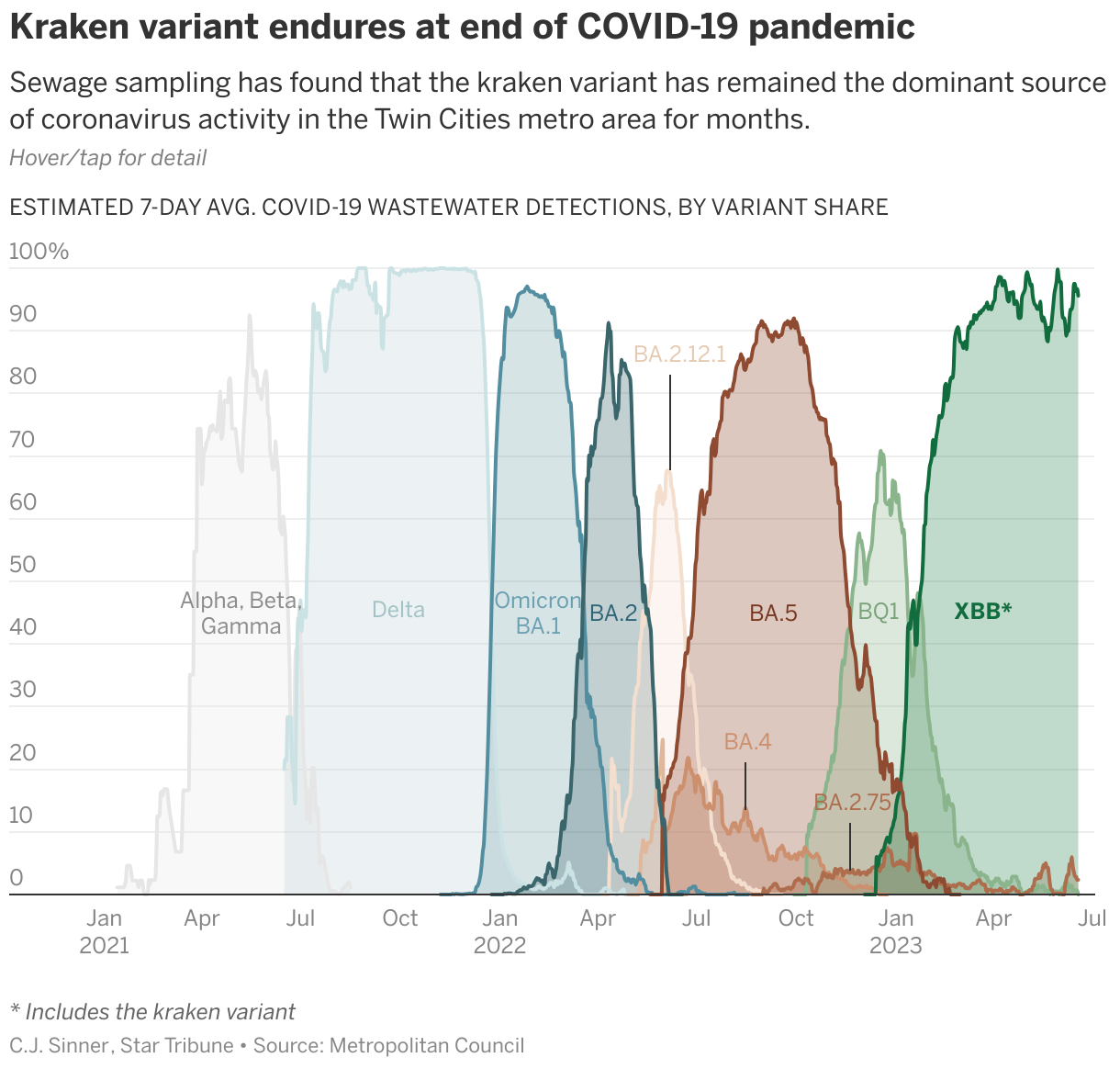
Two Datawrapper visualizations created by the Star Tribune Graphics and Data Visuals team. Visit the articles showing the COVID-19 chart, and the tilted 3D locator map with emoji in the labels to indicate change.
Do you have a guiding principle when working on visualizations?
A graphic should do one of two things. It should either pretty immediately convey to the reader the crux of the trend or issue or location at hand, OR be visually compelling enough to entice the reader to spend time with it, explore it, hover over it, engage with it, become more curious about the topic. Bonus points if it does both.
And what's your favorite Datawrapper feature?
Gotta be annotations. The addition of these over the years, with the ability to add bits of HTML and CSS, various styles of pointers, the ability to control what shows up on certain screen sizes, has allowed a level of polish and contextual information to our graphics that before was only achievable with ai2html.
We loved C.J.'s talk at Unwrapped! You can find her on X or LinkedIn, and see more of her work on her Star Tribune page. To learn more about the conference and other great speakers, visit our blog.


