Ana Bertol, Odd Data & Design Studio, about helping scientists make their data speak with Datawrapper


Ana Bertol from Odd Data & Design Studio spoke at our Unwrapped conference about "Helping scientists make their data speak with Datawrapper."
Ana is a data leader at Odd Data & Design Studio, a Spain- and Brazil-based information design studio. She holds a Doctorate in Physics and has experience as a data scientist and data translator. She has recently discovered her passion for Datawrapper while training researchers from various fields in data storytelling to drive change with their scientific discoveries.
Watch her talk here:
04:22 – Teamwork between scientists and communicators
05:36 – Doing science in Brazil
07:38 – The challenge
10:50 – Working in teams
13:05 – Process
14:59 – Another example
17:54 – Q: Data vis design systems?
20:10 – Q: Convincing scientists from the value of aesthetics?
Full transcript
Introduction
[00:00:04] Ana Bertol: I'm so happy to be presenting after Anna because she said a lot of the things I need people to understand. For those that are seeing the recording of this presentation, please go take a look at Anna Lombardi's presentation before, then come back. Today I'm going to talk about how at Odd Data & Design Studio we are helping scientists to make their data speak using Datawrapper.
And if you don't know any, if you haven't worked with any scientists yet, this is a typical scientist. They are really intelligent people. They have a lot of creativity, especially to solve problems. They are really good at discovering new ways of solving problems. And science requires a lot of dedication.
So they are the type of people that are going to sleep at the lab to create a vaccine or something like that. And I think the main thing about scientists is that they have a passion for learning, and that's why we always say that kids are born natural scientists. Because kids are born with this feeling, this passion to learn everything, and if you can keep this passion with you til you are a grown up, then probably you are going to be a scientist.
But they are not the best at communicating, especially if they need to communicate the results to other audiences, outside academia, and they can be the worst at data visualization. But you might be thinking, oh, this is not nice. She's making fun of scientists. They need our support. They need our love.
And she's making fun of her clients. But you are wrong. I am not making fun of my clients. I am making fun of myself. And I've been waiting for so long to make fun of my old charts. You have no idea. These are the charts from my dissertation. And, I think they could be worse, to be honest. At least they are in grayscale.
They could be using the full color palette of the software. These ones, those are also mine. Those are from my thesis. So let me introduce myself properly. My name is Ana. I'm from Brazil. I am a mother of a really brave and strong-willed three-year-old girl. I am a physicist. I have a doctorate in experimental atomic physics and 13 years of experience as a researcher.
But for the last few years I've been working as a data analyst, data scientist, data and science translator, and a data vis expert, because I can assure you that my data vis game has improved a lot in the last 10 years. This chart you are seeing is at least 10 years old. And my work is basically to bridge knowledge between scientists, designers, developers, and business people to help everybody work together.
And I need to say that even at the time, even 10 years ago, I was one of the best scientists at data visualization. And if you don't believe me, just take a look at my husband's charts. And I can make fun of him too. He allowed me. And I think that's why we get married, right? To make fun of each other. So what I'm really trying to say, jokes aside, is that communicating science, translating science, especially visually, to other people outside the scientific world, is really difficult.
It's not an easy task. It requires a lot of different expertises. And the researcher is going to bring to the table a lot of knowledge about the research. And this is a full time job, It requires everything they have to create the research, to make science. And they also understand how the results of their research impact different users.
Teamwork between scientists and communicators
[00:04:22] Ana Bertol: But they might not be the best communicators or the best at data visualization, and that's okay because nobody knows everything. So to efficiently communicate science, we need to gather a group of people, gather a team with different expertises. That's when translators and designers work together with researchers.
So a translator will be the person that is going to learn a lot about the research and about the data and how we can use this to create a communication, to tell a story, and how we can use this data to convey these messages into data visualizations. And the designers will be the persons that will be creating the final product; that will be creating the data visualization and understanding the needs of the users. So this is teamwork. This is not something for only one person to do or only a group of researchers to do. We need a lot of people, but in science we have budgets and sometimes it's not viable for the department to have a communication team, or for a research group to hire a team to communicate science in a specific project.
Doing science in Brazil
[00:05:36] Ana Bertol: I want to open a parenthesis here because, as I said, I'm from Brazil and I'm working with Brazilian scientists, mostly. You need to understand that we in Brazil, we do a lot of amazing science with almost no money, for you to have an idea.
Until 2022, the monthly payment for a doctorate student was approximately 400 euros a month, and this person wasn't allowed to have a second job to pay the bills. And in Brazil you have to have a master's degree to enroll in a doctorate program. So it's a person with a master's degree that is receiving 400 euros a month to survive.
And Brazil also allocates around 1.2 percent of its GDP to science, while countries like China, Germany, and the United States invest more than 3 percent. However, Brazil ranks 13th in the number of scientific articles published. This is huge. This is a lot. And also the University of Sao Paulo, that we call USP, ranks in position 85 in the world university ranking.
And one of the reasons that USP is considered to be one of the best universities in the world is because of their research program in nutrition. If you know nothing about Brazilian research, one thing you need to know is that this group, this nutritional research group of USP, was responsible for the classification of foods according to their processing level and the theory that consuming ultra- processed food is leading to the obesity epidemic that the world is facing and a lot of non communicable diseases that are in a rise.
So they are amazing.
The challenge
[00:07:38] Ana Bertol: And one of the research groups in this department of nutrition came to us with the challenge. Let's say the challenge. They have two months and less than 3,000 euros to build a website with interactive visualizations to be accessed by public health workers. And, as I said, it's not always viable to have or to hire a team to communicate science, especially in Brazil.
The researchers want to learn everything that we will do while we are doing, because after our partnership is done, they will need to keep the websites working. They will need to add information, because the research will keep going and continuing. It's their life's work, right?
So they need to understand what we are doing because maybe another time they won't have not even 3,000 euros to hire a team. So they want to learn everything. I said they have a passion for learning, right? But the thing about learning new stuff for everyone and anything, not only for data visualization, is that we have this learning curve, which is something like this.
In the beginning, we are going to learn a lot of new concepts. A lot of new things that we didn't even know existed. Until we reach a point when we can criticize and understand some of other people's choices about the subject. But if we won't apply, if we won't exercise this new knowledge, we are going to start forgetting stuff because we are not applying.
We only have another jump in knowledge when we start exercising and applying. Until you reach a point when you can finally apply. Not really well, but you understand everything and can do it by yourself. And then only after a lot of applying, learning from your mistakes, you are finally going to reach the level of knowledge when you can apply things well.
And the real problem is that usually the deadline of the scientific projects, working with us, is in this region. I hope you guys can see this shade. Their deadline is in this region when they are starting to forget things and they can understand some of our choices, but not all of them. And they are not yet applying the things they are learning.
So for this project, we needed a tool that was free of charge. Because money. That was easy to use because we didn't want to add another layer, another thing for them to learn. They are already learning a lot about data visualization and to convey messages using data visualization. And because of the same reason, we wanted a tool that didn't need many layout adjustments.
Otherwise, it would be another thing for them to learn. And these three restraints, let's say, were enough for me to choose Datawrapper for this project.
Working in teams
[00:10:50] Ana Bertol: But we also needed a tool that allowed us to co-work asynchronously and online. And I thought, just thought, that it was too good to be true. A tool that has this in the free plan.
So I didn't look in Datawrapper, if it had this option. I just went the full Brazilian way of solving problems. And I know this expression sometimes is used in a negative way, but I like to own this expression. Because to me it means that we will always find a way of making things work. Even if it's not ideal, even if we put a lot of work, a lot of effort into this, and even if in each step of the process, we will need to duplicate files and publish and send a new link and then work a little bit on a new file and send another file.
So even if this is the way, we are going to find a way. And I believe this is one of the reasons we can do such amazing science even with almost no budget.
Until I found out that there is this functionality, this feature in Datawrapper, which is called Teams, and in fact it's really easy to find. I'm not ashamed to show you this.
In the main menu, it's the second option, My Teams. There is a huge button, Create Team. You just click, choose a name, and then you can edit the settings of your team. You can add members and choose the role for each member of your team. And then you will have your archive with your shared folders. And every file in this folder can be edited by anyone in the team.
So working this way, we could fasten their learning curve because they were working together with us in the same file and practicing while they were understanding our choices. So our workflow was way easier than I was thinking it should be.
Process
[00:13:05] Ana Bertol: We started with an online meeting. The first half of the meeting was like a class. With data vis 101, a few concepts of data visualization for them to understand, what we were doing and why we were choosing the things we were choosing. And then the second half was applying these concepts in their story, their results, the things they are trying to tell people.
And then choosing chart options for their data. Then, our team created a draft of the visualizations. Their team uploaded the real data. Our team refined the layout, applying the visual identity that we defined for the project. Then we all co-worked on titles and comments, but asynchronously, until we reached the final version of the visualizations for the project.
And for you to have an idea, the scheme on the left that was created from scratch took our team more than 20 hours of work. Making a draft, sending them, receiving feedback, applying feedback, sending again and over again. 20 hours of working in one scheme. And the six visualizations on the right, there were interactive visualizations created with Datawrapper, took us less than 10 hours of work. Six visualizations.
They understood it so well that when I was preparing this presentation, I was going to pick the charts to put in the slides and I found out they created a lot more. Things that happened after we ended the project. So it was amazing and they were really beautiful.
But not only time and money, as I said, but also sustainability of the project.
Another example
[00:14:59] Ana Bertol: And so I want to give you a final example of a project that we haven't used Datawrapper for. It was a similar project, a science project. And we are translating a lot of information into 43 visualizations. And we decided to do it from scratch using a graphic design tool and not a tool like Datawrapper.
Because at the moment we chose the freedom to do any visualization we wanted over what now I understand is sustainability of the project. And it took us more than 100 hours and three professionals to create everything and I'm not complaining about the results. I really like these charts. I think they are uniform and they have a visual language and they are amazing.
But right after the end of our partnership they needed to add three more charts to the set. And they were at that point of the learning curve where they understood some of our choices. But since they haven't co-worked with us, they haven't applied that knowledge in choosing the same things. They didn't understand everything that we were choosing.
So what happened was a small difference. You can see the resemblance between what was our original map and the map they added. They really understood some of the choices, but they didn't even have the same tool to create things. So you can see that the font is different, the stroke, the line stroke of the states is different.
They kept the colors, but the color key of the map is a little bit different. It's in the same position, but a little bit different. And even in a bar chart, they tried to do the most similar they could, but maybe you can see that they kept the grid lines that maybe was a default option of the tool they are using.
If I would do this project again today, after the experience with the nutritional research group, I definitely would use Datawrapper. I definitely would choose sustainability over the freedom to do anything that I imagined. And that's why Datawrapper is now our go-to tool to not only help scientists make their data speak, but keep their data speaking when we are not working with them anymore.
And this means a lot in a team that is proud to be tool-agnostic, as we say. So thank you so much and you can reach me and reach us in any of these contexts. Thank you.
Q: Data vis design systems?
[00:17:54] Michi (host): Thank you, Ana, so much for that. It was a very gripping story, but also interesting to hear the sort of cultural differences, both within the science environment, but also in Brazil. We also had a bit of love for you, representing data visitors in Brazil in the comments from some of the watchers. We have quite a few questions here, actually. We have the first one from Annabelle, and they're asking, I'd be curious to know how Anna approaches scientists and acquires projects. Also, does her team create data viz design systems to help create, help scientists replicate styles and charts down the road?
[00:18:38] Ana Bertol: Yeah. Okay, let's begin with the last answer. Yes, we do. But as in the last example I gave, I think the tool plays an important role for them because it's really hard for them to apply a design system, if they are not using the same tool. Working with designers, I feel like designers think their work is really easy, that anybody can do what they do and they think, oh no, I will give you a design system and you can apply. And for scientists, this is terrible. You need to be born with this talent. It's not so easy to apply. So we do create, but we work a lot in methodologies to help scientists apply this in their work.
And how do we approach scientists and acquire projects, this is a tough question. We are working on this. All of our projects were from one scientist telling another scientist that we are a good team to work with.
It was one talking to another by now, but we were working on ways of making more scientists in Brazil know that we are a team that can support them to communicate science and to translate science.
Q: Convincing scientists from the value of aesthetics?
[00:20:10] Michi (host): Thank you. The next question from Mandy is actually somewhat related to that. Mandy says: Hi, Anna. How do you manage to convince scientists of the value of design aesthetics in communicating their work? In their experience, it is often not worth their time and resources, resulting in difficulty finding projects to work on.
[00:20:29] Ana Bertol: It really is. I think it's something that you need to show them. It's not just explaining. You need to show them the difference. You need to show them cases where they are not applying aesthetics and how this can lead to wrong interpretations of the data. So this is the best way of convincing them.
Otherwise, it really is common, this thought of, this is not enough, and this may make my science look less serious than it was. Yeah, this is really hard to work. But also I think we need to respect their needs. If they want something that looks more serious, that looks more simple, we need to understand this.
Reach this middle ground where they are comfortable with the things they are creating together with us. So co-creating is also something. If they understood why you are choosing this, and not because it's beautiful for someone, it's beautiful for other people. If they are co working with you, it becomes easier.
[00:21:48] Michi (host): I guess that's also where a lot of your translation work between these sort of stakeholders plays a big role.
[00:21:54] Ana Bertol: They trust me because physicists are the worst at this super hard science and stuff like that, so I know how to work. With health professionals, they are more like, oh, I want to do something beautiful. I want to talk with people that don't understand science. Especially because we are living in this moment where people are disbelieving in science, and there is this importance of making people like scientists again and believe in science. Some of them are harder to work than others.
[00:22:28] Michi (host): Yeah, Val Robbins adds the comment that what you do helps expand the audience for the scientists and makes them more accessible to people outside of the scientific community. Do you have some comments on that?
[00:22:42] Ana Bertol: That's the main goal: to make a lot of people understand science. This is really important.
[00:22:48] Michi (host): I think that's a really great note to end on. And I thank you so much for the presentation and your time, also for fielding the
[00:22:54] Ana Bertol: Thank you.
[00:22:54] Michi (host): like that. I hope you'll stick around for the rest of the conference.
We asked Ana some additional questions:
Ana, what did you talk about?
Scientists, how can you not love them? Their curiosity, passion, intelligence... and dreadful data visualizations. Don't worry: 13 years as a researcher and 6 more in dataviz allow me this kind of joke. But how can we assist them in communicating their research to broader audiences without burdening them with learning another expertise? Well, with Datawrapper’s foolproof charts.
If I would do this project again today [...], I definitely would use Datawrapper. I would choose sustainability over the freedom to do anything that I imagined. And that's why Datawrapper is now our go-to tool to help scientists make their data speak. Ana Bertol, in minute 17:08 of her talk at Unwrapped 2024
In the knowledge translation project with the nutrition research group at the University of São Paulo (USP), Brazil, Datawrapper was crucial in training researchers to create beautiful, clear, and engaging visualizations tailored for their target audience. Through the team functionality, we were able to combine our graphic design and data storytelling expertise with the researchers' knowledge, working iteratively and accelerating their learning curve while still co-creating. You can learn more about the project in Portuguese here.
Which Datawrapper visualization are you most proud of?
The visualization below was built together with a research team from USP Brazil. It shows the decline in beans and fruit consumption, while other less-healthy ultra-processed foods are experiencing a rise:
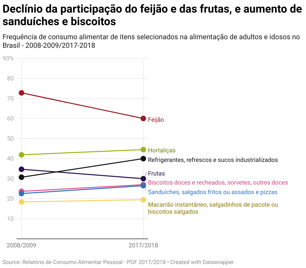
I like this visualization because it demonstrates the versatility of Datawrapper. Slope charts are not a predefined chart type, but they can easily be created using line charts. This chart is part of this data story (in Portugese) about the importance of monitoring the nutritional habits of the population in the public health system.
Why are you using Datawrapper for teaching?
Teaching data visualization often faces the tool barrier: the beginner thinks that everything you are teaching is either talent or tool-dependent, thus is far from their reach. When we start teaching a lot of tips about labels, titles, annotations, grid lines, they just feel like it's something impossible. With Datawrapper, I can focus on teaching them how the same dataset can tell different stories with different choices and use Datawrapper as an easy tool for them to test these choices, regardless of other design options that can overwhelm them: font size, title position, margins, and more.
What's your favorite Datawrapper feature?
Annotations, without a doubt. I love the power of text and visual annotations on charts, and this is one of the main tips I give beginning practitioners. Datawrapper is probably the easiest tool to add many types of annotations, in a way that is always beautiful and adaptable to different screens. Screen adaptability is also one of my favorites!
What's your guiding principle when working on data visualizations?
As someone with a more technical background, I tend to dive into the data and focus on what it allows me to do (or not). However, this is not the most important thing when creating a data visualization: the message is. So, one approach I've been trying to apply is to explicitly write a phrase that can substitute the chart – something like an alt text. Visually representing this message becomes the success metric of my data visualization.
We really enjoyed Ana's talk at Unwrapped! You can find more about her on LinkedIn, and learn about Odd Studio on Instagram or their website. To read more about Unwrapped and other great speakers, visit our blog.


