Taylor Bednarz, Maricopa County, about rapid deploying of a COVID-19 vaccine data webpage


Taylor Bednarz from the Maricopa County Department of Public Health (a county in Arizona, USA) spoke at our Unwrapped conference about "Rapid deployment of a public COVID-19 vaccine data webpage using Datawrapper."
Taylor Bednarz is the senior data visualization epidemiologist with the Maricopa County Department of Public Health. Focused on building data viz capacity within the department, Taylor spends most of their days developing trainings, compiling resources, or consulting on projects. Taylor helped to update, streamline, and improve the County's public COVID-19 vaccine data webpage using Datawrapper.
Watch their talk here:
01:20 – History of the COVID 19 vaccine page
05:18 – Adding buttons to Datawrapper charts
07:01 – Using benchmarks in charts
08:47 – Lessons learned
09:59 – Q: Designing for different stakeholders?
11:34 – Q: Feedback?
12:19 – Q: Transferring knowledge?
Full transcript
[00:00:04] Taylor Bednarz: Hi everyone, and good morning from Phoenix, Arizona. I'm Taylor Bednarz. As Michi said, I am the Senior Data Visualization Epidemiologist with the Maricopa County Department of Public Health, and I'm here today to talk to you about the rapid deployment of a public COVID 19 vaccine data webpage using Datawrapper.
And I really want to thank Matthew for that fantastic primer, because I think it will tie into this presentation very well. A lot of the same concerns about data in government. So moving on, just a little bit of background about us. So Maricopa County is located in the state of Arizona, which sits to the east of California along the U. S. Mexico border. And we have about four and a half million residents, which makes us the third largest health jurisdiction in the United States. And we were one of the first jurisdictions in the United States to identify a case of SARS-CoV-2. And by March of 2020, COVID had overwhelmed our local health resources, just like it had many other places around the country and around the world. We had a significant number of staff members assigned to additional duties, supporting the response, which strained our overall operational capacity for an extended period of time. There we go.
History of the COVID-19 vaccine page
[00:01:20] Taylor Bednarz: But in December of 2020, the first COVID-19 vaccines were authorized for emergency use, which gave us a new type of data to track in this response, vaccination data. So almost as soon as the first doses of the COVID-19 vaccines arrived, we began receiving questions about vaccine uptake from both partners and the public.
We knew we had an important responsibility to provide transparency on the local rollout of the COVID-19 vaccine, so we sought a way to share this vaccine administration data publicly, so we could reassure our community that the vaccine was getting out to those who were most at risk for severe disease.
And so we developed the COVID-19 vaccine public data webpage, so that we could share this data with our community. And we chose Datawrapper because it allowed us to quickly and easily create beautiful visualizations, especially when we did not have a lot of time on our hands.
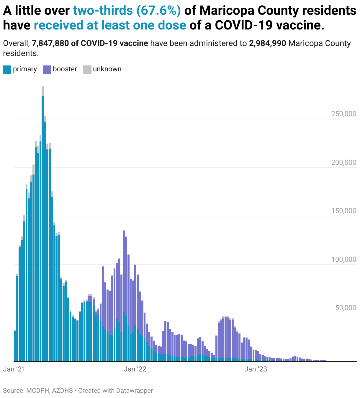
So here's a little snapshot of the first iteration of our COVID-19 vaccine data webpage. We'll walk through the figures as quickly as users would've seen scrolling through the page. We created a bar chart showing the number of vaccine doses administered overall and by dose type. We also shared these data in a donut chart showing the proportion of doses administered by dose type. And as well as a stacked column chart showing the number of doses administered, over time, by dose type.
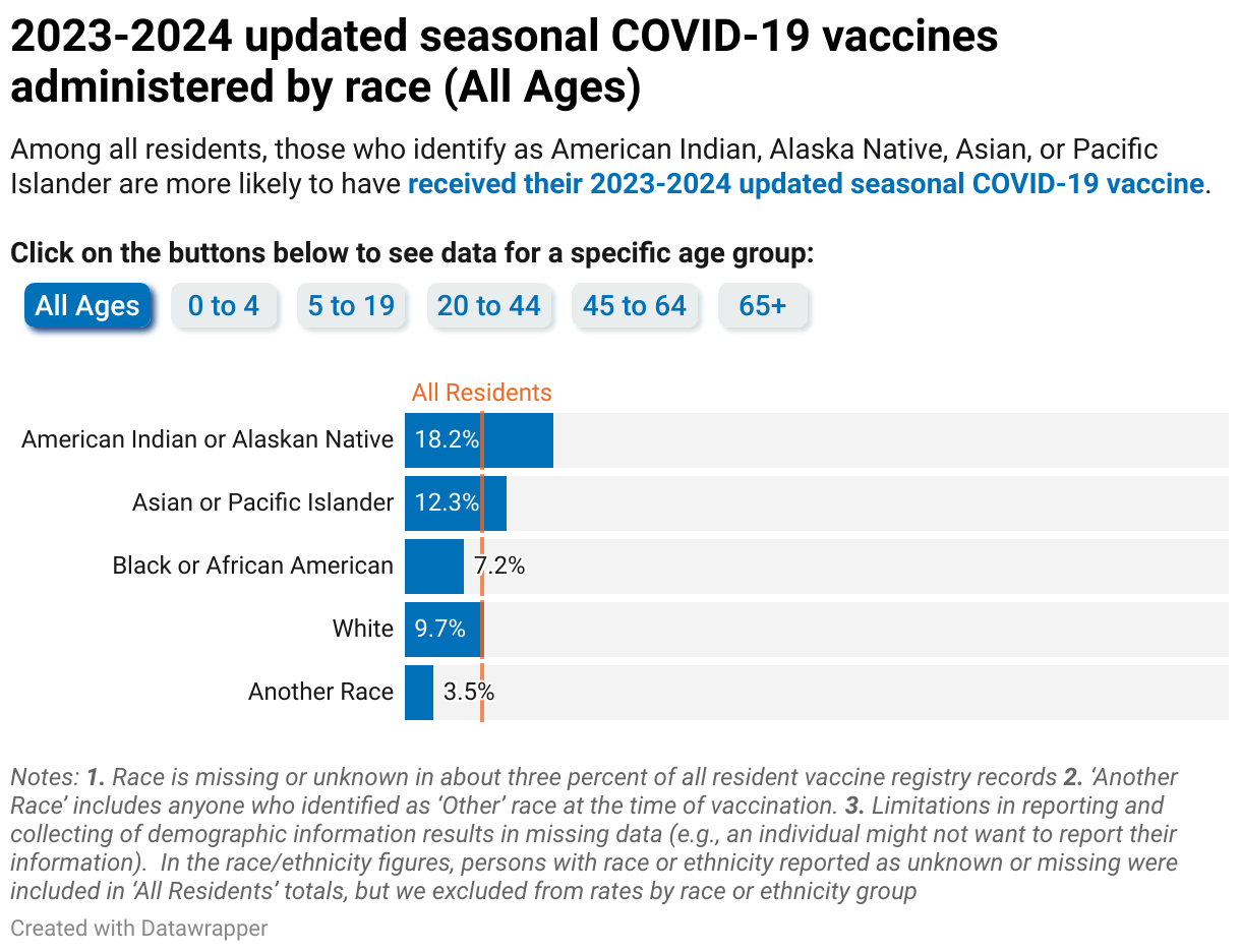
We use split bars to show demographic breakdowns of the vaccinated population, including by sex, by age, by race, and by ethnicity. And what was so great is that Datawrapper charts were easy to share on social media, and so we were able to get this data back out into the community, not just on our website, but pushed out through more avenues, which prompted further public discussion and engagement with the data.
So these figures were updated in March of 2021 because, as many of us remember from COVID, things were constantly changing. And so this first update was to include the newly authorized one-dose vaccine series, as previously every vaccination series required two doses, all the approved ones at that point.
And then again, we updated these figures in August of 2021, when a third dose was recommended of the mRNA vaccine series for immunocompromised individuals. Like Matthew was saying, the adaptability here was a really important feature for us. We updated all our other relevant figures to include these newly approved dose types, including the donut chart and our stacked bar chart.
We also added a chart showing overall daily doses administered and a seven-day rolling average in our version 1. 2. And we followed that how to combine line and bar charts tutorial in the Datawrapper Academy to make this line chart. And we started adding annotations in here to add a little context around data lag times and label our data.
Things were constantly changing. They never stopped during the COVID pandemic. In September of 2022, the CDC updated their recommendations, requiring a booster dose for individuals who completed their primary series at least one year prior to be considered up to date on COVID-19 vaccination. We posted a disclaimer on the webpage temporarily as we went through and updated all the figures to align with new CDC recommendations.
And once again, I'll walk you through how these figures would have appeared on our version two of the page. So we added an election donut so you could really quickly see what percent of our population was up to date. And we also added some HTML formatting for the text in our titles and descriptions so that we could reinforce some of our data legends throughout the visualizations.
We also updated the stacked column chart to show primary versus booster doses instead of those series that we showed in the first place.
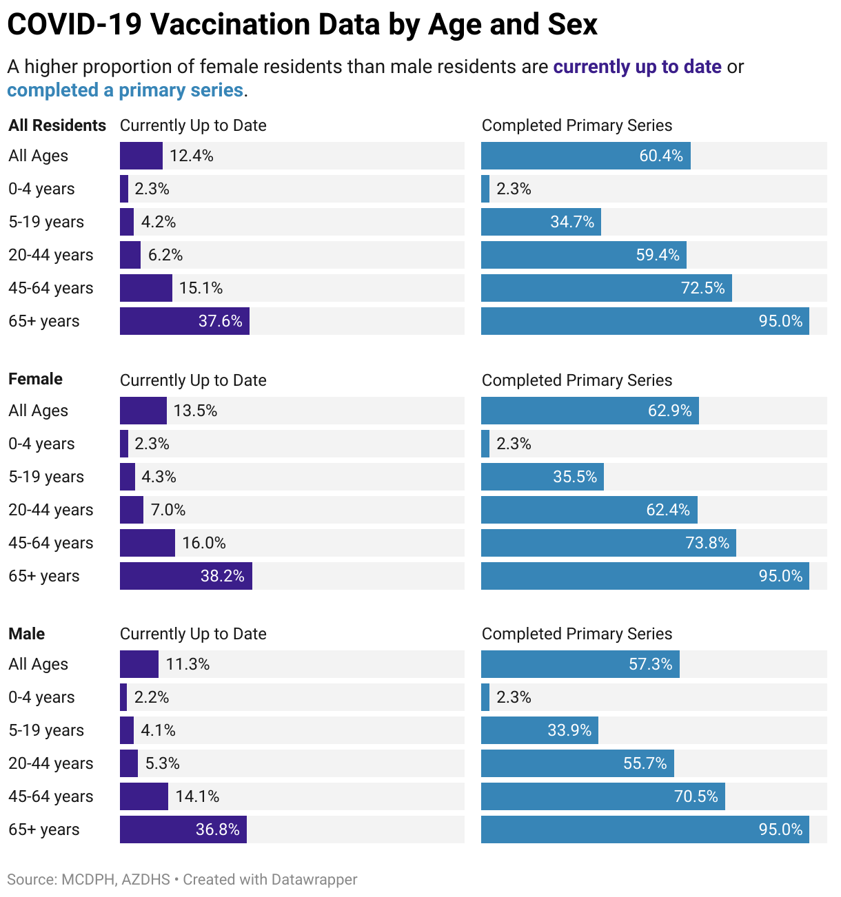
And we also used the split bars to display the proportion of the population who are currently up to date with recommended doses, side by side with those who have ever completed a vaccination series. And as you'll see, we use that HTML text formatting to reinforce those legend colors throughout all the applicable figures.
Adding buttons to Datawrapper charts
[00:05:18] Taylor Bednarz: We also used the split bars to show the same data by race and ethnicity, and we followed the How to Add Tabs and Dropdowns Datawrapper Academy tutorial to add HTML buttons, allowing users to view the racial or ethnic breakdown for specific age groups, which I'm going to try and demonstrate for you now.
So this is a demo of how those buttons work. So here we could click on that 5 to 19 group if we wanted to know what was going on with school-age kids. And we'll see a breakdown of that data just for those ages 5 to 19. And we can always go back to our all ages here.
And while it looks like it's just one figure, each of these is a separate figure, as you can see in that tutorial. And so we update six different charts, like Matthew was talking about in New York, for that interactivity. We use a similar feature here with six separate editions, one for each age group that we want to feature. So, jumping back into our presentation. Like I said, each button links to a different page, and here I wanted to give you an example of some of the HTML code that we actually used for those. So we've tweaked a little bit, it's not exactly everything that you would find in that tutorial.
So here's some little snippets of how we applied the colors in the description, made space, and instructions for those buttons, and then actually added each linked-in view button. We actually updated the style a little bit. You can see there's a little shadow and some other fancy HTML features we played around with on the second edition for continuous quality improvement.
And the really special thing about these is that they're set to fill that container when you open that link. So it won't link you out, it'll just replace the chart you're looking at, which is a really neat feature that makes it look like just one chart.
Using benchmarks in charts
[00:07:01] Taylor Bednarz: So, in 2023, the CDC again updated their COVID-19 vaccination guidelines, now recommending that most people get an updated booster dose for the current respiratory virus season.
We updated our figures to only display the proportion of the population currently up to date with this guidance, since that original vaccination series is deprioritized now as we have new vaccine formulas. And this iteration is still live, so I'm going to try and demo this live version for you as well. There we go. So as you can see, we have that election donut here that we updated with our percent of the population up to date with a current seasonal booster, and then we used the split bars here to combine that age and gender data. I believe it's sex here, not gender, sorry, misspoke. And then because we didn't need those comparisons of the primary series and currently up-to-date groups, we were actually able to replace that all residents comparison bar, that you can see we have an all groups comparison bar up here, with a line, which made it a little more easy to compare.
We actually used the overlay to create this pseudo benchmark line. So it's easier to compare each individual group to the overall average for all groups. Popping one last time back into the presentation. Here's a little snapshot of just how we use that overlay to create that kind of benchmark line.
So we just added the overall vaccination rate for that age group as a second column with the same data in each row for each age group chart, so that when you actually apply the overlay, they all line up on the same data point and it creates the illusion of that solid benchmark line.\
Lessons learned
[00:08:47] Taylor Bednarz: So that's where we are today, and luckily, we learned a few things from our experience.
We learned that no data viz tool is one size fits all, and sometimes different tools are needed for different tasks, especially when things are changing so quickly, and need constant adjustment. Datawrapper is a really useful tool for creating both beautiful and accessible visualizations when resources are spread thin, and in our case, Datawrapper helped us rapidly increase our data visualization capacity during the COVID 19 pandemic due to that accessibility and ease of use. Of course, before I go, I'd like to take a moment to thank everyone who contributed to this project. It takes a village, of course, and they were recognized by many outside of our department. As well we have local news affiliates, local public health association chairs calling out our visuals on Twitter, which was really great to see that we were delivering what our community wanted to see.
And I'm just throwing my information up here. If you have any questions or want a copy of any of those code snippets, here's my email. And I just want to thank you all for taking the time to talk with me today.
Q: Designing for different stakeholders?
[00:09:59] Michi (host): Taylor, thank you so much for the insight into how things went during that wild time in Maricopa County. I do have a question for you, actually. Watching that and seeing as you were walking through the webpage and also understanding that it is a webpage for I guess the broad public. But it's going to be used presumably by all sorts of different stakeholders, I'm left curious how that process of kind of thinking about your stakeholders, having those discussions internally about how you communicate, for which audience, and how do you, yeah. I guess I don't know if that's making sense, but…
[00:10:36] Taylor Bednarz: Yes, I think I know what you're asking. This, it's a constant issue we've run into, honestly, where we have a limited amount of time or space to produce this kind of work, and we're trying to get the biggest bang for our buck. And so we do have resources to direct internal efforts to track this more granularly on the internal level.
And sometimes we will share some of that data or create reports for partners that want to target their interventions. But then we also want to have a place for the people who don't know who to ask, who to come to, the students, whoever's doing research, to be able to access it.
So we do try and make it really broad appeal. We try to thread the needle where there's some features of it that might be a little too much for the public. They might not be interested. But we try and just make sure that's lower down on the page. And the simpler donut chart of just how many people are up to date with their vaccination is right up at the top.
And so we try and stagger it that way so we can reach the broadest audience when we don't have a lot of resources to work with.
Q: Feedback?
[00:11:34] Michi (host): Did you ever get feedback? You shared a sort of screenshot from Twitter, but beyond that sort of feedback on how receptive stakeholders were or are to the data visualizations that you're putting together and presenting?
[00:11:49] Taylor Bednarz: Yeah, I think we've had really fantastic feedback across the board. We have made a more conscious effort. We were already starting this process pre-COVID. And COVID set us back a little bit of being more intentional with our data storytelling and making sure our data is accessible to the public.
And so that's something we've been working through more and just coming up with creative ways of how to make one dashboard that might work for two different audiences, but just figuring out how to set it up so that the public's going to get what they need. And your partners are also going to be able to dig in and get what they need.
Q: Transferring knowledge?
[00:12:19] Michi (host): I guess on that question of transferability. By no means is this something in the past, but looking forward and maybe also since then, to what extent have you been able to transfer sort of the learnings from this and also the framework and even just generally the structure into other contexts, if at all? Were they more receptive to that now that sort of you have a proven dashboard in Datawrapper?
[00:12:47] Taylor Bednarz: Yeah, absolutely. I think that it's just made data vis seem more accessible to our employees, which is really great. There are so many people who are just overwhelmed at the idea of trying to create a visualization from scratch, and really showing them that it's easy. You can walk through it step by step, and you can create a really beautiful, powerful visualization without spending a month reading 10 books on it.
[00:13:10] Michi (host): Thank you for being with us today, presenting and giving us some insight into sort of the inner workings at Maricopa County.
We asked Taylor a few questions before their talk:
Taylor, what will you talk about?
During the COVID-19 pandemic, providing accurate and timely data to the public was essential for building trust within the community. Using Datawrapper’s standard charts, annotations, and overlays, along with a bit of HTML, Maricopa County Department of Public Health (MCDPH) rapidly deployed a COVID-19 Vaccine Data webpage reporting immunization uptake among Maricopa County residents overall and by sex, age, race, and ethnicity. MCDPH will share how Datawrapper made it easy to adapt visualizations and create several iterations of the webpage to better suit community needs over time.
Datawrapper is a really useful tool for creating both beautiful and accessible visualizations when resources are spread thin, and in our case, Datawrapper helped us rapidly increase our data visualization capacity during the COVID-19 pandemic. Taylor Bednarz, Maricopa County, in minute 9:06 of their talk at Unwrapped 2024
Why did you start using Datawrapper?
In the past, we crafted nearly all our visualizations in Excel. When the COVID-19 vaccine became available, we knew we would need to provide accurate and timely data to address questions about vaccine uptake. We sought a less resource-intensive way to share these data with the public. Enter Datawrapper.
What was so great is that Datawrapper charts were easy to share on social media, and so we were able to get this data back out into the community. Taylor Bednarz, Maricopa County, in minute 2:47 of their talk at Unwrapped 2024
When do you use Datawrapper?
I recommend Datawrapper whenever my colleagues need to create crisp, clean visualizations in a hurry. It’s an excellent tool for analyses, as you can quickly see the shape of your data in a variety of layouts. I find Datawrapper to be particularly useful for staff to build confidence in their data viz capacity as they can create beautiful visualizations with just a few clicks.
What's your guiding principle when working on data visualizations?
My personal mission in data viz is to break down the barriers between the data and the people. This is one of the reasons I love using Datawrapper – I can easily create, share, and collaborate on visualizations without needing an expensive license or extensive training. Features offered by Datawrapper, such as in-chart annotations and HTML text formatting, allow us to provide more context that can help people interpret our data.
We loved Taylor's talk at Unwrapped! You can find more about them on LinkedIn. To learn more about Unwrapped and hear other great speakers, visit our blog.


