Philipp David Pries, IPPEN.MEDIA, about exploring new territories in locator maps


Philipp David Pries from IPPEN.MEDIA spoke at our Unwrapped conference about "Locator Maps: Exploring new territories." If you want to take your locator map creation skills one step further, watching this talk is a great place to start.
Philipp created his first Datawrapper chart, about turtles, ten years ago. Since then he has steadily increased not only his positive feelings towards this animal species, but also his love for diverse data visualizations. Philipp now leads a five-person data journalism team at IPPEN.MEDIA, one of the largest German publishers including publications such as Frankfurter Rundschau and Münchner Merkur. Map data projects of all kinds are his greatest passion. When his team recently created a map based on a new turtle-related data set, he experienced a sort of full-circle moment.
Watch his talk here:
03:17 – Improving markers
06:33 – Mini charts in locator maps
11:18 – Map keys directly on the map
14:37 – Combining Datawrapper with QGIS
16:28 – Bringing raster data into locator maps
19:48 – Bringing 2,000 points into locator maps
23:12 – Maps as infographics
25:10 – 5 tips for your next locator maps
28:32 – Q: Reducing the size of GeoJSON files?
30:36 – Q: Code for the shown examples?
31:08 – Q: Using the Datawrapper API?
32:32 – Q: Balancing beauty and time pressure?
Full transcript
[00:00:04] Philipp David Pries: So, very much welcome to my talk about locator maps and about exploring new territories, how I called it. So this is not a keynote or something, but I want to show you six maps, like six projects and six hacks, how we tried to achieve it or we really achieved it.
First, some words about me: I'm Philipp, a German data vis specialist based in Munich. And I work for IPPEN Media, which is one of the biggest German networks of publications. The Germans might know the Munich Merkur, or the tz, or the Frankfurter Rundschau. And the international audience might know, Buzzfeed Germany.
Yeah, let's just begin. And a bit more about me and my team a bit later. So, the question is, what am I talking about? And the answer is, let's talk
about six maps and hacks, in the next minutes. And I really want to invite you to a bit of a journey, to locator maps a bit beyond the horizon. The first is about markers and how to improve them. The second is about integrating mini charts for more context to your map. The third is better map keys or more beautiful map keys. The fourth is from raster to vector map into locator map. The fifth hack is about grid maps. And the last thing I want to talk about is maps as infographics.
And first of all, one word about who is talking to you right now. I'm a journalist, great. And what's more about me, just a very bit. So I thought what could explain me and my team better when it's all about locator maps? And the answer is to show it on the locator map.
And so this is me and my fantastic team. Shout out at this place, to the data journalism team in Munich. We are in the middle of Bavaria, Germany. And our office is between the Oktoberfest, which is all about beer, and the Hofbräuhaus, which is all about beer. And we are somewhere in the middle. But, yeah, our drug is not beer, but our drug is data. And we really love to work with Datawrapper and locator maps, and trying to push the borders. So if you're in Munich, just come along.
Okay, so this is about the data journalism team, and now we just dive into the first example,
Improving markers
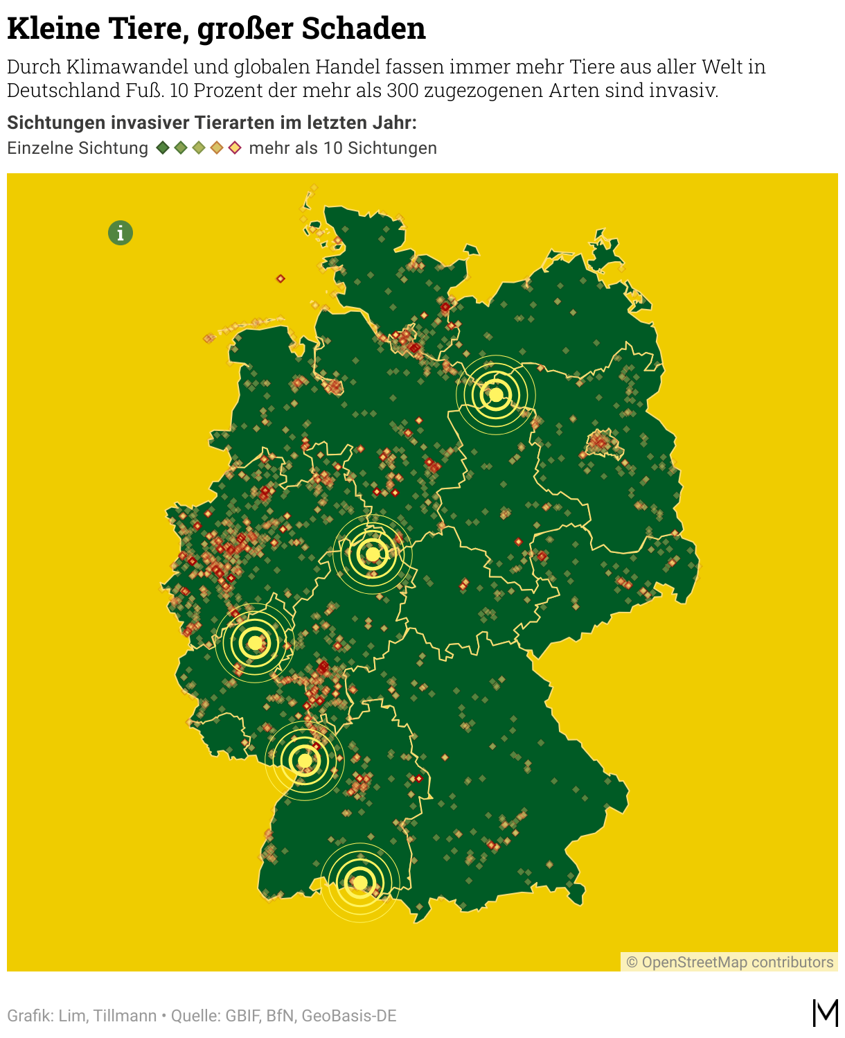
[00:03:17] Philipp David Pries: My first example will be the one about invasive species and how we achieved it. So the first example you see here on the right. I will always show the result of our work, and then we will go through some steps on how we made it possible. So on the right side, you see a locator map, which is about invasive species, which crowded through Germany.
And this we wanted to show on a data visualization. And the thing was, we had some kind of interactivity, which we wanted to highlight because people often don't grasp the point that there is some additional interactivity. And the second thing is that we wanted to show a bit more data transparency in this case, but we don't want to let the text flood all over the data vis.
And so it's not that the map doesn't have any place anymore, space anymore. And this is what we did with the info button on the left top side. And on the top down side, you can see this call to action, which says, "Click me for more information”, to give some call to action feature on this site.
And this is how we did it. First of all, we host the hand and the info image asset for ourselves. So we don't use the Datawrapper icons here, but we use our own design ones, and host it on the public server. And therefore, we are able to integrate it into a Datawrapper.
The second thing is, we use a new marker with opacity zero. So it's not visible, but it still works so that you can hover over it.
And the second thing is some HTML and CSS code to make it possible. And how this works in reality is a small snippet on the next slide. So here on the left, you see the text field code. Don't blame us, we are not front-end developers at all, if it's not a perfect snooki, but it really works. And the middle is about the tooltip field. So these are the two fields within the Datawrapper marker, and you were able to customize code here in fantastic ways. We'll show you more later. And the result is you can hover over this info button here, how we call it, or info marker. And you get additional information, additional insights, something we want to tell the interested readers, about the locator map on the first interaction.
Mini charts in locator maps
[00:06:33] Philipp David Pries: Okay, so this was the first example and now we are just on the second map and the second hack. And this has been one chart about the people in the Hamas-Israel war. And the challenge was to give more insight about how the people live there and how many people live in a special place and grasp a bit of insight about what's about this terror-prone region in this kind.
And we ended up that it's not enough to just show one map. We, we needed more. And this is why we utilized what we always call a mini chart. And you see it here at the bottom of the data visualization. So you see here, it reads, "Where the people in this region really live". And we show bar charts and some figures about the three countries on the map with some more context. And a bit more context assisting the main map approach is something we find very crucial. Because our maps are always embedded in lots of articles about Israel, for example, and the data visualization must give enough context on its own. So even if you don't have two or three other visualizations in place.
And how did we do it? First of all, it's very important to identify the data or visual idea to support the map. And our answer was here: you show on the bar chart. The second is that you utilize the notes field for custom code within Datawrapper. So the usual note fields, which are usually used for additional text or something. And you can, inside, insert or hijack HTML and CSS, and yes, lots of it. So here, it's quite a bit of code as you see, but the result is we have a small sneaky mini chart about the Israel war.
And on the next page, you see some more mini charts we already produced. So they are always at the bottom of the main map. And they also give more context or try to give more context for the main map. For example, you have here something on the left side, a chart within the chart, so to say. We have a ranking. We have something about forest fires, wildfires, and the comparison. And some more ranking.
And this is just with Datawrapper. This is only Datawrapper, just with HTML and CSS. It can result in something which is a small front-end project, so to say. I'll show you on the next slide. So on the top right, you see the mini chart showing how it resulted in the end. So it's about coups in Africa and when they have been successful and when not.
And you see the source code. In Datawrapper, it works fine. It works fast. You just have to build up like your library and have an idea of the visual idea, what your goal of this mini chart shall be. And then you can make wonderful, nice - at least I find them beautiful, and hopefully insightful - to enrich and contextualize your map with these mini charts.
Map keys directly on the map
[00:11:18] Philipp David Pries: This has been mini charts, and now we are on the third map hack. And the third map hack I want to talk about is about map keys. In a lot of cases, the default Datawrapper map keys are great. And in some, we have the feeling we need a more customized approach. An approach that is more related to the key map matrix.
And you see two examples on this slide. And the first one on the left side is about the renovation of German railway in the next years. And each year has a specific color code. And this is what we already coded with HTML and CSS to make this possible for this data visualization.
And on the right side, you see something about the flood in Germany at the beginning of this year. And we customized this map key to make the insight more graspable for all the readers.
One advantage is that you can integrate the map key inside the core map, like the main map. And therefore you have more space for it. Yeah. You don't need like space on the top or below the map or something, but you can really use parts of the map, which just would be gray or not insightful, and use this space for your key map metrics and therefore your better map key.
And these are two examples of map keys from me and my team in the last month. And I want to show you some more on the next page. So here you see a protest map with weeks of protest on the left side, coded with different colors. And two smaller examples, which is about the gender pay gap from 4 percent to 22%, and this third example is about this invasive species again.
And this is also just CSS and HTML. And is our approach to customize map keys. We don't code it from scratch for each map key, but we have something like a code library right now. So we can use them over and over and again, and just customize it after we build it once. And so these are map keys.
Combining Datawrapper with QGIS
[00:14:37] Philipp David Pries: This is my transition slide when it comes to the next. Because, right now we talked about three maps and hacks that were improving the map components. We talked about markers and how to improve them with buttons. We talked about the mini charts for more context to your web visualization. And third, we talked about the map keys, which are also assisting the main insight of the map.
And now we're here because we really love locator maps and we also wanted and still want to push the borders when it comes to the main map. So, really, the main map storytelling is in locator maps. And this is what this slide is all about. Because for us, it works with a combination of Datawrapper and a bit of map preprocessing. Which sounds complicated, but it must not be complicated at all.
I will show in the next slides. So this is called QGIS and other map processing tools like Mapshaper and the mentioned geojson.io. And I want to show you what is possible beyond the classic locator map functionality.
Bringing raster data into locator maps
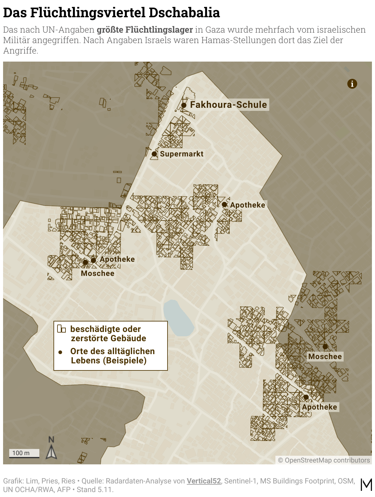
[00:16:28] Philipp David Pries: And so we just start with the first example. This fourth data visualization is about the flood in Libya. And you see here on the right side, it shows the precipitation in liters which took place in Libya at a certain time. And we wanted to show you, the readers, and give the feeling about what it's all about, this event. And the challenge was that this data often comes with satellite data from NASA and Copernicus and European institutions and stuff like that. And this is a raster image and raster data. And of course, you cannot import raster data in locator maps. It just says, Hey, please give me a vector and or a GeoJSON or something I can cope with. That's completely fine. I know why. And so our challenge is to convert this raster image into something Datawrapper likes and locator maps like and is able to display it.
And this is how we did it. First, we obtained the raster satellite data. In this case from NASA; can be other sources. And then you mainly use a function which is called Raster to Vector. And therefore you're able to have this raster image, like a TIFF, and make some pre- processing, like saying, okay, the black squares mean high precipitation, and the gray mean lower precipitation, kind of this. And you convert it into layers, into seven layers. The map you see here on the right consists of seven layers. And if you converted it into these GeoJSONs, you're able to style it with Datawrapper. And then you have a wonderful locator map above this flood in Libya. I show a bit more about it here, like behind the scenes. On the very left, you see a traditional raster image. You can just download from a lot of sources. In the middle, you see the vectorized image, like you see the different precipitation zones, we converted with QGIS in this case. And on the right side, you see the area markers which we imported. So for every precipitation zone, one locator map marker. And afterwards we styled it. And the result is this Libya map. So great way for storytelling when it comes to a specific scope of data.
Bringing 2,000 points into locator maps
[00:19:48] Philipp David Pries: So next is grid maps. This is my fifth example. And you see here on the right side, boom of barbershops and treats. So we wanted to display the occurrence and the existence of barbershops in Germany as a boom, because it's much more than before. You see my beard here. It's barbershop made, hopefully. And our approach was to display the barbershops in Germany. And after we analyzed the data, we had, I think, 2,000 coordinates. Yeah, single markers. And as you know, with locator maps, you cannot import more than 100. So it was virtually impossible to get them into a locator map. But we wanted to show the barbershop boom with locator maps.
And therefore our challenge was to display it. And we wanted to display it with a better representation than administrative districts. Because there are small German cities, there are big German cities. We have big districts and stuff like that. You lose some focus in this special case, at least, when you try to a choropleth map of German districts. And this is why we tried the approach with a gridmap, and this is what I want to show you now.
The first thing is, we imported a white base map. So this is our custom approach. This is just a GeoJSON covering the whole world that makes the rest of the base map just invisible. And therefore, you just see nothing in the first hand, and then you can apply other maps. And the second thing is, of course, I cannot go in very much detail here right now, but you join the coordinates of these 2,000 barbershops with grid map data. And afterwards, for every category, you have one marker again, and import it into the locator map. And then you have a grid map within a locator map.
There are three small pains. I want to be transparent at this point. There's a small distortion, which resides to the coordinate reference system. It's fine for Germany, we think, but it doesn't really work when you get too close and too much detail on this.
And the file size, I think, is more than one megabyte. And of course, this can be so much of a topic if you must be really important. But these are grid maps. The result, I'm very happy with, and you're able to do storytelling with a different approach.
Maps as infographics
[00:23:13] Philipp David Pries: So my last example is about maps as infographics. And you may be a bit shocked of this, because of course this is not our real world. But this is a customized do-it-yourself world, because this is a QGIS screenshot, and you see some European countries we just applied on this map. And why do we do such a thing? You see on the next map. Because here you see another example of these maps as infographics. We had a project to display the seven kingdoms, like seven Royal houses in Europe. And the challenge was that just using a usual choropleth map would not be fine because they are very far away from each other. You would have lots of space unused and we just really want to have focus on this. And therefore, we customized here still this white base map workflow again. And then we created a new QGIS layer. And therefore, we arranged the countries as shown here on a QGIS map. And we styled it, and this is the result in the end. So we customize maps here that we can use as infographics because we, we think it suits the message best here.
5 tips for your next locator maps
[00:25:10] Philipp David Pries: So just coming to the end. And a quick start. We talked about six maps and hacks, like on the big picture. And I want to, don't want to leave you behind with some tips for a quick start at this point. And these are five things. If you now think, okay, locator maps are cool, I knew that, but it can be even cooler a bit. And how you just could go out of the office right now or your home, or stay at home and take your MacBook, and just start with your next locator map project. And these would be my quick start tips for your next locator maps.
First, find a place to self-host your image and icon assets. As you know, right now, it's not possible to customize them. Would be a nice feature request, looking at you, Datawrapper team. Love from this site. And, from now it works fine for us if you find a public web server or your own web server and host your icons and your images yourself. And it can make your maps better from the first second onwards.
The second tip is mini charts. Why not find an approach to enrich your map data with some visual nuggets or patterns?
The third is not a no-brainer, even after one year: use AI and GPT-4, especially the OpenAI Plus code interpreter plugin is extremely good in front-end coding. And even if you're not a front-end coder and we are not front-end coders at all, you're able to code your own HTML and CSS projects, and bring all your visual ideas to life within Datawrapper.
The fourth would be QGIS, or other geodata tools. If you want to support some map ideas, you need a bit of map pre-processing. And this would be my first approach. Other tools, always just free and open source, to just start.
And "just start" is maybe the most important next step. Start small, because even minor improvements like map keys can already boost your map.
So, coming now to the end. Thank you very much. Hopefully, I was able to provide some tips and insights about how we produce and make locator maps. And so now thank you very much and happy hacking with Locator maps.
Q: Reducing the size of GeoJSON files?
[00:28:32] Lisa (host): Thank you so much, Philipp, that was super interesting to see. And I believe the audience really liked your maps, too. We had some good comments here. People really liked the mini charts. And everybody thought it was amazing. We do have some questions from the audience. Demonik Rod wants to know: What tools do you use to reduce the size of the your GeoJSON files?
[00:28:58] Philipp David Pries: There are several approaches. The easiest one is just using MapShaper, which is a free software tool and a web tool. It's called simplifying. And you just click through the scale of simplification. And you really see the result in the end. You see, when your GeoJSONs break or don't look appropriate anymore. So, a very simple approach is MapShaper. And then there are advanced possibilities, as I mentioned, QGIS, which has also more advanced mechanisms for simplifying. And if you want to do it on the hardcore way, there are tools called minify, GeoJSON minify, "canoe" it's called. And there you can kill the last numbers of each coordinate and even make your GeoJSON smaller. But you probably won't need it. So it's simplifying and trying to reduce the length of coordinates, and as a result, you can really highly compress the GeoJSONs, and have more possibilities and more horizon for getting them into the locator maps.
Q: Code for the shown examples?
[00:30:36] Lisa (host): Thank you. We have another one from Taylor Johnston: Will you provide code somewhere for some of these examples? I would love to look behind the scenes. Maybe a blog post or something upcoming?
[00:30:48] Philipp: Yeah, good question. I will just write it down, and maybe this could be something like a blog post, where I would have a bit more space and time. And give some more detail. Yeah. Great idea.
Q: Using the Datawrapper API?
[00:31:08] Lisa (host): I agree. All right. And the last question from the audience: I imagine you mostly use the Datawrapper API to publish these maps, Raphael Cockx asks, given how much preprocessing you need to do?
[00:31:22] Philipp: To be honest, yeah, not really. Because it depends. Yes, we use the Datawrapper API. The examples I showed you right now are customized one-timers; we just update them with the more current data from time to time. These are the ones for real storytelling on articles on the homepages of the websites, and the apps and stuff like this. This is our "storytelling approach". And then we have, of course, the different approaches, like when it comes to dashboards or more frequently updated data. Or we have a live map for Ukraine and Israel, So we have an automatic nightly workflow, which updates our Ukrainian and Israel locator maps. And this is where we build scripts to update them via the Datawrapper API.
Q: Balancing beauty and time pressure?
[00:32:35] Lisa (host): One last question because I'm really wondering: These maps are so designed. But you're part of a newsroom, there must be some time pressure, right? How much time does it take to create these maps, and how do you balance maybe time pressure, deadlines, with creating these beautiful maps?
[00:32:53] Philipp: Yeah, this is always a balancing, because, of course, especially the mini charts, for example... If we have to develop it from scratch, of course, it takes longer, and you just cannot take it from anywhere and use it again.
If we have a breaking news situation, like the first day of the Israel war, the Ukrainian war, for example, of course, you sometimes have to rely on your more standard [charts] or your mini charts you already developed or something.
And then there are projects that are not so time-related. Or you can plan it for next week or something. And then, of course, we have a bit more time for doing this. The point is: we try to gain time by building our own code library and our coding standards. And so for the next visualization, which really has a deadline, you can be somewhat fast, or faster at least, and get on a specific pace. And then we have a bit more free space for exploring new possibilities. And because we don't want to stand at the point we are at right now, but of course we have a lot of other days, and ideas to get even further with lovely locator maps.
[00:34:38] Lisa (host): That sounds nice. We're looking forward to that. Philipp, thank you so much for joining us and explaining to us everything about locator maps and answering our questions. That was super insightful. Thank you.
[00:34:49] Philipp: Thank you so much.
We asked Philipp a few questions before his talk:
Philipp, what will you talk about?
Locator maps can be used for so much more than labeling cities, regions, and countries. With some tricks and tweaks, you can create insightful maps and visually pleasing infographics on complex topics. In my presentation, I'll cover a variety of ways for creative storytelling, including grid maps, unique map keys, additional diagrams, and map layers. I'll also demonstrate advanced possibilities with CSS and custom geodata.
What's your favorite Datawrapper feature?
Definitely importing line and area markers into locator maps. The built-in OSM is a very helpful source for many geospatial base data. But for more technical or niche data, I love the GeoJSON import of self-produced shapes and coordinates, for example, via QGIS. Within the 2MB limit, the possibilities are virtually endless. This is how we were able to map topics like the destruction in the Gaza Strip, species extinction, the spatial distribution of barbershops in Germany, and much more.
How has it been integrating Datawrapper into your organization's workflow?
In the early days, individual embed code snippets were still floating around in our newsrooms – as was probably the case in many other offices. All of our data visualizations are now being used as so-called data assets. They can be integrated into home pages and apps using drag and drop, and all journalists within our organization can also easily search for them in our content management system. Automatic recommendations when writing articles will follow soon.
What's your guiding principle when working on data visualizations?
Our goal is to build the most insightful and aesthetically pleasing data visualizations possible, to inspire and reach users in a variety of ways. We want them to experience a multi-part data vis journey. From the beginning on, the graphic should catch the user's eye. In the first minute, they should already be able to grasp something informative or inspiring from it. After that, the user can explore further: further insights, further discoveries, helpful context beyond the core topic.
We loved Philipp's talk at Unwrapped! You can find more about him on LinkedIn and X. To learn more about Unwrapped and hear other great speakers, visit our blog.


