Victòria Oliveres, elDiario.es, about how her team is using Datawrapper


Victòria Oliveres, data journalist at the Spanish online news site elDiario.es, spoke at our Unwrapped conference about "How we use Datawrapper at elDiario.es: from drafting to creating a customized style."
Watch her talk here:
00:50 – What we use Datawrapper for
09:17 – Achieving a unique style
11:59 – Repeating charts
13:23 – Using annotations
14:18 – Q: Acceptance for data vis?
15:45 – Q: Other tools?
16:52 – Q: Annotations on mobile?
Full transcript
[00:00:04] Victòria Oliveres: Good afternoon from Barcelona. As she said, I'm a data journalist working at ElDiario. es, which is a Spanish digital news site. In ElDiario, we have a data unit, which is formed by the editor Raúl Sánchez, my colleague Yuly Jara, and me. The three of us work together with the rest of the newsroom, and we tackle a lot of topics.
We are not a thematic section but a technical team. So some day we talk about politics, another day about economics, education, health, climate. A variety of topics.
What we use Datawrapper for
[00:00:50] Victòria Oliveres: And how we work? Well, we work all together with the rest of the newsroom. We are part of the newsroom. Sometimes it's the data team that has the idea or the hypothesis for a topic, or sometimes it's a journalist in the newsroom, the one who comes to us with an idea or with a specific data table that they want to visualize. I think it's important that we state this first: how we work in ElDiario, who is our team, so you understand how we use Datawrapper, and which are the benefits of using Datawrapper for us.
As you may know, in a newsroom, there are a lot of things happening at the same time. And so time is a very valuable resource. We use Datawrapper a lot because for us it's fast and simple. We must solve all these requests from the newsroom, but also we want to have time for our own projects of analysis and visualization.
As we know the functionalities of the tool, and also we've taken some decisions about design before, when we make these charts, we already know how to make them, and we can save a lot of time in this short talk. I will show you some of these situations, when we use Datawrapper in our team, and also some of the considerations we've taken into account before.
So all our charts have a familiar look, and this also allows us to save time. It's true that we don't use Datawrapper for all of our charts, because sometimes we also like to code them, to have more control over some customized elements. But even on those occasions, as you will see later, Datawrapper comes in very handy in the workflow.
First of all, we use Datawrapper for quick charts. They are simple, effective, and fast. So there's a request from the newsroom, they have a data table, and the only decision we have to take is which chart type to use, maybe a line chart, maybe a bar chart, maybe a dot plot. Well, when we've made this decision, the rest is very fast because we have examples of what to do and we have design decisions taken.
So, with no code, just using the process you've seen before in the other talk, using Datawrapper, we can solve them very fast. Also, we use Datawrapper for automated charts because, as you may know, there's this API in Datawrapper which allows you to edit charts, to update data, to make different changes without even opening the website.
For example, in this case, I'm showing here, it's about the Euribor. Usually, every time the European Central Bank makes an announcement or a new decision, we have to update this chart. So we just go into R, this language of analysis, we update the data, and we duplicate and update the chart without even touching the website.
So this is even faster than creating a chart – just a couple of minutes. Well, it depends on the data we are handling, but it's a very quick process, and it has saved us a lot of time. Also, another occasion we use Datawrapper is for drafting. As I said before, sometimes we use Datawrapper because we want some more specific charts, or we want to give them a style that we've worked on before, but before making the effort of coding this new chart, we use Datawrapper. So we do the analysis in R, and then we upload the data to Datawrapper just to see how it looks. And when we are okay with the visual type we chose, then we go to code this chart. Again, a time saver, Datawrapper. And related to this drafting functionality we've given to Datawrapper, we also use it for visual analysis. Maybe we have a very big data vis with lots of data, and we make lots of charts that won't all get published.
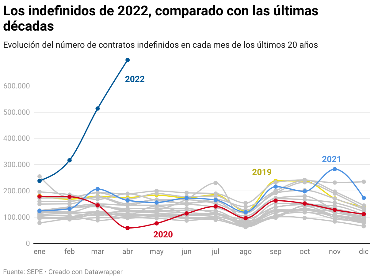
And to see visually, to visually analyze the data, we find it very handy to put them in Datawrapper. Our first results, our first ideas, so we can see them very quickly. We can also share them with other colleagues in the newsroom, so they can see visually what we are trying to do, which point we are making. And maybe all this data, maybe we don't use it. For example, this, I forgot to say before, this is an analysis we did about education in Spain. We did lots and lots of charts, analyzing how the education level of parents affected the education level of their children. And we did all these charts you are seeing here, to choose which was the best piece of data that was transmitting this idea.
And afterwards, it was when we finally chose that this was the indicator that we were going to use that we coded the final chart. During the process of visual analysis and then drafting of the final idea, we use Datawrapper for this project. Also, sometimes Datawrapper is used for all the article. It was an article about the crowds filling Madrid's city center before Christmas. It was a thing that everybody was talking about, like, okay, yes, there's a lot of people in central Madrid, but nobody was putting numbers to it.
So we use Datawrapper: first to show line charts about the evolution in a normal work day of the people in central Madrid, and how it changed during the Christmas days. Also, a map of where the people were coming from to visit the city center. Also, a column chart showing the difference between a normal day and a crowded day.
And all of these charts were already using Datawrapper because it has many, many, many different types of charts, and we very often use them.
Achieving a unique style
[00:09:18] Victòria Oliveres: So, after I showed you a little bit around our data unit, about how we use Datawrapper, I also wanted to complement this idea with what we consider when we create these Datawrapper charts.
So we use them a lot of times, but we want to have a unique, familiar brand style, no? Even though they are Datawrapper charts, there are ways to make them look more personal to you. So all your projects or all the articles from your news group or from your investigative group, they all look the same. These are some of the tips, things you want to think about.
We've taken some decisions about chart design. For example, when we use a line chart, we use steps in the evolution when there's many data points, or we use the line, the straight line with dots when there's not so many. This was a design decision we've taken before. So now every time we are making a new chart that's a line chart, we know that if it's a chart with lots of numbers, with lots of data points, we will use the steps. And on the other side, if it has a few, we will use the straight lines. Also, when taking decisions about colors, we have a color palette of our own: categorical colors, what to use, what is a positive-negative relation. We have colors for political parties. We have colors for gender, and we also have some other color palettes that we use only in special projects. All of them are El Diario colors. It may be, here in Spain, if someone sees the chart standing alone without the article, maybe they can remember then that it's an El Diario chart because it's using these same colors all the time.
And these couple of decisions, they save a lot of time. We've taken time to prepare them, to think about them, to think about the chart style, to think about the color palette.
Repeating charts
[00:12:06] Victòria Oliveres: And then, we thought, with these decisions, we can work faster. Also, sometimes we try to repeat the same chart throughout the article.
I don't mean that we'll repeat the same data, but the same indicator. For example, in this article, we were showing a percentage of the population that had problems to pay their rent. But we want to show also the total percentage of people in each group, in each region, in each income group, that were renting.
So, we use this style of chart, and we repeated it through all the article, with the percentage of people who had problems paying the rent, but also the rest of the people who are renting. And this idea made it easier for the audience to understand because they only have to understand the chart one time, and then every time during the article, they find the same chart type, the same format. So it's easier for them to read the results.
Using annotations
[00:13:31] Victòria Oliveres: The last design decisions we've made is that we use a lot of annotations on the charts, as you can see in these charts. We write a lot of things so the audience can read the charts easier. We also put the legend in the subheading, so with text, we can help the audience to read them.
And as I said before, these are decisions that, if you take them beforehand, every time you have to make a new chart for your team, it will be very fast to tackle. Because Datawrapper is simple, it has lots and lots of functionalities. Have time to experiment with them. But after that, just stick to them, and you will save a lot of time. Thank you very much.
Q: Acceptance for data vis?
[00:14:18] Guillermina (host): Thank you very much, Victoria. Thanks for sharing that with us. We have some questions here from the audience. We have one from Leon. I work in a very small newsroom. Often, many colleagues don't think about a chart or map to visualize their story. In your opinion, how can we increase acceptance for data visualization?
[00:14:47] Victòria Oliveres: Yeah, I know this can be a handicap the first time, but after, when they know they can use you, you will have a lot of work. Usually, now, for us, it's the other way, so people have lots of ideas with data, so we have a lot of work. But maybe in the beginning, it can be yourself. So when you see a story that they are working on, if you know that they are working on it, or after they publish, you can go to them and give them the idea about which data to use, which sources there are of data, and how it would appear in a chart.
And I'm sure, after a little bit of training on sources and after seeing some examples of charts and maps, they will come to you very fast.
Q: Other tools?
[00:15:45] Guillermina (host): Thank you. One last question that we have here, uh, from Ria, what other tools or packages do you use to code? Which one would you recommend?
[00:15:56] Victòria Oliveres: As I explained a little bit, we mainly stick to these two: we use Datawrapper a lot for all types of charts. And only on special occasions, we use D3, which is a library from JavaScript, but you have to code a lot in that. In Datawrapper, it's very easy, you don't have to know how to code. And also for mapping, we use Mapbox, which we also link to D3. Because sometimes we have a lot of regions and we can visualize them better with Mapbox and D3. It depends on the final chart we want to achieve and also the time we have, because if we don't have time, Datawrapper is the best option.
Q: Annotations on mobile?
[00:16:52] Guillermina (host): Thank you. We have, I think, one last question from Kristi T: Do you have best practices regarding the number of annotations for optimal mobile display?
[00:17:07] Victòria Oliveres: Well, I don't think it's a number of annotations because they can be bigger or smaller. I know in Datawrapper, there's this option of showing them as a key. So sometimes an annotation that you have on desktop is in the chart and on mobile is in the notes space. We don't use it a lot, we only use it if there's one or two annotations, because also reading a lot of annotations at the bottom of the chart can be a little bit tricky, and it's not that easy, but sometimes we have annotations just for the desktop, and annotations just for mobile, which are written maybe with more abbreviations. So we can have the same number of annotations in desktop and mobile, but they are not the same. We use abbreviations or more numbers so we can fit all of them in the same chart.
[00:18:07] Guillermina (host): I think those were all the questions. Victoria, again, thank you so much. Thank you so very much for having joined us, and for also telling us and giving us all these tips that you do at eldiario. es. And congratulations on your work. Thanks.
[00:18:27] Victòria Oliveres: Thank you very much for having me here. And I will attend the rest of the conference because it will be very interesting.
[00:18:36] Guillermina (host): Then we'll see you there. Thank you.
We asked Victòria a few questions before her talk:
Victòria, what will you talk about?
At elDiario.es, we use Datawrapper mainly for two tasks: quickly drafting our ideas and results, and reacting fast to news. I’ll show how, by connecting and automating our data wrangling and analysis processes from R to Datawrapper, and considering some in-house style rules, we can solve all our newsroom colleagues’ requests in no time – and even have time for our own data team projects.
We don't use Datawrapper for all of our charts, because sometimes we also like to code them, to have more control over some customized elements, but even on those occasions, Datawrapper comes in very handy in the workflow. Victòria Oliveres, elDiario.es, in minute 2:55 of her talk at Unwrapped 2024
What's your experience with Datawrapper?
Datawrapper was one of the first tools I used when I entered the world of data journalism and visualizations almost seven years ago. Especially in the last four years since I was hired in the elDiario.es data team, Datawrapper has been a time saver. We use it every day. The more than 11,000 charts our team has created with this tool prove it!
What's your favorite Datawrapper feature?
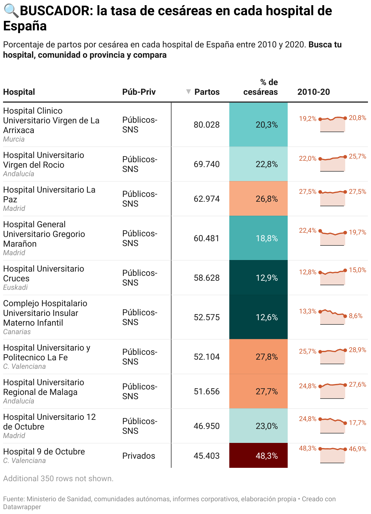
Tables are one of my favorites. They allow you to display large amounts of data in an organized and visual way. We’ve used them for very different purposes: from creating rankings (example), to displaying images along with text and numbers (example), to using all their potential when making them searchable. As in this case, when Raúl Sánchez, editor of the elDiario.es data team, revealed for the first time the rate of C-sections in each Spanish hospital:
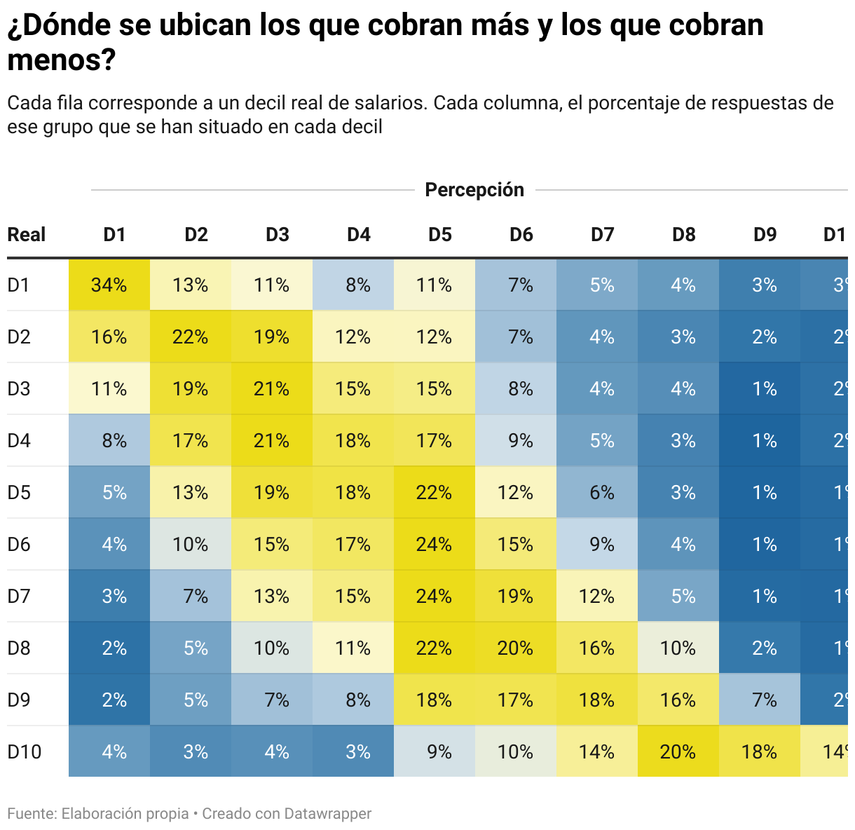
We also like the heatmap option in tables. We used it to show the results of an experiment: Where do the people who earn the most and the least perceive themselves in comparison to the rest of the Spanish salaries?
What's your guiding principle when working on data visualizations?
Embrace simplicity - but don't ditch complex visualizations! Sometimes people think that designing line or bar charts is for novice professionals. The truth is that communicating complex information through a simple visualization is harder and more effective than it seems. However, this doesn't mean that we have to avoid more creative or elaborate charts just because they seem difficult to understand for the general public. We can use many tricks to help readers understand the information and improve their visual literacy in the process.
We loved Victòria's talk at Unwrapped! You can learn more about her on X, LinkedIn, and her eldiario.es author page. To find out more about Unwrapped and hear other great speakers, visit our blog.


