Kiko Llaneras, El País, about coding Datawrapper histograms, beeswarms, and more in R


Kiko Llaneras, data editor at El País, spoke at our Unwrapped conference about "Datawrapper and R? How we code custom charts."
Watch his talk here:
01:26 – Creating quick Datawrapper charts in R
02:36 – Benefits of combining R and Datawrapper
05:35 – Creating custom Datawrapper charts in R
08:57 – Examples for templates of Datawrapper charts
11:54 – How to get started
14:10 – Q: Working with the templates?
16:17 – Q: How long does building & tweaking take?
18:54 – Q: Make the template code public?
21:07 – Q: Why not use Javascript or D3?
Full transcript
Introduction
[00:00:04] Kiko: I think this is a good continuation from CJ's work. So, I will just start, yes. My name is Kiko Llaneras and I have a background in engineering. I spent 10 years...I am an ex-academic. I spent 10 years in academia. I got my PhD, but, around 2015, I changed my career. I was working as a blogger, but I started to spend more work time doing this blogging thing in 2016, I moved into journalism full-time, and I have been at El País for eight years now. At El País, I'm leading the visual and data team, and we use a lot of tools, the main two tools we use every day are Datawrapper and R. R is the programming language we use for all the analysis, I'm going to talk about how we combine these two tools, how we use R and Datawrapper to do different things I'm going to talk about two particular tricks.
Creating quick Datawrapper charts in R
[00:01:26] Kiko: The first one is how we use this combination to create quick charts. Basically, we work with R for all the data stuff. So you typically have some data. Here you have some data about the World Cup last year. And we are in R doing the analysis, doing the scraping, doing a combination of different data sets, and computing our analytics.
All the work around data, we do that in R. The thing is that we can then create a chart with Datawrapper using the API and using a one-liner, in fact. Using this one-liner data to chart and with identification from a chart in Datawrapper. We can send the data from R into the chart and create one of these charts that you all know we can create with Datawrapper.
Benefits of combining R and Datawrapper
[00:02:36] Kiko: So this is the first step. This is a very simple way of working, but it is very useful for us because we can create the chart directly from where the data is. Why do we like this approach a lot? Two reasons.
The first one is that it's a way of having very good charts. You know that Datawrapper charts are very good. They are very clean. You have a lot of options. They are responsive, so they work very well on your mobile phone, etc. So all the benefits of Datawrapper charts, we have that. But I also like the workflow. How the process works. Because it's a very quick way of having a chart that we can publish. From the code to the chart that we publish is only one click. So it's very quick and very convenient.
Very convenient in two ways: It's very simple to reuse the chart, and in particular I like that it's very easy to edit the chart once it has been published. If we use Adobe Illustrator or JavaScript for making a chart, if there is a typo or if we have to change anything in the chart, we have to talk with someone who has the files, we have to edit the files, we have to take them, we have to upload them. So the process takes some time, but if the chart is a Datawrapper chart, many people in the team can go to the chart and edit it.
For instance, we have a translation team that sometimes translates a story from El País in English to our international edition. They can of course translate the story, and I don't have to talk with them, but they can also translate the Datawrapper charts. Because they know how to duplicate the chart. Then they know how to edit all the text. And they can translate the whole story. I don't have to be in the loop. So this is the benefit of the process I was talking about.
So how can this be done? The most important part is the Datawrapper API, but also this package from R, which is Datawrappr with no "e", that basically allows you to do everything that you can do with a Datawrapper chart from R. This is the core of the work I'm going to explain in the following.
So this was the first case of how to do very quick charts, very good charts from R.
Creating custom Datawrapper charts in R
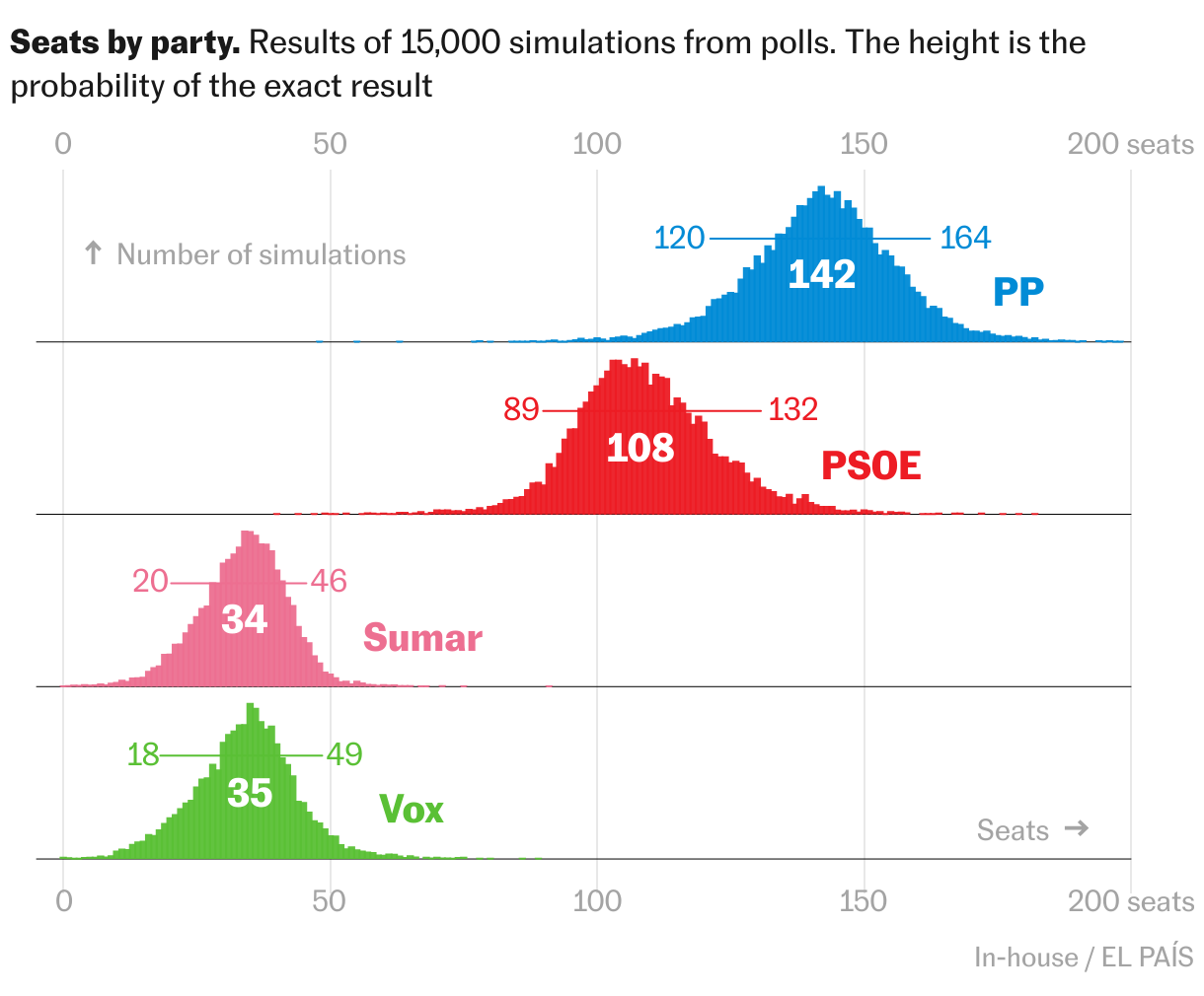
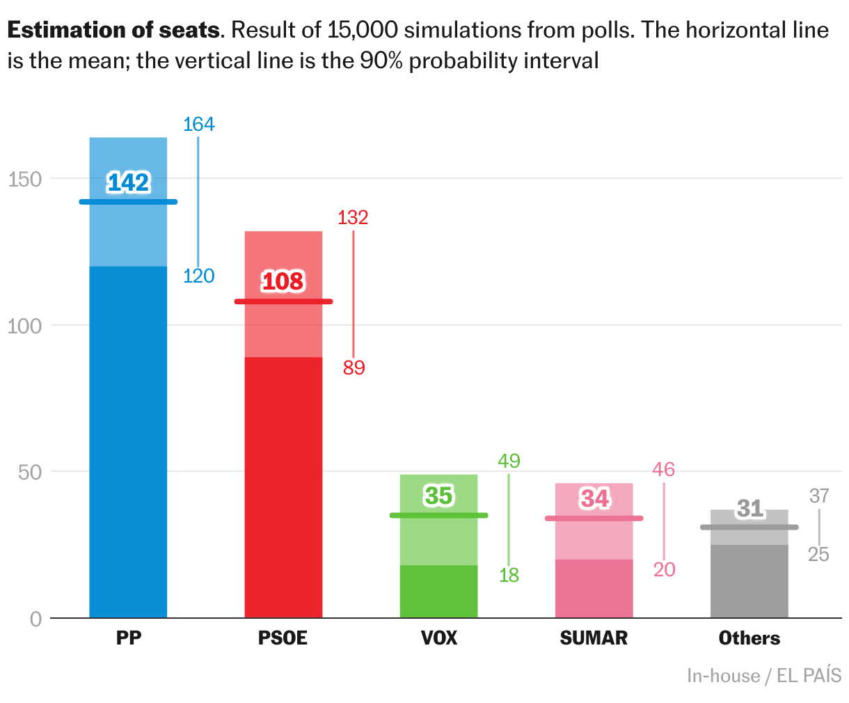
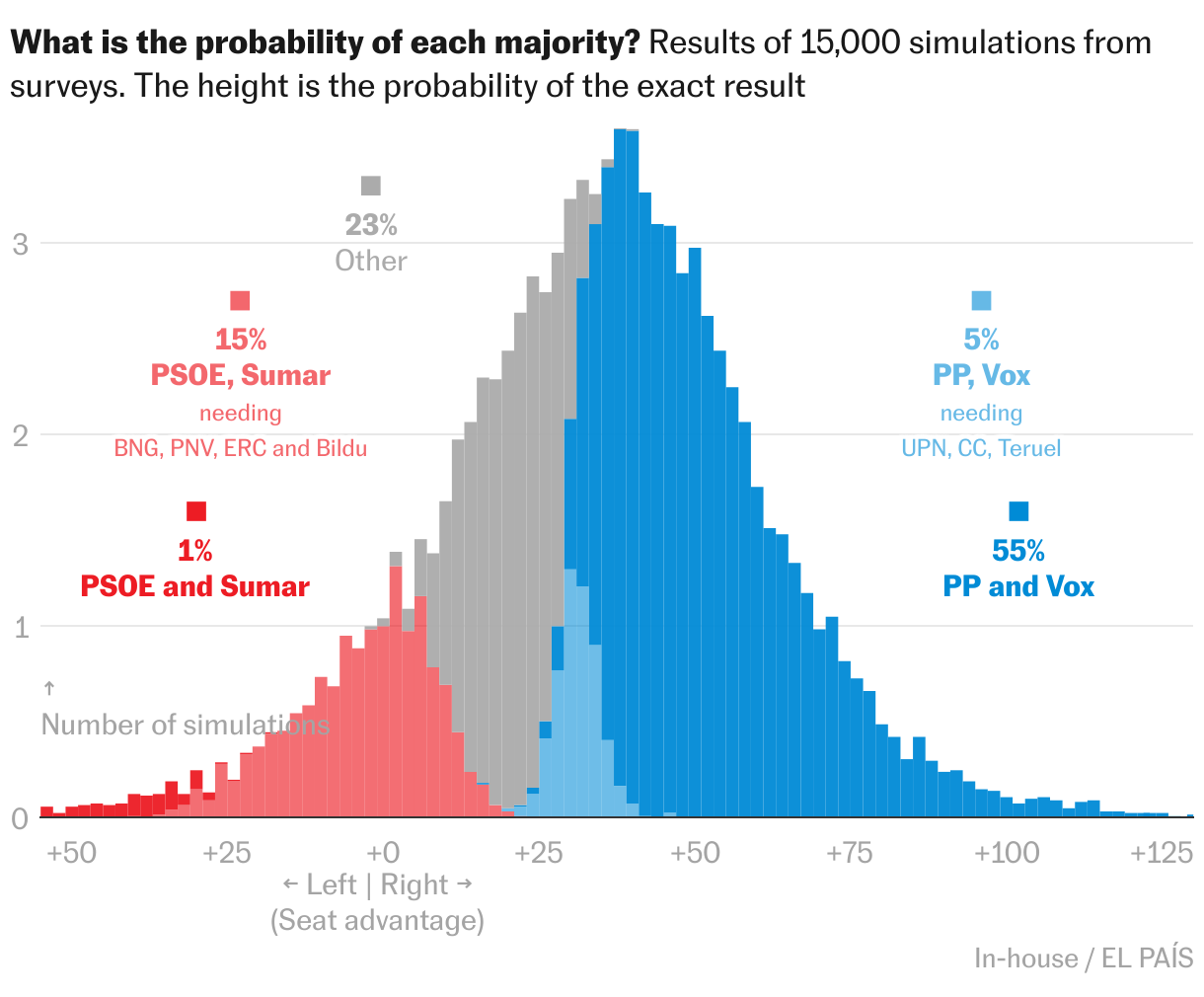
[00:05:35] Kiko: The second one is how to create some custom charts with R and Datawrapper. The approach is very similar to what CJ just told you, but we are doing this from R. I can start with an example. This is a particular custom chart. It's not a template chart from Datawrapper because you have the columns, but there are some median lines. You have two boxes for each column. And you can see the things that are not standard. This chart is basically a boxplot. But it's a particular kind of boxplot that I like. I like it more than a boxplot. It's simpler than a boxplot. If you haven't seen a boxplot anytime in your life you can understand this chart. This chart is done in Datawrapper, but it's not a standard. No. How did we do it? You have the pop-up as you can see it. You have all the niceties of Datawrapper. But how did we do it? This is a scatter plot. The scatter plot is the template in Datawrapper that allows you to hack it. It is the best one for hacking. So this is a scatter plot. But if you show the scatter plot, there is nothing to be seen here. The only thing that is standard in the Datawrapper chart are the pop-ups, in fact. The pop-ups are invisible dots, bigger dots that allow us to have a pop-up. But all the columns in the chart, we added this as custom lines. This experimental feature that I hope you never remove from the app because we use it a lot. This experimental custom lines and custom areas, this is how all the columns and all the lines you see here, this is how we add them. We added all the principal elements of the chart as custom lines. Then we use annotations for all the text and even the labels in the columns. All these names of the parties are also annotations.
So, this is the chart. The chart is a scatter plot with all these custom elements. But the thing is: We didn't do this manually. We did all of this by coding in R. This is the code for the chart. These are like, I don't know, 200 lines of code or less. We have some preparation for the data, we have an ID for the chart, then we have some code for adding the columns, some code for the pop-ups, and some code for the labels.
Examples for templates of Datawrapper charts
[00:08:57] Kiko: This is not a lot of code, but, somehow it is. I wrote this code a long time ago, and I'm not exactly sure how every element works, because I wrote it three, or four years ago, and I have used it a lot by copy and pasting. This is one of the nice features of this approach. I'm not writing 200 lines of code every time. This works as a template. In fact, I have been using this chart a lot recently. I don't know. I used a version of this chart a couple of weeks ago for regional elections in Galicia. I used it last year in Spain, the UK, Andalusia, Italy, and France the year before.
This is one of the benefits of this approach. We are somehow building our own templates. And it's not completely automatic when I want to use the chart again. But basically you have to copy the chart, copy the code, and edit it here and there to have it working.
And yeah, we are using this a lot with different variants. Why we like it: You have the same benefits I was talking about a few minutes ago: These are good charts, the process is very good. But now we have custom charts within R that are very convenient for us because we are always working with R.
These are some templates, and I love it. We use this a lot. For instance, these histograms, are being done with exactly the same approach. These are scatter plots with all the columns. You have the dots and all the stuff, but this is exactly the same approach.
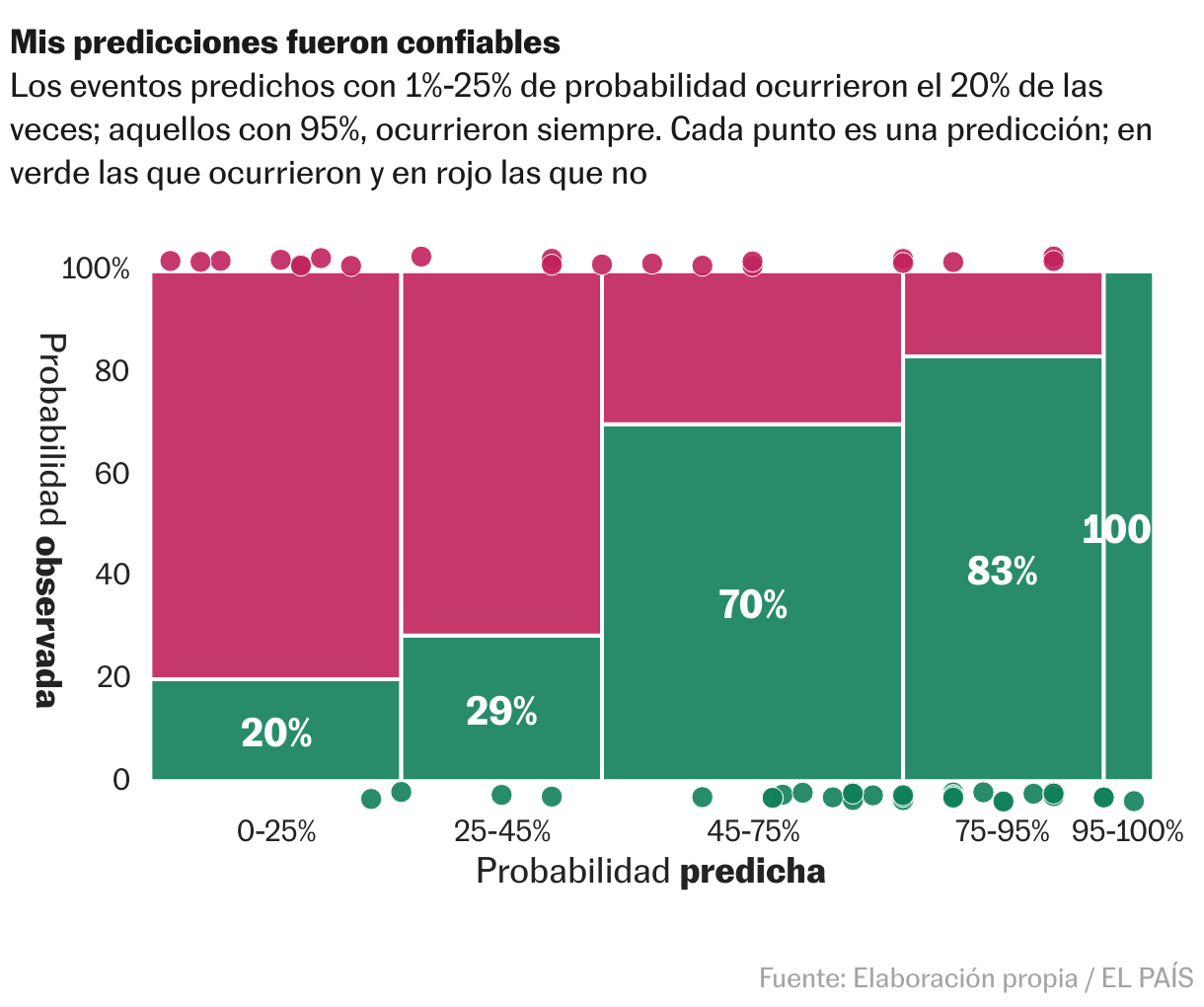
This is the same. This seems to be different rows, but this is not different rows. We are adding the lines for each of the histograms. We have done some combinations of stacked areas with dots. This is in Spanish, but I can talk about this after. Also Borja Andrino, a colleague at El País, has done the same approach to build these radar maps, that are again scatter plots that we publish from R. These are very nice. They are particularly tricky, because you have to keep the proportion when you are working on a mobile phone, but they work. He has also worked with beeswarm charts that are very useful.
How to get started
[00:11:54] Kiko: Finally, if you want to learn how to do this, I have some very short advice.
First advice is: Start by reading the documentation for the Datawrapper API. It's very complete and is the core of this approach. The API is what allows us to do all this.
Then you can read or install and read the DatawrappR R package. That basically allows you to communicate with the API within R. It works very well. And a trick, I think it's very useful to start working with this, is to use this function, retrieve_chart_metadata. It gives you all the metadata that you can change in a chart. You can select any chart you are working with and see all the metadata. This is a very convenient way of inspecting the data and trying to change a parameter and observing how the chart is changing. It's a way to understand how the process works.
When we are working on one of these charts, the process is a two-step process: first, trial and error. We work on a chart, looking for the results we want. Then, I think it's interesting to add a second step. Now that the chart is working, spend some time on the code to prepare the code to be a template. You can make relative margins, for instance, you can clean the code, and document the code. It's very useful to spend some time here.
That's basically it. We just love Datawrapper. And we also love R. It's very nice to combine both and it has been very useful for us. I'm glad to answer any questions you have. Thanks for the invitation.
Q: Working with the templates?
[00:14:10] Gregor (host): Wow, Kiko. Very impressive. I would have never thought that this is possible. Wow. It's a lot of work you put into creating these templates. Really, thank you a lot for sharing this. By the way, how do you work with these templates internally? Do you have a repository for them? How big is the team working with them? Because I feel like you always need some developer as the first step, right?
[00:14:43] Kiko: Yeah. The thing is: Each of these templates has an owner. Typically, it's the person who first developed it. And then we typically use these people to fine-tune it. So all the electoral charts... I do a lot of work in elections. So these are my charts in some sense, I can prepare them for other people, but this is something that I typically do.
For instance, all these radar maps or all the sports charts, Borja Andrino is the gatekeeper here. So if I want to use the charts, I typically say, Borja, can you prepare this for me? And this is how we do it. Because we are somehow a small, not that small team, about 13 people, but we have different specialties. Not all of us are working with R, so this is typically how we do it. These templates are not completely automatic, so this is not something that we do for everyday charts. It's somewhere in between what we do daily and development that uses JavaScript. We are not going to spend a week working with JavaScript, but we have this team. So it's somehow in between.
Q: How long does building & tweaking take?
[00:16:17] Gregor (host): There's a question from the chat from Amy Scott German that is related to this. She would love to hear more about how you build out the script templates and how long the tweaking of these code takes for each new iteration from the template.
[00:16:34] Kiko: Yeah, I'm not sure about the first development. I think it didn't take that much time. It seems more difficult than it is because when I did the first one, I didn't expect to do 10 of them, but I discovered that it was quite efficient. So I was, surprised that, when I started working on the first template, in a few hours I had the result.
So, this was not a lot of work. Because basically you are just putting rectangles and lines, you have coordinates, but it's not difficult. If you are familiar with R code, and are coding in R every day, this is very easy. Because the API is quite flexible.
And then the tweaking part, this is not a lot of work either. And these charts are always done in projects that are quite data-rich. When I work on elections, I'm typically publishing a poll of polls, or a prediction model, so I spend a few days fine-tuning the model, making the predictions, gathering the polls. I have this setup. And this setup is a template by itself.
The part of plotting the chart is just part of the project. I have to fine-tune the colors and the names of the parties. I have to adjust some margins because maybe the parties are not between 0 and 20 seats. They have 100 seats because the election is different and I have to change some small details. But this takes maybe half an hour of tweaking per chart. No more than that.
Q: Make the template code public?
[00:18:54] Gregor (host): There was a follow up question by Amy that I think a lot of people have, including myself: Do you have, by any chance, a public Git repo for these scripts, for these templates, for learning more about the custom lines?
[00:19:09] Kiko: We haven't done it. We are not that secretive about this. I put it in the slide. But what happens typically with the repos is that you never find the time to document your code and to share your code. For instance, I'm not publishing our prediction models.
I'm very often asked about them. And I'm not publishing that because it's a lot of work and it's very easy to replicate. I think I cannot share the model. I'm very transparent with the methodology, but I don't feel comfortable sharing the code of the prediction model.
But with the charts, I'm not that secretive. Because it's not that difficult. If someone is familiar with R and spends a couple of days working with these ideas, they can build these templates and many others.
I think there are a lot of different charts that can be done in a similar way.
Another direction for this is something one of the speakers before me talked about: You can do something similar with maps. By tuning the shapefiles, you can then create a custom shapefile that is not a map anymore, but has dots and different forms. Whatever you want. So I'm glad to share some of these or answering any questions if someone is interested. I'm glad to do it.
Q: Why not use JavaScript or D3?
[00:21:07] Gregor (host): That's one more thing that I'm interested about: There's a lot of code that you spend on positioning all the rectangles and putting that into the Datawrapper API. Where's the line where it makes more sense to actually just make the graphic using JavaScript or D3, or using a front-end framework rather than using R for this. Or what are the benefits of still doing it in this R-to-Datawrapper workflow?
[00:21:39] Kiko: I was thinking about this when preparing the presentation. On the one hand, I think it depends on the people. In the team, we have people who are masters, people who work with R every day. This is my case, but I'm not the only one. So for me, it's more efficient to do the chart in R, because I'm not that good in JavaScript. JavaScript implies involving another person. So this is already a barrier for me. But if I can work with Datawrapper and R, I can make things that are somehow difficult. So in some sense, this depends on the people. Other people in my team who are very familiar with JavaScript probably don't use this solution because they are not able to write the R code. So this depends on your toolbox.
But, in general, the second factor to consider is that I like that when I publish a Datawrapper chart, it is already published. In the sense that if someone is reading my piece and there is a typo in the chart, anyone can go to the chart in Datawrapper, find it and correct it, and the story is already correct. That is quite powerful. Because otherwise you have to find the person who owns the files, who can find the files. Then you have to make versions in Adobe Illustrator... depends on the solution. But it's not so simple to find a reliable solution. So this is somewhere in between.
[00:23:51] Gregor (host): Okay. Last question. Yuriko is asking if you think there's a benefit of using R rather than Python? There is a Python library for Datawrapper as well.
[00:24:10] Kiko: I don't think so. I think the magic of this approach is happening in the API. If you are familiar with Python, Python is the way to go for you. I think the same process can be done for sure. Probably some people with JavaScript can also use the API from JavaScript. So Python for sure. And maybe using Observable or another solution can also be workable.
[00:24:46] Gregor (host): Thank you so much, Kiko, again, for sharing your scripts and your workflows.
We asked Kiko a few questions before his talk:
Kiko, can you please introduce yourself?
I'm a Spanish data journalist with a Ph.D. in Engineering who writes for El País, a daily newspaper in Spain. Back in the day, I started as a blogger. Now, I try to blend an analytical stance with journalistic storytelling.
That's also what my book, "How to Think Clearly," is about (available in Spanish so far). It's a book to help us when doing analysis, and it comes with many interesting stories (like "Why did Barack Obama sleep so peacefully?" and "Why are so many footballers born in January?"), advice, and dozens of ideas and shortcuts. It will be published in English by Penguin Random House in 2025.
What will you talk about?
I code in R and create most of my charts with Datawrapper. In my talk, I'll show how we combine both and share two use cases that we love at El País: (1) creating quick, clean, and responsive Datawrapper charts directly from our R code; and (2) using the Datawrapper API to produce custom (special!) Datawrapper charts such as histograms, beeswarm plots, or bizarre column charts.
We just love Datawrapper. And we also love R. It's very nice to combine both, and it has been very useful for us. Kiko Llaneras, El País, in minute 13:56 of his talk at Unwrapped 2024
How do you use Datawrapper in your team?
We use it every day. We create many charts with Javascript, and we still use ai2html, but right now the majority of our web charts and maps are done with Datawrapper.
I like that when I publish a Datawrapper chart [...], if someone is reading my piece and there is a typo in the chart, anyone can go to the chart in Datawrapper, find it, and correct it. Kiko Llaneras, El País, in minute 23:06 of his talk at Unwrapped 2024
It's the perfect tool for everyday charts: it is simple and fast, and the results are clean, elegant, responsive, editable and reusable.
But it is also very good if you have some extra time to fine-tune your graphics, choose your colors carefully, add annotations, etc. You can even build custom charts using the API, and use tricks (as I will show in my talk) to create templates for new chart types.
What's your guiding principle when working on data visualizations?
For me, the analysis is the cornerstone. What data do you have? What do those data truly tell? And what do they not?
As with any craft, people often confuse the product of the work with the work itself. They ask me about where to find data and how to make good charts, but really our work revolves around ideas and the process of understanding something (usually complex) and then explaining it in the clearest and most interesting way possible.
We loved Kiko's talk at Unwrapped! You can learn more about him on X, LinkedIn, and his website. To find out more about Unwrapped and hear other great speakers, visit our blog.


