Patrick Stotz, Der Spiegel, about their 7 most satisfying Datawrapper workarounds


Patrick Stotz from Der Spiegel spoke at our Unwrapped conference about "You can't do that with Datawrapper! Are you sure? Our 7 most satisfying Datawrapper workarounds."
Watch his talk here:
02:38 – Using additional, hidden notes
05:43 – Building custom color legends
09:31 – Using images as color legend
12:07 – Locator maps as choropleth and line symbol maps
14:59 – Stacking Datawrapper charts
17:07 – Faking a chart zoom effect
19:23 – The hidden power of custom maps
25:26 – Q: Tweaking Datawrapper vs a custom solution?
27:44 – Q: Filtering with custom legends?
28:29 – Q: Switching to other charts with tabs
29:29 – Q: Styling markers individually?
30:35 – Q: Prompt for generating custom basemaps?
31:22 – Q: Omitting QGIS?
Full transcript
Introduction
[00:00:04] Patrick Stotz: Thanks a lot. Glad to be here. And yes, I can see my slides. This seems to work. I want to talk about satisfying Datawrapper workarounds. What I mean by that, I'll get to in a bit.
But first, a few words about me. My name is Patrick Stotz. I'm a data journalist and I'm a data viz and cartography enthusiast. So that's how I got into data journalism in the first place. And I'm using Datawrapper since 2019. So I already have quite some experience with the tool and what I'm going to show today is not only my work, but the work of this whole fantastic team I'm co-leading. This is the team you see on the picture. This is our department of data and visualization at Der Spiegel.
Okay. So why Datawrapper workarounds? We at Der Spiegel, we use Datawrapper for our print and online publications, and we produce a lot of charts. It's roughly, I've counted it a few days ago, roughly 50 charts each week. So on the top right, you see: our current archive is 12,500 charts, which sometimes is overwhelming, if you're looking for something. We try to organize it in a way that you can find your charts again, sometimes successful and sometimes not. But that's not what I want to talk about. That's just how much we produce.
And in general, if we start with the project, of course, our first question is always what's the best way to visualize something. We don't start thinking in tools because that limits you to what certain tools can do. And it's not the way you should think about visualization. So the first question is always, what's the best way to visualize something? But then the second question for us always is, can we solve this in Datawrapper when we've got an idea?
If we can solve it in Datawrapper, we say, yes, go for it and do it in Datawrapper, or at least try. And if we can't do it in Datawrapper, then we use the other tools we got at hand, which is Adobe Illustrator, which is AI2HTML, QGIS, Mapbox, Svelte, Blender. And while doing so during the last years, we found quite a lot of satisfying workarounds how to do things in Datawrapper that we didn't think or haven't thought that would be possible, and that's what I want to share with you today.
It will be seven examples and it will be from small, not very complex, simple things to rather complex and sophisticated solutions.
Using additional, hidden notes
[00:02:38] Patrick Stotz: The first one is something that is useful in ordinary reporting, everyday reporting, and it solves the problem you've got here at hand. So this is a chart mainly with a sample headline, and it is a survey you want to show as a chart. And you got the results of the survey and the subheadline. The precise question is important for the chart, but maybe you also want to include some notes on the methodology. And you can see that this text is already quite long. It's getting longer and longer. And there might be more information that is not key, but you want to include as well.
And if you do it like this, then you can see, okay, this is getting quite cluttered. It's not looking good. Imagine it on a small mobile phone and it's something you don't want to read, you don't want to see. But there's a solution for that. And the solution is this here: using additional, hidden notes.
You can move the information, we've had in the subheadline that was too long into the notes section, included in an additional note. Additional note means, you're going to see this chart as it is on the left when it's loaded on the page. And as soon as you click on the small arrow, the section expands and you got everything that you see on the right below the triangle opening up. And you can include information that is not key in this section. It is hidden by default, can hold a lot of information. You can write text, you can even include symbols and other elements, which I will get to in a bit. And hide it by default. Make your chart compact, but also have this additional information right at hand.
So how does this work? This is the code behind this example you've just seen. It's just a very small block of HTML code you see there in the black section. And this code goes into the notes field in Datawrapper. And actually this is not a Datawrapper feature at all. It's an HTML feature. It's called an HTML summary tag. And the HTML has the functionality of displaying this kind of information and expanding it when you click on it. So that's what we are using here and including it in Datawrapper.
And there are two more additions which are quite useful in my eyes. And the first one is to improve visibility a bit. Because normally, if you hover over the small triangle, and you read there's additional information. You've got your ordinary cursor. But it's better if you have a pointer because the pointer indicates that there's something you can click on, something that expands.
So if you do CSS style "cursor: pointer," you can turn the whole HTML summary tag into something that's at first sight clickable and interactive. So that's a small thing we include here in the style section of the HTML tag. And, as mentioned before, you can not only use it for text, but you can also work with HTML, CSS, and so on, in this notes section. But that's something we will see in the next example.
Building custom color legends
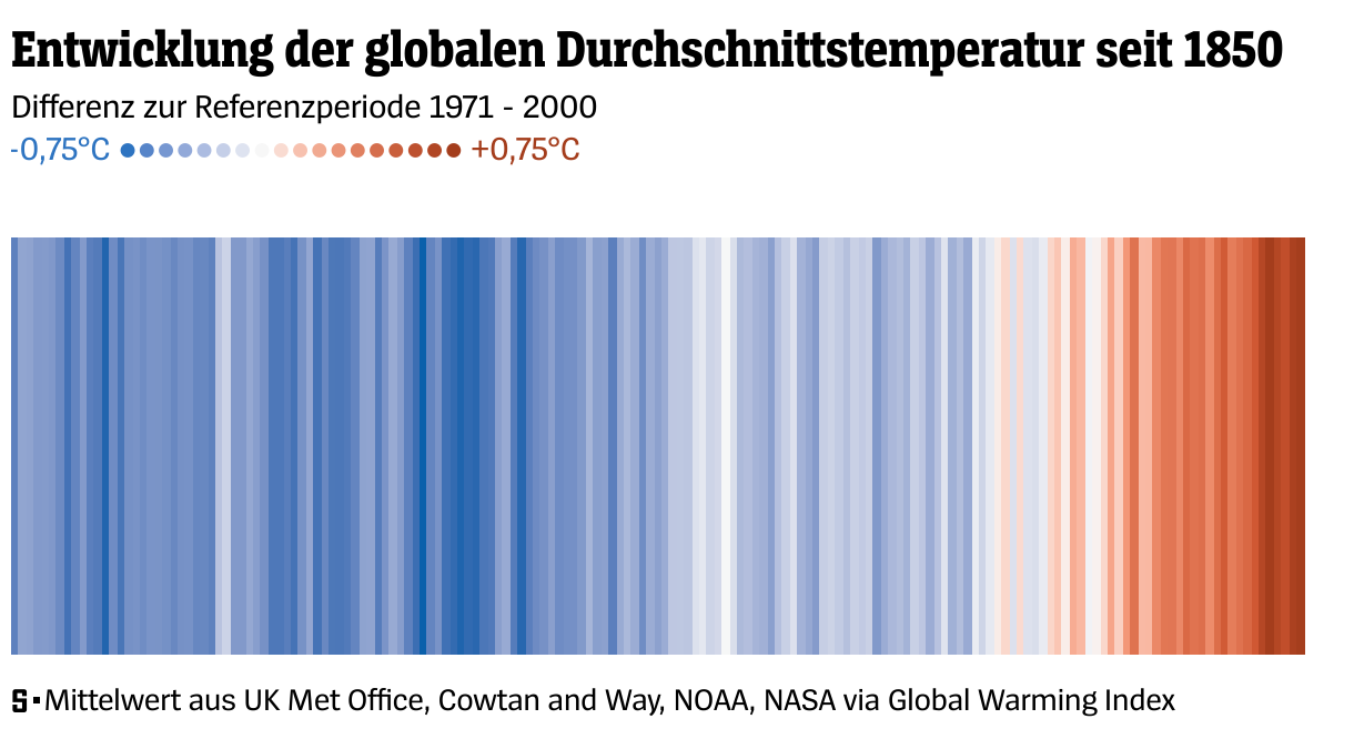
[00:05:43] Patrick Stotz: So that's our second example, how to build custom legends. And I want you not to focus on the chart that's in the middle. That's a chart you're all familiar with. It's the warming stripes. You can do them in Datawrapper. This is a Datawrapper chart. I didn't invent it myself. There's a blog post by Datawrapper, which is super useful, which leads you through all the steps to build the warming stripes, or climate stripes, in Datawrapper.
So that's not what I want to focus on. I want to focus on this section here, which is the custom legend I've included in the warming stripes. Because warming stripes, they don't come with a legend most of the time. They are understandable without a legend, but maybe it's nice to have one. And it's just an example. It's usable and applicable for many other chart types and situations as well.
So how is this done here? Again, it's just a small piece of code. Again, it's HTML code. And it uses HTML symbols. Like the black dot, which we are using here. Or other HTML symbols like the copyright symbol, and there are stars and there are even areas with hashes and various types of HTML symbols. If you google for them, you find a lot of them. They work in all browsers. Sometimes they look different in some browsers, so that's worth checking. But you can use them for many occasions in Datawrapper. And you can also color them. And that's how we achieve the look we've got here, from the blue to the dark red, depending on the temperature.
And this color comes from the CSS style. And the CSS style is here in the span style sections, the colors in hex codes. So this is the place where the color comes in. Then you got one point after another in the beginning, in the end, you've got our Celsius written as text. That's already quite it. And apart from that, you can also use more custom CSS, which is font size, line height, and things like margin. This is just the point where you're trying or playing with styles and doing small adjustments until everything looks perfectly right as wanted. But the basic here is using HTML symbols to improve your legends and to improve readability of your chart.
This comes with a note of caution, cause these kinds of HTML symbol legends, they work in dark mode, but they need some extra work.
Those two charts here actually are not mine. It's a screenshot from the Datawrapper blog where it is all explained. Basically, when you're including CSS style as here for example with the text field "before" in the chart. Text field "before" has one style, with a CSS class of "hide-in-dark" and one style of the CSS class of "hide-in-light". And depending if you're dark mode or light mode, one of the two is hidden, the other is visible. And this way you can make sure that in one chart the text is white, the other is black, and that you got a lighter gray and a darker gray, depending if you're in light mode or in dark mode.
So if you're using HTML symbols and colors, and the like in CSS styles, make sure to check your dark mode if you're using it. And make sure the colors are not only translated in the correct way in the chart, but also in your HTML or in your CSS-styled legend or subline.
Using images as color legend
[00:09:31] Patrick Stotz: Okay. What if you get situations where you build maps and you need even more complex legends that go beyond what we've just seen? So these two examples here are maps that we've published during the last years. And, I don't want to focus on the maps themselves actually, but I want to focus on the legend.
So those two legends you see here below the maps, they, as you can maybe recognize, they don't look like Datawrapper maps because these kinds of legends cannot be generated by Datawrapper. But they are custom-made, but still, they are integrated directly into the Datawrapper chart. As you can see here, there's a header, there's the map, there's the legend, and then there's the map footer. So everything is within the Datawrapper.
How do we do that? Again, here's the code. What we are doing here is using HTML again. And in this case, we're using the HTML "background" property. So to explain everything that's part of the legend, it just starts with a bold text. The bold text is the heading of the legend. Then there's another HTML block, which could be a <div> as well. I don't know why it did use a <b> tag in this case. And this element holds the background image, actually. It's the property "background: URL" and in the "background: URL", you are including a link to... could be anywhere on the web. This is the address where we are hosting our own images. So you can publish them yourself, host them yourself on your server. And by using this workaround, "background: URL", you can include them below or above or anywhere in your chart. And the rest you see around it. Like the floating, width, height, background-size, background-repeat, and margin-top. Those are the other CSS properties you have to play with to make sure it works for your website, for your positioning, for your orientation, depending on mobile or on desktop. Many things are possible. This is what we came up with that worked. In this case, the legend's got a certain aspect ratio between height and width.
So that's pretty much it. And, yeah, loading an image from a URL and playing around with positioning and size. And then you got much more possibilities to use custom legends.
Locator maps as choropleth and line symbol maps
[00:12:07] Patrick Stotz: Speaking of locator maps, we've just heard a talk by Philipp, who showed some examples which are similar to what I want to show in my fourth example. And that is how to use locator maps as choropleth maps or as line symbol maps. If you look at those two maps here, they are Datawrapper locator maps, but they are not used like locator maps normally are used, so to show cities and points of interest, small location information. They are used to show more complex data. The one on the right is the traffic situation, traffic analysis for Barcelona, how the traffic changed in certain areas, on certain roads. And the one on the left is public transportation around Hamburg. Areas around Hamburg you can reach within 30, 45, and 60 minutes around the central station. And this is called actually an isochrome map because it shows the areas which you can reach within a certain period of time. And both of them are a data layer put on top of a locator map.
So how do you do that? In this case, the important thing or the little secret is uploading one layer at a time. So if you got your traffic analysis done, you've got all the roads and every road is in the category, it has a certain, in this case, reduction, or an increase in traffic.
You cannot upload them all at one time to Datawrapper. If you do that, you get just one line marker. And one line marker can only have one color. So that destroys the idea of showing different streets in different colors. So what you have to do is separate them in your geospatial software. For us, it's QGIS, or it doesn't matter actually in which software you're working. You have to export your geospatial data as different files and import them one at a time. In this case, we imported all those lines. I think it's nine different categories. Four of them with the different shades of blue. Here in the view are more with shades of red. And we get two more which are areas actually. This one is... I think it's a market hall. It's a building, I think it's a market hall. And the other one is a highlighting for a certain section of the road. So those are areas put on top of the map, working with some transparency.
You can all style them individually with color, with outline, with filling. And then by doing so you can choose some kind of a mix between a location map, because you're using location map for the background, for the inset map on the top right, and a data map, which in this case is a line symbol map, and showing the results of your analysis on a Datawrapper locator map.
Stacking Datawrapper charts
[00:14:59] Patrick Stotz: Next up: This is a chart, which, on the first view, you wouldn't think it's a Datawrapper chart. It's a stacked area chart of the share of the area of Germany that suffers from drought over time, over five decades, starting in 1970 or 1971. And each of those sections you see here is an ordinary stacked area chart. But everything together is made in Datawrapper and is combined out of six different charts. I'll advance one more slide and you see what we did there. Actually, we stacked area charts. We use one chart for the legend. So the first chart is only the legend. There is data in there. But the data is empty. So only the chart, only the legend is included in the first chart. Then you got five more charts, which are the stacked area charts, ordinary simple data record charts. And all of them are combined in our content management system. They just added one after another without any interruption or break or spacing in between. And that's already quite it. It is important that you use the legend separately, because if you don't, the legend is part of the first chart. And you want to have a specific height for each chart. Each chart needs to have the same height, so the data is scaled properly. If you include the legend in the first chart, it's part of the height calculation. This legend gets pretty long and mobile, so it destroys the whole idea of every section having the same height. So that's why we exclude the header from the first chart. And also, this is why we didn't include a footer. The footer was the source, which we normally have at the end of our charts, we did not include it because it's the same thing. It would be part of the calculation of the height. If we exclude it, we can make sure it's all the same height, and we can all combine these five or six charts into one big stack of stacked area charts.
Faking a chart zoom effect
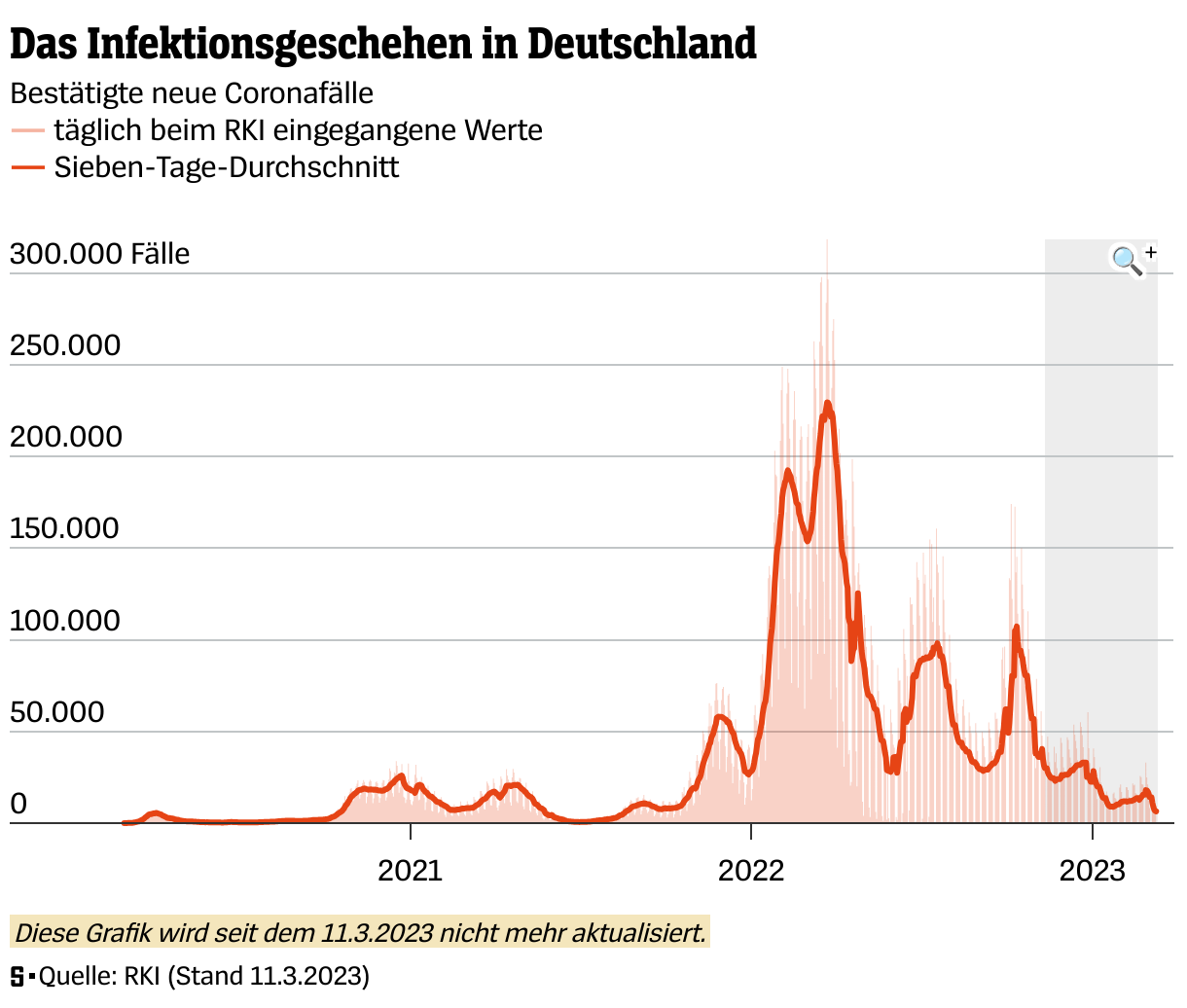
[00:17:07] Patrick Stotz: Example number six. How to fake a chart zoom effect. Probably most of you will recognize this chart, even if you don't speak German. That's the world most of us, or many of us spent in during the last years. It's infection numbers, COVID infection numbers, starting from the beginning of the pandemic until we finally stopped updating them, which was in March 2023.
And over time, the period gets very long within the data, within the chart. And this makes the chart hard to read. So we wanted to have a zoom effect. And we wanted to work in Datawrapper still, because it was just easier than to code it by ourselves in a custom example, which we did later on. But still, we found out it's possible in Datawrapper.
And that's how it works. You've got a small magnifying glass, and if you click on it, you're going to zoom to this section of chart and see the chart how it is on the right. If you click again on the magnifying glass, it zooms out and you're back at the full view of the chart.
And how does this work, this little piece of magic? Actually, those are two separate charts. So you've got one chart with the whole period and one chart with the last three months or six months. I can't remember anymore how we did that. And they are connected via an icon. And this icon includes an HTML link to the other chart.
So it's just an <href> with the URL of the other chart. Important: set of property target="_self." That means if you click on the link, it will not open a new window. It will open in the same window and it leads you to the other chart. The other chart has a reference as well, back to the original chart. And you can include a small plus and minus symbol to make sure the readers understand which is zooming in, which one is zooming out.
And we are highlighting in gray, which is the area we're going to zoom in. And both of these together are two separate charts that look like one chart and which have a zoom effect, which of course does not exist in Datawrapper, but you can build it.
The hidden power of custom maps
[00:19:23] Patrick Stotz: And that's already quite it. But I got one more thing. And this is something I find really funny. Because I wasn't responsible for the whole project, but I just got the beginning, and I was really excited how it turned out in the end.
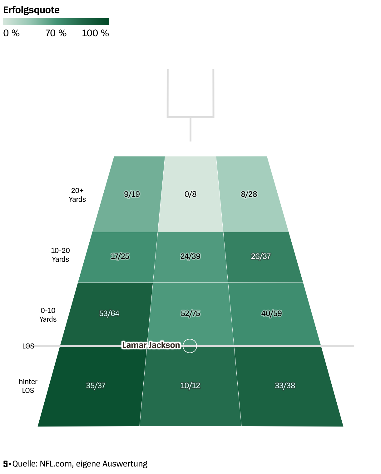
So this here is the thing we wanted to build. This is not a Datawrapper chart. This is what we had as an example. It's a passing maps or passing charts, I don't know how they are called by their common name. With NFL data and for different quarterbacks, they show, from the quarterback position, if he's passing the ball, how high is his success rate, throwing the ball to different sectors of the football field. The darker the color, the better, the higher the success rate. And you can also see how many attempts there are. How many were successful. And this is really insightful if you want to compare quarterbacks in football.
But how to do that in Datawrapper? Our first try was... well, this is a heat map actually. Not much different than a heatmap. Why don't just try a Datawrapper table with heatmap columns? And it kind of works. You got this table here. It's not pretty at all. You got the information in there, but actually this is nothing we would like to present to our readers. A lot of them probably wouldn't understand it. So we were not really pleased with the result and we wouldn't have published this version of the visualization. We'd have chosen something else than Datawrapper if this was all we could have done in Datawrapper. So that was the first try.
Then we experimented some more and we found out this solution here. The heading of this chapter is hidden powers of custom maps, and that's what we use there. This is a custom choropleth map in Datawrapper. So we created a GeoJSON with the shape of a football field, or the sectors of the football field here. We were lazy, or the colleagues that did it were lazy. They asked ChatGPT for their help and asked ChatGPT to generate a GeoJSON file, which should give them dimensions. Upload it to Datawrapper. And then use labels, text annotations and an arrow as a line, an arrow without an arrow in the end, so it's just a boring line, to show the line of scrimmage where the ball gets thrown into play and the name of the quarterback in text. And you got the text annotations and labels with all the data and you've got a tool tip. So this is really... Yeah, it works. This chart here turned into a Datawrapper version of it. And I was quite pleased and thought, that's really cool. Turned out nicely. And I went to vacation. And during vacation, the article got published. And when they published the article, it looked like this. And the emojis were my reaction when I saw it. And I thought, how did they do that? And what they did actually is, they turned the custom choropleth map into a choropleth map with 3D effect. And which is... I think it's insane. But it worked. There are three steps involved, one more than in the example we've seen before. And it starts with Illustrator, actually, because the colleague who got involved then, he's got a graphic design background, and he thought, ChatGPT can draw a GeoJSON, a boring GeoJSON, but I can draw a GeoJSON with a perspective, and I can make it more look like a football field.
That's what he did in Illustrator. He exported the file from Illustrator as a DWG file, which is normally used for CAD, so for construction work. But still, you can export it out of Illustrator, you can import it into QGIS, and once it's in QGIS, you can export it as a GeoJSON, load it into Datawrapper, and from there on, it's ordinary Datawrapper work, and you can still join the data depending on the ID of the individual fields.
And I'm going to show you, so you believe me, it's actually the way we did it there, and it's actually a Datawrapper chart. I'm going to show you the steps that were involved. This is the football field as my colleague sketched it in Illustrator. So just some rectangles with the perspective here, just showing in gray, having the numbers 1 to 12. And you're opening them in QGIS and you have a map there in the background. You see that the center of the DWG file that you imported is at zero, the zero coordinates where Null Island is supposedly. So it's just West of Africa. and from there on you can export it as a GeoJSON. It looks like this in the import dialog on your custom map. You still got the ID and with the ID, you can join data. And that's how we did it. We did it for, 10, 15 quarterbacks. I don't know. So you could do it by a script automated, could even update it every week. It could make a permanent project out of it, but that would have been more than we dreamed for this project. We had this beautiful map, which looked maybe even better than the example we had at hand when we started with it.
And we were able to do it all in Datawrapper because I forgot to mention for this project, we did not have much time. It was necessary to do it within a few days. We could not start coding ourselves, designing something which takes a lot of time. But we were able to use Datawrapper, use a custom hack and we're quite pleased with the outcome.
And now I've talked a lot. I've talked quite fast. I hope not too fast, but I thank you a lot for listening. And I still got time, but we still got time for questions, I think.
Q: Tweaking Datawrapper vs a custom solution?
[00:25:26] Gregor (host): Thank you, Patrick, so much for your talk. I am really impressed by the use of custom base maps for this. I've never thought of this. We have about seven minutes for questions. Maybe I start with one that I have myself because it's curious to me: you said the first step in your decision making of what tools to use for your graphics is the question, can we do this in Datawrapper? But you've shown yourself that this is a tricky definition. You can do a lot in Datawrapper if you include custom base maps and all the scripting. How do you decide what is the amount of effort you want to put into doing it with Datawrapper rather than starting with a custom solution right from the start?
[00:26:16] Patrick Stotz: Yeah. It's a lot of gut feeling, I would say, and experience. For the football field example, we were sitting together as a whole team, with people from different backgrounds, some of them data journalists, some of them graphic designers. We're speaking about a certain project and what we had in mind, what we wanted to achieve. And we had the restriction, we didn't have much time. So we thought about, okay, that would be cool. This is the outcome we want. Brainstorming session. How can we do it and how can we do it fast? And then, in this session, someone said, okay, let's try Datawrapper first, if we can do it in Datawrapper. Because we will see the outcome, or if it works or not within one hour or half an hour. So that's how we tried the table solution. The scatterplot we tried quickly as well and we tried the very first rough version of the custom choropleth map. And we've seen, okay, that might work. And from there on, we thought, okay, how much more time that will cost to make it look perfectly all the way you want it to look. So it's step by step, using Datawrapper first for testing it out and then making a decision to go on with Datawrapper or not. But of course you have to have in the back of your mind how much time will the solution in one software or another cost.
And, of course, if we don't decide "Datawrapper first", but "Datawrapper within a few hours first". Of course, those Datawrapper solutions that take days, they themselves are not very fast and are not the first choice, if you're out of time.
Q: Filtering with custom legends?
[00:27:44] Gregor (host): I see. Thank you. We got one question in the chat. It's from Rhea. I hope I pronounced this correctly: how can you add filtering functionality to custom legends that you make? Perhaps it's about this: when you use a built-in legend and you hover over the legends, then sometimes things get highlighted in the charts or maps. Maybe it's about this. Have you tried to do this?
[00:28:09] Patrick Stotz: If it's about that, then you can't do that anymore. No, that's a functionality that comes to standard Datawrapper legends. As soon as you do the custom legend, there's no interactivity between your legend and the chart itself. That's something you can't use anymore as soon as you use a custom legend.
Yeah.
Q: Switching to other charts with tabs
[00:28:29] Gregor (host): There was one question about the city-switching in your fourth example. How did you do this? Is this also using these links?
[00:28:41] Patrick Stotz: No, that's like a custom piece of code we developed over time. So we've got a little tool which we can use for a tab selection where you can combine three, four, or five different tabs; four different Datawrapper charts. You can even do a combination of Datawrapper charts and other elements, iframes, HTML, AI2HTML elements. So you can navigate through different charts, or elements via a tab bar. And the same thing also exists with the dropdown option. So you can use it for 10, 20, 30, 40 options in a dropdown list. But that's our own coded solution, which just references Datawrapper charts. So it's built by ourselves and it's one level on top of Datawrapper.
Q: Styling markers individually?
[00:29:29] Gregor (host): Let's pick this one. I think it's about the same chart, it's about the city line chart. It's from Nandor from WDR: You import and style all those markers manually - did I hear that right? It sounds super tedious for iterating on designs. He wondered if you had any tips regarding the workflows for this.
[00:29:53] Patrick Stotz: So in projects like this, we do the styling in QGIS. So we have one layer in QGIS. We style it by category, define all the different colors. And then there's an option in QGIS to export every feature or every feature category into a separate layer. So it's just one export and you end up with, in this case, seven or nine different layers. You upload those nine layers manually and you adjust the colors manually in Datawrapper. That's right. if it was a project that you use regularly, there would maybe be the option to do it with the API to automate stuff. But if it's just seven, eight, nine layers, just do it by hand. It doesn't take that long.
Q: Prompt for generating custom basemaps?
[00:30:35] Gregor (host): We got two more questions about the custom basemap. Taylor Johnston asked: How was the prompt that you entered in ChatGPT for this? Is it complicated or just straightforward?
[00:30:50] Patrick Stotz: Actually, my colleagues did it. I didn't do it myself. It was along the lines of, "Imagine I want to draw a football field as a GeoJSON. It has to start at coordinates 0, 0, go to 100, 100, has to have 12 fields with dimensions of 10 or 20 or anything, and please write the GeoJSON file with the GeoJSON specifications." That's quite it. That should work. Maybe give it a try. These kinds of things... ChatGPT knows how a GeoJSON has to be formatted. it should be easily doable.
Q: Omitting QGIS?
[00:31:22] Gregor (host): And then the last one, from Patricia: Is there a way to omit QGIS?
[00:31:29] Patrick Stotz: Probably. You would need a piece of software that translates a DMG file into a GeoJSON file. There should be other solutions. Just google for that. "Turn a DMG into a GeoJSON file". I bet you'll find other software solutions as well. And not only QGIS.
[00:31:52] Gregor (host): Okay. Thank you so much, Patrick, for your time and for the talk again.
[00:31:56] Patrick Stotz: My pleasure.
We asked Patrick a few questions before his talk:
Patrick, can you please introduce yourself?
I’m working as a data journalist since 2015 and currently fill the position as co-lead of the data & visualization department at the German newsroom Der Spiegel. I have learned most of what I know about data visualization through knowledge exchange in the dataviz community or simply learning on the job. Datawrapper is my “Swiss Army knife” for all kinds of visualizations, from the most simple charts to automatic updates via API and the DatawRappr-Package.
What will you talk about?
At Der Spiegel, we use Datawrapper on a daily basis. We have made it a habit to always check first whether we can solve challenges in Datawrapper before building more complex self-programmed solutions. In this talk, I would like to share some of the most unusual hacks we have implemented while doing so.
We found quite a lot of satisfying workarounds for how to do things in Datawrapper that we didn’t think would be possible. Patrick Stotz in minute 2:15 of his talk at Unwrapped 2024
How do you use Datawrapper (in your team)?
We use Datawrapper for a wide range of use cases in our team. It's our primary tool for quickly producing news graphics for our website spiegel.de, and we use it for all of the standard visualizations for our weekly print magazine.
We also use Datawrapper to create highly customized charts and maps for larger stories, keep lots of dynamic charts updated with data via the API, and use it for quick prototyping and data exploration.
What's your guiding principle when working on data visualizations?
Always ask you self if the chart you are producing is transporting exactly what you want to express. Does it emphasize the most important information? Is it easily understandable? Would additional annotation help? And: Is it well embedded into your article?
We loved Patrick's talk at Unwrapped! You can find more about him on Bluesky, Mastodon, and LinkedIn. To learn more about Unwrapped and hear other great speakers, visit our blog.


