Data vis lists, 2025

Happy New Year! While our regular Data Vis Dispatch is still on holiday break, we've collected plenty of lists highlighting the best data visualizations of 2025. They celebrate data journalism, data visualization, simple charts, elaborate maps, and their creators from the past year, as we like to do. We've gathered them all in one place for you to explore.
Recurring topics include — well — you have to look into the lists for that.
First up: existing lists (and even awards) of the best data visualizations of 2025, which were created to highlight outstanding charts, maps, and data journalism from the past year.
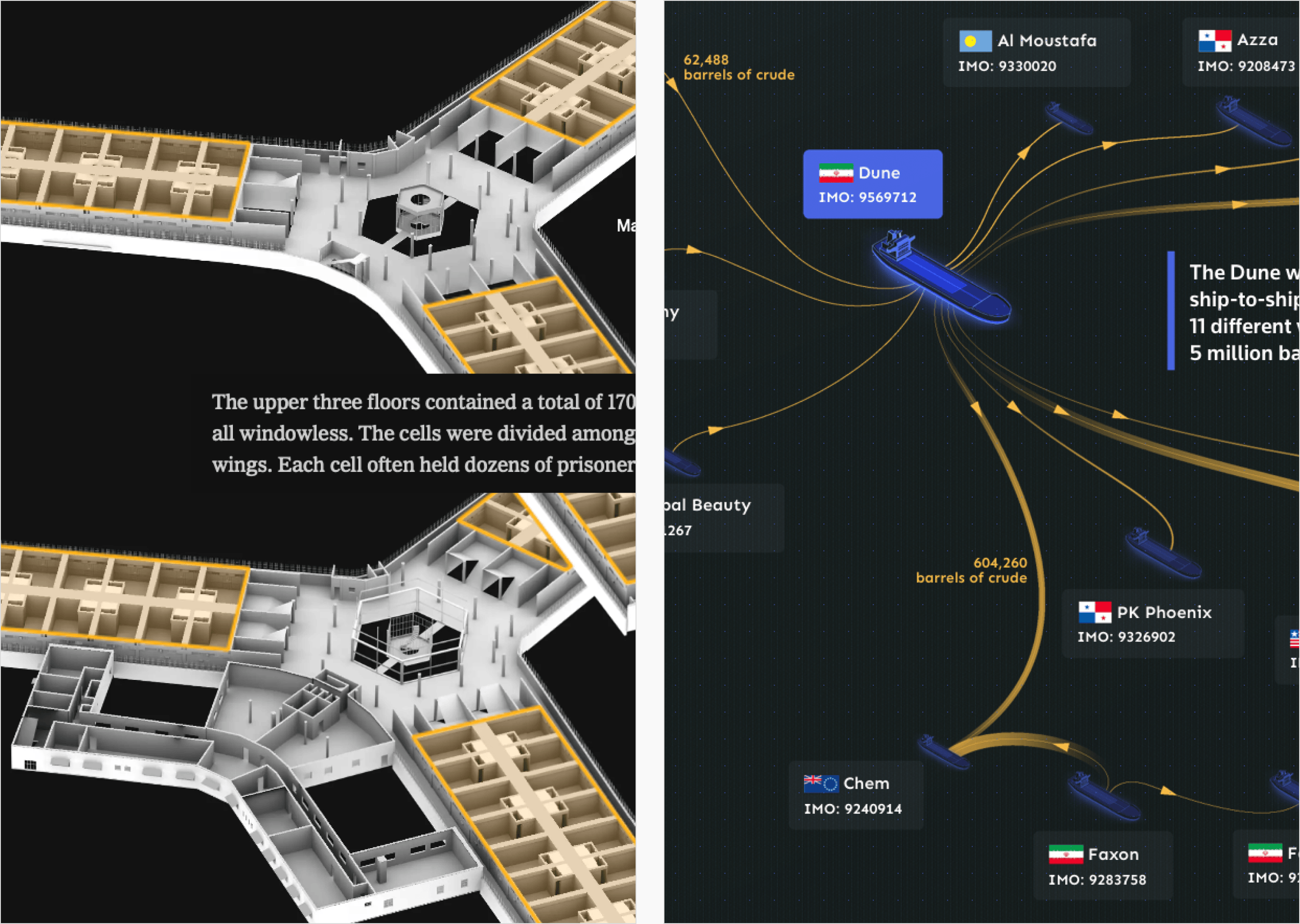
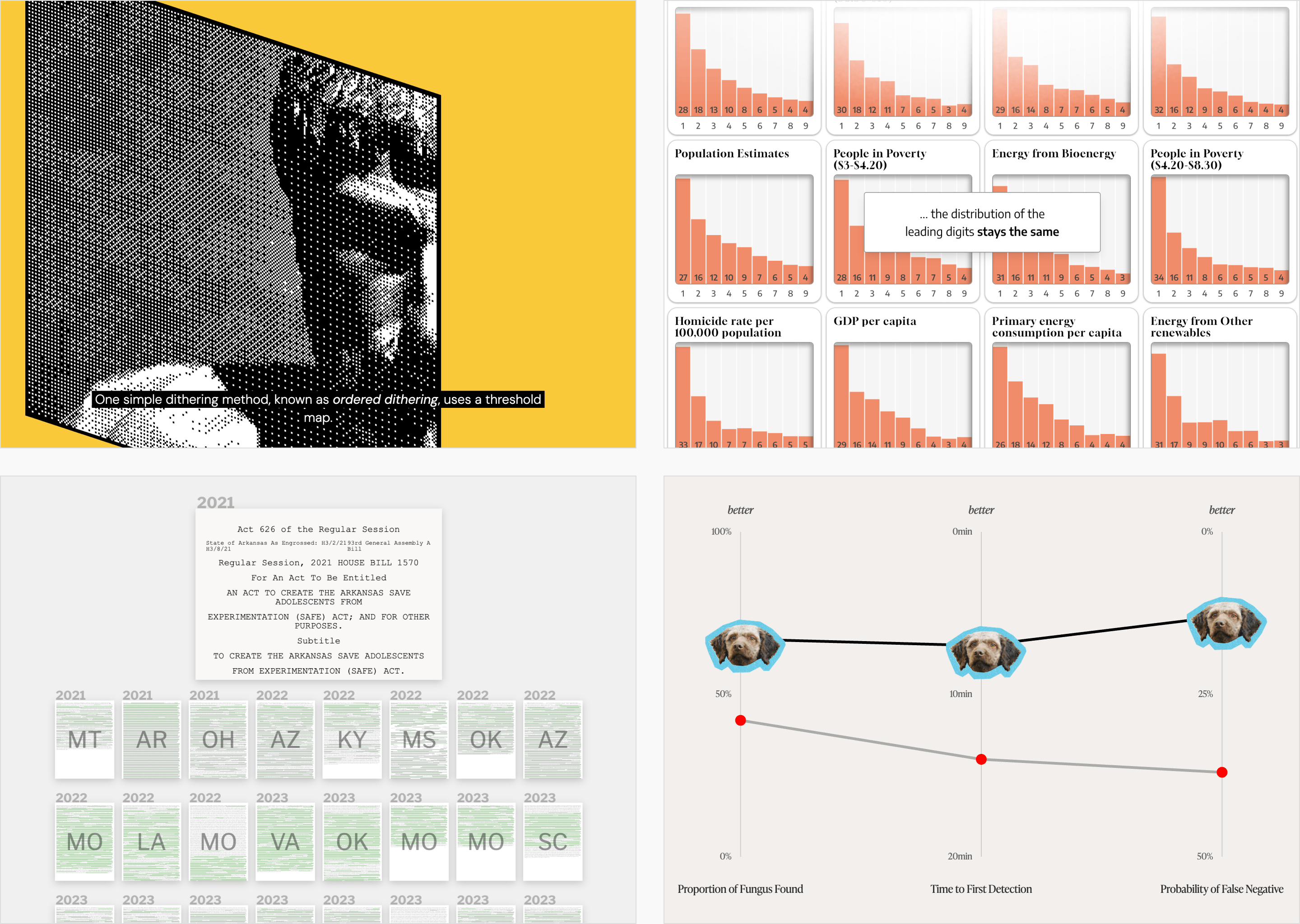

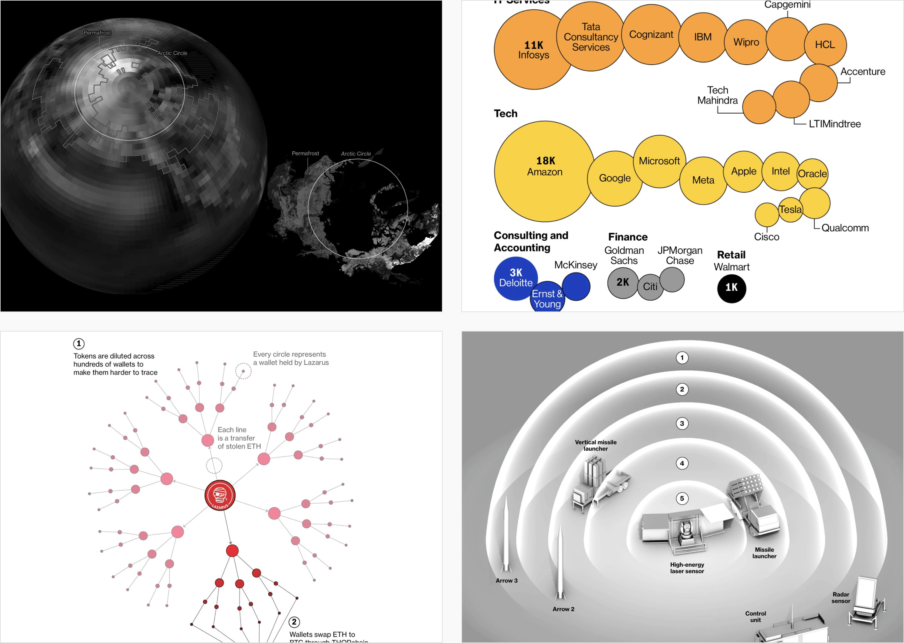
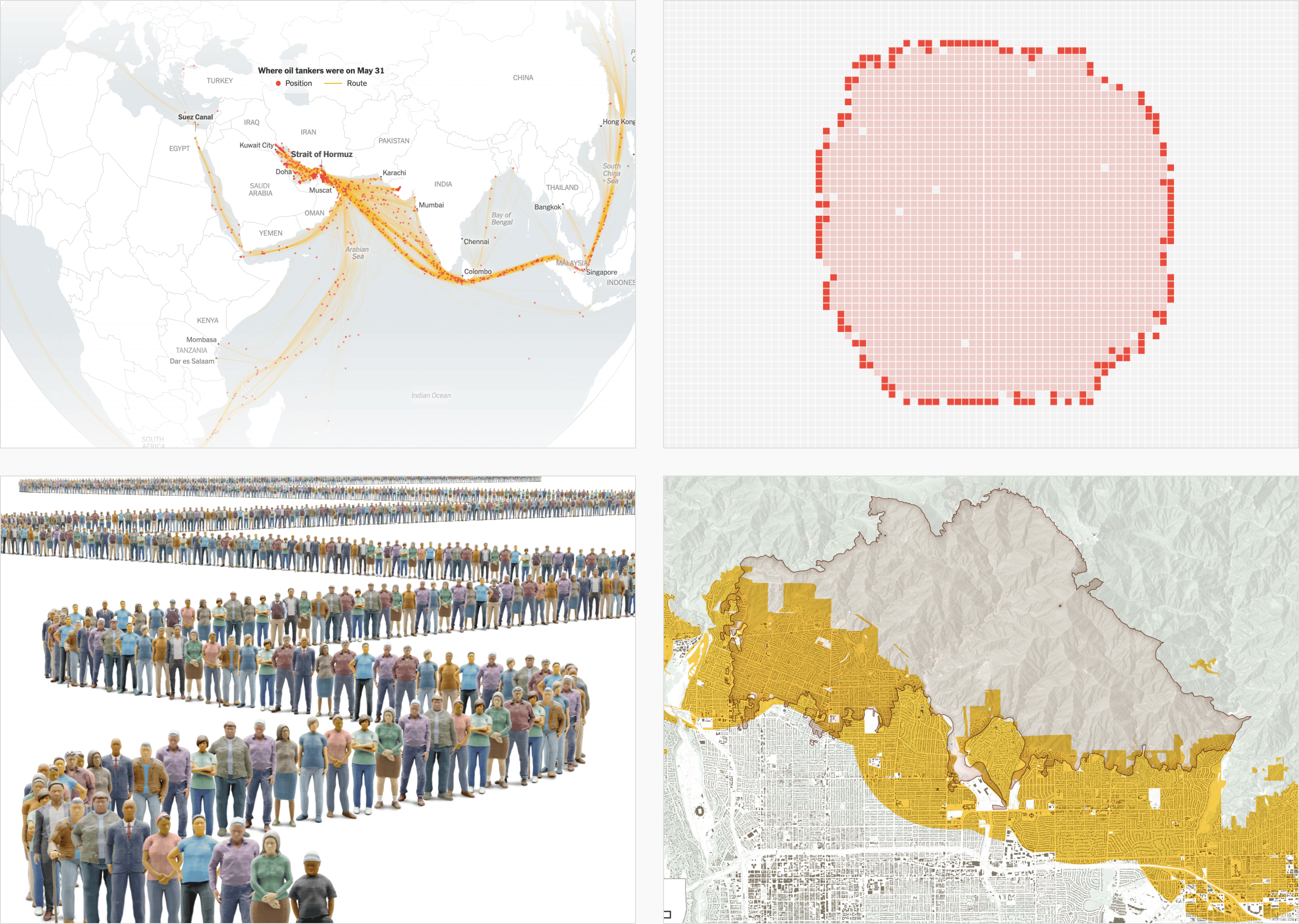
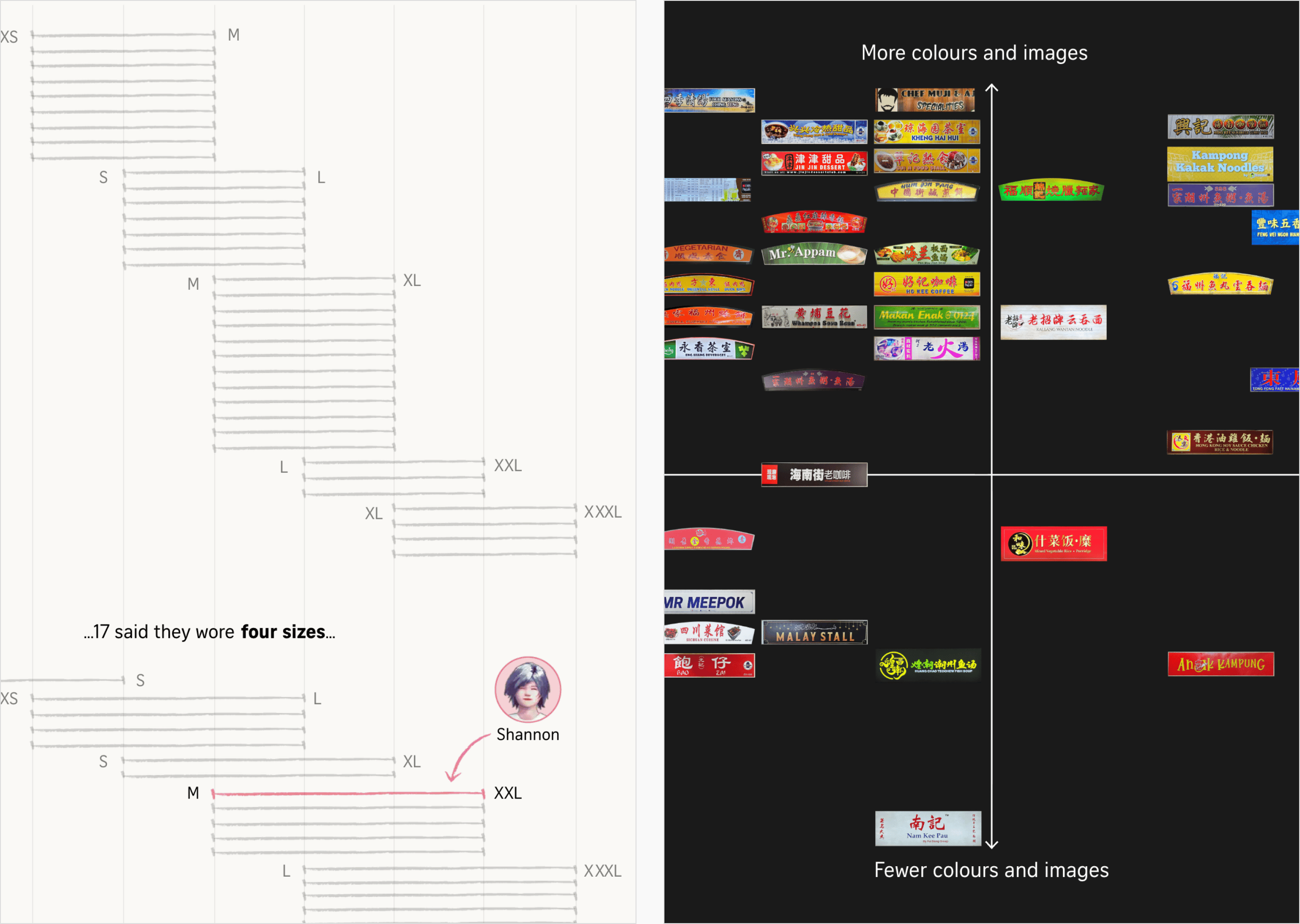
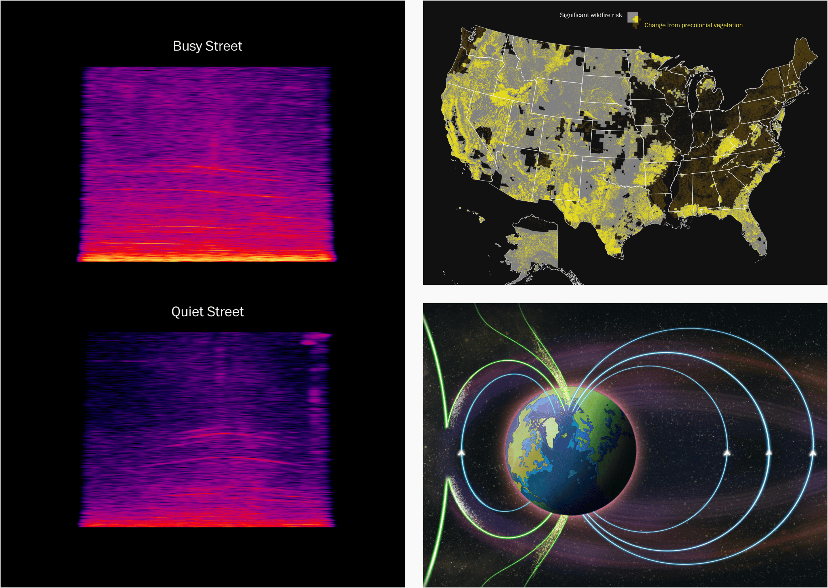
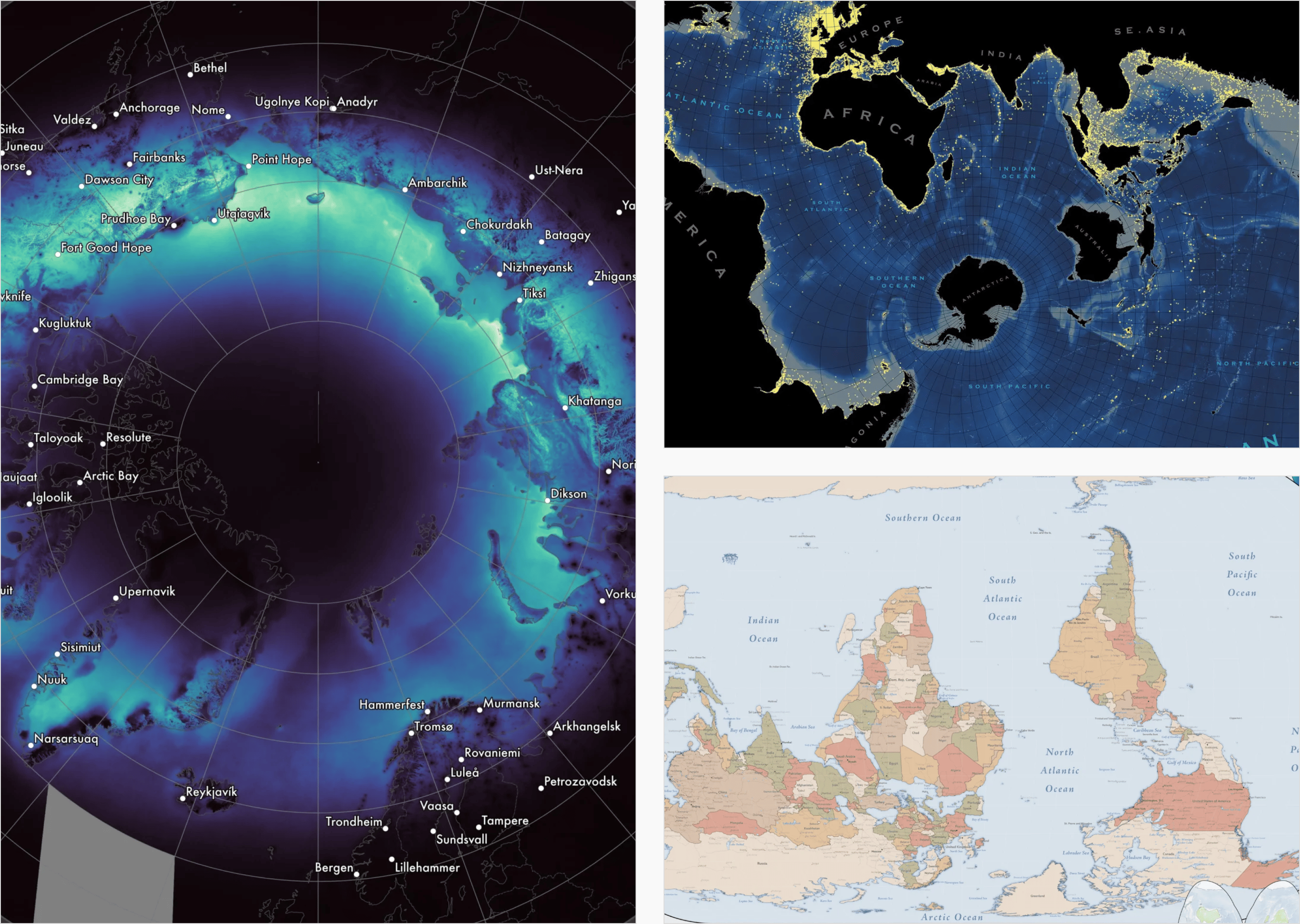
Numerous newsrooms and companies presented and collected their own visualizations from the year 2025 into rich and varied portfolios.
![Nexo Jornal: <a href="https://www.nexojornal.com.br/especial/2025/12/26/retrospectiva-do-ano-2025-em-graficos"><strong>O ano de 2025 nos gráficos do Nexo</strong></a> [<em>The year of 2025 in the Nexo charts</em>], December 29](https://datawrapper.de/cdn-cgi/image/quality=85,width=2880,f=auto,fit=cover/https://kirby.datawrapper.de/media/pages/blog/data-vis-dispatch-december-30-2025/534cf8075f-1767086086/nexo.png)
... and some newsrooms, individuals, and organizations selected their most popular, important, (and even worst) visual works of 2025.
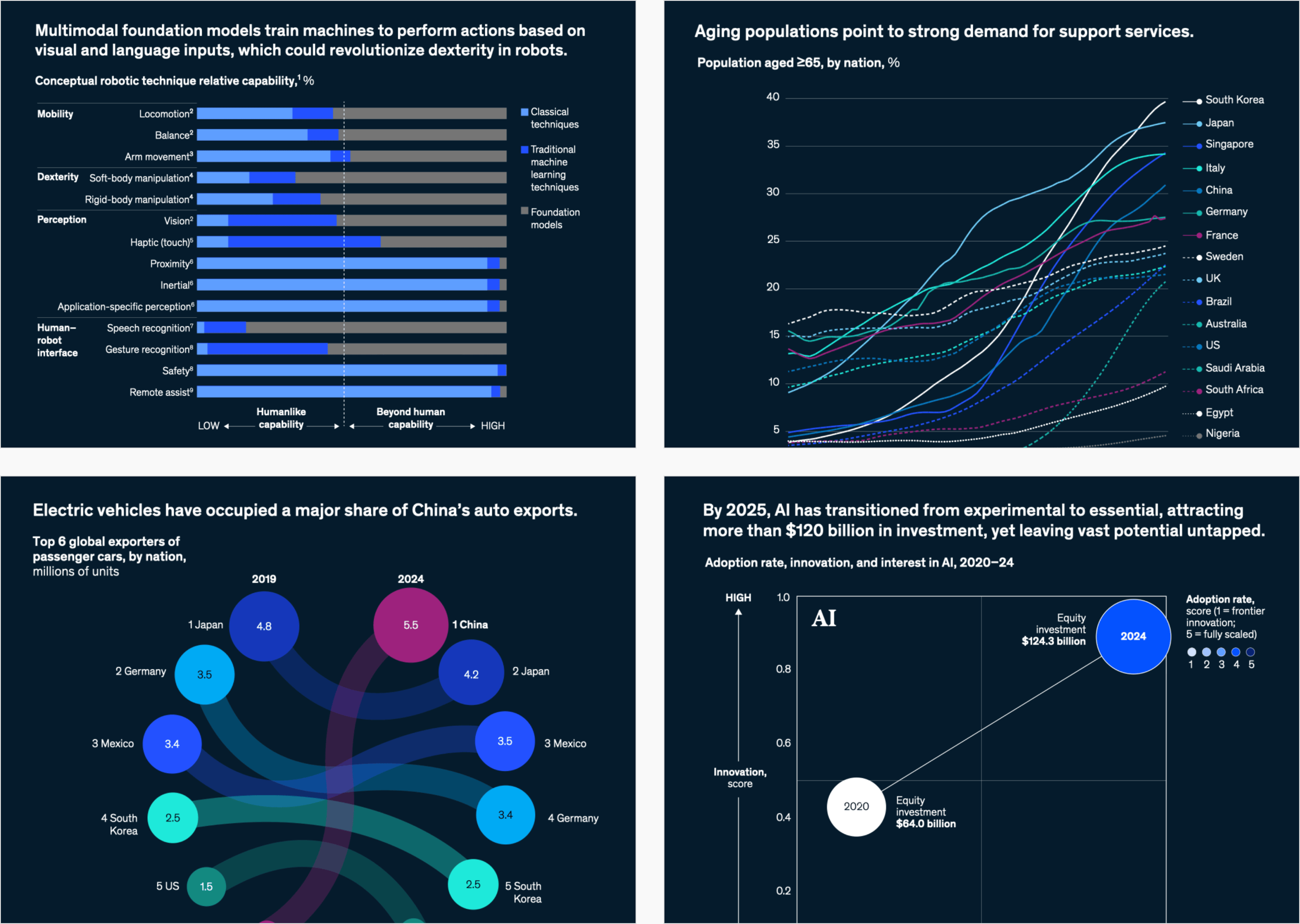
Other lists focus on visualizations that help explain 2025 and its most common topics.
Finally, we at Datawrapper haven't fallen behind. We've written two articles looking back at 2025. Which visualizations did Datawrapper users create? And what were our favorite news visualizations?
With that, thank you for an inspiring 2025 and a very vis-y New Year!
What else we found interesting
Applications are open for…
A cartographic design intern at Esri Creative Lab
A graphics reporter (deleted data project) at The Guardian
A data storyteller at Kontinentalist


