Data Vis Dispatch, December 23: Holiday special

The year is almost over, and to look back on memorable moments from the data vis world, we are bringing you special Dispatch editions in the last two weeks of the year. We’re reflecting on some incredible visualizations created over the past (nearly) twelve months. Some were shocking, some amusing, and some simply beautiful. All of them made us think about the potential of great data visualization.
A few in particular had a way of sticking with us. As is our holiday tradition, we asked the team: What data visualization from the past year are you still thinking about? This week's Dispatch features the Datawrapper team's favorite visualizations of 2025.
Recurring topics include — well — they're as diverse as the team is.
Let's start with the teams most frequently encountered on this blog: the communication team, the designers, and the'website creators.

Alicia
Visual designer
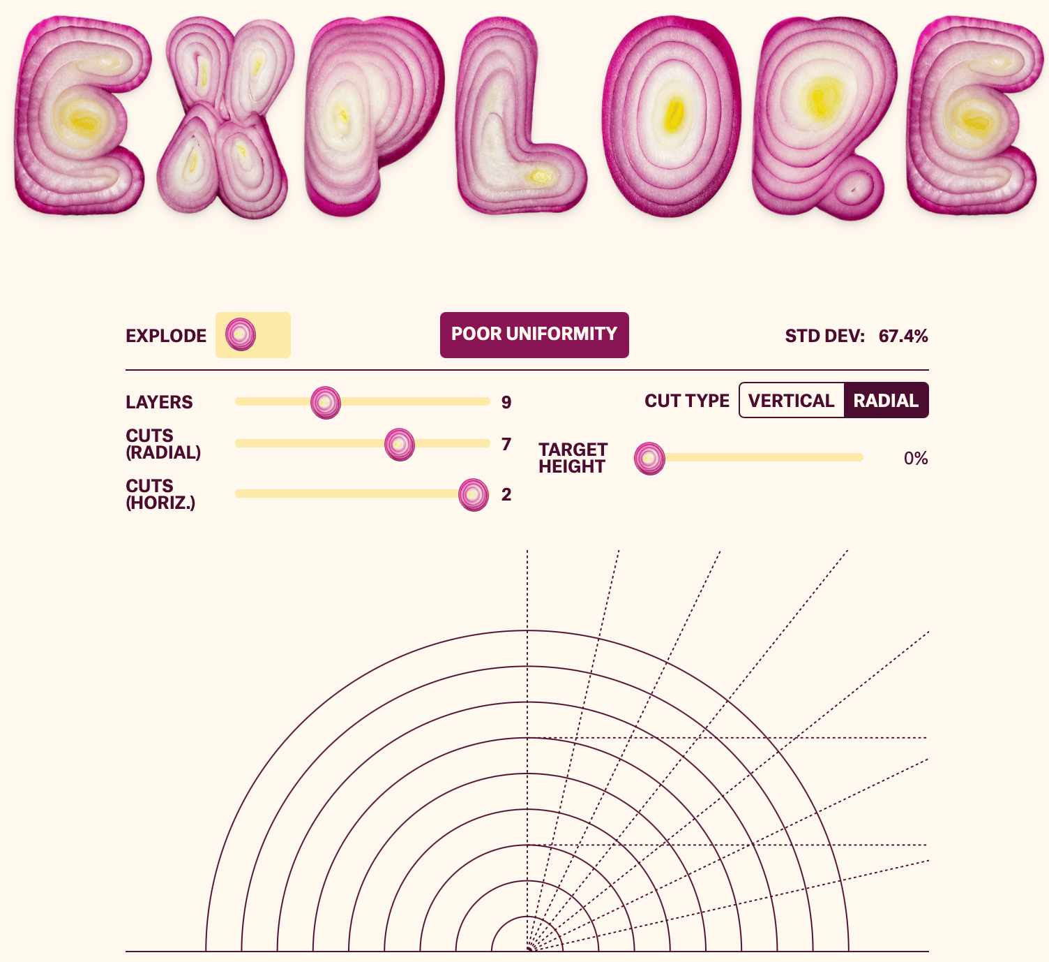
A piece from this year I remember enjoying is Dicing an Onion the Mathematically Optimal Way by The Pudding. Interactive visualizations are always fun, and I appreciate being curious about mundane topics and communicating the findings in an engaging way.
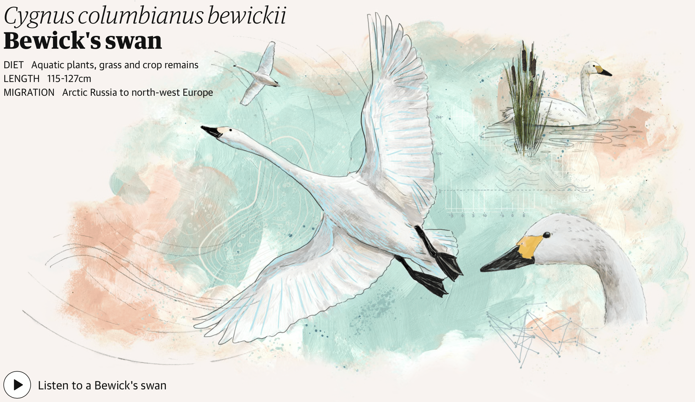
Another one that stuck with me is Bird migration is changing. What does this reveal about our planet? – visualised by The Guardian. The illustrations are so beautiful!

Jonathan
Website development lead
This data story by ZEIT finally gave me enough context to better understand why buying a home can feel so out of reach for people my age. I love it when a few well-designed charts alongside a well-written article make something in my mind click!
![DIE ZEIT: <a href="https://www.zeit.de/wirtschaft/2025-12/immobilienpreise-eigentum-generationen-entwicklung-nebenkosten"><strong>Was Millennials beim Hauskauf ruiniert</strong></a><strong> </strong>[<em>What ruins millennials when buying a house</em>], December 17](https://datawrapper.de/cdn-cgi/image/quality=85,width=1324,f=auto,fit=cover/https://kirby.datawrapper.de/media/pages/blog/data-vis-dispatch-december-23-2025/0a55a0907f-1766400924/cleanshot-2025-12-18-at-12.29.58@2x.png)

Lisa
Head of communications
Alvin Chang told my favorite data story of the year for The Pudding (again!): 30 minutes with a stranger. One of its most important points: “Researchers have repeatedly found that people don’t think they’ll enjoy interacting with strangers. But after the interaction, participants tend to say it was a positive experience.”
It’s storytelling at its best, moving back and forth between anecdotes and the bigger picture.
And like many of Alvin’s stories, this one doesn’t just inform, but provokes – and might even change our behavior. It reminded me of my own encounters with strangers and how much they brightened my day, and made me realize that I should try to initiate them more often myself.

Veronika
Communications
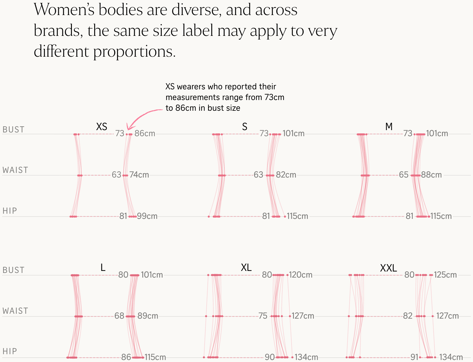
One of my favorites this year appeared in our September Dispatch. The Straits Times' team looked into the chaotic world of women's clothing sizes. It's a great example of taking a (frustrating and relatable) personal experience, gathering data, and using visualization to make sense of said experience within a wider context. Its brilliant storytelling, thoughtful design, interviews, and 3D printed figurines (!) elevated a simple idea to a rich and engaging analysis.
And of course, my colleagues' Weekly Charts! They're such a delightful mix of personal interests and beautiful (and ridiculously creative) Datawrapper visualizations. (You might want to sign up for our newsletter if you haven't already. *wink wink*)

Vivien
Communications
It's hard to call my favourite visual article of the year 'favourite'. It's more the one I thought about most often, the one I often dug out to show others. It's an article about the 104 women in Germany who were killed by their partners or ex-partners. This piece is the work of Elisabeth Raether, Annick Ehmann, Tamara Flemisch, and Dana Hajek, published by DIE ZEIT. The topic is so important!
The authors did a great job of digging into a subject with such limited available data. I appreciate how sensitively the authors dealt with the topic and the effort the research must have required. Above all, I'm touched that, amid all the statistics, the personal stories are not overlooked — none of the 104.
Now, let's hear from the app developers on their 2025 favorites.

Julian
App developer
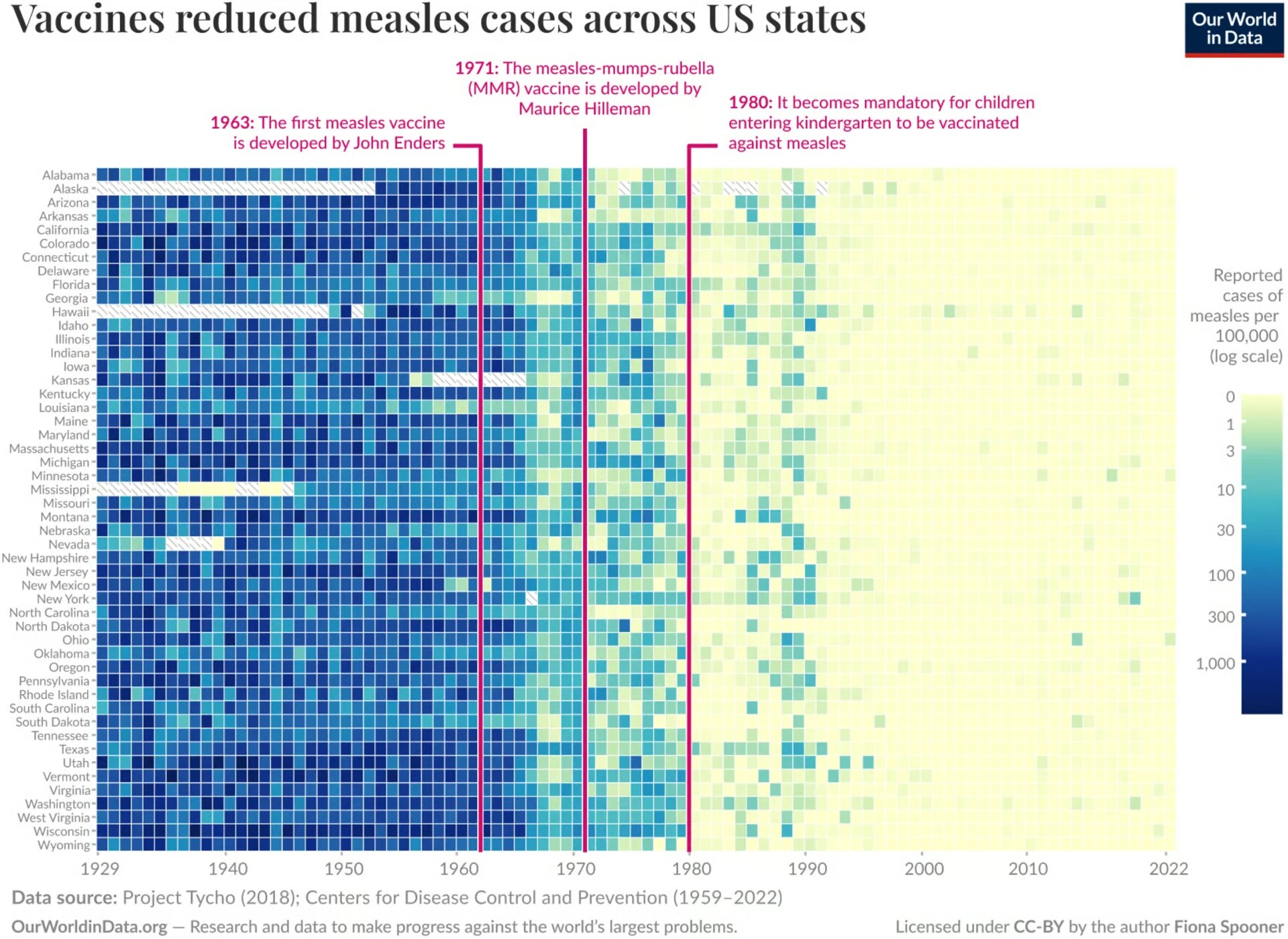
I really like the chart in the May 20 edition of the Dispatch showing the reduction in measles cases due to vaccines. It has an extremely powerful message and is super easy to read. It's also interesting from a data vis perspective because it uses a heatmap as an alternative for data that's usually plotted on a line chart

Linus
App developer
My favorite visualization (or rather, set of visualizations) was When You Will Die by Nathan Yau. Visualizing outcomes of simulations based on the probability of living another year for each year of life gives much more perspective than the average and median lifetime stats you usually see.
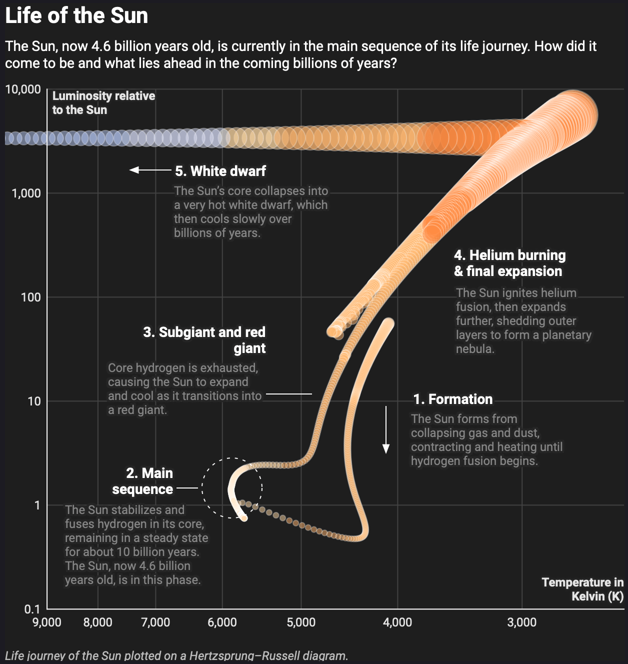
My honorable mention goes to Life of the Sun by my colleague Pascal. Informative, but above all else, visually beautiful!

Toni
App developer
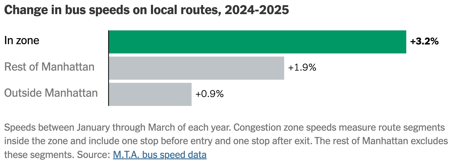
Here are my two good news contenders this year. First, NYC’s congestion pricing reports: I love how this makes it crystal clear that the whole backlash was manufactured and had no ground to stand on. Policies like this are a no-brainer, especially for people without vested interest in the success of fossil fuel companies.
Second, Renewables will be the world's top power source by 2026: While this doesn't mean we can rest easy, and we need to do a lot more to further mitigate the catastrophic effects of climate change, it's important to celebrate achievements that felt impossible a decade ago. Renewables are cheaper than ever, and this marks a turning point in how humanity is powered.
![Solarpabst: "Ab nächstem Jahr wird der meiste Strom weltweit durch Erneuerbare erzeugt" [<em>From next year, most of the world's electricity will be generated from renewable sources</em>], October 31 (<a href="https://social.anoxinon.de/@solarpapst/115470519584020622"><strong>Mastodon</strong></a>)](https://datawrapper.de/cdn-cgi/image/quality=85,width=1080,f=auto,fit=cover/https://kirby.datawrapper.de/media/pages/blog/data-vis-dispatch-december-23-2025/8399721c4a-1766407414/1669c24f458d6bbf.jpg)
Here are some projects that our visualization developers appreciated over the past year.

Elliot
Visualization developer
My favorite of 2025 was The Rising Cost of ICE Flying Immigrants to Far-Flung Detention Centers. I love the way that subtle animation is used to elevate the maps opening this important story. Not only does this motion help readers distinguish between the overlapping lines, but it also indicates direction without requiring the use of arrows. Plus, it just looks really cool.

Erle
Visualization developer
When I realised how often I have been mentioning The Pudding’s The Pour-igin of Species to people this year (basically any time someone was talking about wine), I knew this had to be one of my picks. I love how it takes a deep dive into this whimsical but very relatable question: “You like wines with animal labels. Which wine are you buying?” Because, let’s be honest, don’t we all choose our wine based on the label? 🙋🏻♀️ Polished with fun touches such as wine bottles rolling into the screen, this publication absolutely made me smile.
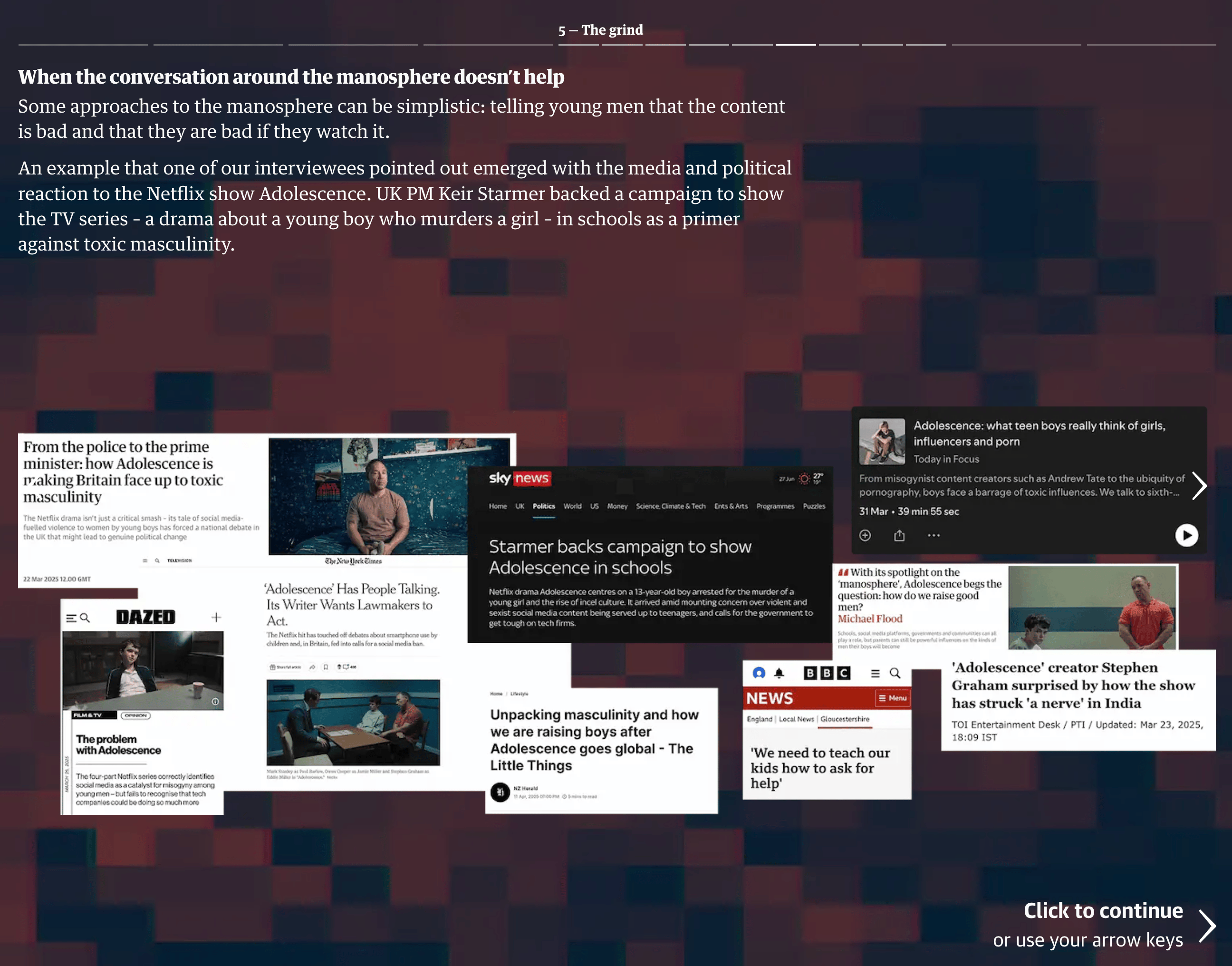
Another article that really stuck with me was The Guardian’s audiovisual story on the manosphere. I thought it did a great job of showing how personal stories are inextricably linked to larger forces such as social norms, economic trends, and the oft-cited loneliness epidemic. It affected me and prompted me to wonder: “how do the men in my life feel about the manosphere? In what way can they relate to its philosophy, if at all?” It felt like the kind of piece that can open up the way to an important conversation.

Ivan
Visualization developer
I really enjoyed the Biocubes visualization, which compares the weight of organic and human-made mass (technomass) on Earth. This unusual piece features 3D shapes and playful animations, which are not typically in my datavis toolbox. But the authors do a great job using this format, making the piece educational and entertaining. At just a quick glance, the visualization reveals some amazing facts:
Technomass weight recently surpassed biomass weight 😮
Fungi collectively weigh more than all animals 😳
Viruses weigh more than humans 😱 (I thought viruses were tiny?!)
And last but certainly not least: our co-founders.

Gregor
Co-founder
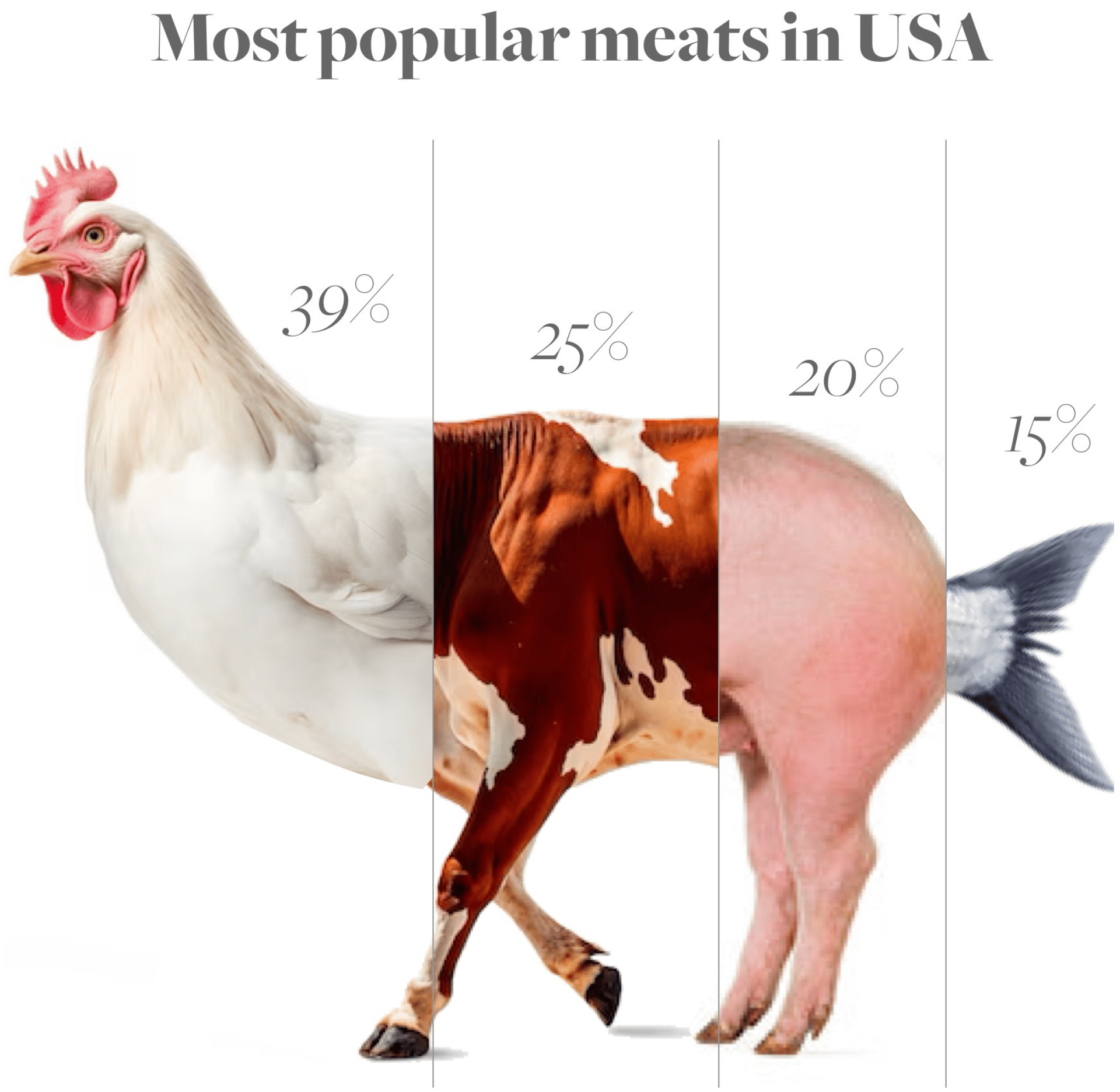
I would like to highlight Karim Douieb's beautiful yet disturbing charts as one of my personal highlights of the year. In my opinion, there is no better way to present these numbers! 🐔🐮🐷🐟

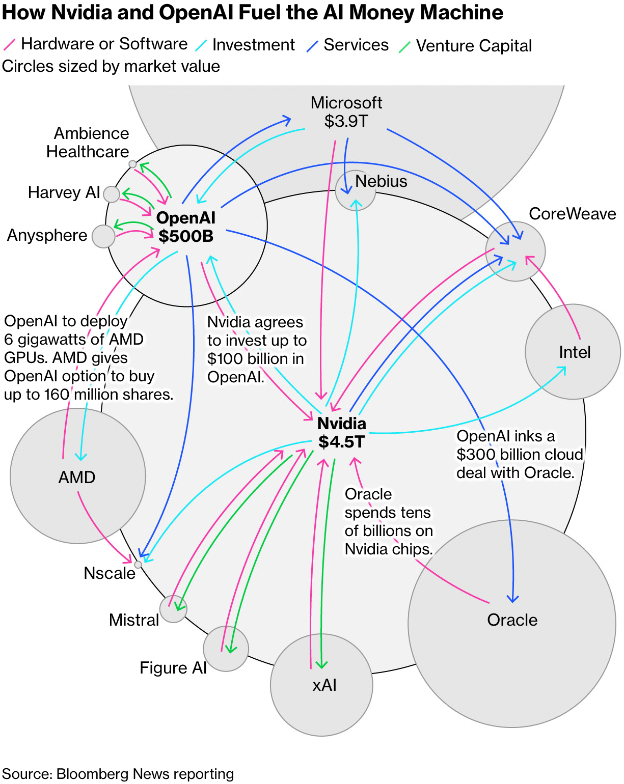
Mirko
Co-founder
AI is the tech topic of the year and very likely the next years. The investments are in the billions, for chips, for data centers, for electricity, and partnerships. The visualization from the Bloomberg team shows how uniquely complicated the deal-making frenzy is around AI. Actually, the criss-crossing of billions of dollars being invested is more comparable to investment banking than previous tech cycles. Is there a problem? Well, not if all goes to plan. Will everything go as planned? That remains to be seen, but is not really likely at this scale. This is why this visualization is important – it is in many ways a warning of super-complex deal-making into the future. I am thankful that data journalism/data visualizations work hard to communicate what is going on to the general public.
What else we found interesting
Applications are open for…
A cartographic design intern at Esri Creative Lab
A graphics reporter (deleted data project) at The Guardian


