Data Vis Dispatch, February 3: Measles, ICE, and skiing

Welcome back to the 230th edition of Data Vis Dispatch! Every week, we’ll be publishing a collection of the best small and large data visualizations we find, especially from news organizations — to celebrate data journalism, data visualization, simple charts, elaborate maps, and their creators.
Recurring topics this week include the comeback of measles in the U.S., ICE activities, and expensive, shrinking ski regions.
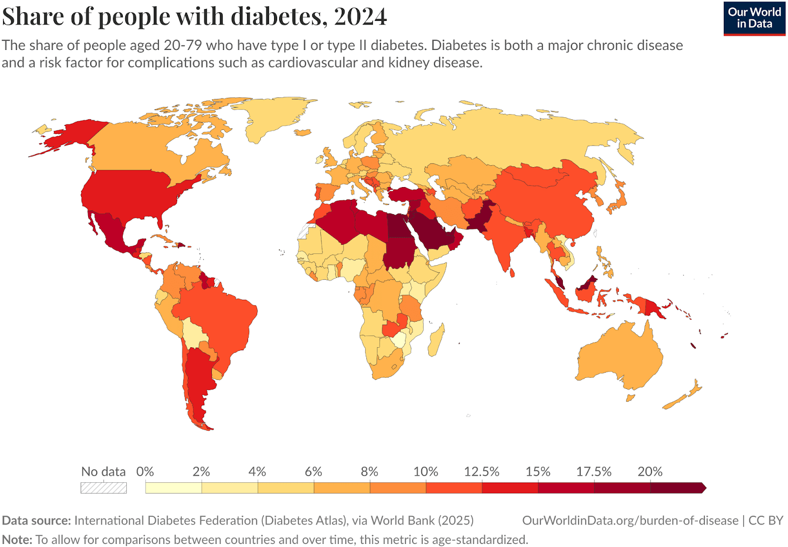
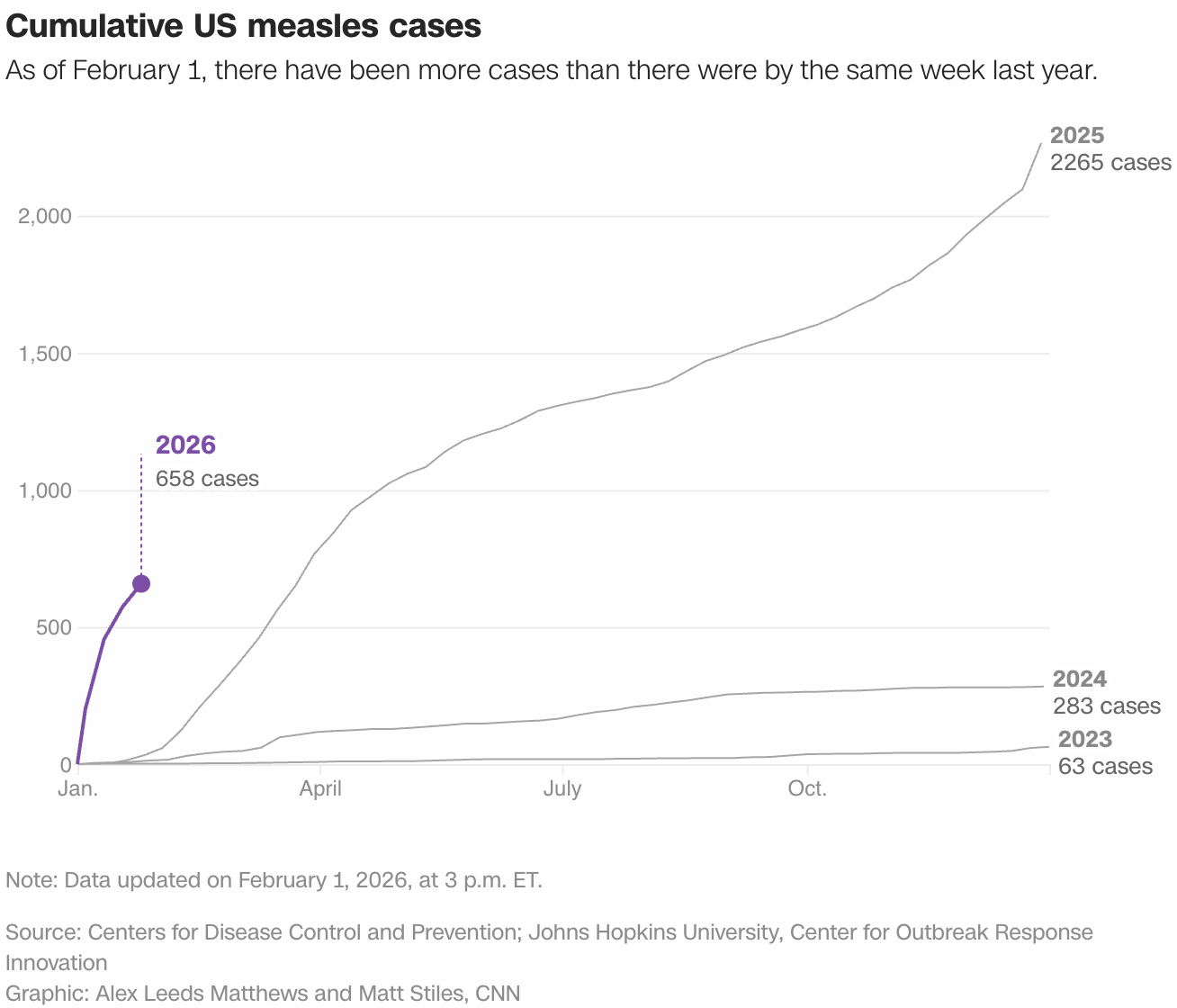
It’s cold in our Berlin office, and, as always, a cold is also making the rounds. However, illness is not just a seasonal inconvenience. Measles, once declared eliminated in the U.S., are back. Diabetes is rising quickly in South Asia and Africa. And neglected tropical diseases continue to shape everyday life for millions.
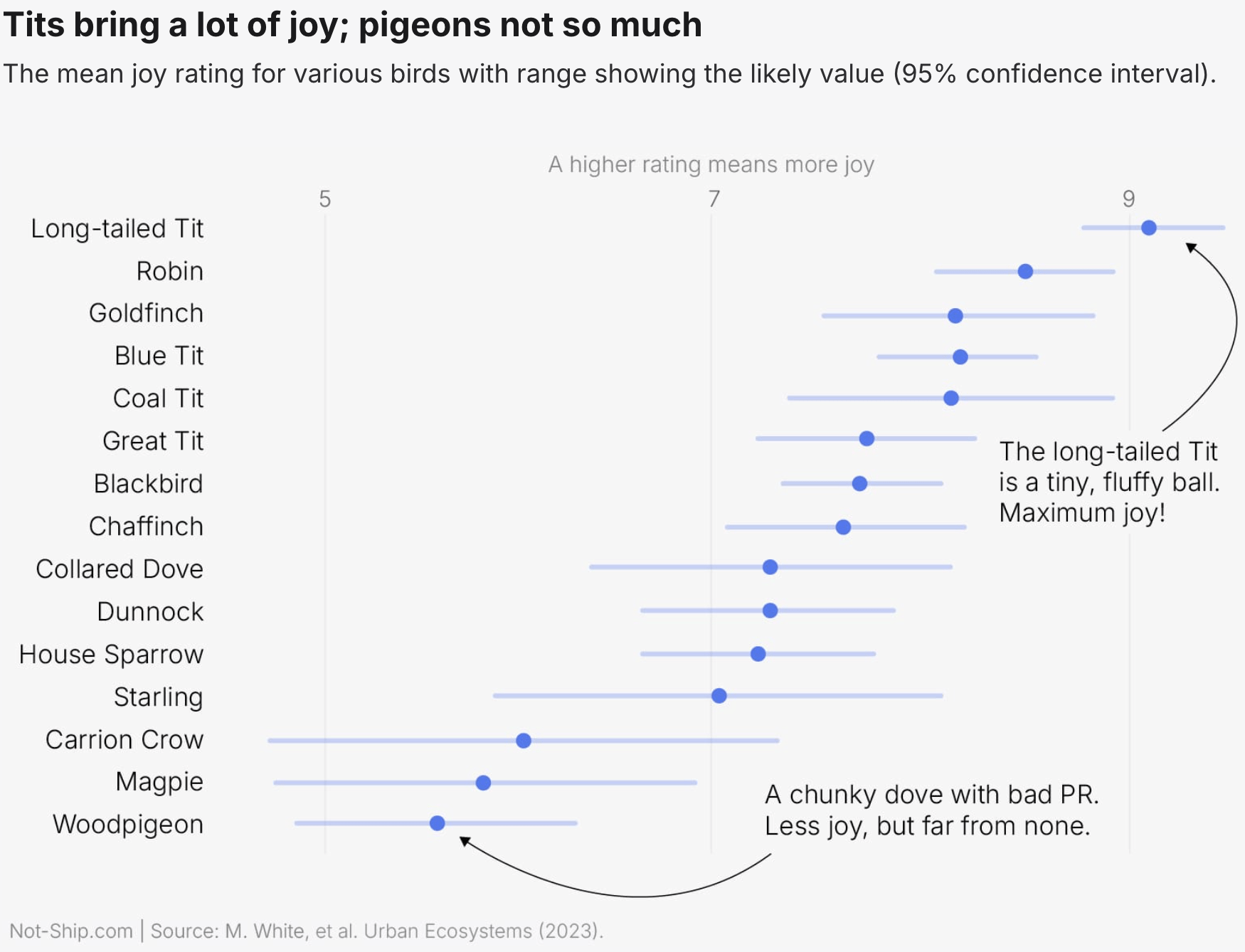
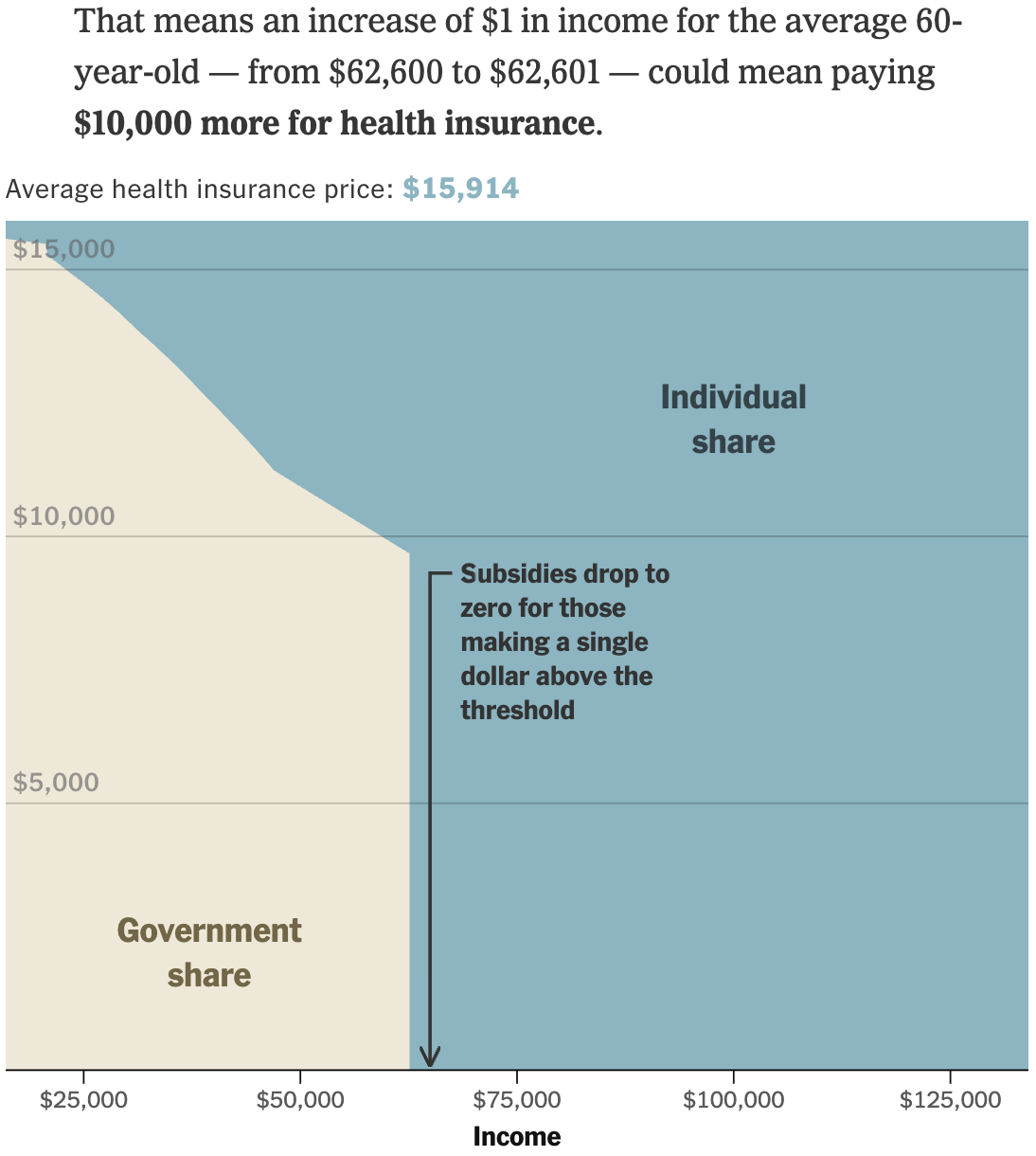
In terms of health, birdwatching can ease stress, tension, and fatigue. That's great! What's not great: Obamacare’s open enrollment period is over, and a $1 income difference can have a significant impact.
Apart from causing colds, the freezing temperatures also prompt many people to head to the mountains for a skiing trip. However, skiing isn't getting cheaper, and ski resorts are losing snow.
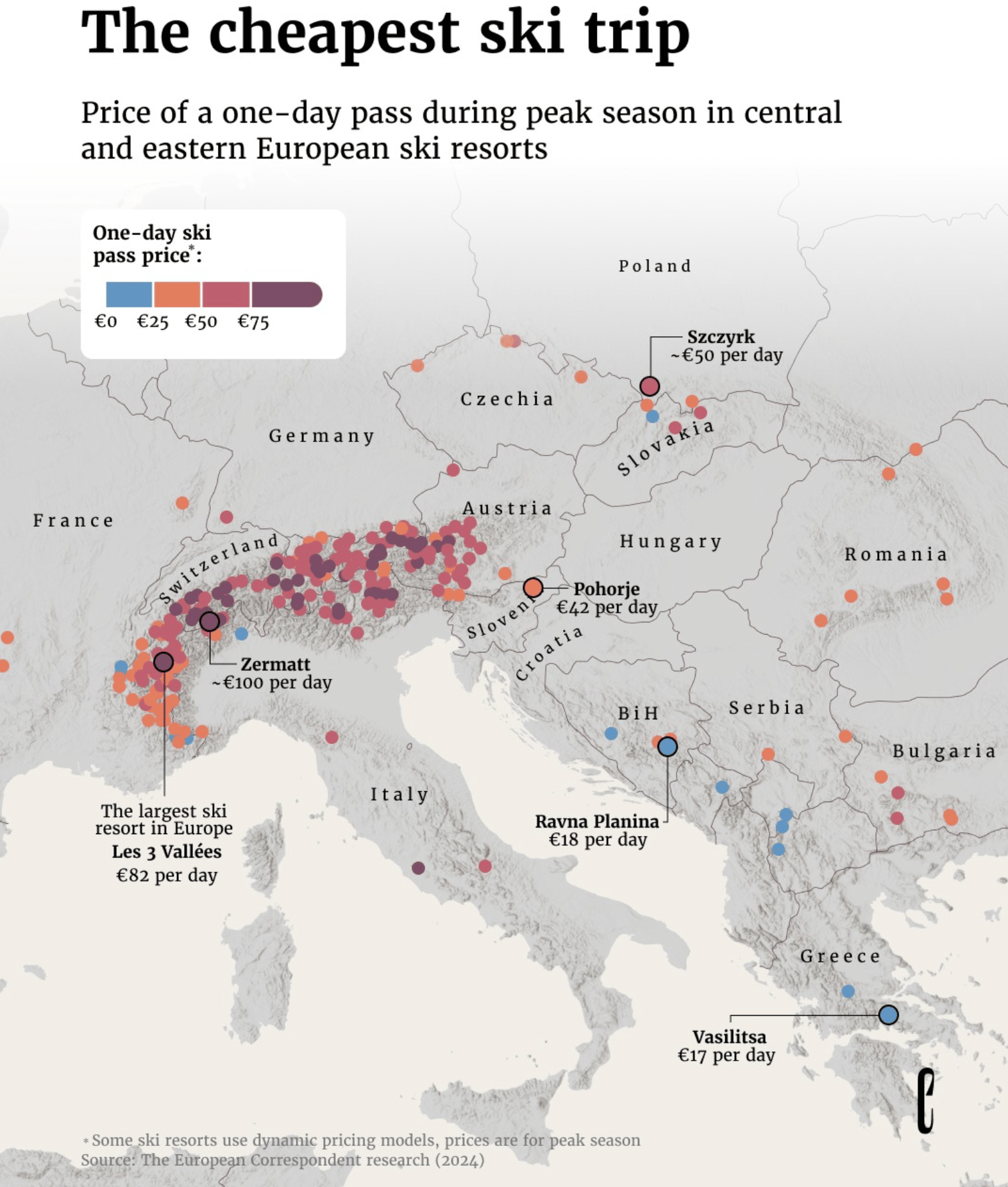
![Tagesanzeiger: <a href="https://www.tagesanzeiger.ch/skifahren-schweiz-so-viel-schnee-hat-ihr-skigebiet-verloren-128089570008"><strong>So viel Schnee hat Ihr Skigebiet seit den 1960er-Jahren verloren</strong></a> [<em>This is how much snow your ski resort has lost since the 1960s</em>], February 1](https://datawrapper.de/cdn-cgi/image/quality=85,width=2202,f=auto,fit=cover/https://kirby.datawrapper.de/media/pages/blog/data-vis-dispatch-february-3-2026/acc7067d29-1770110551/cleanshot-2026-02-03-at-10.20.44@2x.png)
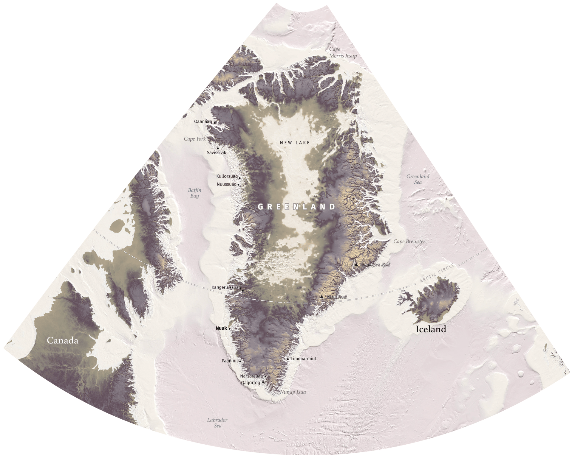
Apropos of losing snow, let's take a look at how Greenland looks without its enormous ice shield, using sub-ice data for the area.
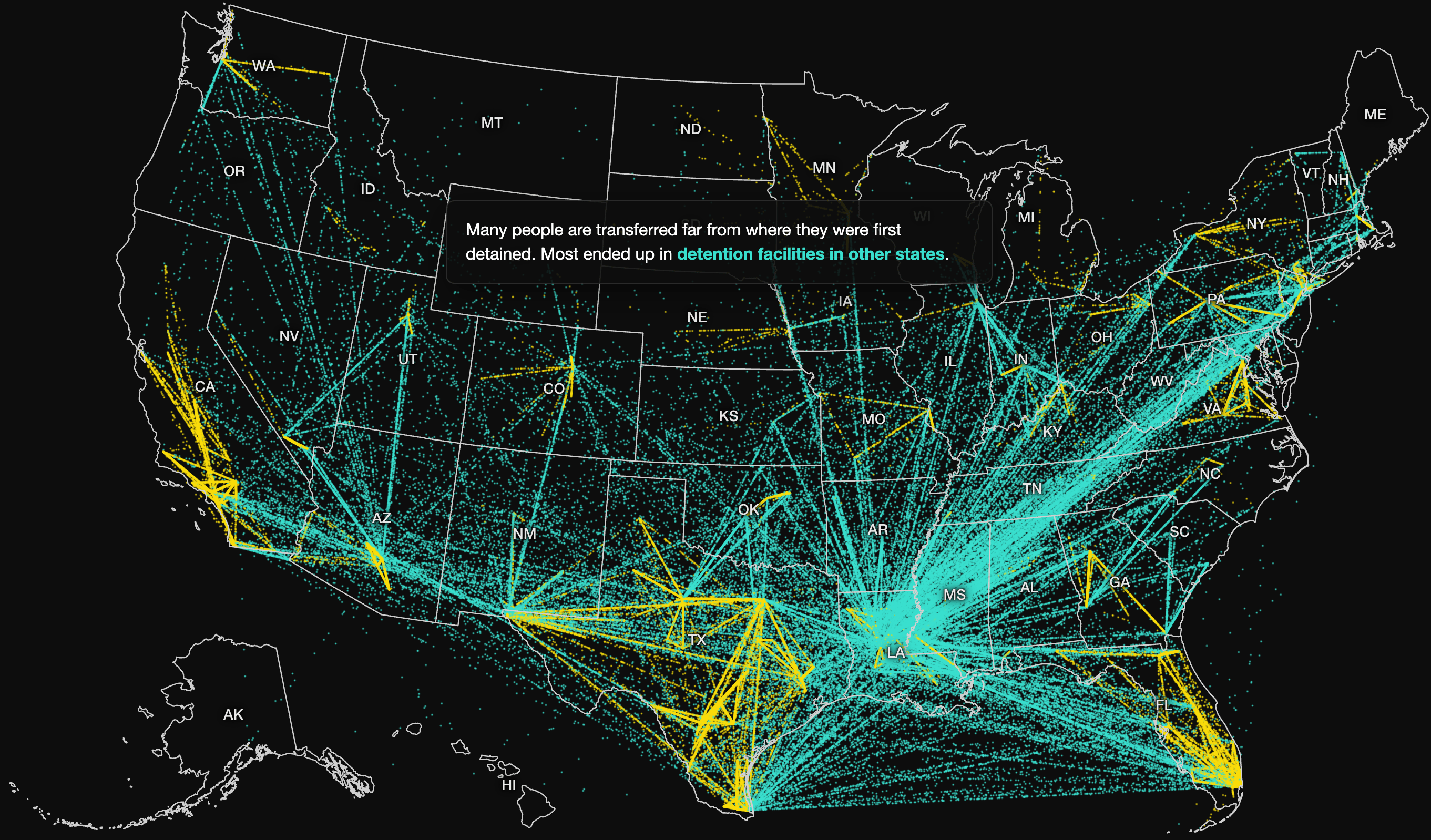
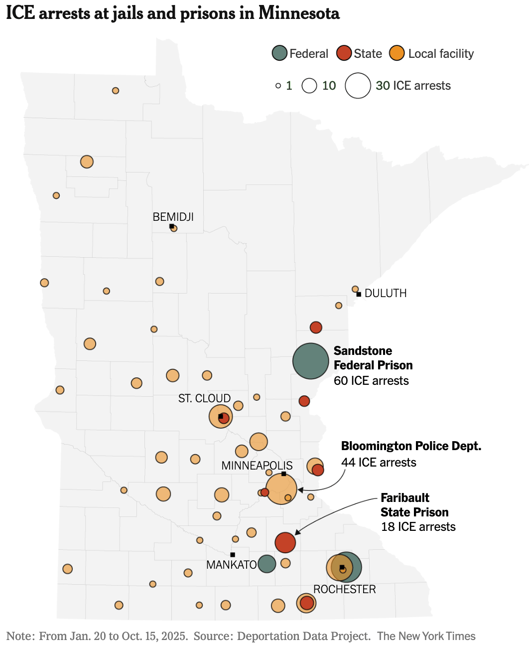
Greenland is the perfect gateway for talking about the U.S., where Immigration and Customs Enforcement (ICE) activities are widely discussed. Newsrooms visualized arrests and long transfers between jails.
![DIE ZEIT: <a href="https://www.zeit.de/politik/ausland/2026-01/ice-einsatz-usa-minneapolis-minnesota"><strong>Wie Trump ICE zur Waffe macht</strong></a> [<em>Chart description: Since Trump took office, arrests by ICE agents have risen rapidly. [...] More and more often, people with no criminal record or with pending criminal proceedings are being arrested</em>], January 29](https://datawrapper.de/cdn-cgi/image/quality=85,width=1490,f=auto,fit=cover/https://kirby.datawrapper.de/media/pages/blog/data-vis-dispatch-february-3-2026/a56c04ce02-1770056780/cleanshot-2026-02-02-at-19.25.53@2x.png)
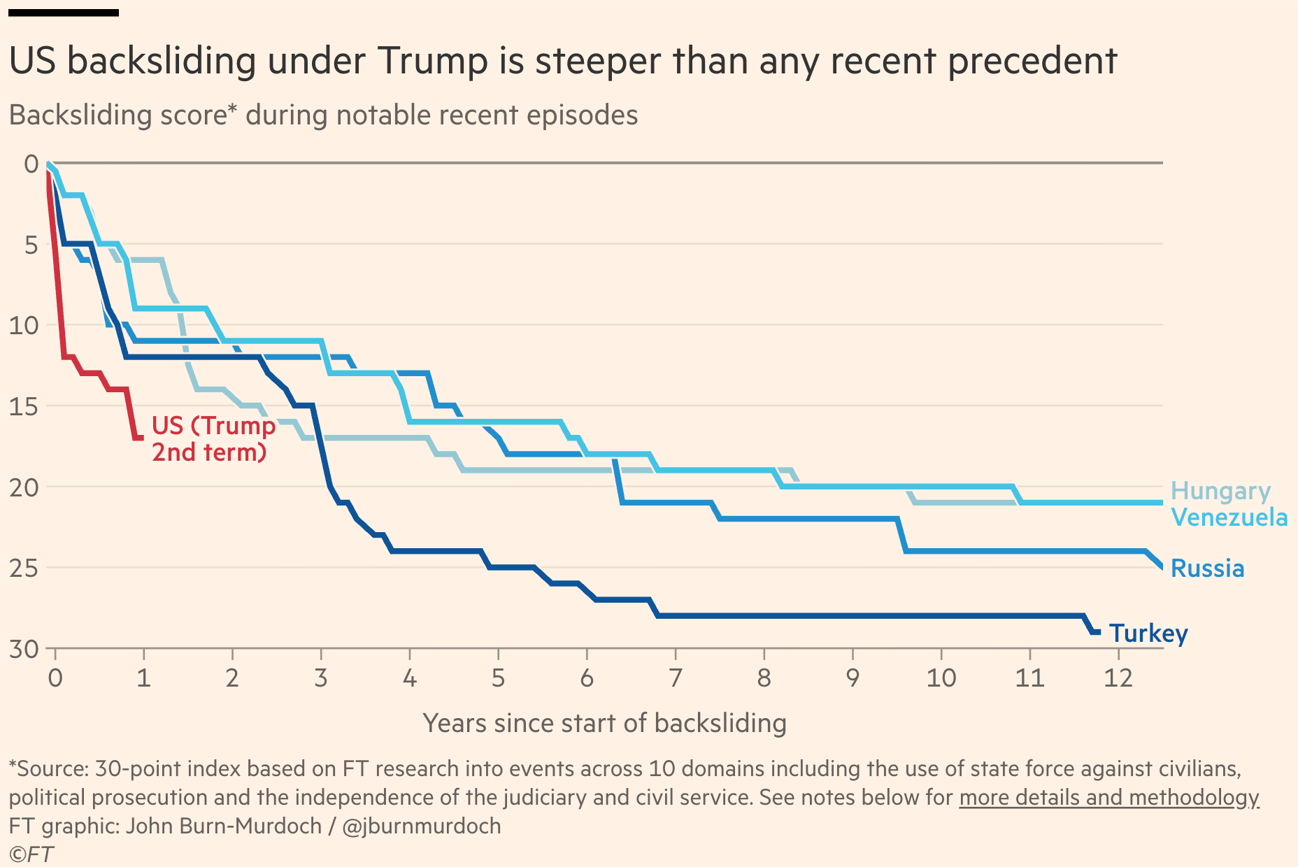
The political violence carried out by ICE is an impressive example of democratic backsliding in the U.S., which happens much faster than in other countries.
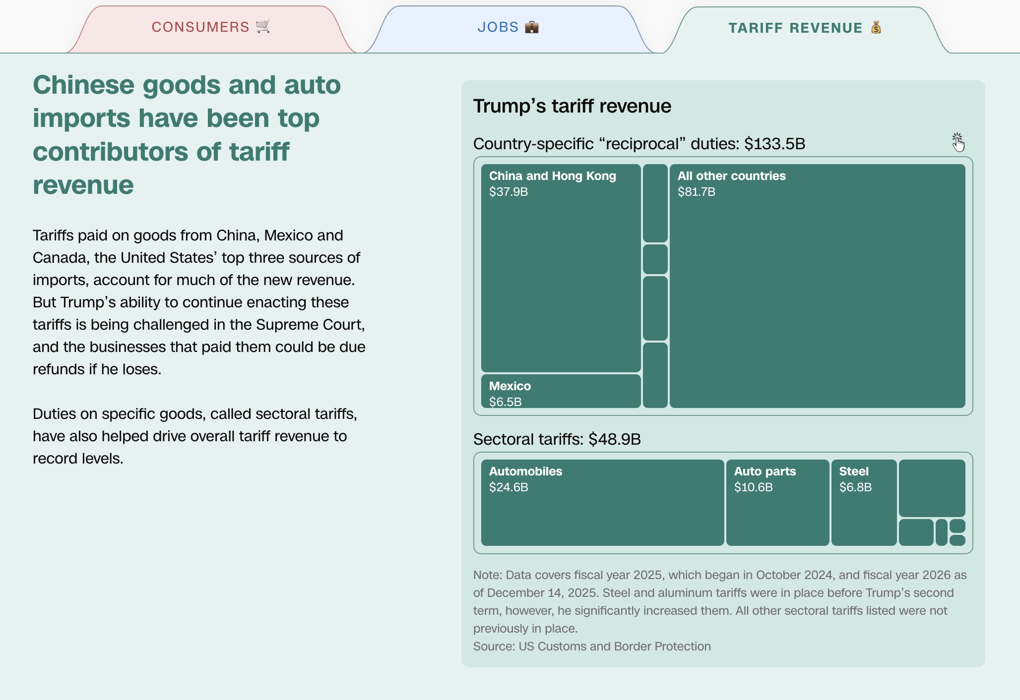
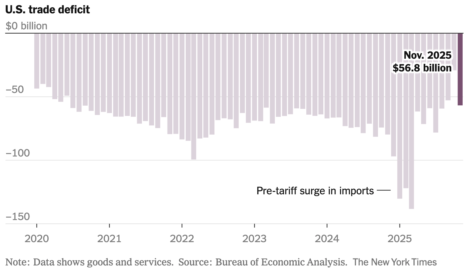
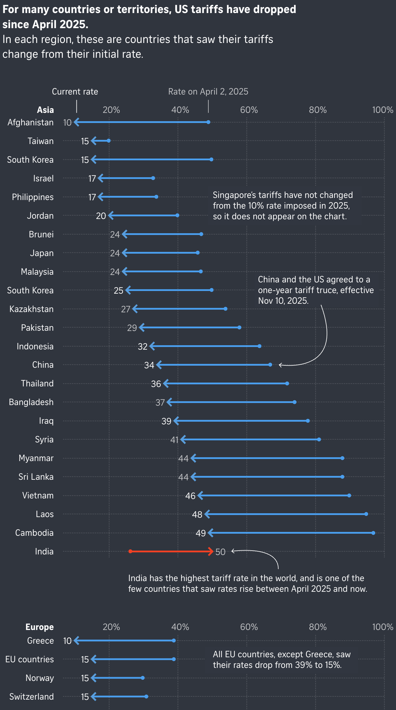
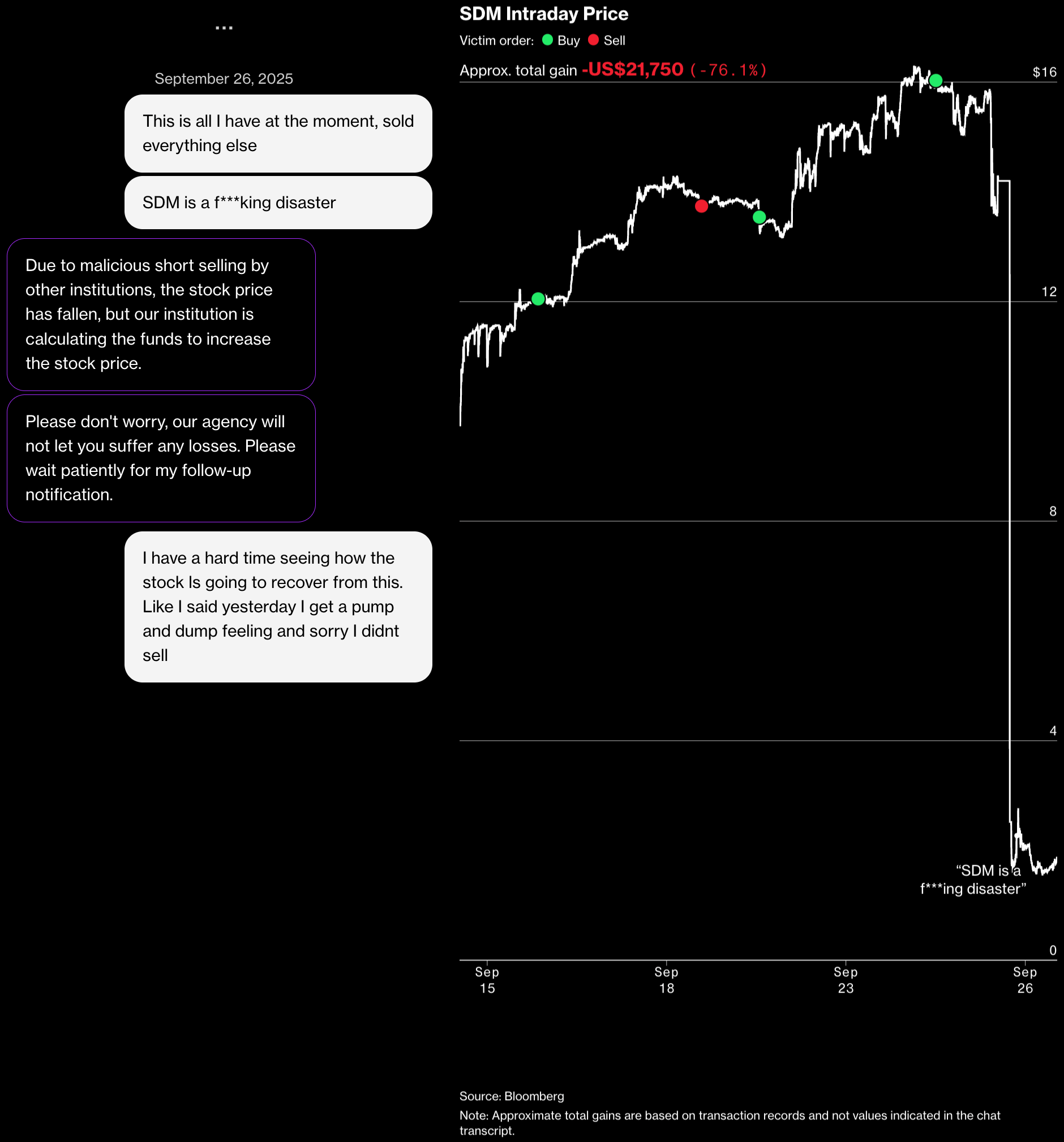
Other concerned visualizations examine the U.S. economy. They analyze increased tariffs and their effects, as well as stock manipulation schemes.
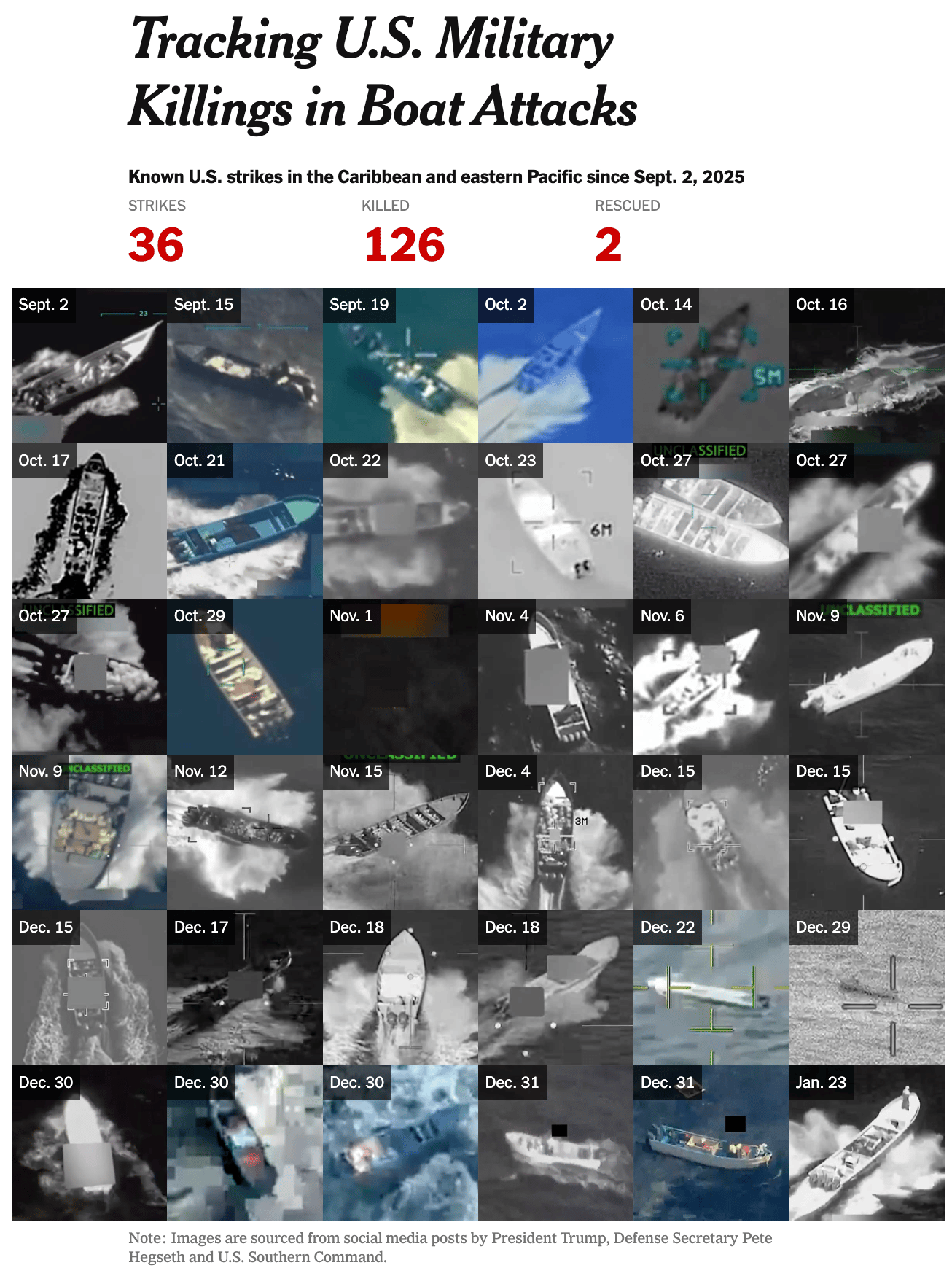
In light of all this worrying news, let's not forget about other conflicts, such as U.S. strikes in the Caribbean and the eastern Pacific or the shifting border in Ukraine.
![Тексти.org.ua: <a href="https://texty.org.ua/projects/116639/rosiyany-zbyrayut-stabilno-vysoki-vrozhayi-z-okupovanyx-terytorij/"><strong>Росіяни збирають стабільно високі врожаї з окупованих територій</strong> </a>[<em>Russians are getting consistently high yields from the occupied territories</em>], January 27](https://datawrapper.de/cdn-cgi/image/quality=85,width=2808,f=auto,fit=cover/https://kirby.datawrapper.de/media/pages/blog/data-vis-dispatch-february-3-2026/2da74a5750-1770111653/cleanshot-2026-02-03-at-10.38.59@2x.png)
We conclude this rather negative episode of the Data Vis Dispatch with some interactive visualizations. These range from a horizontal scroll over an empty street in the UK, over an auditory exploration of languages spoken around the world, to a sun of Oscar nominees and winners.
![Ihar Yanouski: "The dataset behind it: films directed by those nominated for or awarded the Oscar throughout the entire history of the ceremony [...]," February 2 (<a href="https://www.linkedin.com/feed/update/urn:li:activity:7423776226689064960/?originTrackingId=SyskWu5LPJWZrMbM3jVDpw%3D%3D"><strong>LinkedIn</strong></a>)](https://datawrapper.de/cdn-cgi/image/quality=85,width=800,f=auto,fit=cover/https://kirby.datawrapper.de/media/pages/blog/data-vis-dispatch-february-3-2026/6762e77b17-1770121749/1769966178946.gif)
What else we found interesting

![Der Spiegel: <a href="https://www.spiegel.de/panorama/justiz/muenchen-neue-spur-zum-brandanschlag-1970-der-mann-mit-dem-hitler-tick-a-c007de0e-d9d1-476c-b39b-a928fa14a69e"><strong>Der Mann mit dem »Hitler-Tick« soll das jüdische Altenheim in Brand gesteckt haben</strong></a> [<em><span>The man with the "Hitler obsession" is alleged to have set fire to the Jewish retirement hom</span></em><span>e</span>], January 29](https://datawrapper.de/cdn-cgi/image/quality=85,width=1422,f=auto,fit=cover/https://kirby.datawrapper.de/media/pages/blog/data-vis-dispatch-february-3-2026/11268533e4-1770109761/cleanshot-2026-02-03-at-10.08.59@2x.png)
![Josh Hawley: "I had a great time working with Ben Goult recently on this infographic that summarises some of his research on a super interesting protein called talin. Talin acts as a chain of mechanical switches that fold and unfold in response to pulling forces from actin within synapses. The resulting talin state then influences the firing probability of the synapse [...]," February 2 (<a href="https://www.linkedin.com/in/josh-hawley-679a49188/recent-activity/all/"><strong>LinkedIn</strong></a>)](https://datawrapper.de/cdn-cgi/image/quality=85,width=2500,f=auto,fit=cover/https://kirby.datawrapper.de/media/pages/blog/data-vis-dispatch-february-3-2026/e7ccb44d32-1770110365/ko8huyxcjqp60hxwuncnect4.jpg)
Applications are open for…
a working student to curate the Dispatch here at Datawrapper!🗞️
a graphics reporter (deleted data project) at The Guardian
a mentor and community engagement director at Data Visualization Society


