Data Vis Dispatch, January 20: Greenland, polar bears, and dots

Welcome back to the 228th edition of Data Vis Dispatch! Every week, we’ll be publishing a collection of the best small and large data visualizations we find, especially from news organizations — to celebrate data journalism, data visualization, simple charts, elaborate maps, and their creators.
Recurring topics this week include Greenland, polar bears, and unconventional use of dots.
Trump’s claim to control Greenland has prompted a renewed examination of its geopolitical significance, particularly as rising temperatures and melting Arctic ice open new maritime routes.
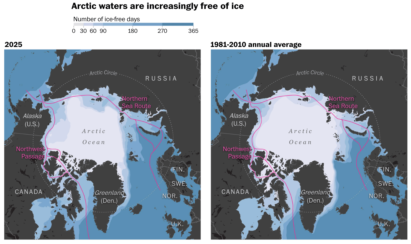
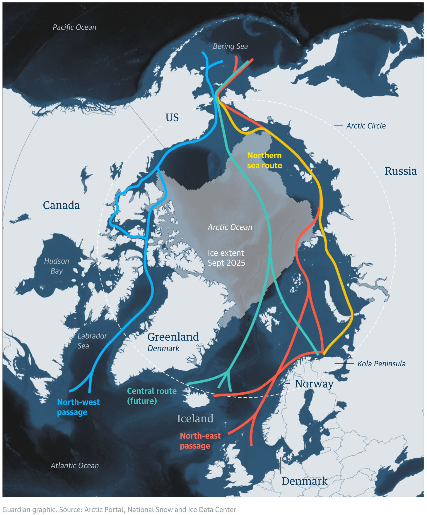
![Der Spiegel: <a href="https://www.spiegel.de/ausland/groenland-was-die-arktis-insel-so-attraktiv-macht-a-caf38e3a-84d8-4584-b507-e93aee39b3c0"><strong>Deshalb will Trump Grönland haben</strong></a> [<em>That's why Trump wants Greenland</em>], January 16](https://datawrapper.de/cdn-cgi/image/quality=85,width=1672,f=auto,fit=cover/https://kirby.datawrapper.de/media/pages/blog/data-vis-dispatch-january-20-2026/2e4012e61b-1768812711/cleanshot-2026-01-19-at-09.51.11@2x.png)
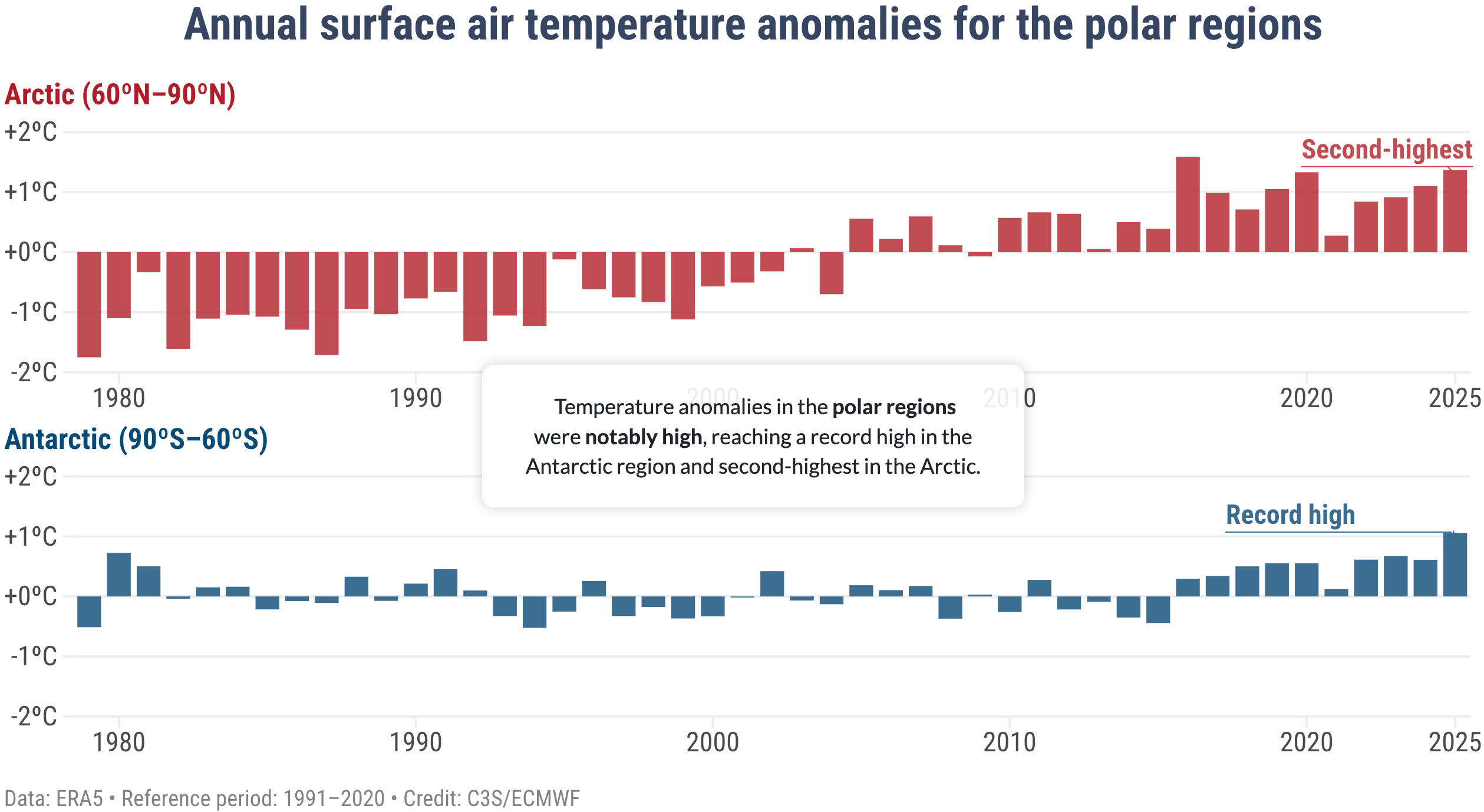
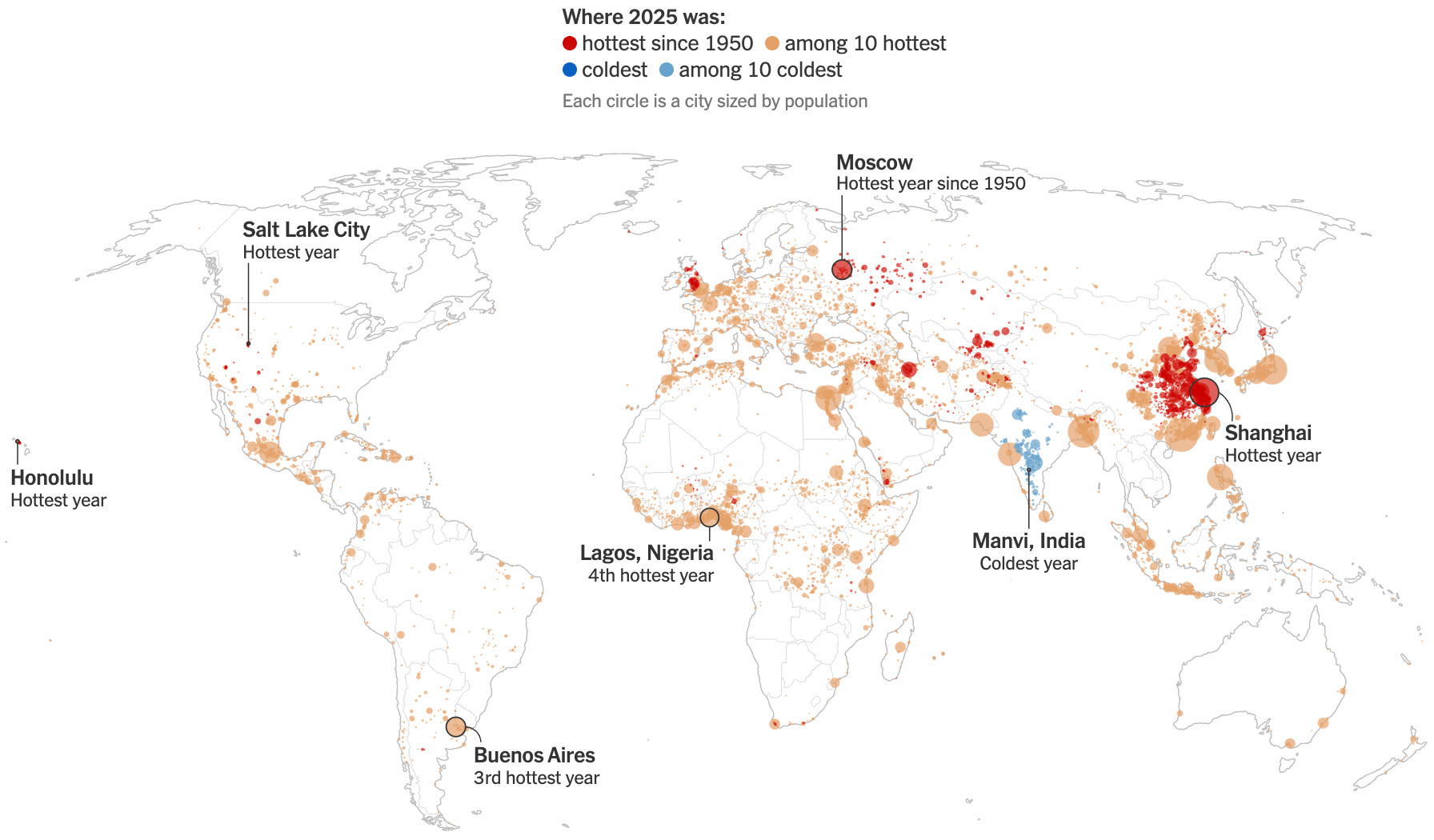
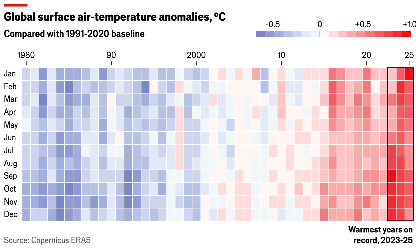
Apropos melting ice: It's hot. Actually, it's been hotter than ever, according to data released by Europe’s Copernicus Climate Change Service.
In fact, it has become so hot that it is affecting the DNA of polar bears. Other topics on the wildlife front include the red deer's (Germany's animal of the year) distribution areas and the return of the lynx.
![La Rázon: <a href="https://www.razon.com.mx/infografias/2026/01/13/el-adn-del-oso-polar-revela-huellas-de-la-crisis-climatica/"><strong>El ADN del oso polar revela huellas de la crisis climática</strong></a><strong> </strong>[<em>Polar bear DNA reveals traces of the climate crisis</em>], January 13](https://datawrapper.de/cdn-cgi/image/quality=85,width=1616,f=auto,fit=cover/https://kirby.datawrapper.de/media/pages/blog/data-vis-dispatch-january-20-2026/857447d277-1768824668/cleanshot-2026-01-19-at-13.09.33@2x.png)
![Berliner Morgenpost: <a href="https://www.morgenpost.de/interaktiv/article410884606/koenig-des-waldes-wider-willen.html"><strong>Der Rothirsch: König des Waldes – wider Willen</strong></a> [<em>The red deer: King of the forest – against his will</em>], January 14](https://datawrapper.de/cdn-cgi/image/quality=85,width=1224,f=auto,fit=cover/https://kirby.datawrapper.de/media/pages/blog/data-vis-dispatch-january-20-2026/e4592e22a8-1768824950/cleanshot-2026-01-19-at-13.14.48@2x.png)
![Das WWF Magazin 01/2026: Wieder da [<em>Chart description: Support for the lynx population in Thuringia</em>], January 14 (<a href="https://www.wwf.de/fileadmin/fm-wwf/Publikationen-PDF/WWF_Magazin/WWF-Magazin-01-2026-Wiederansiedlung.pdf?_gl=1*1tt8x3p*_up*MQ..*_gs*MQ..&gclid=Cj0KCQiA5abIBhCaARIsAM3-zFXRQ7BH48yCoYVG6XMLe_YFRXn1xw4jbivubB2V5MdHwLLJyQknhhEaAhOHEALw_wcB&gbraid=0AAAAADgffw7BWp8uL-NvOBu9SiW8gGZYp"><strong>magazine preview</strong></a>)](https://datawrapper.de/cdn-cgi/image/quality=85,width=882,f=auto,fit=cover/https://kirby.datawrapper.de/media/pages/blog/data-vis-dispatch-january-20-2026/748b9cd228-1768825236/cleanshot-2026-01-19-at-13.17.01@2x_neu.png)
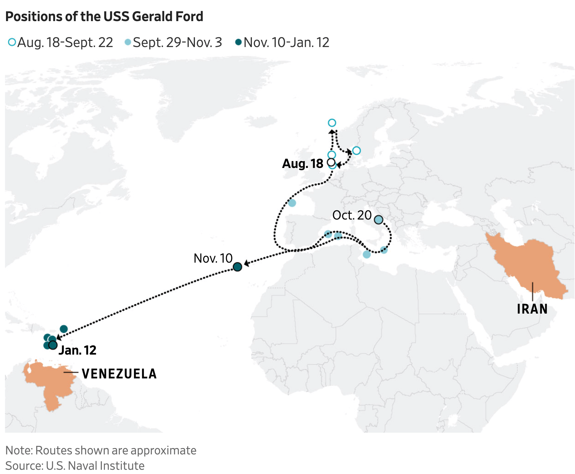
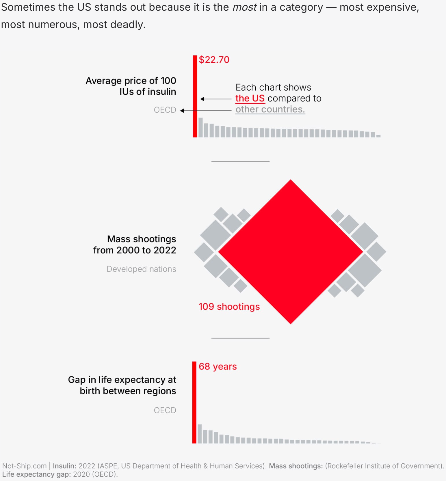
The U.S. has tensions not only with Greenland but also with many other countries around the world: Governing Venezuela could prove difficult due to various armed forces in the country. Tariff threats against Europe highlight import and export imbalances. And, compared to some other countries, the United States are the exception — exceptionally dangerous, pricey, and unequal.
![Der Spiegel: <a href="https://www.spiegel.de/wirtschaft/wo-die-europaeische-union-von-den-usa-abhaengig-ist-a-98033b44-5987-40d1-a6db-e30afe54e753"><strong>Wo Europa von Amerika abhängig ist</strong></a> [<em>Where Europe is dependent on America</em>], January 19](https://datawrapper.de/cdn-cgi/image/quality=85,width=1266,f=auto,fit=cover/https://kirby.datawrapper.de/media/pages/blog/data-vis-dispatch-january-20-2026/b2b611164e-1768838451/cleanshot-2026-01-19-at-16.59.00@2x.png)
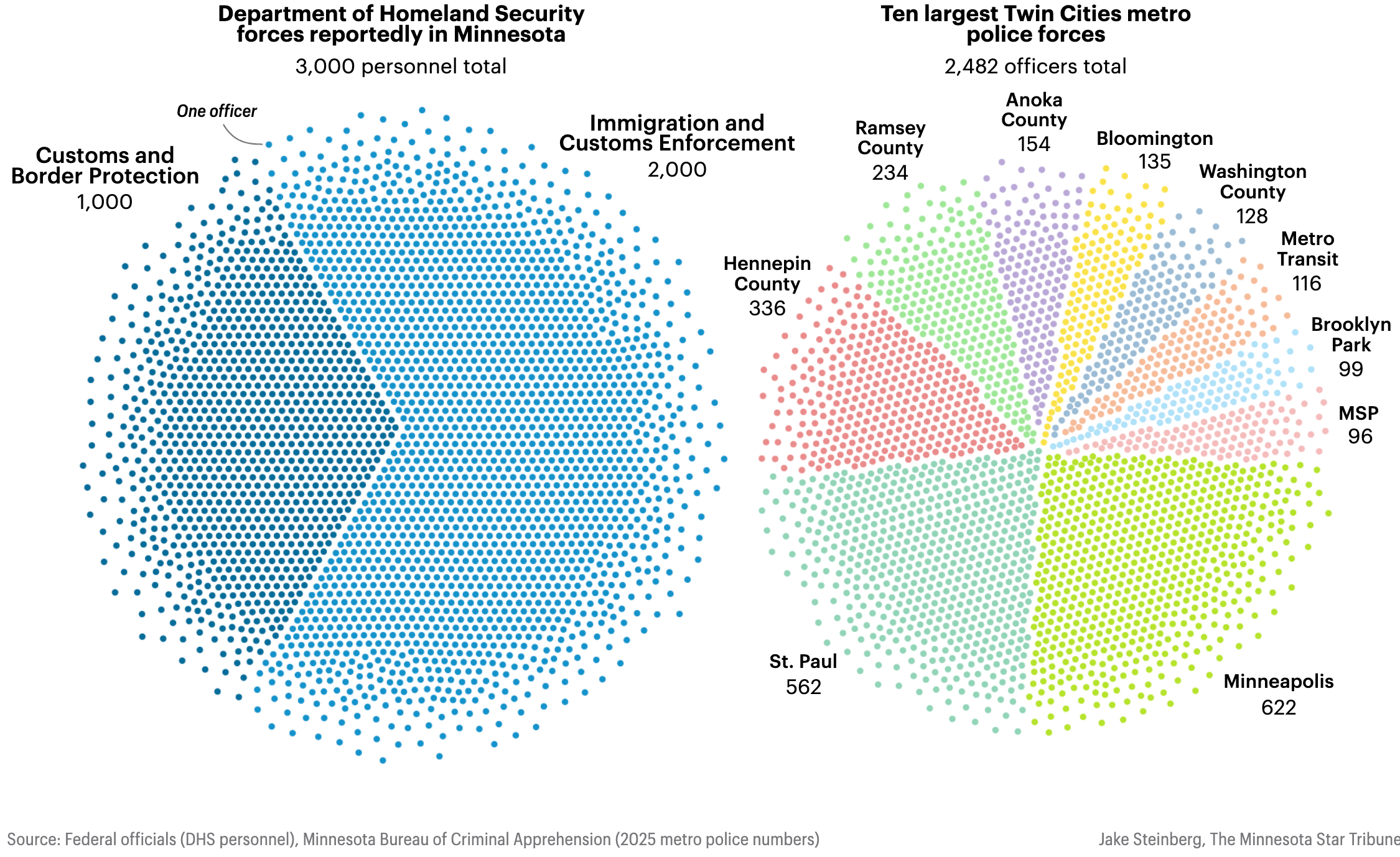
We've seen quite a few unconventional uses of dots in the past week, especially concerning U.S. topics. A dot pie chart examines homeland security presence in Minnesota after the shooting of Renee Good, and a dot pile shows Switzerland's trade balance with the U.S.
![Neue Zürcher Zeitung: <a href="https://www.nzz.ch/visuals/trump-und-die-schweiz-den-handelsbilanzueberschuss-interaktiv-senken-ld.1916084"><strong>Machen Sie Trump glücklich – und reduzieren Sie den Handelsbilanzüberschuss der Schweiz</strong></a><strong> </strong>[<em>Chart title: Switzerland exports twice as much as it imports</em>], January 16](https://datawrapper.de/cdn-cgi/image/quality=85,width=1308,f=auto,fit=cover/https://kirby.datawrapper.de/media/pages/blog/data-vis-dispatch-january-20-2026/64591f4c19-1768837707/cleanshot-2026-01-19-at-16.47.21@2x.png)
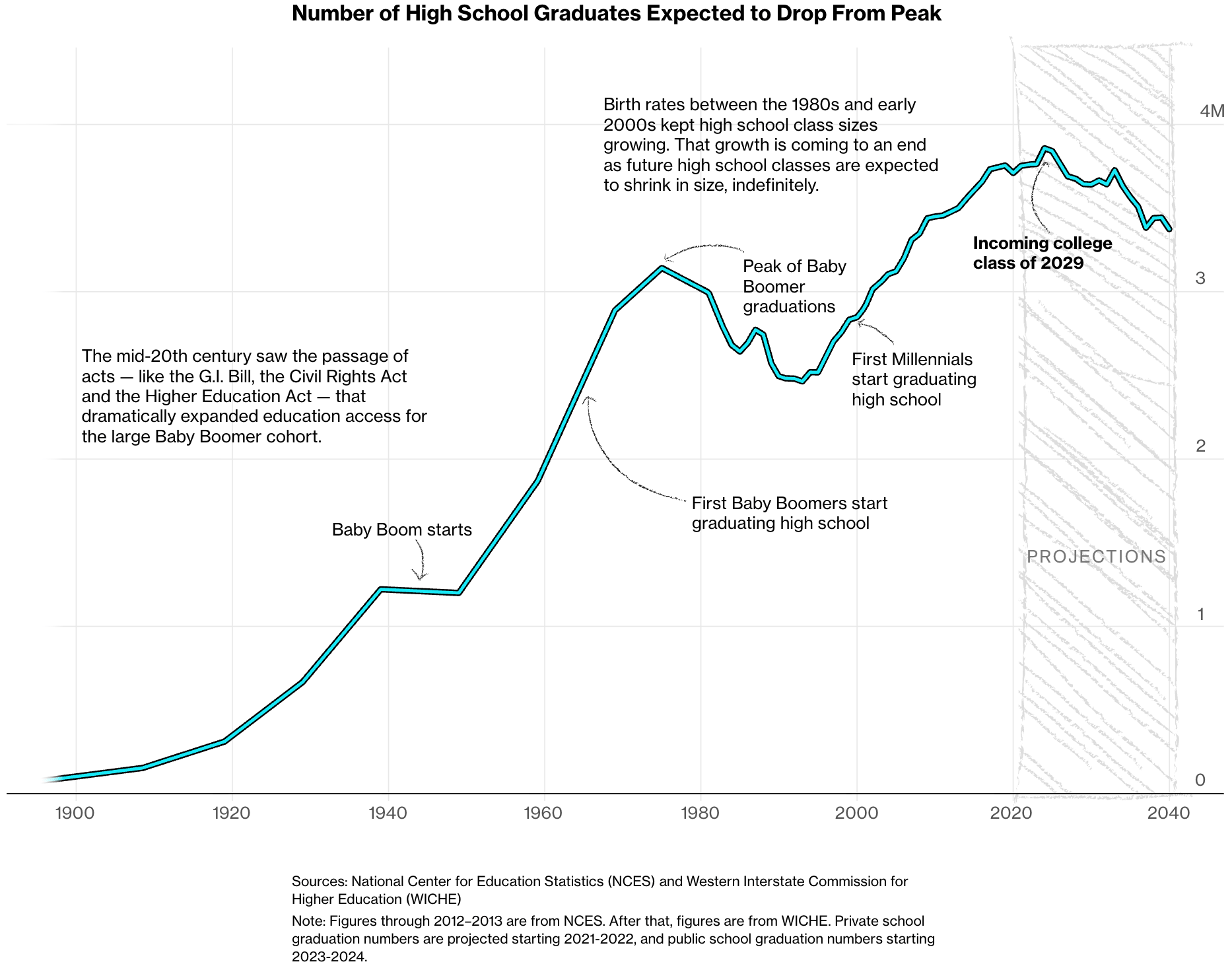
Not only the U.S., but also France, a country with one of the highest birth rates in Europe, is facing a drop in births, which could lead to a surplus of colleges compared to the number of future students.
![Le Monde: <a href="https://www.lemonde.fr/les-decodeurs/article/2026/01/13/demographie-la-population-est-elle-en-declin-naturel-dans-votre-commune_6662050_4355770.html"><strong>La population de votre commune est-elle en déclin naturel ? Vérifiez avec notre outil de visualisation</strong></a> [<em>Chart title: In which municipalities are the most people born (or die)?</em>], January 14](https://datawrapper.de/cdn-cgi/image/quality=85,width=1238,f=auto,fit=cover/https://kirby.datawrapper.de/media/pages/blog/data-vis-dispatch-january-20-2026/aa214a4099-1768813784/cleanshot-2026-01-19-at-10.08.36@2x.png)
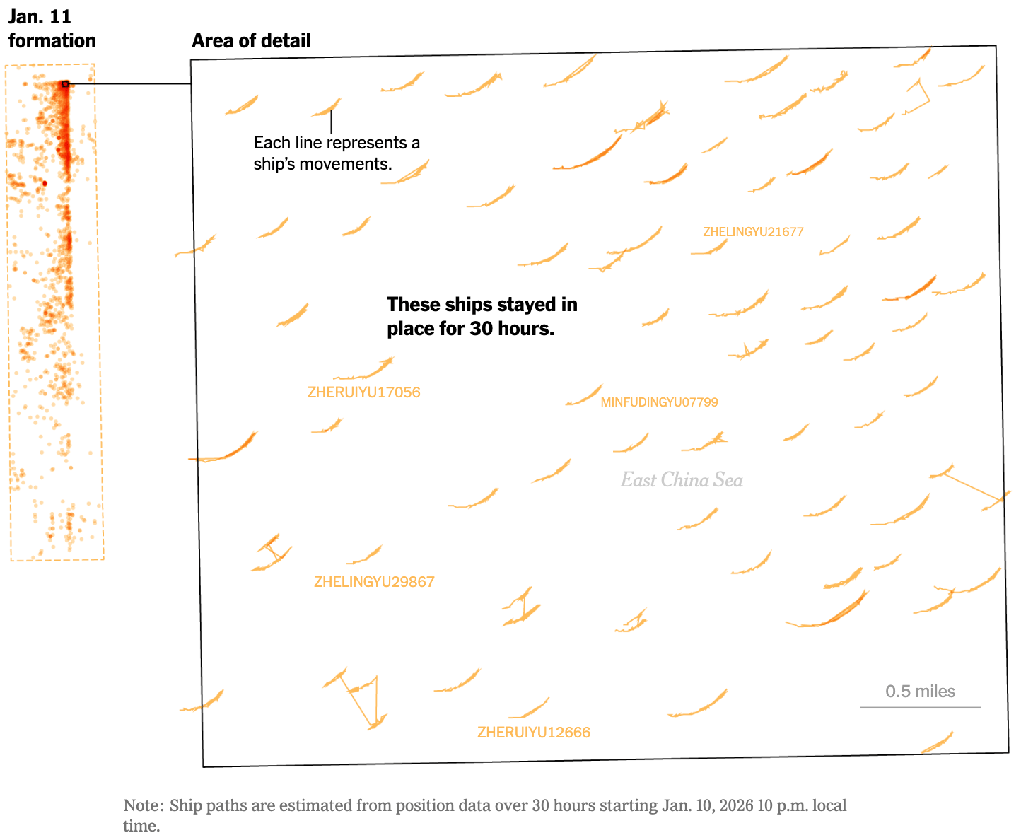
Unfortunately, the world's conflicts are not standing still. Protests in Iran continue, as does police repression. Meanwhile, China is mobilizing fishing boats to create massive floating barriers.
![El País: <a href="https://elpais.com/internacional/2026-01-17/cronologia-visual-de-las-protestas-en-iran-como-empezaron-y-que-sabemos-pese-al-bloqueo.html"><strong>Cronología visual de las protestas en Irán: cómo empezaron y qué sabemos pese al bloqueo</strong></a><strong> </strong>[<em>A visual timeline of the protests in Iran: how they started and what we know despite the blockade</em>], January 17](https://datawrapper.de/cdn-cgi/image/quality=85,width=1448,f=auto,fit=cover/https://kirby.datawrapper.de/media/pages/blog/data-vis-dispatch-january-20-2026/5525e097ed-1768825917/cleanshot-2026-01-19-at-13.31.26@2x.png)
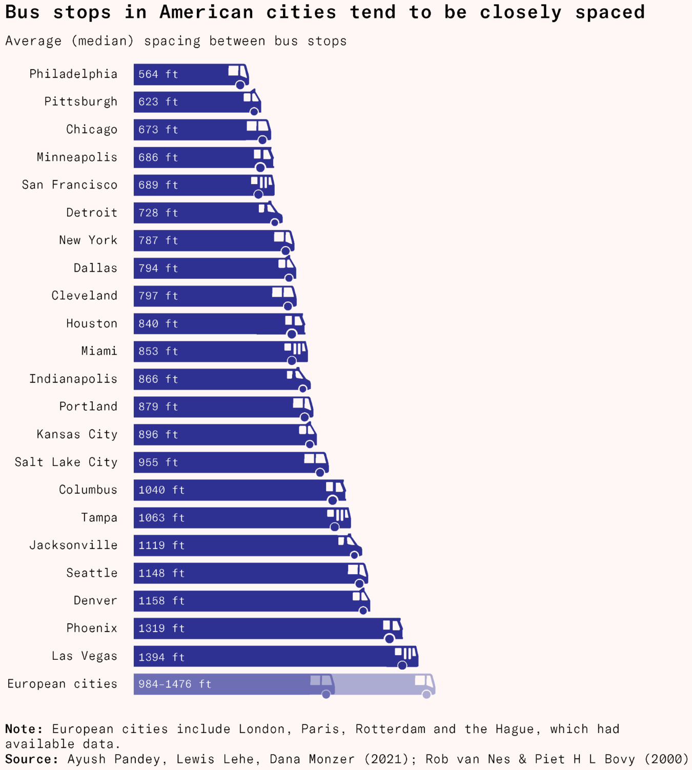
The vehicles dominating transportation topics this week? Trains and buses! In Spain, two high-speed trains derailed, causing multiple deaths and hundreds of injuries, an unconventional visualization maps the last train rides in Tokyo, and bus stops in the U.S. are too close to each other.
![Diario Sur: <a href="https://www.diariosur.es/sociedad/graficos-sabemos-accidente-tren-adamuz-20260119014420-ntrc.html"><strong>Gráficos | Lo que sabemos del accidente de tren en Adamuz</strong></a> [<em>Graphics | What we know about the train accident in Adamuz</em>], January 19](https://datawrapper.de/cdn-cgi/image/quality=85,width=2452,f=auto,fit=cover/https://kirby.datawrapper.de/media/pages/blog/data-vis-dispatch-january-20-2026/8db537d0fb-1768837462/cleanshot-2026-01-19-at-16.43.39@2x.png)
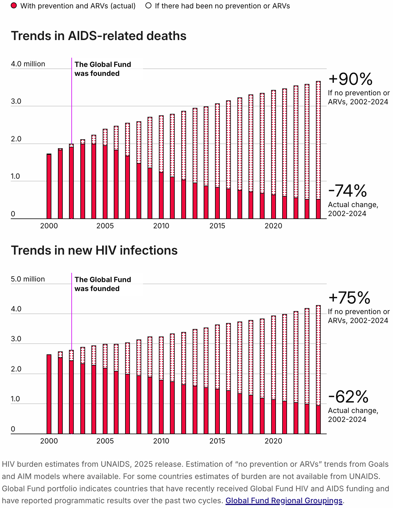
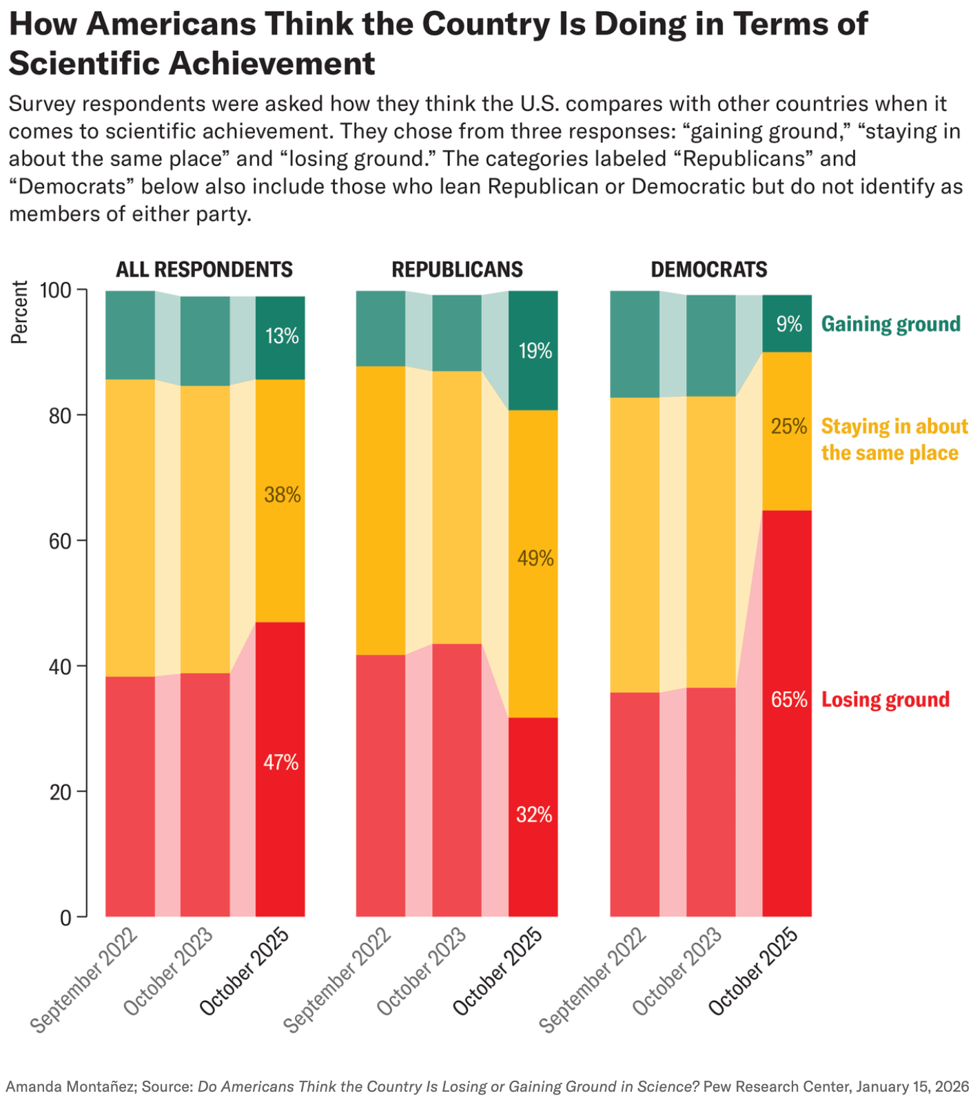
Wikipedia turned 25! Topics that may have been searched during those years: land footprint of food, HIV trends, and scientific achievements, losing ground in the eyes of U.S. citizens.
![Der Spiegel: <a href="https://www.spiegel.de/netzwelt/wikipedia-wie-die-online-enzyklopaedie-die-welt-erobert-hat-a-1b6ce40a-affb-4965-9ee2-919d6a095383"><strong>Wie Wikipedia die Welt erobert hat und wo sie noch schwächelt</strong></a> [<em>How Wikipedia conquered the world and where it still falls short</em>], January 15](https://datawrapper.de/cdn-cgi/image/quality=85,width=2008,f=auto,fit=cover/https://kirby.datawrapper.de/media/pages/blog/data-vis-dispatch-january-20-2026/3611c7d3f1-1768838819/cleanshot-2026-01-19-at-17.06.02@2x.png)
![The European Correspondent: "What we eat shapes what Earth looks like from space. Around 45% of the world’s habitable surface is used for agriculture, and 80% of that land is used to grow feed or graze livestock. Food production is therefore the single most influential factor in land use. This also makes agriculture the main driver behind deforestation worldwide [...]," January 17 (<a href="https://www.instagram.com/p/DTkbJZGDHrg/"><strong>Instagram</strong></a>)](https://datawrapper.de/cdn-cgi/image/quality=85,width=1310,f=auto,fit=cover/https://kirby.datawrapper.de/media/pages/blog/data-vis-dispatch-january-20-2026/3199b02807-1768838255/cleanshot-2026-01-19-at-16.56.35@2x.png)
What else we found interesting
![Diario Sur: <a href="https://www.diariosur.es/culturas/proceso-detras-cloud-dancer-colores-pantone-ano-20260115071209-ntrc.html"><strong>El proceso detrás de 'Cloud Dancer' y otros colores Pantone del año</strong></a> [<em>The process behind 'Cloud Dancer' and other Pantone colors of the year</em>], January 15](https://datawrapper.de/cdn-cgi/image/quality=85,width=2108,f=auto,fit=cover/https://kirby.datawrapper.de/media/pages/blog/data-vis-dispatch-january-20-2026/52382843df-1768825311/cleanshot-2026-01-19-at-13.21.27@2x.png)

Applications are open for…
a working student to curate the Dispatch here at Datawrapper!🗞️
a cartographic design intern at Esri Creative Lab
a graphics reporter (deleted data project) at The Guardian
a data storyteller at Kontinentalist
a mentor at Data Visualization Society


