Jared Whalen, Axios, about batch-creating Datawrapper visualizations


Jared Whalen spoke at our Unwrapped conference about how "Batch chart creation with Datawrapper."
Jared is a data visual journalist, designer and web developer on the Axios Visuals team. He works with Datawrapper and its API regularly to make charts and maps and find ways to improve the graphic team's workflow.
Watch his talk here:
01:31 – Datawrapper API meets command line
03:37 – Examples for batch-created charts
04:37 – Previewing charts & SvelteKit interface
06:04 – Q: Datawrapper community?
08:03 – Q: Dynamic annotation placement?
09:38 – Q: How difficult to implement?
10:38 – Q: Complexities of the SvelteKit interface?
Full transcript
Creating the same chart for 30 cities
[00:00:04] Jared: Thank you. Okay. My name is Jared Whalen, and like was said, I am on the Visuals Team at Axios. And today we'll be talking about how we use Datawrapper to create charts in batches. A little context, if you're unfamiliar with, Axios is a newsroom that is focused on producing short-form content for both the web and for our newsletters.
We have about 50 of those, and every week we are sending out hundreds of newsletters, so it's quite a bit of content. A large portion of that content comes from Axios Local, where we currently have micro newsrooms in about 30 cities, each with its own reporters and its own daily newsletters. The Axios Visual Team helps support every single one of these cities, so it's very common that if we say, make a map for our Texas newsletters, within a few hours, we'll get a bunch of requests like this for other cities wanting us to make versions for them. And as Axios Local grows and grows, we are just producing more and more batches each week, and the need for coming up with a good solution becomes more evident.
At first, the team was making batches one chart at a time. And the obvious problems with this workflow is that it's not really a great use of anyone's time. It's more prone to mistakes and inconsistencies between charts. It makes updating batches a nightmare. And it also has the unintended consequence of everybody being sad and full of self loathing.
Datawrapper API meets command line
[00:01:31] Jared: Our solution at Axios was to create a command line based workflow that leverages the Datawrapper API and R.
The idea is that one template and one dataset can equal dozens of charts. To start a batch, we always begin with a template. This chart and all of the styles would then be copied for each of our locals, and the underlying data will be updated.
We can also update text and styles using a dynamic template pattern. For example, in this case, we have this series ID in the headline. And for every chart, this can be updated with whatever that series ID is, whether it's a state name or a city.
We then structure our data the same way that you would see it in Datawrapper. You see that we've also added a series ID column that represents each chunk or each section of data we want to split into.
What that, column allows us to do is, we can split this big data set into chart sized chunks that we can then pass to our template. So once again, all we're really doing is we're taking that data set, splitting it into pieces, and for each piece, cloning the template and updating the data, along with any text and style properties we've configured. We bring it all together into a git repo that contains all of the files used in this workflow. For each batch, we pull down a copy of this repo and replace the data file with our batch's data. We can then run all of the commands for this workflow from the terminal using a utility script that prompts the user for which process they want to run, whether it's a chart or a map. It asks for the template ID and then a folder for where you want to store the charts.
Once all the charts are published, the embed information for the batch is automatically saved to a Google Sheet that can be then shared with anyone in the newsroom. This means that nobody has to go through and manually collect them, rather we can just write from the terminal, copy the outputted Google Sheet, and send that to whoever needs it for their stories.
Examples for batch-created charts
[00:03:49] Jared: The repo includes workflows for both charts and maps, and is flexible enough to pretty much handle any type of graphic that Datawrapper supports. So you can see here that we have maps, we have some pretty stylized scatter plots, we have column charts, and really anything that takes rectangular data, we can then automate the process.
If you want to take things one step further with some code customization, you can even go deeper with the API and update things like base maps and annotation positions. For example, here are a few beautiful maps created by Erin Davis, where she extended those R scripts to update the map with custom TopoJSON.
A generalized version of this repo is publicly available on the Axios Visuals GitHub, along with instructions on how to set it up for the team. If you found any of this useful, please take a look. And use whatever works and pretty much get rid of what doesn't make sense for your newsroom.
Previewing charts & SvelteKit interface
[00:04:50] Jared: So what's next for the way we use the API and leverage Datawrapper? As batching has become a bigger and bigger part of Axios Local's mission, we've continued to find ways to improve this process. One example is we made a simple tool to view all the charts in a batch at once and at different device sizes.
All you have to do is take that Google Sheet that gets exported, paste it into the input, and it will automatically load all these charts. This allows for faster editing and sharing a preview with reporters.
Another big example of how we're improving this workflow, and something that's kept me very busy recently, is we're actually converting that R based command line tool into a SvelteKit GUI that fits into our internal tool ecosystem a little bit better.
In addition to making batches just more approachable for those who are not comfortable working in the terminal, it has allowed us to build in support for things like dynamic annotation placement and conditional property styling, using menus and GUIs and things that people can actually manipulate rather than relying on flags in the command line.
In summary, the Datawrapper API and a bit of planning can go a long way in helping you and your team save a lot of time and save some of your sanity. If you're interested in using Axios Visual's R based workflow as a starting point and have any questions about that repo, please feel free to reach out to me.
Thank you for listening.
Q: Datawrapper community?
[00:06:15] Shaylee (host): Thanks, Jared. That was fantastic. And every bit as interesting as I thought it was going to be. Perfect. I love the text variables. I don't know that I've ever seen those in action like that. So kudos. All right. In our blog post where we announced you as one of our speakers, you mentioned that one of your number one tips for people working with Datawrapper and wanting to get better was to reach out to the Datawrapper community, look around and see what other people are doing. I wanted to know: where do you look for Datawrapper community kind of mindsets? Since we've talked about Twitter and these kind of third spaces in the tech world are vanishing, where do you look for Datawrapper specific community like that?
[00:07:05] Jared: Sure. A great space is the News Nerdery Slack channel, which tends to be a lot of people in the news space, but there's also people there who are just information tellers. And, like you said, as things like Twitter or X or whatever we're calling it become not as useful, places like that are a bit more focused, tend to be a great spot.
Another thing I would say is just as Datawrapper gets used by more and more newsrooms, you can go to places that maybe used to rely on custom graphics teams for everything, but now are really relying on Datawrapper. And many times you'll look at a chart and you're not quite sure if that's Datawrapper, and you right click and look at inspect it, and sure enough, they've managed to really make that fit their style. And from there, it's really just digging around into how they do it. Obviously, the Datawrapper blogs are a great way to find some tips and tricks and hacks. But really, it's just one of those things where if you see a chart you like, try recreating it in Datawrapper and see what's possible.
[00:08:06] Shaylee (host): Excellent tips. I love all of it. And shout out to our comms team for the great blog and to the News Nerdery Slack. Great ideas.
Q: Dynamic annotation placement?
[00:08:21] Shaylee (host): We do have a couple of questions up in the chat that are a little bit more related to what you talked about today. So we can pivot a little bit. We have one from Emma Rubin: can you speak more to dynamic annotation placement? What challenges have you had adding annotations to multiple automated charts at once. And how have you solved those?
[00:08:33] Jared: Sure, so the way that we are handling label placement, especially in the GUI, but this is possible with the R workflow as well, is, whether it's in your data or a separate data file, just some way to associate that series ID. Let's say it's Philadelphia court, basically making sure that value links up with however you're that those Those annotation placements.
So for example, a chart we did recently, we wanted to move the annotation up and down the y axis, just depending on that locals peak value. So for there, I'm pretty sure the workflow we did for that was we just had a separate, data frame essentially in R that pulled it from Philadelphia and said, okay, this value is 500 or so, and then pass that to the metadata.visualize.textannotations or whatever that part of the metadata is.
Which again, I think as was said earlier, just got to poke around and dig around that API. But it's just a matter of trying to target it in there and do that update the same way you would update the text or any other property.
[00:09:43] Shaylee (host): Yeah. And great job on that metadata key right off the top of the dome. That's impressive.
Q: How difficult to implement?
[00:09:50] Shaylee (host): We have another question from Katie Kausch. I hope that I'm pronouncing that correctly. They say: How difficult is this to implement for a very beginner R user?
[00:10:02] Jared: So if you're referring to the repo that I shared, ideally, following the instructions, you should be able to get it up and running with very little R knowledge. The question comes in, does that actually work for your workflow? Because for Axios, we're producing it, which is very specific to how we need things to run.
That being said, hopefully, with a base understanding of R, you can understand what the functions are doing, and then modify as needed. So it shouldn't take a super deep level to get started, and then from there it's just a matter of how customized you
[00:10:37] Shaylee (host): Excellent advice, and thank you so much for sharing that repo. I'm sure that a lot of people in this whole conference will find that very useful. It's definitely something that we get questions about.
Q: Complexities of the SvelteKit interface?
[00:10:49] Shaylee (host): Did you want to speak on any of the complexities that you are facing as you're going into creating that GUI that you were talking about?
[00:10:58] Jared: I think the biggest complexity that we're facing there is it's easy to understate when you're working with just scripts, like R scripts, that either they work or they don't. As opposed to a user experience where you just have a lot more room for error. And errors tend to crash the whole thing. And we're building this thing that way so that it lives on a Netlify server. And it just has a lot more complications to it.
The reason why we are building that GUI is because we do this so often. We're easily doing 5, 6, 7 of these batches a week. So anything to speed up that process really helps the you're like, That is like a very blue sky thing that we were able to make work without for several years.
So I show that as like a fun thing that we're doing with the API, but by no means feel as though that's what you would have to use. And also a real benefit of doing the R process is when it's a GUI, if somebody wants to add a feature to it, they have to go through the maintainer, who in this case is me, and we have to see if this makes sense to update. As opposed to the R workflow, everytime you have a new batch, you download an instance or a copy of that repo and you can customize to whatever your needs. So for example, in those cases with those beautiful maps with the TopoJSON uploads, Erin took her existing R script for her analysis and piped that into that workflow. So whether it's R, whether it's whatever your background is, learning how to just take your existing workflow and funnel that into the API is very
[00:12:39] Shaylee (host): Yeah, that sounds exactly right, and it definitely sounds like the guardrails there of the GUI will benefit Axios. Thank you for elaborating and thank you so much for this wonderful talk. It was great to hear from you.
We asked some additional questions before his talk:
Jared, what will you talk about at Unwrapped?
Axios publishes newsletters in multiple cities, and it is often the case that multiple locals will want a chart using the same dataset. Creating a chart manually for each local was unsustainable, especially as Axios expands into more cities. So I created a workflow using Bash and R that automates most of the work.
Using DatawRappr, an R wrapper for Datawrapper’s API, the script takes a base chart or map and iterates over a tidy dataset to create and publish a unique visual for each series. It also uses a templating pattern to update text fields like the title, description, and alt text. After creating the batch, a reference sheet with each chart’s embed code is uploaded to Google Drive for reporters to access.
How do you use Datawrapper at Axios?
The Axios Visuals team produces dozens of graphics a week using a variety of tools. We primarily use Datawrapper for those graphics that don't require bespoke code, but are more advanced than what our in-house tool for reporters can handle. Over the years, we've come up with dozens of tips and tricks and code snippets to really expand upon the already vast array of options Datawrapper gives us.
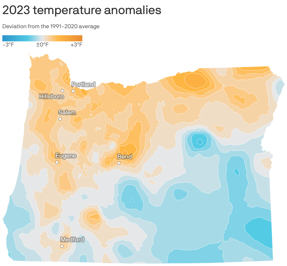
We automated everything about the Datawrapper map above in R. That includes downloading and processing raster data, converting it to a custom choropleth, trimming the choropleth to each state of interest, selecting the cities to show, and publishing the final maps.
Here's a scatterplot we created with Datawrapper:
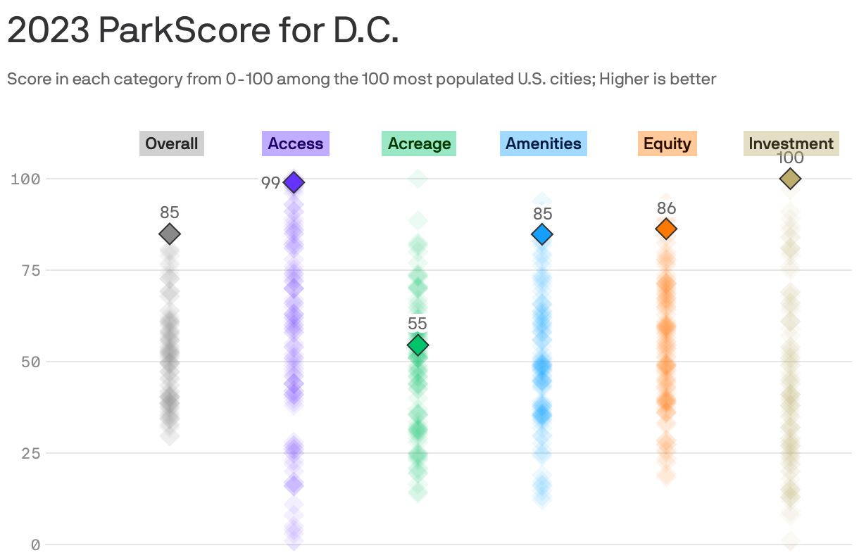
Parks confer a wealth of benefits on residents. Using data from the Trust for Public Land, these charts rank the country’s best cities for public parks and break down the metrics that make a great parks system. Using our batching process, we were able to create unique versions of this chart for each city in our local network, updating the title and highlighting data points as needed.
What advice would you give to other Datawrapper users?
My advice is to be on the lookout for all of the ways the Datawrapper community is pushing the envelope of what is possible with the app. Datawrapper strikes an amazing balance between ease of use and the ability to get really creative. We frequently challenge ourselves to recreate bespoke graphics in Datawrapper just to see what is possible and often find that with some creative data layouts and CSS you can do a lot of amazing things.
As Datawrapper gets used by more and more newsrooms, you can go to places that used to rely on custom graphics teams for everything, but now are really relying on Datawrapper. Jared Whalen, Axios, in minute 7:18 of his talk at Unwrapped 2024
We loved Jared's talk at Unwrapped! Learn more about him on his website. To find out more about Unwrapped and listen to other great speakers, visit our blog.