Say hi to Michelle!

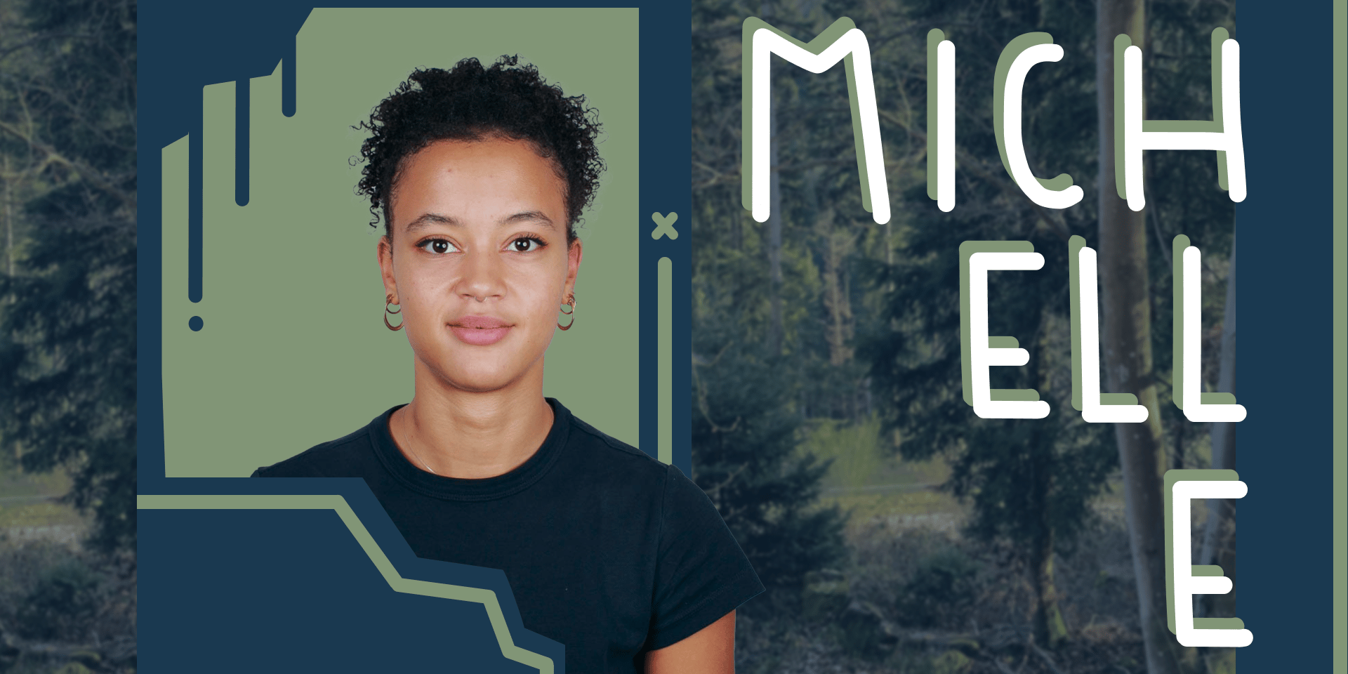
Hi, I’m Michelle. I recently joined the communications team here at Datawrapper, where I put together the weekly Data Vis Dispatches and get to appreciate some truly amazing visualizations.
Who am I outside of work?
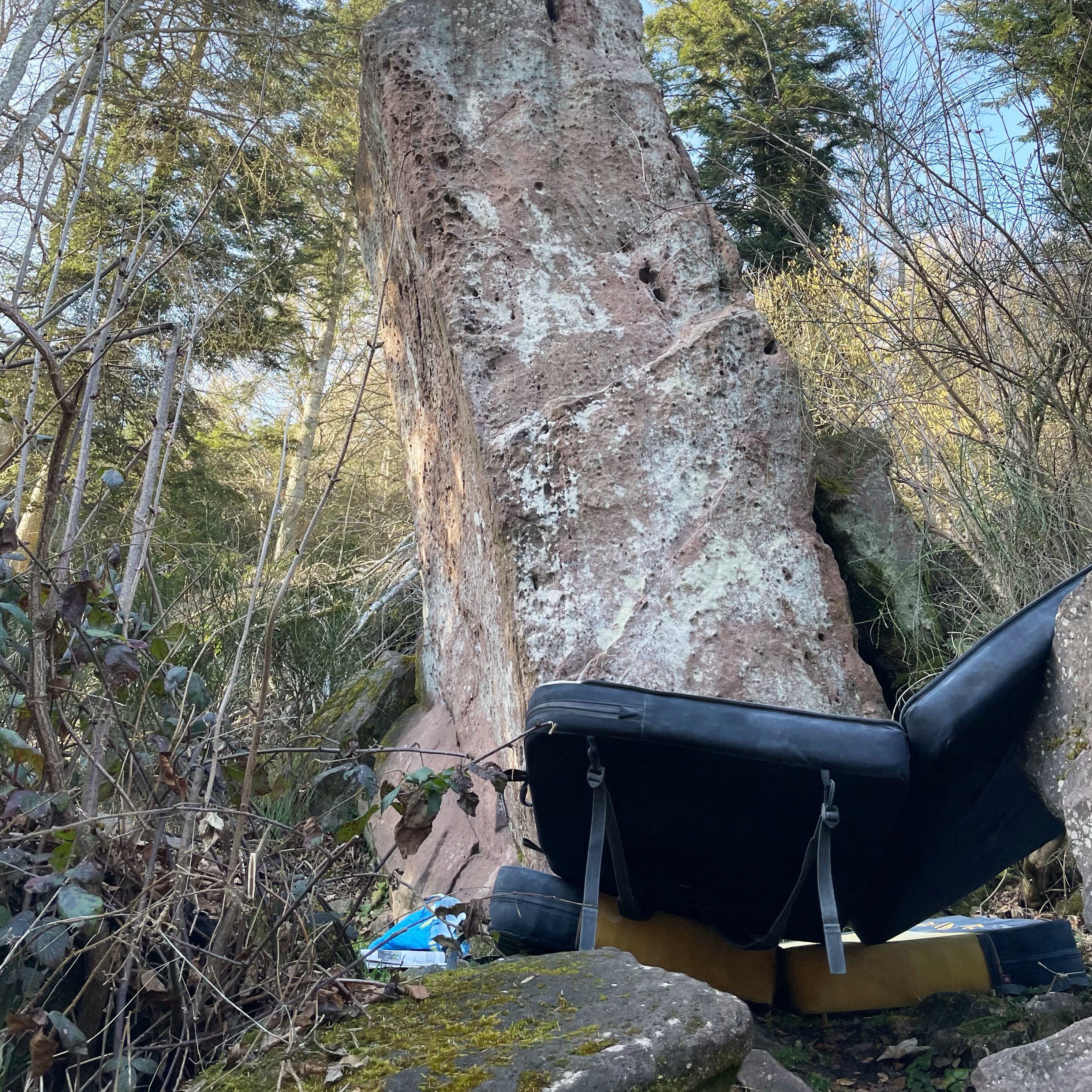
When I’m not behind the computer, I’m very, very likely to be found at the nearest bouldering gym, or even better, climbing some rock outside in southern Germany. Having spent most of my childhood trying out literally any possible sport that I could get my hands on — fencing and Zumba were definitely highlights — I am still easily won over by a game of volleyball or basketball.
What’s my background?
I spent the majority of my life living in Lagos, Nigeria, before moving to Stuttgart. I moved then to Potsdam to study interface design at the Fachhochschule Potsdam, where I am currently almost halfway through my studies (a bit surreal). While I am still enjoying the freedom and opportunity to explore different areas, I enjoy focusing on data-based projects and speculative design research, where I am able to analyze and rethink current forms in society.
Why did I join Datawrapper, and what will I do here?
I was interested in learning more about data visualization and especially the intersection with journalism. Although I don't have much experience in the field of data vis yet, I'm quite sure that the opportunity here at Datawrapper in curating the Dispatch is the perfect way to get to know it better.
The weekly Data Vis Dispatch is a newsletter featuring interesting visualizations from the past week. My job essentially involves collecting visualizations and gathering and writing relevant information to accompany them. What could you want more? Truly, I cannot even begin to explain how much fun I am having!
How did I get interested in data vis?
I have always enjoyed research. I find the collecting, organizing, and filtering of information fascinating. It plays a significant role in my design process and is an essential step in my work.
After participating in a two-week workshop at my university where we were tasked with creating a data visualization in the form of a data news report, I was instantly hooked. It allowed me to combine research and data collection with design to create something that effectively informed an audience on the specific topic. And not long after that, I saw a job offer for this position on my university's platform and took it as a sign.
What areas do I want to explore in the future?
In some of my projects so far, I have been particularly interested in the topic of web accessibility, and what it means to design inclusively and accessibly. I hope to learn more and further develop my skills in this area in the future!
Two of my favorite projects so far
The Radical Friendship Simulator: The aim of this project was to explore the potential role of friendships in the future if they were to be prioritised more in our lives. Users are encouraged to explore, in a playful way, what kind of future they find desirable and how they wish to experience friendship going forward. The simulator offers scenarios that blend elements of utopia and dystopia, helping users to familiarise themselves with new ideas and practices that they can use to actively shape their desired future.
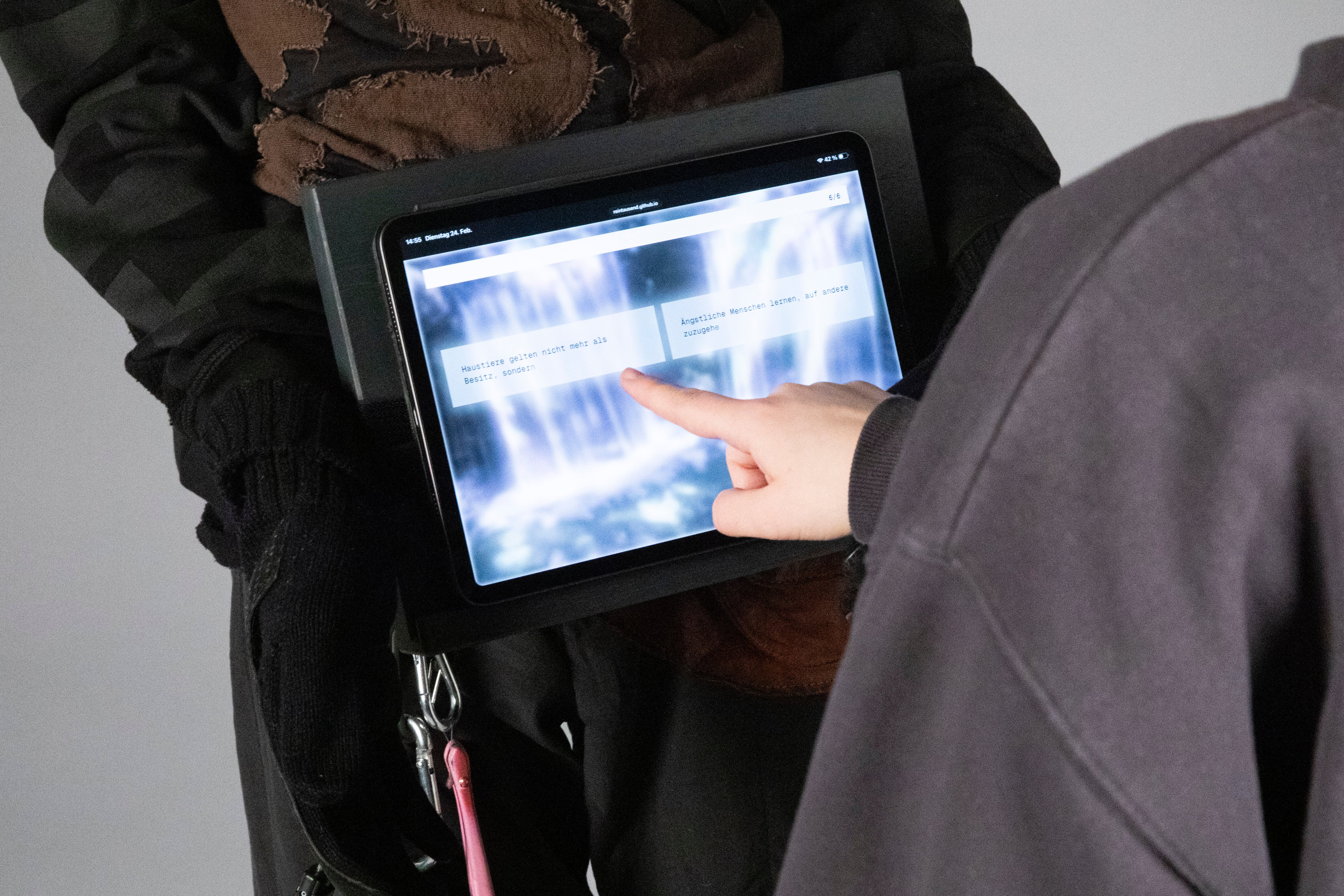
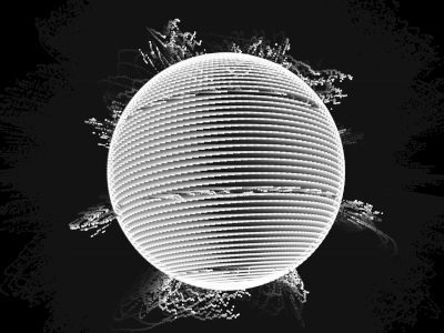
Audio visualizations of alarm signals in Germany: These signals are translated into particle visualizations that can be experienced using augmented reality, providing an alternative, interactive way to raise awareness of the different signals and their meanings.
Having been given the wonderful opportunity, I am very excited not only to dive into the world of data visualization but also to share with you all the incredible visualizations I come across through the weekly Dispatches. With that being said, see you in the next Dispatch!