Mapping destruction in Gaza

Hi, this is Gregor, co-founder of Datawrapper and visual data journalist at DIE ZEIT. This week’s Weekly Chart is about a somber subject some of us would perhaps rather look away from.
On Tuesday, the Israeli military instructed residents of Gaza City to evacuate toward the south of the Gaza Strip. But long before troops entered, the city had already sustained extensive damage amid the ongoing war.
Researchers are using satellite imagery to estimate the scale of destruction across Gaza. Their latest assessment, as of August 19, suggests that nearly 60% of buildings have been damaged or destroyed since the war began in October 2023.
Mapped out, it paints a bleak picture of the Gaza Strip.
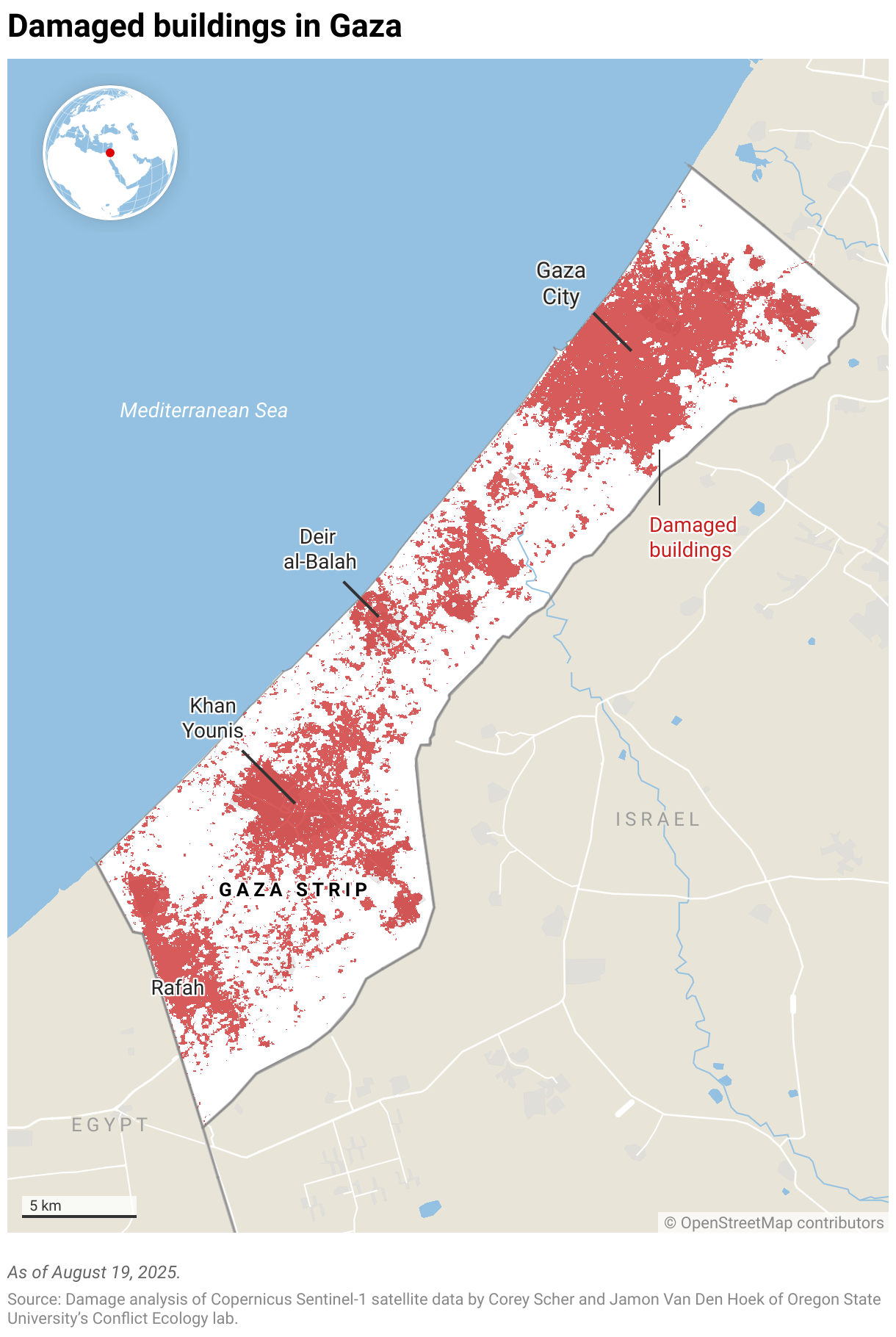
But for me, as someone who has never been to that region, it’s hard to grasp what this means. To get a clearer picture, I downloaded all prewar building footprints in the Gaza Strip from OpenStreetMap and overlaid them with the damage assessment dataset:
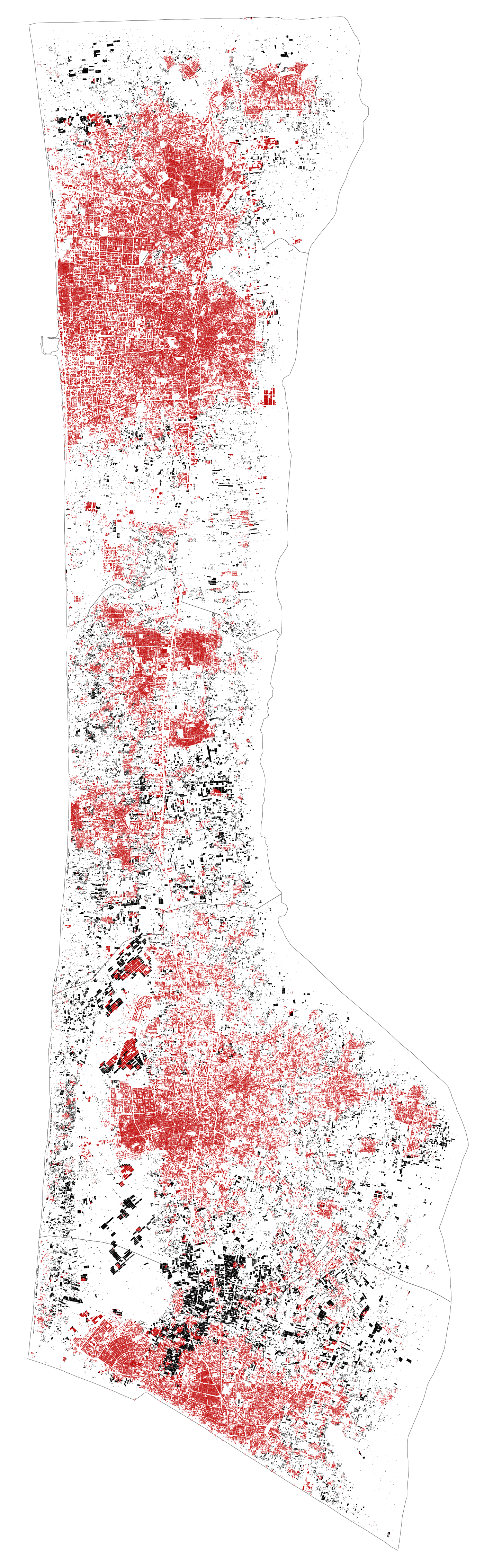
Despite being stripped of everything but buildings, this map still gives me a better picture than the first map of what’s being damaged in the Gaza Strip. For instance, we can see that Gaza City is not just a point on this map, but covers a huge area in the north of Gaza. Also, we can see just how many buildings there are — or used to be — in the Gaza Strip.
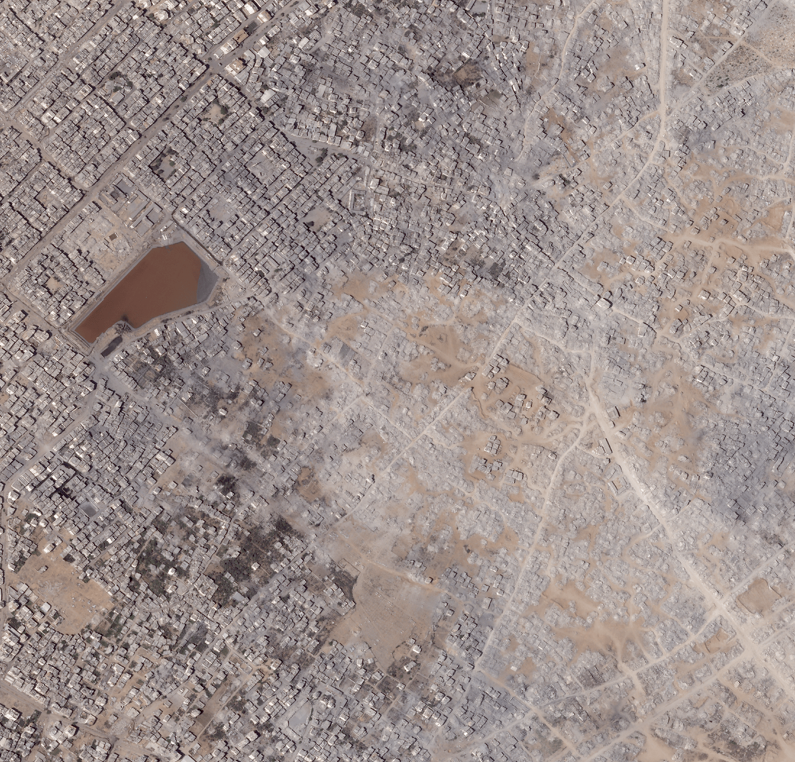
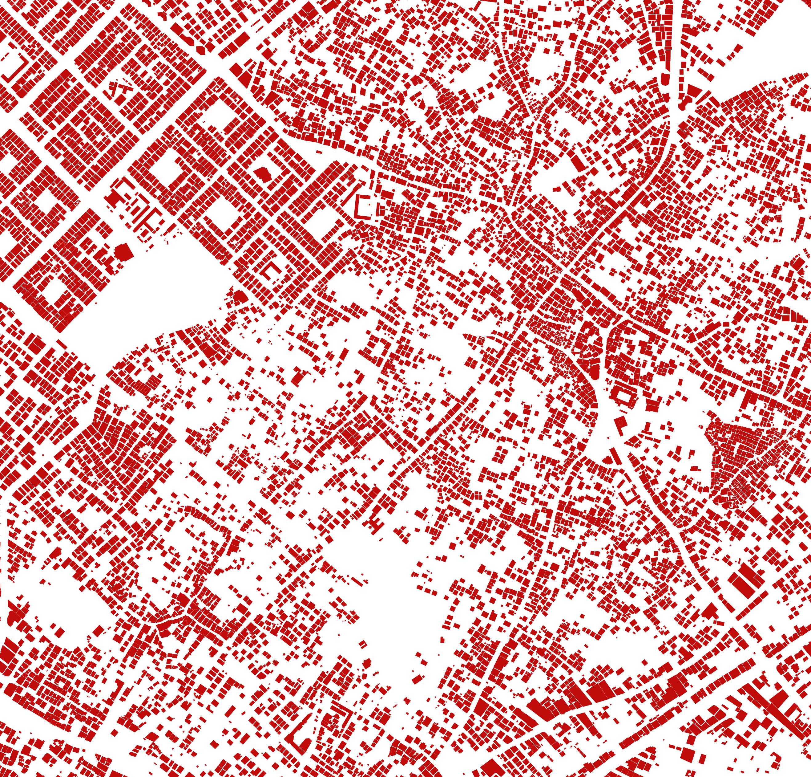
Once we zoom in a little closer, we can see the streets and individual city blocks. As a final step, I overlaid the buildings with an actual satellite map, taken six days ago:
How I made these maps
To download the OpenStreetMap building footprints, I used QGIS and the QuickOSM plugin. Then I loaded the buildings into Mapshaper along with the damage assessment regions. Cropping the buildings to the extent of the Gaza Strip was a lot faster in Mapshaper than in QGIS. After styling and geo-projecting the data, I exported the layers as an SVG file, which I further edited in Illustrator. For overlaying the satellite images with the building footprints, I went back to QGIS, since Mapshaper doesn't support raster layers yet.
That’s it for this week. Next week you’ll hear from our designer Gustav.


