Data Vis Dispatch, May 20: Maps, government spending, and the Arctic

Welcome back to the 193rd edition of Data Vis Dispatch! Every week, we’ll be publishing a collection of the best small and large data visualizations we find, especially from news organizations — to celebrate data journalism, data visualization, simple charts, elaborate maps, and their creators.
Recurring topics this week include some good old maps, what governments spend their money on, and regions in the Arctic.
We're diving into this edition with a collection of choropleth maps working well with their color scales:
![Atlatszo: <a href="https://atlatszo.hu/adat/2025/05/13/a-fideszes-jelolteket-segitheti-az-ugynevezett-telepulesvedelmi-torveny/"><strong>A fideszes jelölteket segítheti az úgynevezett településvédelmi törvény</strong></a> [<em>Chart title: Change in the number of residents eligible to vote in parliamentary elections at settlement level compared to 2022</em>], May 13](https://datawrapper.de/cdn-cgi/image/quality=85,width=2544,f=auto,fit=cover/https://kirby.datawrapper.de/media/pages/blog/data-vis-dispatch-may-20-2025/9fa2a7c036-1747650308/cleanshot-2025-05-19-at-12.23.05@2x.png)
![Tim Hormigos: "And as per tradition, behold the interactive map of Metro Manila for key opposition bets […]," May 16, (<a href="https://x.com/bnstim/status/1923332600199860301"><strong>X</strong></a>, <a href="https://public.flourish.studio/visualisation/23219535/"><strong>Map</strong></a>)](https://datawrapper.de/cdn-cgi/image/quality=85,width=1938,f=auto,fit=cover/https://kirby.datawrapper.de/media/pages/blog/data-vis-dispatch-may-20-2025/48f5727684-1747650380/cleanshot-2025-05-19-at-12.25.53@2x.png)
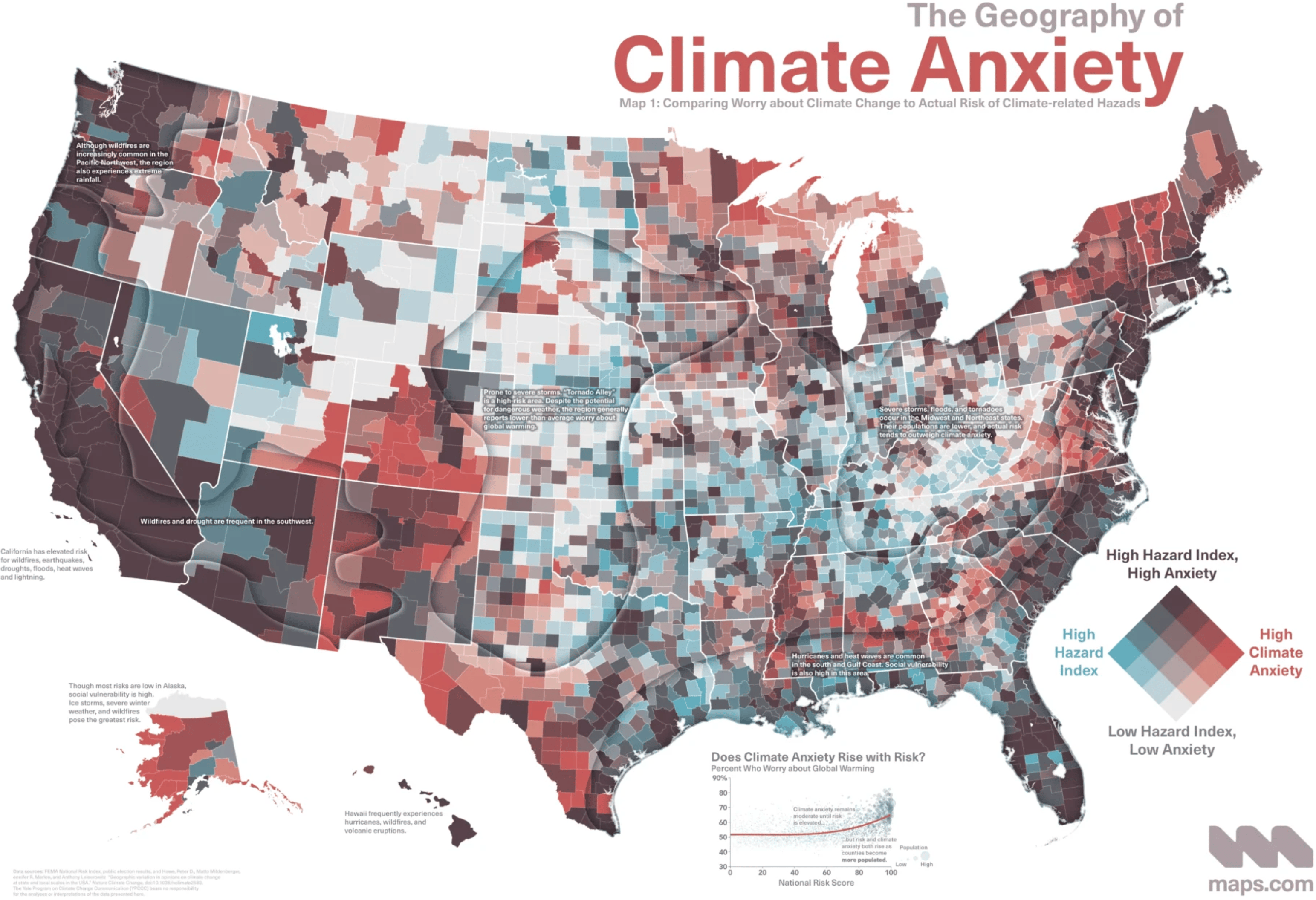
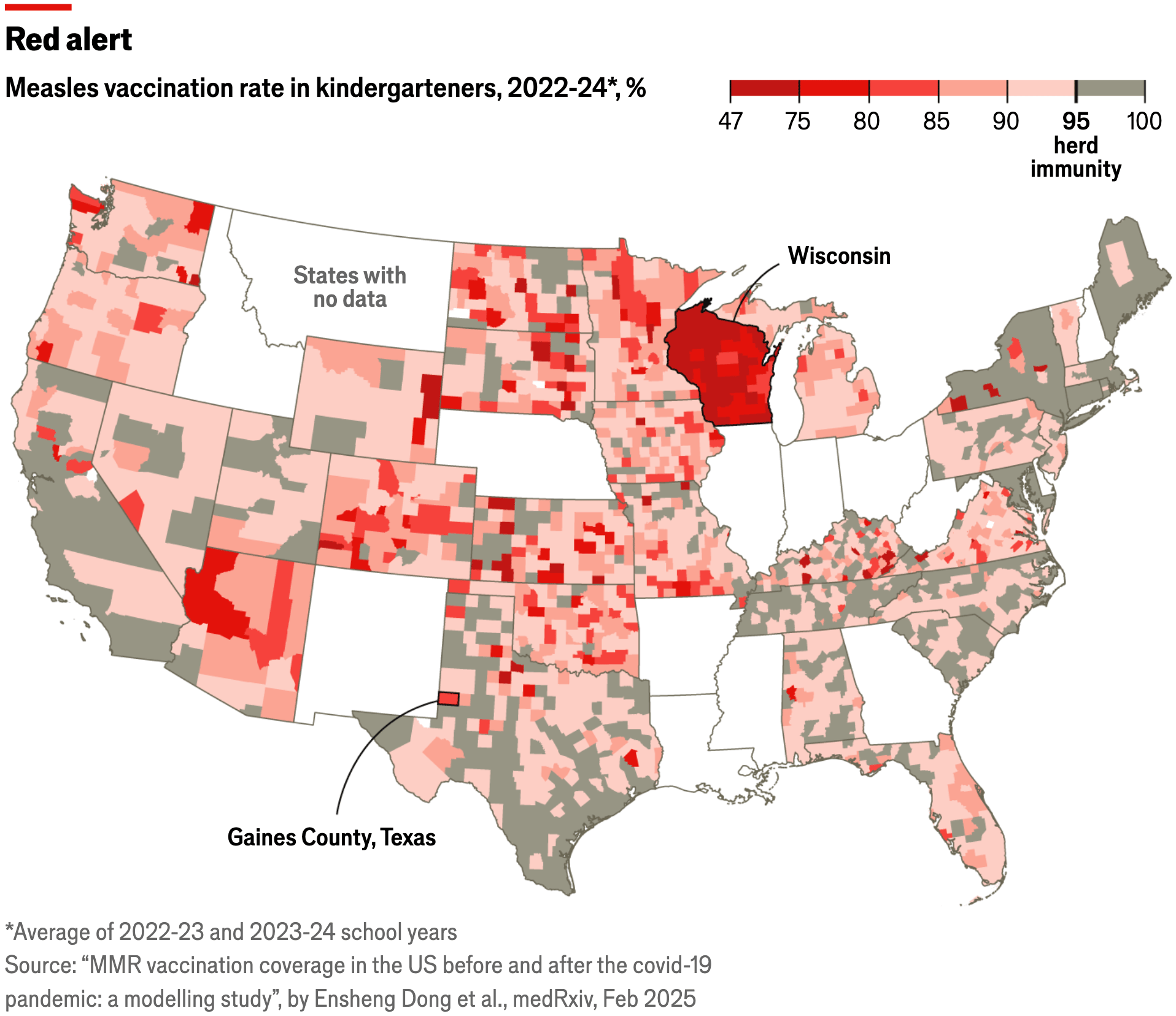
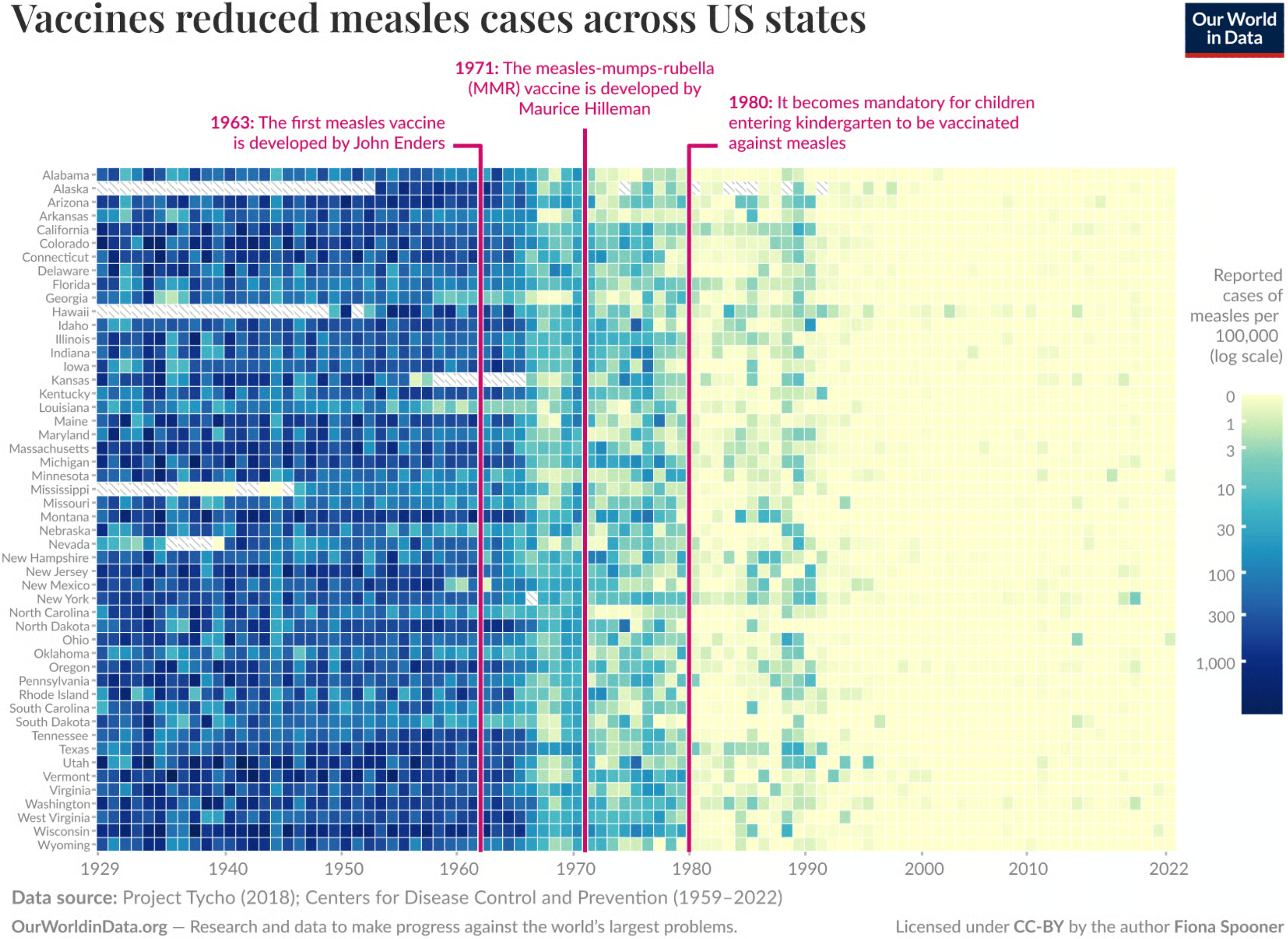
From maps to measles, here are two ways vaccination rates in the U.S. were presented:
We found a few different methods to look at and visualize government spending:
![Our World in Data: "What do governments spend money on? […]" May 15 (<a href="https://x.com/OurWorldInData/status/1923058604363378842"><strong>X</strong></a>)](https://datawrapper.de/cdn-cgi/image/quality=85,width=1364,f=auto,fit=cover/https://kirby.datawrapper.de/media/pages/blog/data-vis-dispatch-may-20-2025/16114db152-1747732964/cleanshot-2025-05-20-at-11.18.58@2x.png)

![Perrin Remonté: "La marche du glacier […]," May 15 (<a href="https://x.com/PerrinRemonte/status/1922931914538639537"><strong>X</strong></a>, <a href="https://www.perrinremonte.com/"><strong>Blog</strong></a>)](https://datawrapper.de/cdn-cgi/image/quality=85,width=1510,f=auto,fit=cover/https://kirby.datawrapper.de/media/pages/blog/data-vis-dispatch-may-20-2025/0df88d1f2f-1747744122/cleanshot-2025-05-20-at-14.28.14@2x.png)
![Tom Patterson: "My latest map: Physical Features of the Circumpolar North […]," May 13 (<a href="https://x.com/MtnMapper/status/1922247032263098408"><strong>X</strong></a>, <a href="https://shadedrelief.com/arctic/"><strong>Blog</strong></a>)](https://datawrapper.de/cdn-cgi/image/quality=85,width=1500,f=auto,fit=cover/https://kirby.datawrapper.de/media/pages/blog/data-vis-dispatch-may-20-2025/d44cf48d0f-1747732547/gq0xy9qxwaapkuv.jpeg)
Two other ways to show land, with line charts instead of maps — in graphics about area shares in war zones, both by Der Spiegel:
![Der Spiegel: <a href="https://www.spiegel.de/ausland/ukraine-so-sieht-es-an-der-front-aktuell-aus-interaktive-karte-a-29f2b57c-d228-4661-899e-c9462b4323b4"><strong>So sieht es an der Front in der Ukraine aus</strong></a><strong> </strong>[<em>Chart title: Territories occupied by Russia, share of total area of Ukraine</em>], May 15](https://datawrapper.de/cdn-cgi/image/quality=85,width=1905,f=auto,fit=cover/https://kirby.datawrapper.de/media/pages/blog/data-vis-dispatch-may-20-2025/34b6002d3b-1747651795/cleanshot-2025-05-19-at-12.48.28@2x.png)
![Der Spiegel: <a href="https://www.spiegel.de/ausland/gaza-satellitenbilder-zeigen-systematische-zerstoerung-und-uebernahme-des-kriegsgebiets-a-41b40d48-28ff-4020-b760-0852e890ca0f"><strong>Wie Israel den Gazastreifen schrumpft und die Menschen vertreibt</strong></a> [<em>Chart title: Developed area with likely significant damage in the Gaza Strip governorates, percentage share</em>], May 17](https://datawrapper.de/cdn-cgi/image/quality=85,width=1954,f=auto,fit=cover/https://kirby.datawrapper.de/media/pages/blog/data-vis-dispatch-may-20-2025/4626dc93e1-1747651834/cleanshot-2025-05-19-at-12.50.12@2x.png)
A few maps even snuck into our miscellaneous group at the end — it deals with migration, football, flooding, and political polarization:
![Die Zeit: <a href="https://www.zeit.de/politik/deutschland/2025-05/fluchtrouten-gefluechtete-balkan-mittelmeer-grenzen-daten"><strong>Deshalb kommen weniger Geflüchtete in die EU</strong></a> [<em>This is why fewer refugees are coming to the EU</em>], May 15](https://datawrapper.de/cdn-cgi/image/quality=85,width=1958,f=auto,fit=cover/https://kirby.datawrapper.de/media/pages/blog/data-vis-dispatch-may-20-2025/b077001427-1747651349/cleanshot-2025-05-19-at-12.42.03@2x.png)
![Der Spiegel: <a href="https://www.spiegel.de/sport/fussball-warum-der-distanzschuss-vom-aussterben-bedroht-ist-a-543f836e-b771-48ba-a58b-c470266c0ad7"><strong>Warum der Distanzschuss vom Aussterben bedroht ist</strong></a> [<em>Why the long-range shot is threatened with extinction</em>], May 14](https://datawrapper.de/cdn-cgi/image/quality=85,width=1256,f=auto,fit=cover/https://kirby.datawrapper.de/media/pages/blog/data-vis-dispatch-may-20-2025/83ddea97cf-1747652155/cleanshot-2025-05-19-at-12.55.40@2x.png)
![Die Zeit: <a href="https://www.zeit.de/politik/deutschland/2025-05/gesellschaftliche-spaltung-polarisierung-ideologisch-affektiv-asyl-klima"><strong>Wie tief Deutschland emotional gespalten ist</strong></a> [<em>How deeply Germany is divided emotionally</em>], May 13 <span class="badge">Beautiful examination</span>](https://datawrapper.de/cdn-cgi/image/quality=85,width=724,f=auto,fit=cover/https://kirby.datawrapper.de/media/pages/blog/data-vis-dispatch-may-20-2025/8aed911798-1747735027/cleanshot-2025-05-20-at-11.40.34@2x.png)
What else we found interesting
![Neue Zürcher Zeitung: "Maps are not made for mobile. That's why we tested different designs in a large user study […]," May 15 (<a href="https://x.com/nzzvisuals/status/1922925748148396077"><strong>X</strong></a>, <a href="https://www.tandfonline.com/doi/full/10.1080/00087041.2024.2447628#abstract"><strong>Study</strong></a>)](https://datawrapper.de/cdn-cgi/image/quality=85,width=1841,f=auto,fit=cover/https://kirby.datawrapper.de/media/pages/blog/data-vis-dispatch-may-20-2025/f35d47c619-1747728006/cleanshot-2025-05-20-at-09.59.25@2x.png)
![Insight Crime: <a href="https://insightcrime.org/es/noticias/lo-que-revelan-cientos-de-incautaciones-de-narcosubmarinos-sobre-las-rutas-globales-de-cocaina/"><strong>Lo que revelan cientos de incautaciones de narcosubmarinos sobre las rutas globales de cocaína</strong></a><strong> </strong>[<em>What hundreds of narco-submarine seizures reveal about global cocaine routes</em>], May 16](https://datawrapper.de/cdn-cgi/image/quality=85,width=1436,f=auto,fit=cover/https://kirby.datawrapper.de/media/pages/blog/data-vis-dispatch-may-20-2025/0ec9214d13-1747652010/cleanshot-2025-05-19-at-12.53.09@2x.png)
Applications are open for…
A senior lecturer in computer science at giCentre, London
A project lead at Processing Foundation
A senior graphics reporter at NPR
A PhD in data physicalization at Institut Mines-Télécom
Help us make this dispatch better! We’d love to hear which newsletters, blogs, or social media accounts we need to follow to learn about interesting projects, especially from less-covered parts of the world (Asia, South America, Africa). Write us at hello@datawrapper.de or leave a comment below. Want the Dispatch in your inbox every Tuesday? Sign up for our Blog Update newsletter!


