Data Vis Dispatch, December 9: Wars, coffee, and Christmas

Welcome back to the 222nd edition of Data Vis Dispatch! Every week, we’ll be publishing a collection of the best small and large data visualizations we find, especially from news organizations — to celebrate data journalism, data visualization, simple charts, elaborate maps, and their creators.
Recurring topics this week include war and conflict, coffee trends in Asia, and Christmas themes.
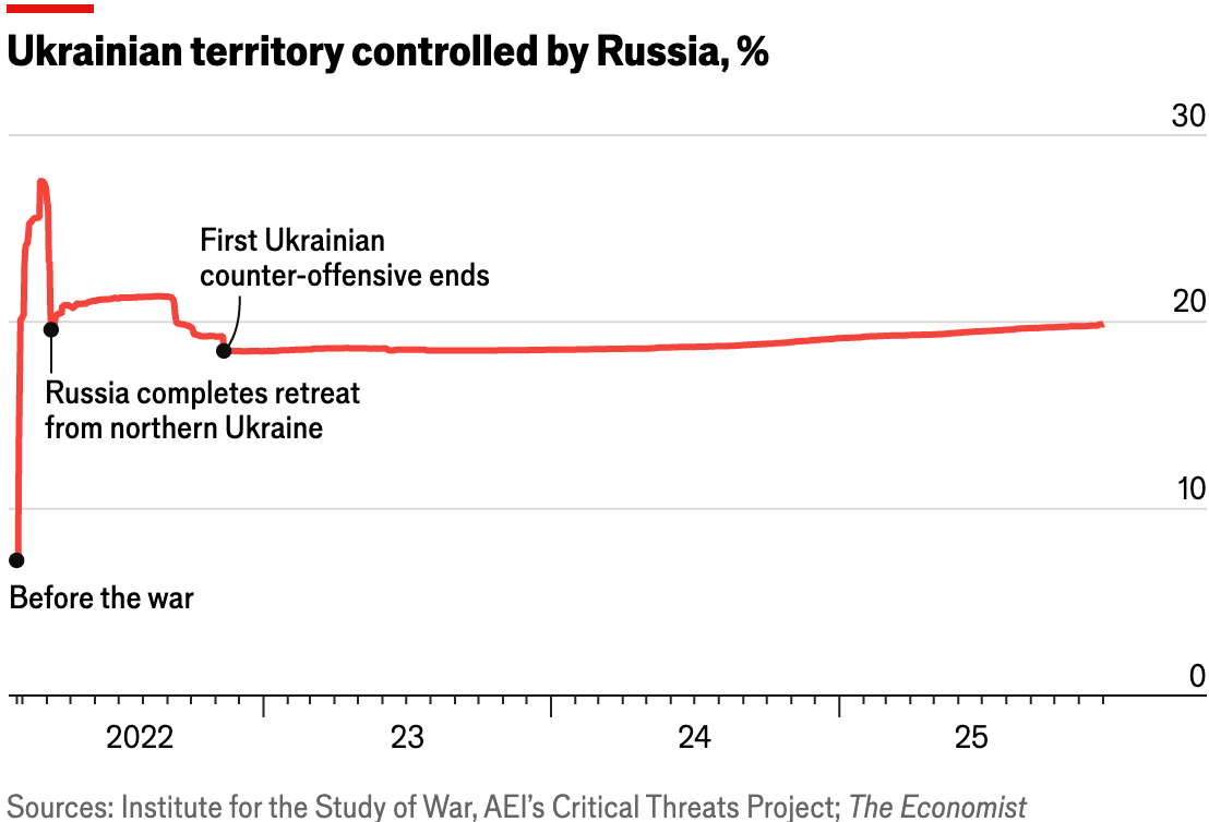
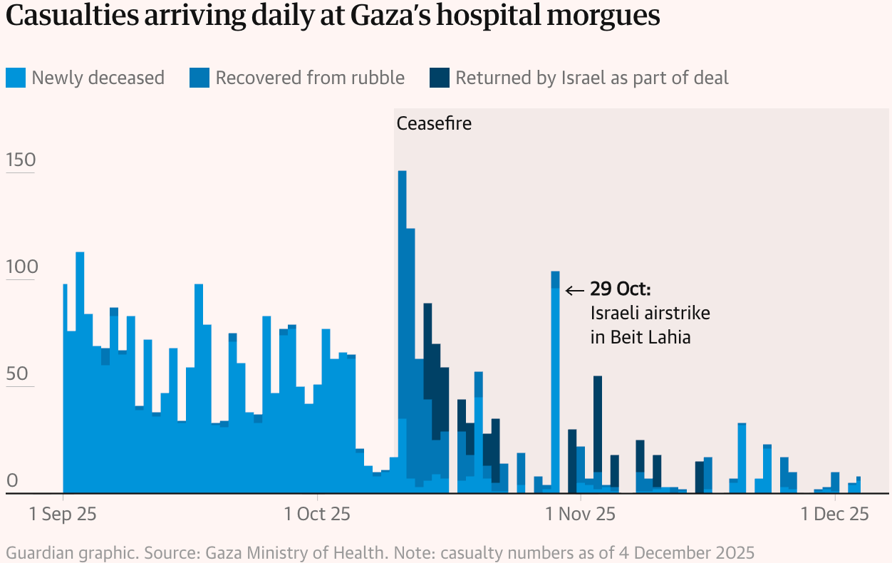
Visualizing war and conflict has become a regular activity in newsrooms worldwide. This week, we look at the situation in Ukraine, Syria, and Gaza, as well as military and surveillance spending.
![SPIEGEL: <a href="https://www.spiegel.de/ausland/ukraine-krieg-was-putins-drohnentaktik-so-effektiv-macht-a-7ba31612-f538-4568-afcc-a01e38e55319"><strong>Was Putins Drohnentaktik so effektiv macht</strong></a> [Chart description: <em>Growing waves of attacks</em>], December 5](https://datawrapper.de/cdn-cgi/image/quality=85,width=1252,f=auto,fit=cover/https://kirby.datawrapper.de/media/pages/blog/data-vis-dispatch-december-9-2025/4f685f8522-1765318171/cleanshot-2025-12-09-at-23.09.10@2x.png)
![Texty.org.ua: <a href="https://texty.org.ua/articles/116434/temni-dni-tryvali-vidklyuchennya-elektrky-oxoplyuvaly-vsyu-ukrayinu/"><strong>Темні дні. Тривалі знеструмлення охоплювали всю Україну</strong></a> [Chart description: <em>Time without electricity during the day</em>], December 4](https://datawrapper.de/cdn-cgi/image/quality=85,width=1766,f=auto,fit=cover/https://kirby.datawrapper.de/media/pages/blog/data-vis-dispatch-december-9-2025/ac9481e538-1765317190/cleanshot-2025-12-09-at-22.53.03@2x.png)
![Mabu News: <a href="https://mabunews.stibee.com/p/313"><strong>🎩 CCTV가 내 개인정보를 마음대로 빼간다면 어떡하지?</strong></a> [Chart description: <em>Palantir - Annual Federal Government Contract Value</em>], December 5](https://datawrapper.de/cdn-cgi/image/quality=85,width=1222,f=auto,fit=cover/https://kirby.datawrapper.de/media/pages/blog/data-vis-dispatch-december-9-2025/b2454c9a93-1765315857/cleanshot-2025-12-09-at-22.30.33@2x.png)
Political charts come in an array of surprisingly cheerful colors, showing Argentina's new Congress, impeachment requests against Brazilian judges, and approval ratings in Germany.
![LA NACION: <a href="https://www.lanacion.com.ar/politica/asi-queda-la-nueva-camara-de-diputados-que-tratara-las-reformas-de-javier-milei-nid03122025/"><strong>El nuevo Congreso: Así queda la Cámara de Diputados que tratará las reformas de Milei</strong></a> [<em>The new Congress: This is how the Chamber of Deputies will look as it debates Milei's reforms</em>], December 3](https://datawrapper.de/cdn-cgi/image/quality=85,width=1972,f=auto,fit=cover/https://kirby.datawrapper.de/media/pages/blog/data-vis-dispatch-december-9-2025/11a4803a64-1765281290/cleanshot-2025-12-09-at-12.54.03@2x.png)
![NEXO: <a href="https://www.nexojornal.com.br/grafico/2025/12/05/stf-supremo-pedido-impeachment-ministros-alexandre-de-moraes"><strong>Moraes é o principal alvo de pedidos de impeachment no STF</strong></a> [Chart description: <em>Requests to initiate impeachment proceedings against Supreme Court justices</em>], December 5](https://datawrapper.de/cdn-cgi/image/quality=85,width=1080,f=auto,fit=cover/https://kirby.datawrapper.de/media/pages/blog/data-vis-dispatch-december-9-2025/0a56b9b3d0-1765316303/cleanshot-2025-12-09-at-22.36.43@2x.png)
![DIE ZEIT: <a href="https://www.zeit.de/politik/deutschland/2025-12/waehlerschaft-afd-potenzial-umfragen-statistik?utm_medium=redpost&utm_source=bluesky&utm_campaign=zeitde"><strong>Die AfD ist vorerst am Limit</strong></a> [<em>The AfD has reached its limit for now</em>], December 9](https://datawrapper.de/cdn-cgi/image/quality=85,width=1864,f=auto,fit=cover/https://kirby.datawrapper.de/media/pages/blog/data-vis-dispatch-december-9-2025/063d14138a-1765285640/cleanshot-2025-12-09-at-14.07.02@2x.png)
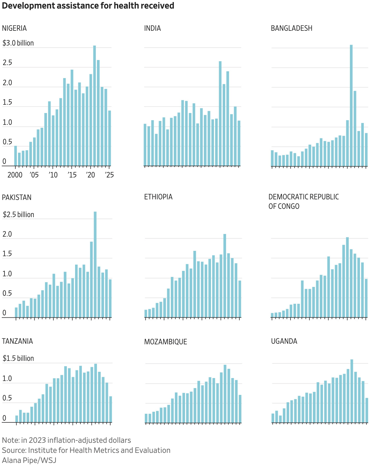
Recent U.S. policies have had a strong impact on research, immigration-related arrests, as well as development assistance abroad.
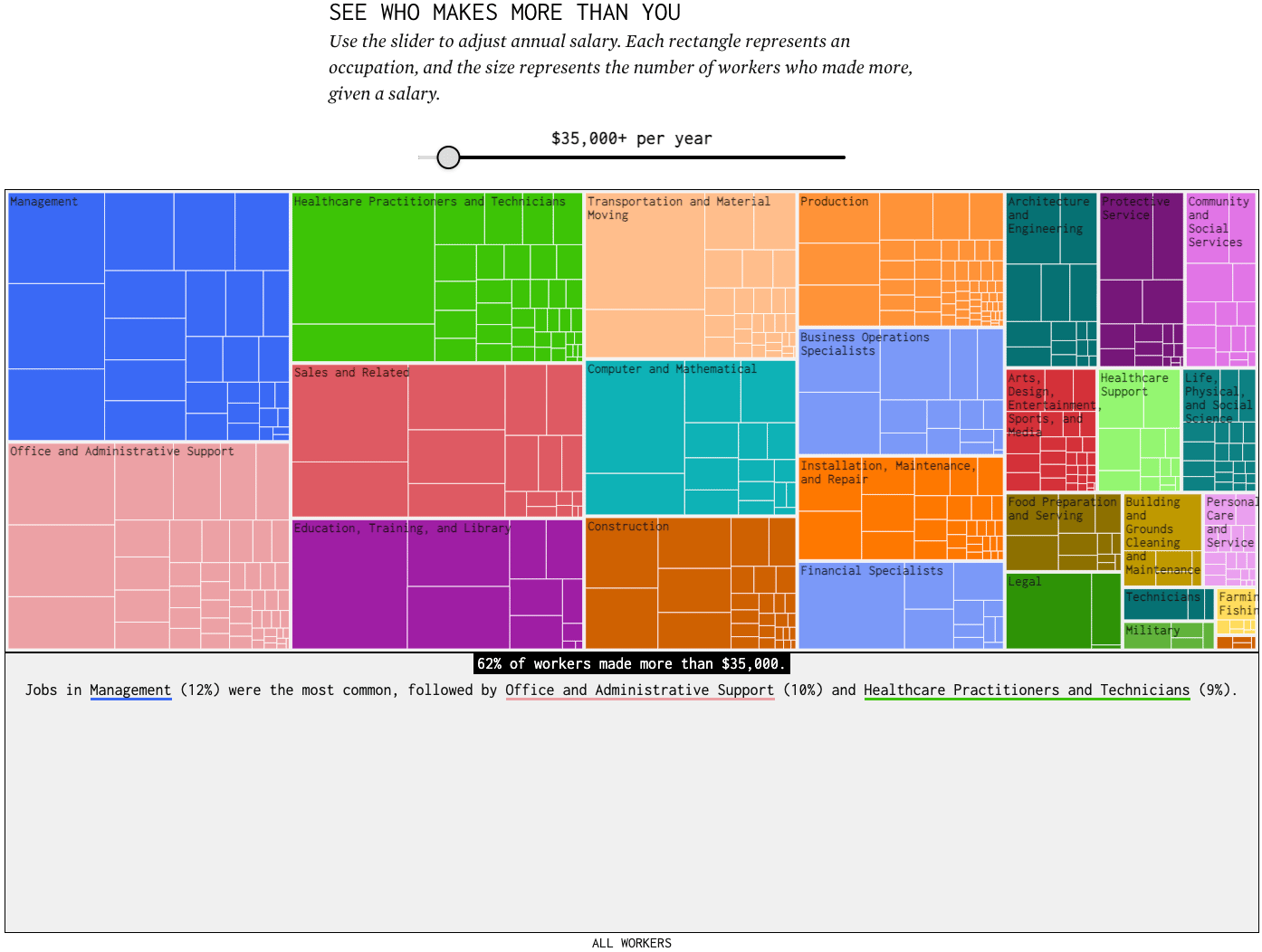
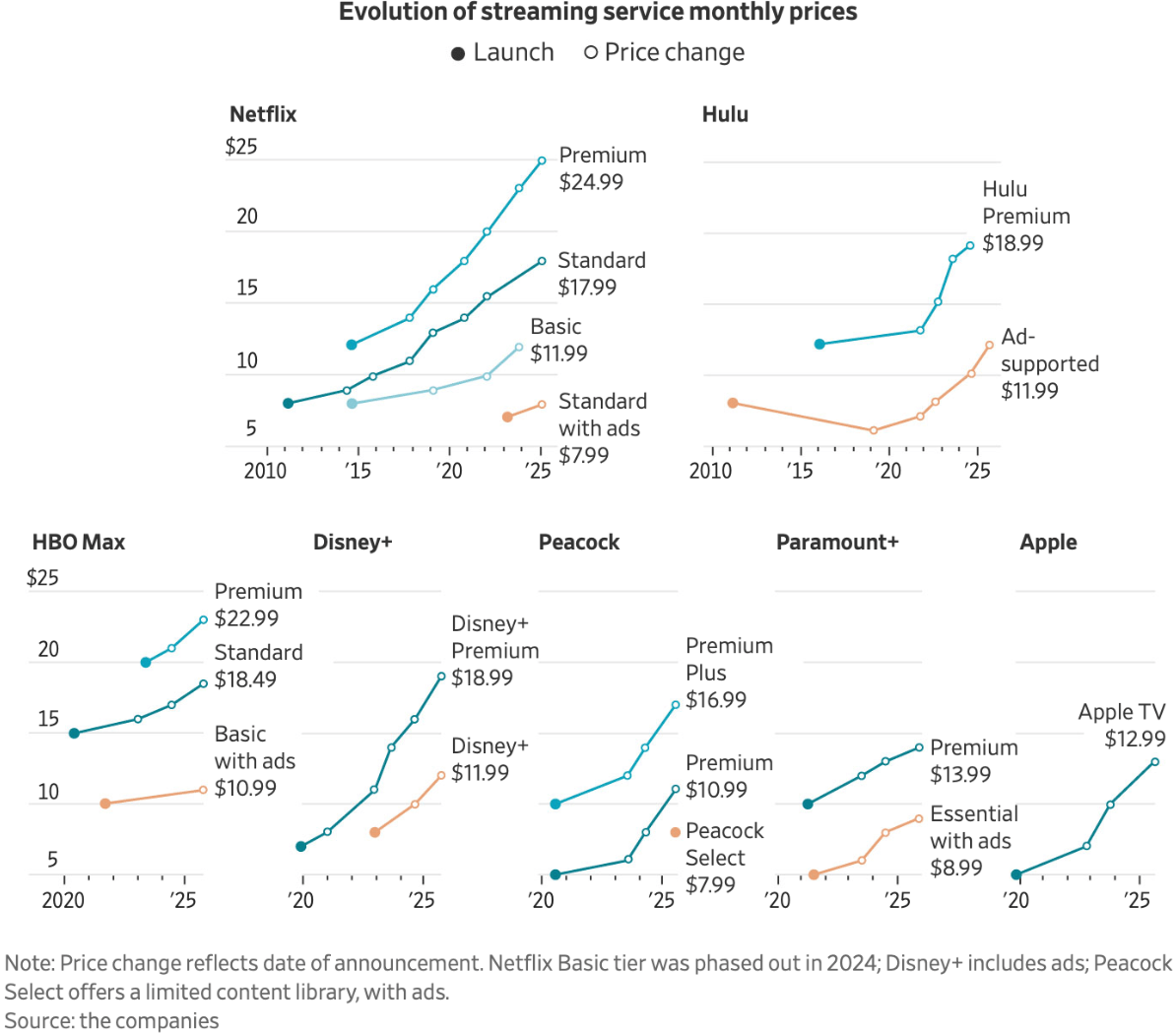
A quick look at salaries and costs: explore how much you earn compared to others in your field and beyond, and what streaming service you may be able to afford.
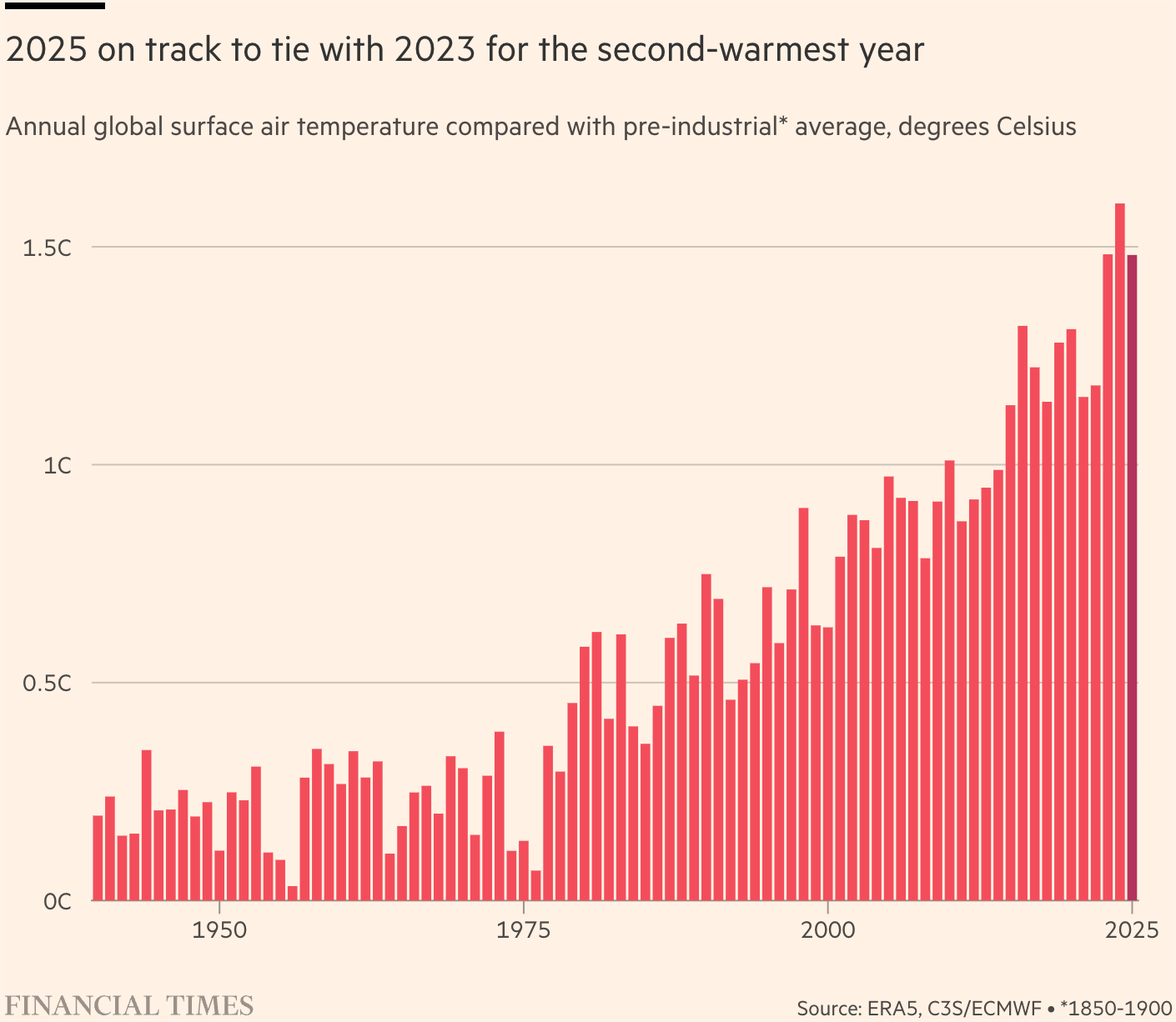
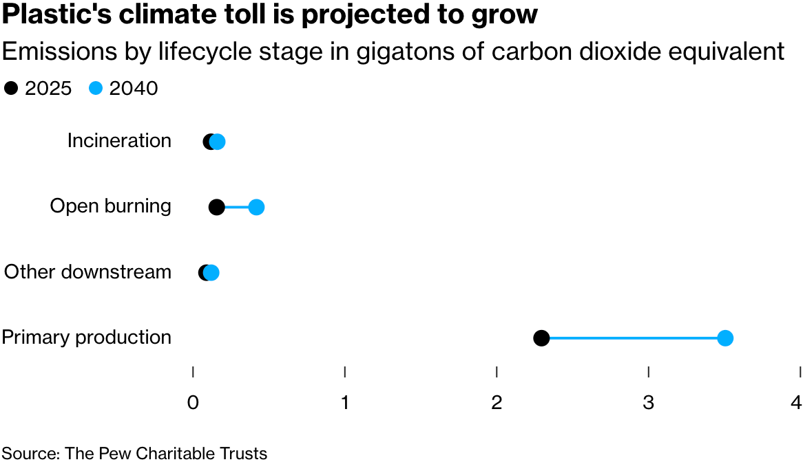
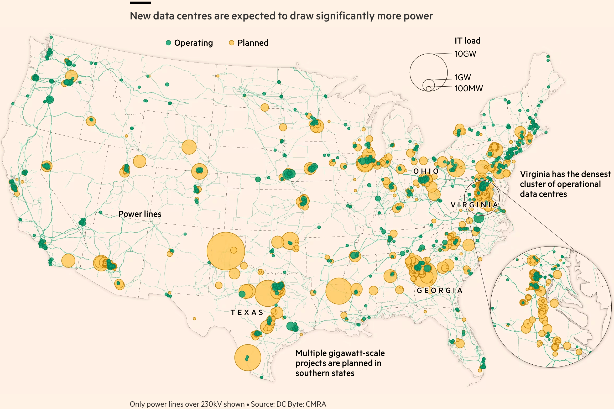
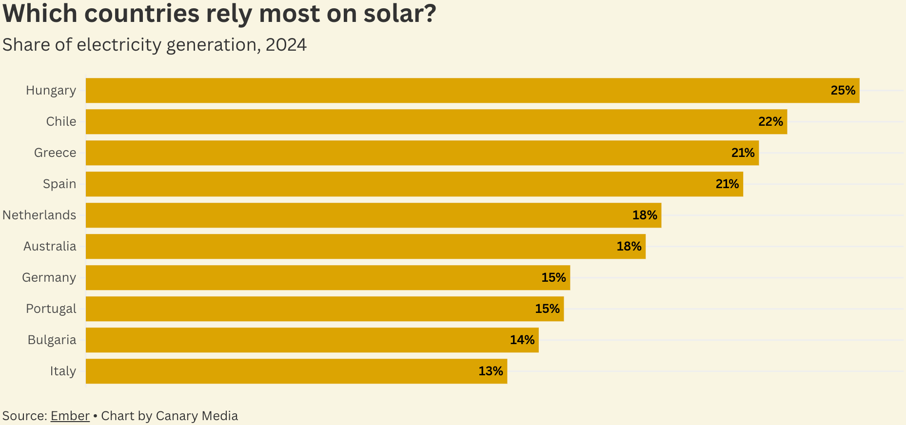
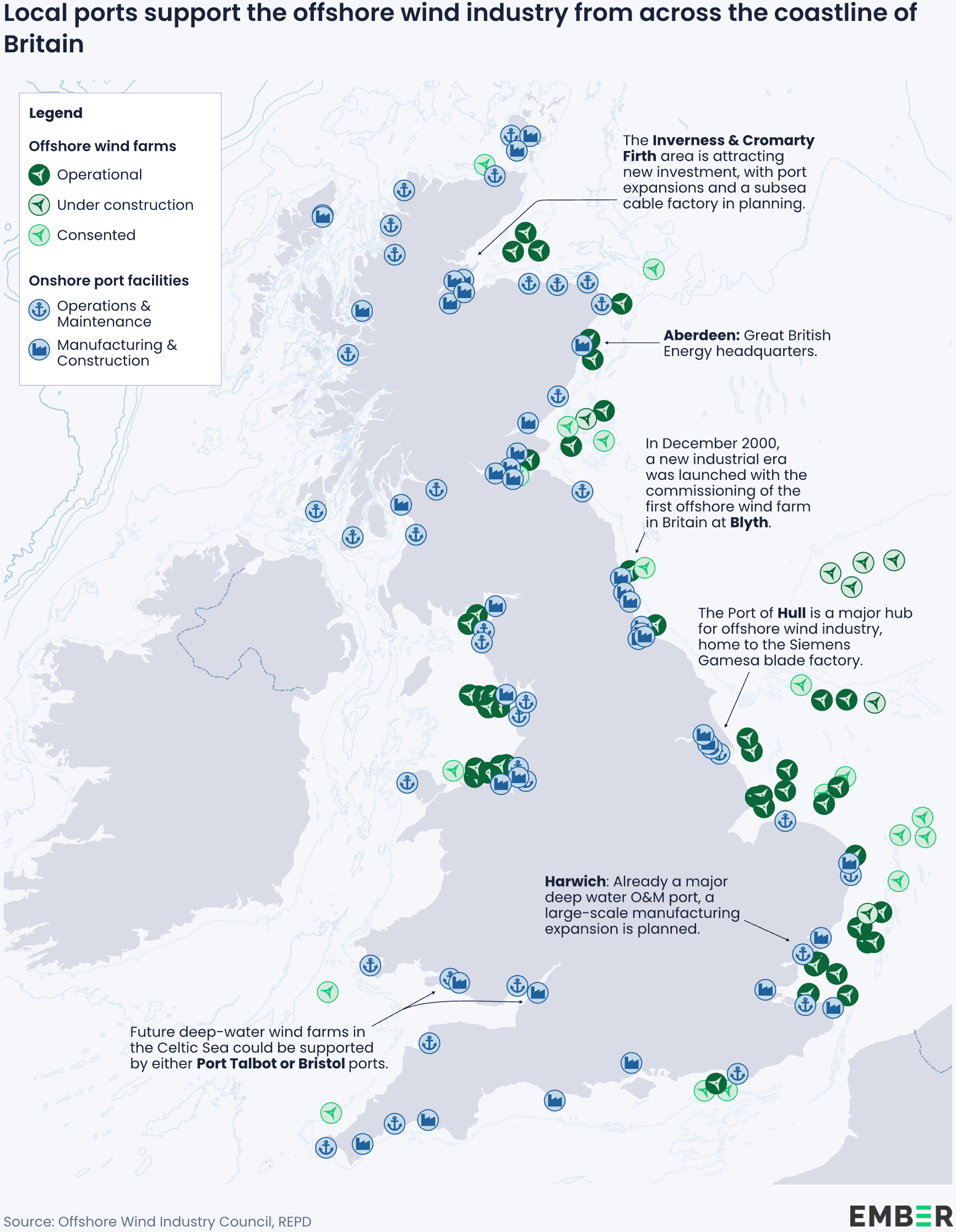
It has been another hot year for our planet, and the climate toll of plastic and data centres continues to grow. Thankfully, so does solar and wind power.
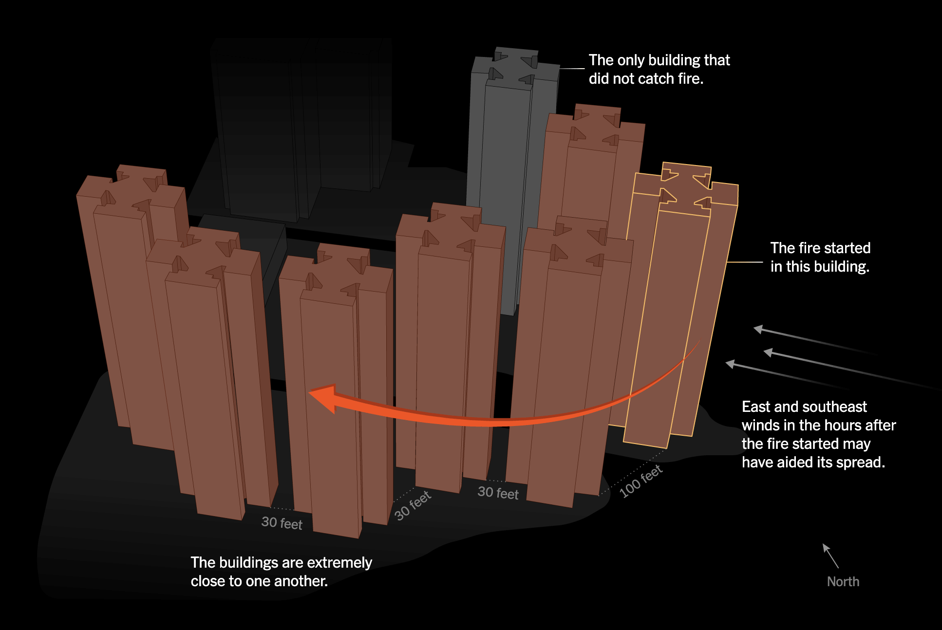
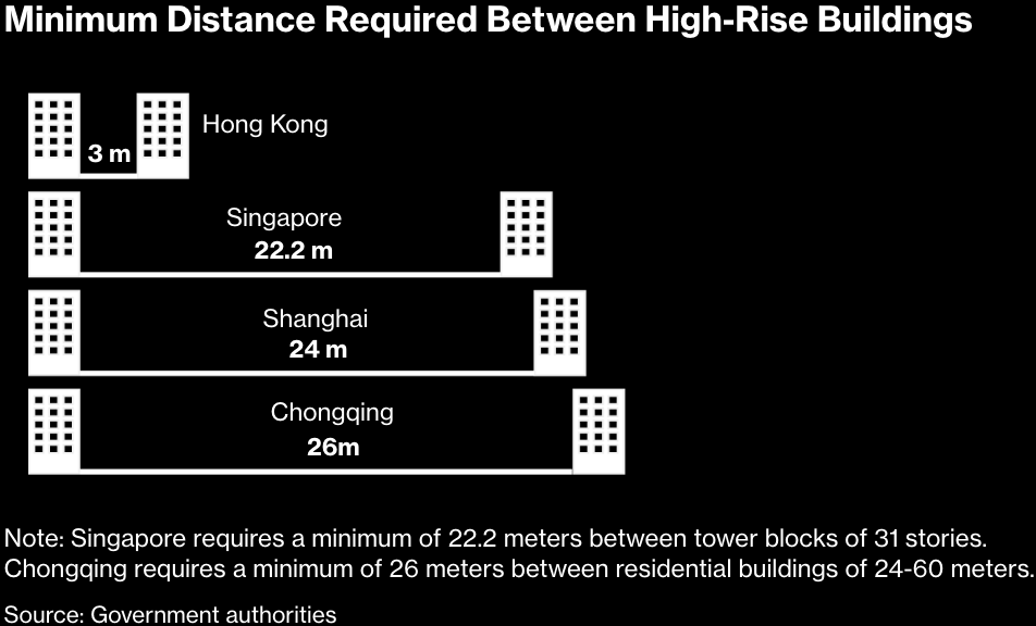
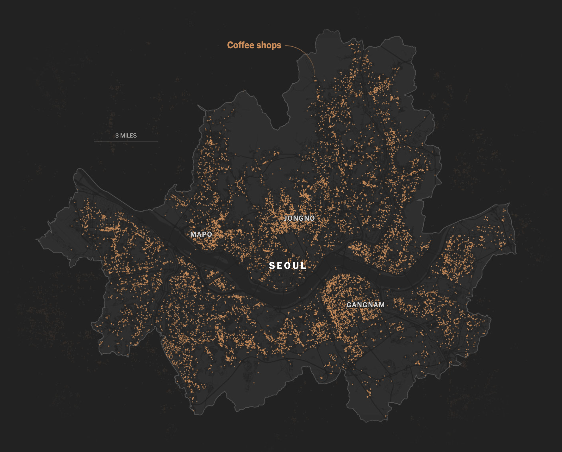
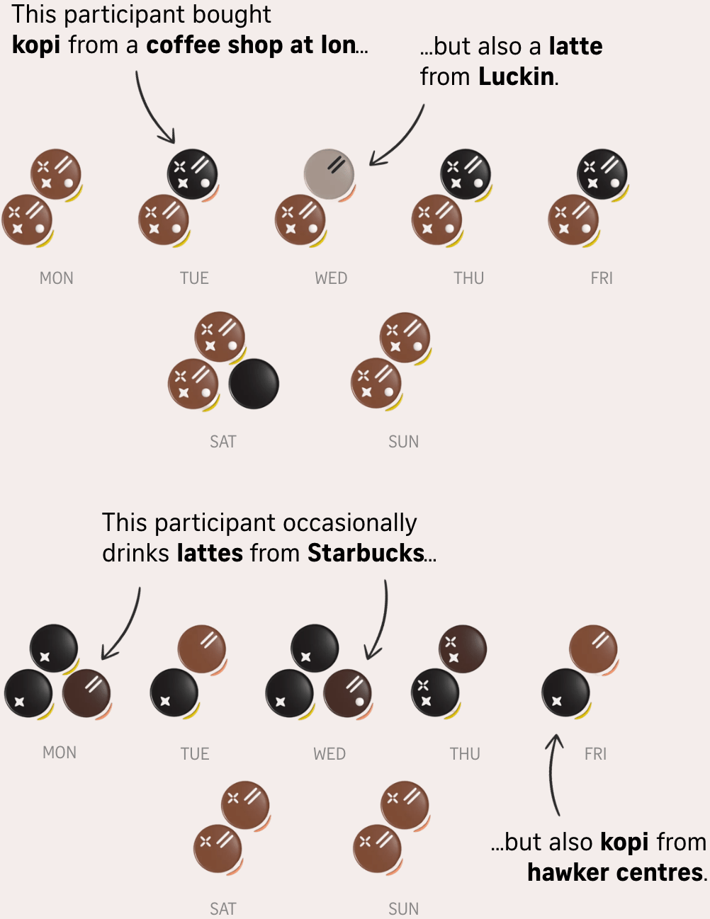
Investigation has revealed more information about the Hong Kong fire. On a lighter note, South Korea has too many coffee shops, and Singapore explores its own coffee trends.
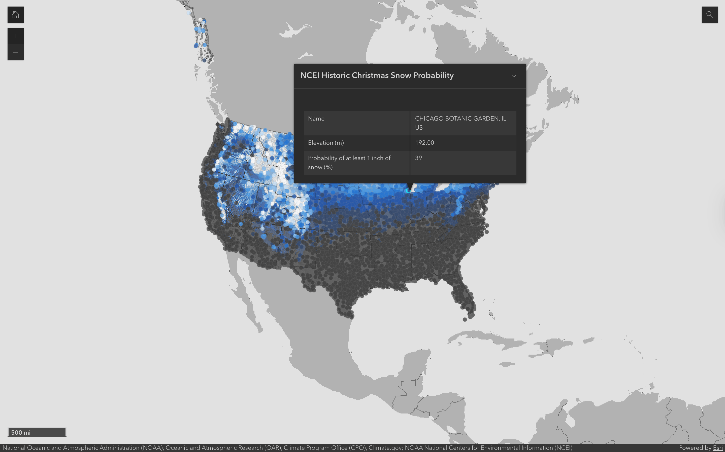
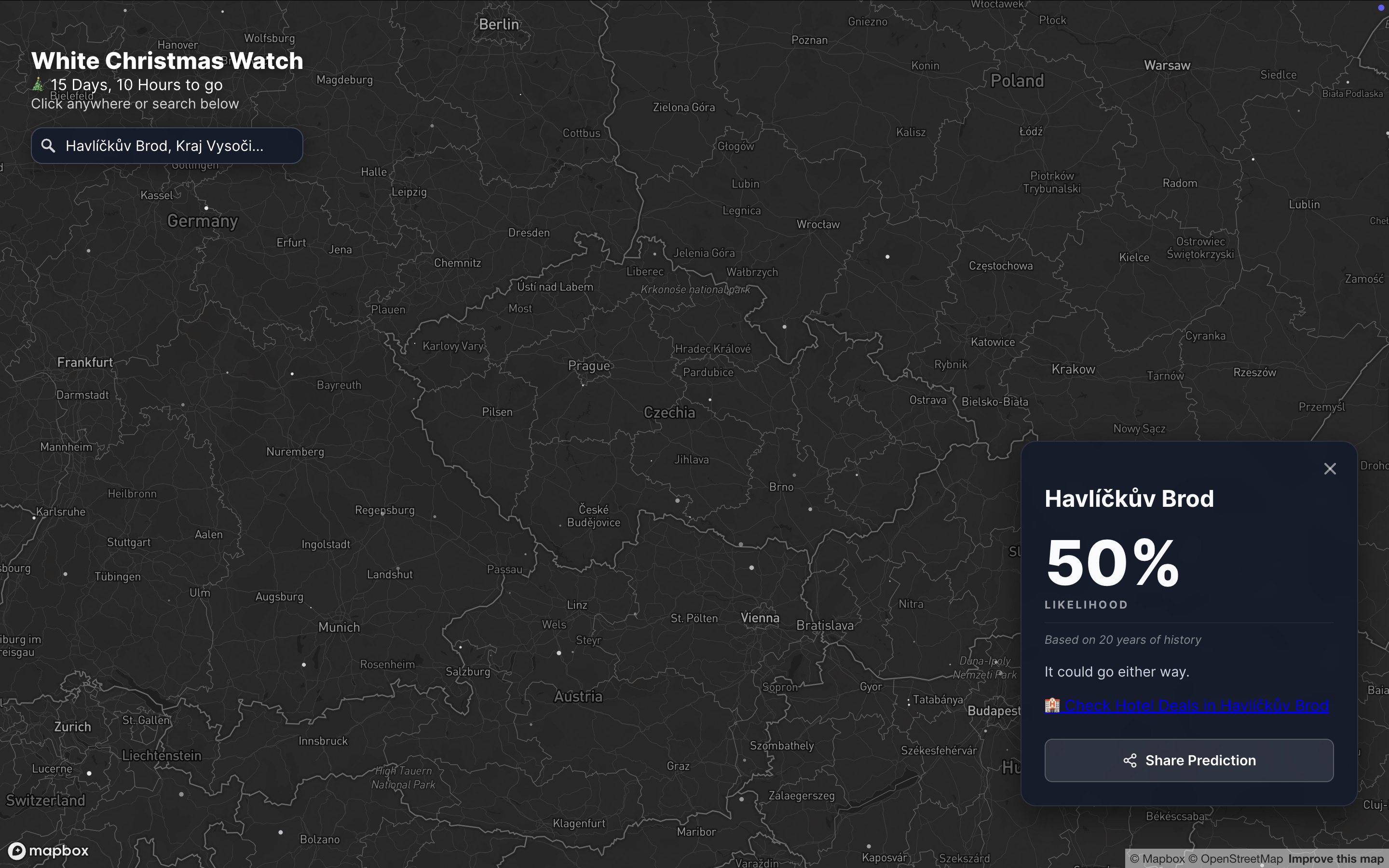
And last but not least, the Christmas spirit is upon us, and it has inspired many visualizations, from the likelihood of snow to Christmas lights, gifts, and feelings.
![Diario SUR: <a href="https://www.diariosur.es/economia/negocio-encender-navidad-100-millones-carreras-iluminar-20251207000705-ntrc.html"><strong>El negocio de ‘encender’ la Navidad: 100 millones y carreras por iluminar más</strong></a> [Chart description: <em>Total spending on Christmas lights</em>], December 7](https://datawrapper.de/cdn-cgi/image/quality=85,width=2290,f=auto,fit=cover/https://kirby.datawrapper.de/media/pages/blog/data-vis-dispatch-december-9-2025/f64f362ff2-1765316567/cleanshot-2025-12-09-at-22.41.42@2x.png)
What else we found interesting
Applications are open for…
A cartographic design intern at Esri Creative Lab
A graphics reporter (deleted data project) at The Guardian


