Data Vis Dispatch, December 2: Hong Kong fire, the Amazon, and food

Welcome back to the 221st edition of Data Vis Dispatch! Every week, we’ll be publishing a collection of the best small and large data visualizations we find, especially from news organizations — to celebrate data journalism, data visualization, simple charts, elaborate maps, and their creators.
Recurring topics this week include the devastating fire in Hong Kong, problems in the Amazon region, and food for children and gourmets.
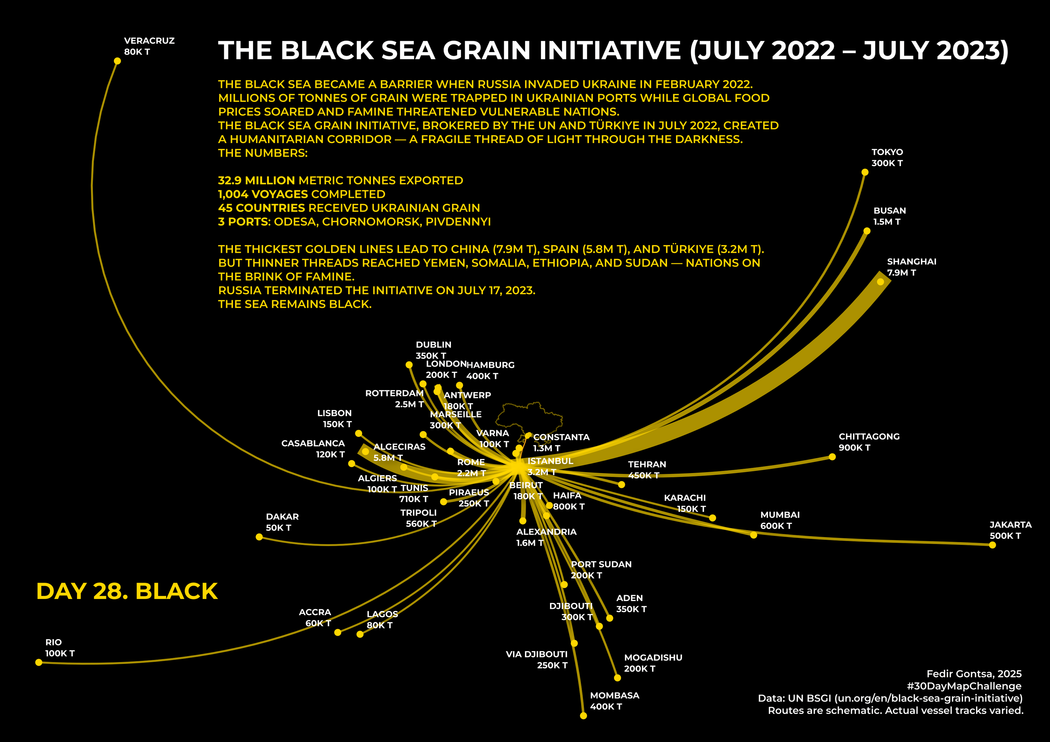
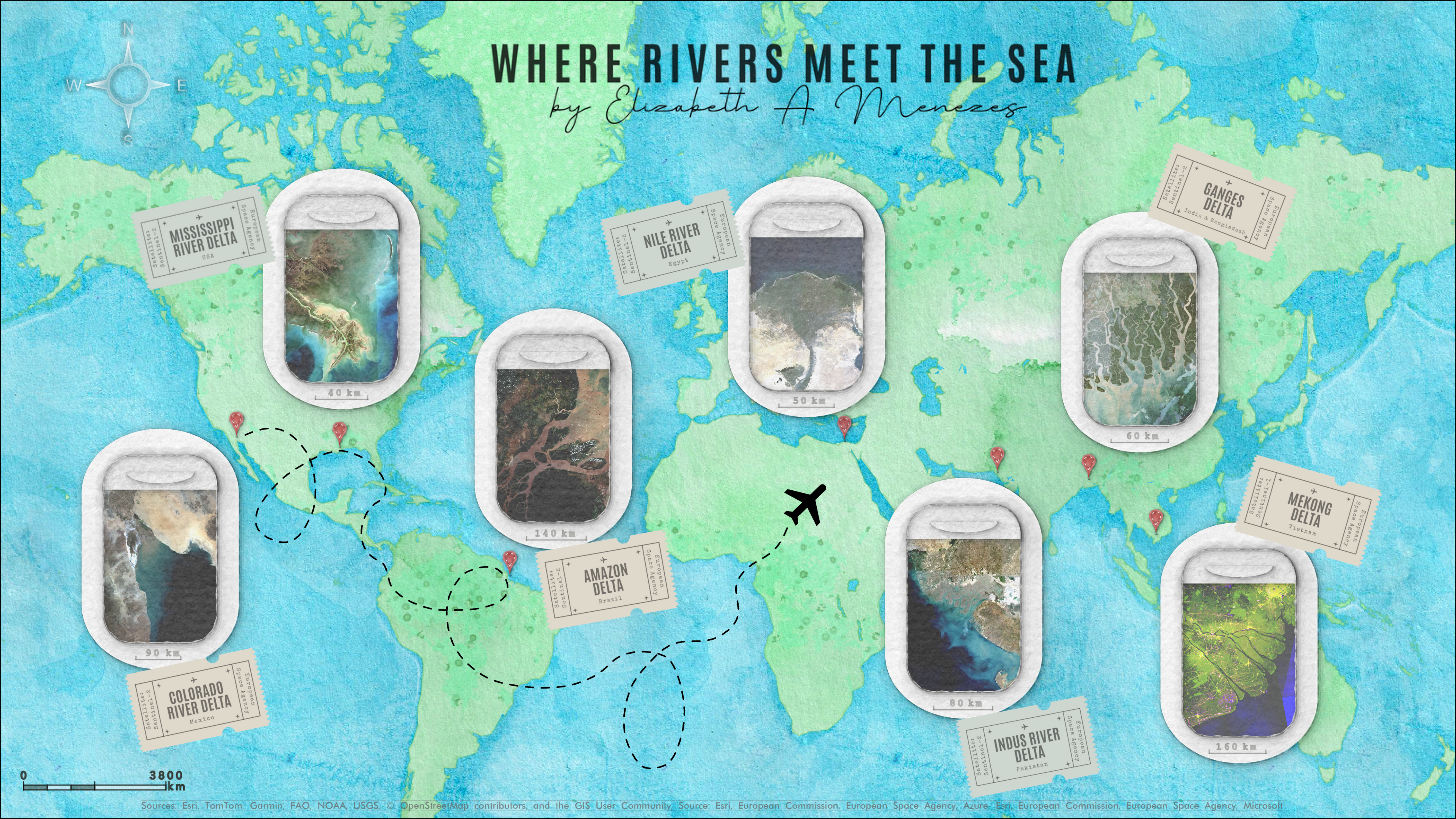
November has flown by, and we have already reached the end of the #30DayMapChallenge. The final themes were boundaries, black, raster, and makeover.
![Alexandre Médina: "#30daymapchallenge · Jour 30 · Relooking Europe · Europa · Ευρώπη · Європа; Zoomez pour découvrir les villes d'Europe dans leur langue [...]" [<em>Zoom in to discover the cities of Europe in your own language</em>], November 30 (<a href="https://www.linkedin.com/feed/update/urn:li:activity:7400871933405347841/"><strong>LinkedIn</strong></a>)](https://datawrapper.de/cdn-cgi/image/quality=85,width=800,f=auto,fit=cover/https://kirby.datawrapper.de/media/pages/blog/data-vis-dispatch-december-2-2025/006c6a7d96-1764584436/1764505369256.jpeg)
People from all over the world flock to big cities. Where do they come from? And how far do they have to commute to access healthcare, nightlife, or food choices?
![DIE ZEIT: <a href="https://www.zeit.de/zeit-magazin/2025-11/zugezogene-in-grossstaedten-geburtsort-einwohner-umzug"><strong>Wo kommen die Großstädter eigentlich her?</strong></a> [<em>Where do city residents actually come from?</em>], November 25 <span class="badge">find yourself</span>](https://datawrapper.de/cdn-cgi/image/quality=85,width=2134,f=auto,fit=cover/https://kirby.datawrapper.de/media/pages/blog/data-vis-dispatch-december-2-2025/1310897bd1-1764582348/cleanshot-2025-12-01-at-10.44.53@2x.png)
![The European Correspondent: "You’ve probably heard someone talk passionately about a '15-minute city' before. At its core, it's the idea that cities can be designed so that everything you need is no more than a 15-minute walk, bike ride or public transport trip away [...]," November 27 (<a href="https://www.instagram.com/p/DRjfp_VjzBa/?hl=fr"><strong>Instagram</strong></a>)](https://datawrapper.de/cdn-cgi/image/quality=85,width=1472,f=auto,fit=cover/https://kirby.datawrapper.de/media/pages/blog/data-vis-dispatch-december-2-2025/6291a65684-1764673247/cleanshot-2025-12-02-at-12.00.12@2x.png)
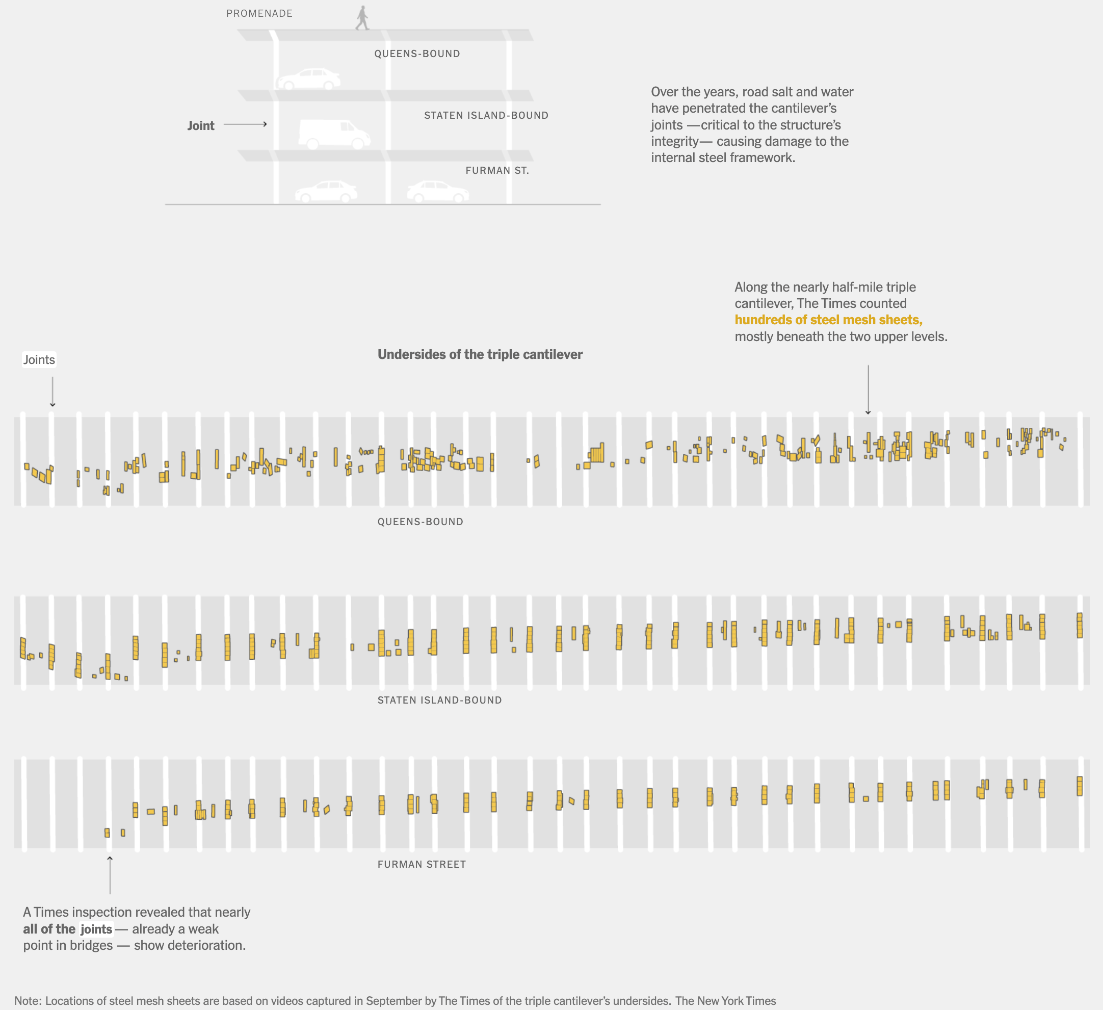
In the realm of transportation, individual roads were in the spotlight this week. Delays are common on the General Paz in Buenos Aires, and the Triple Cantilever Bridge in New York City was not designed to withstand the volume of traffic it carries.
![La Nación: <a href="https://www.lanacion.com.ar/sociedad/esta-menos-mal-o-mas-mal-pero-bien-nunca-la-general-paz-ya-no-tiene-horario-pico-esta-siempre-nid02122025/"><strong>Puede estar menos mal, pero bien, nunca</strong></a> [<em>Chart title: Average daily traffic (ADT) by sections on the Gral. Paz</em>], November 25](https://datawrapper.de/cdn-cgi/image/quality=85,width=1546,f=auto,fit=cover/https://kirby.datawrapper.de/media/pages/blog/data-vis-dispatch-december-2-2025/7105dd2823-1764587869/cleanshot-2025-12-01-at-12.17.22@2x.png)
![Le Monde: <a href="https://www.lemonde.fr/les-decodeurs/article/2025/11/30/pourquoi-le-train-est-toujours-plus-cher-que-l-avion_6655422_4355770.html"><strong>Pourquoi le train est toujours plus cher que l’avion</strong></a> [<em>Chart description: This table shows the average minimum prices for train and air travel on the six busiest European air routes</em>], November 30](https://datawrapper.de/cdn-cgi/image/quality=85,width=1172,f=auto,fit=cover/https://kirby.datawrapper.de/media/pages/blog/data-vis-dispatch-december-2-2025/1a8c861820-1764684766/cleanshot-2025-12-02-at-15.12.38@2x.png)
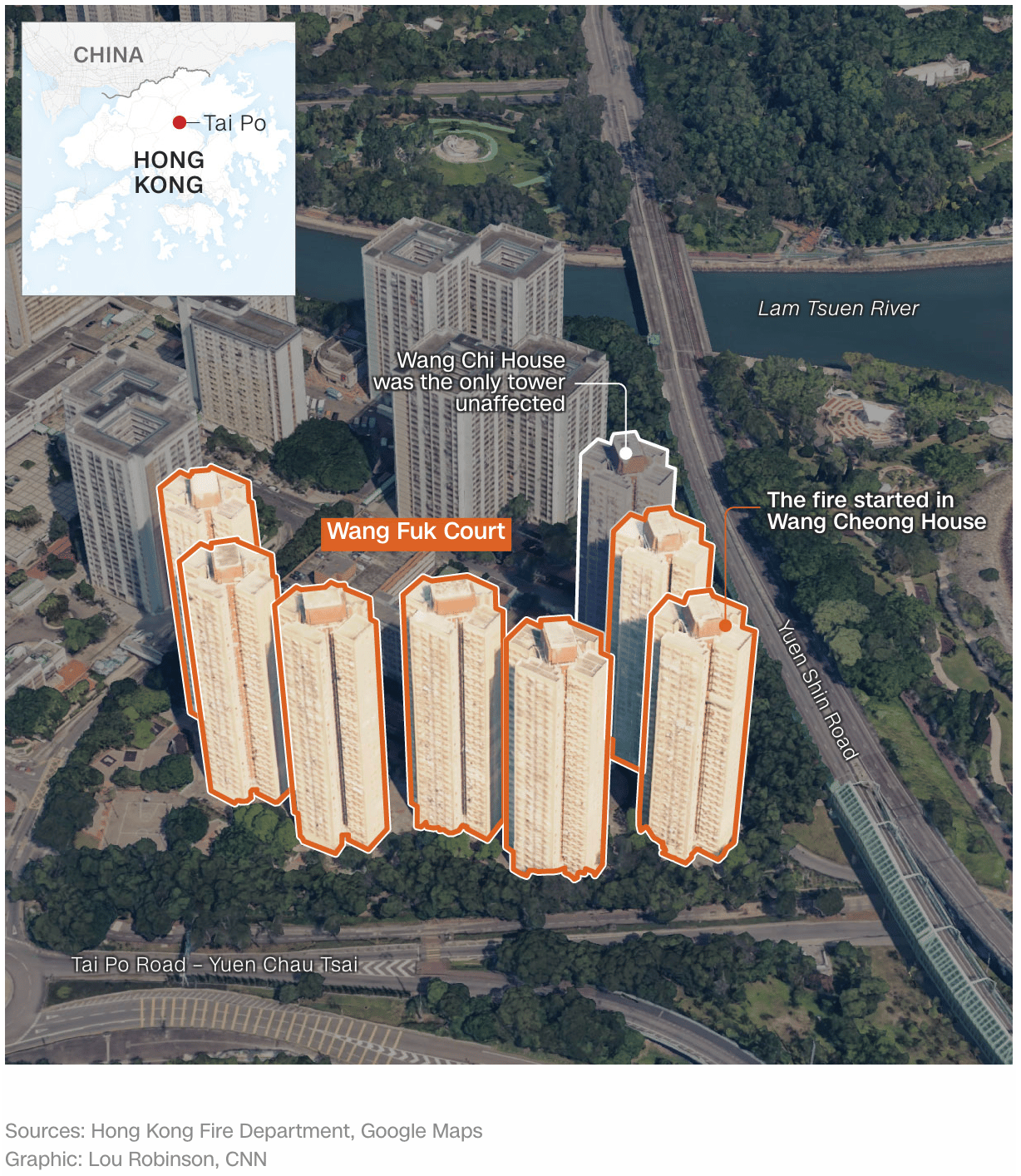
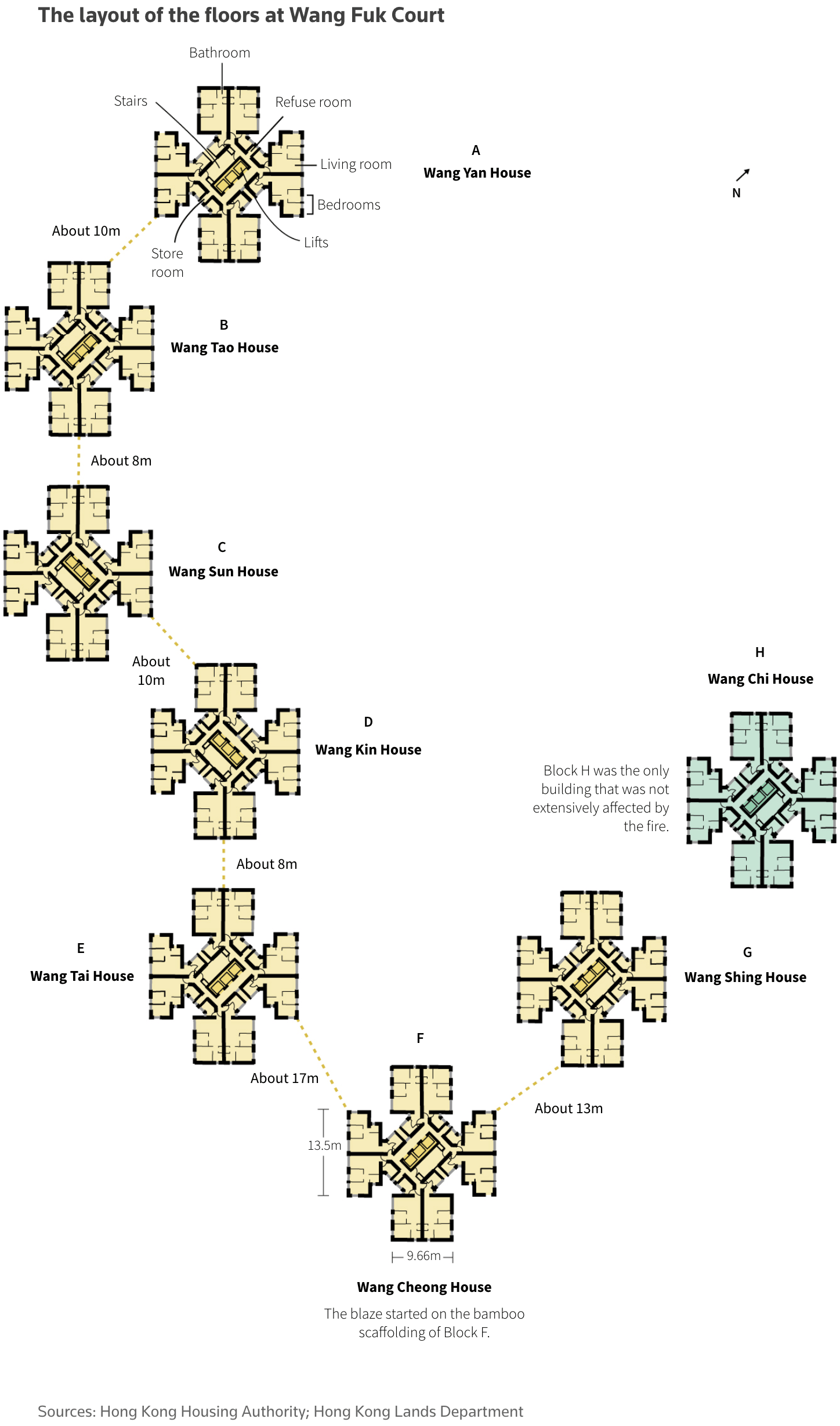
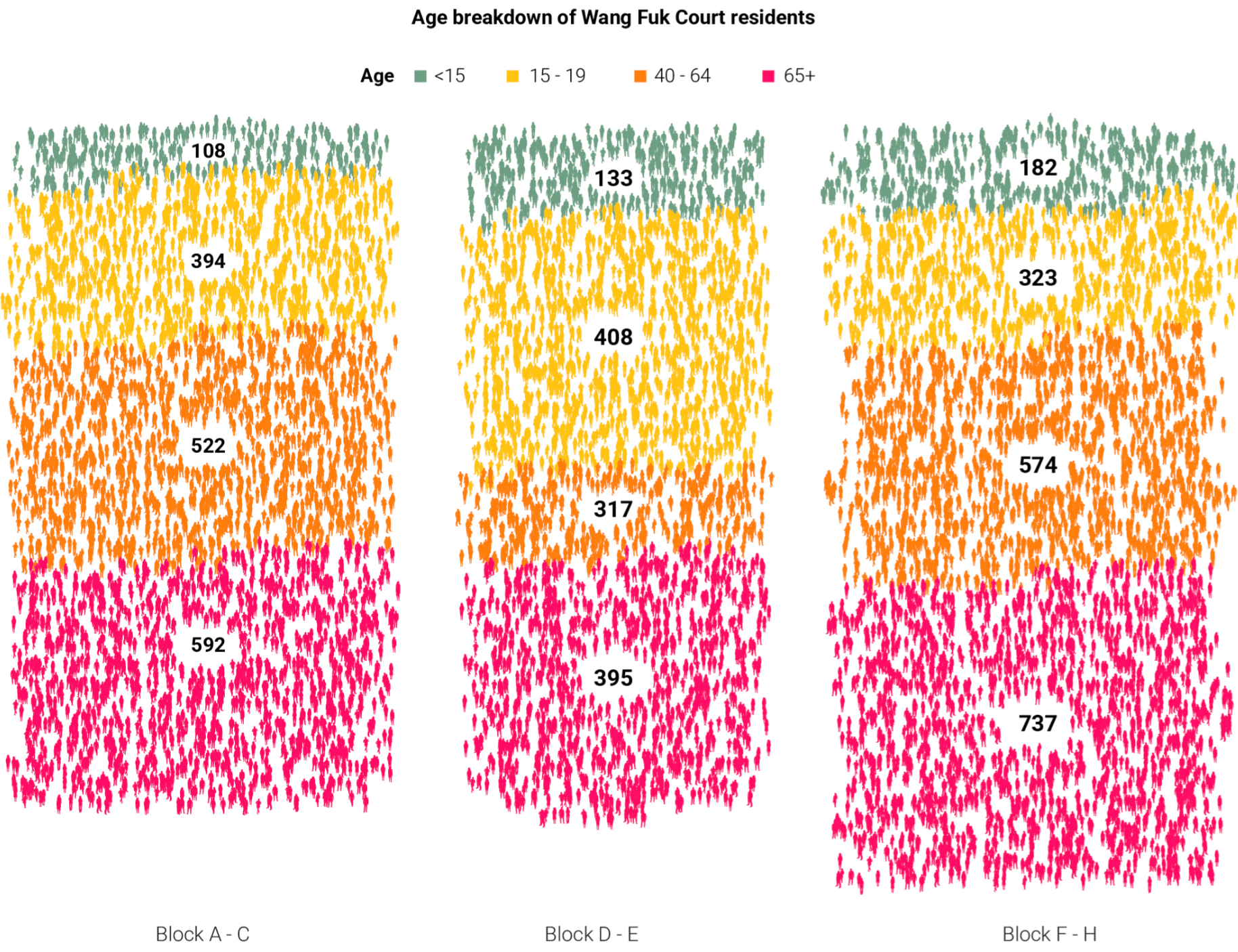
On November 26, a major fire broke out in a Hong Kong apartment complex, killing many people. Visual explainers show how it happened, what factors fueled the fire, and who was affected.
![DIE ZEIT: <a href="https://www.zeit.de/politik/ausland/2025-11/grossbrand-hongkong-hochhaus-feuer-ausweitung"><strong>Warum das Feuer in Hongkong nicht aufzuhalten war</strong></a> [<em>Why the fire in Hong Kong could not be stopped</em>], November 27](https://datawrapper.de/cdn-cgi/image/quality=85,width=1318,f=auto,fit=cover/https://kirby.datawrapper.de/media/pages/blog/data-vis-dispatch-december-2-2025/1e65e459a4-1764684866/cleanshot-2025-12-02-at-15.14.20@2x.png)
In the Amazon, fires are a problem too. Indigenous women are at the forefront of firefighting, but this also exposes them to the risk of acute respiratory infections. That's not all the negative news from the Amazon, with critical minerals being illegally transported away.
![Gênero e Número: <a href="https://www.generonumero.media/mulheres-indigenas-e-queimadas/"><strong>O que arde e o que resiste: mulheres indígenas entre o fogo e a floresta</strong></a> [<em>Chart title: Cases of acute respiratory infections among indigenous people</em>], November 28](https://datawrapper.de/cdn-cgi/image/quality=85,width=1358,f=auto,fit=cover/https://kirby.datawrapper.de/media/pages/blog/data-vis-dispatch-december-2-2025/f47c84ae5e-1764668544/cleanshot-2025-12-02-at-10.41.43@2x.png)
![Amazon Underworld: <a href="https://amazonunderworld.org/el-comercio-de-minerales-criticos-la-ruta-ilegal-que-conecta-la-amazonia-con-china/"><strong>The trade in critical minerals: the illegal route connecting the Amazon to China</strong></a> [<em>The trade in critical minerals: the illegal route connecting the Amazon to China</em>], November](https://datawrapper.de/cdn-cgi/image/quality=85,width=1528,f=auto,fit=cover/https://kirby.datawrapper.de/media/pages/blog/data-vis-dispatch-december-2-2025/d66be6c2e0-1764668705/cleanshot-2025-12-02-at-10.44.25@2x.png)
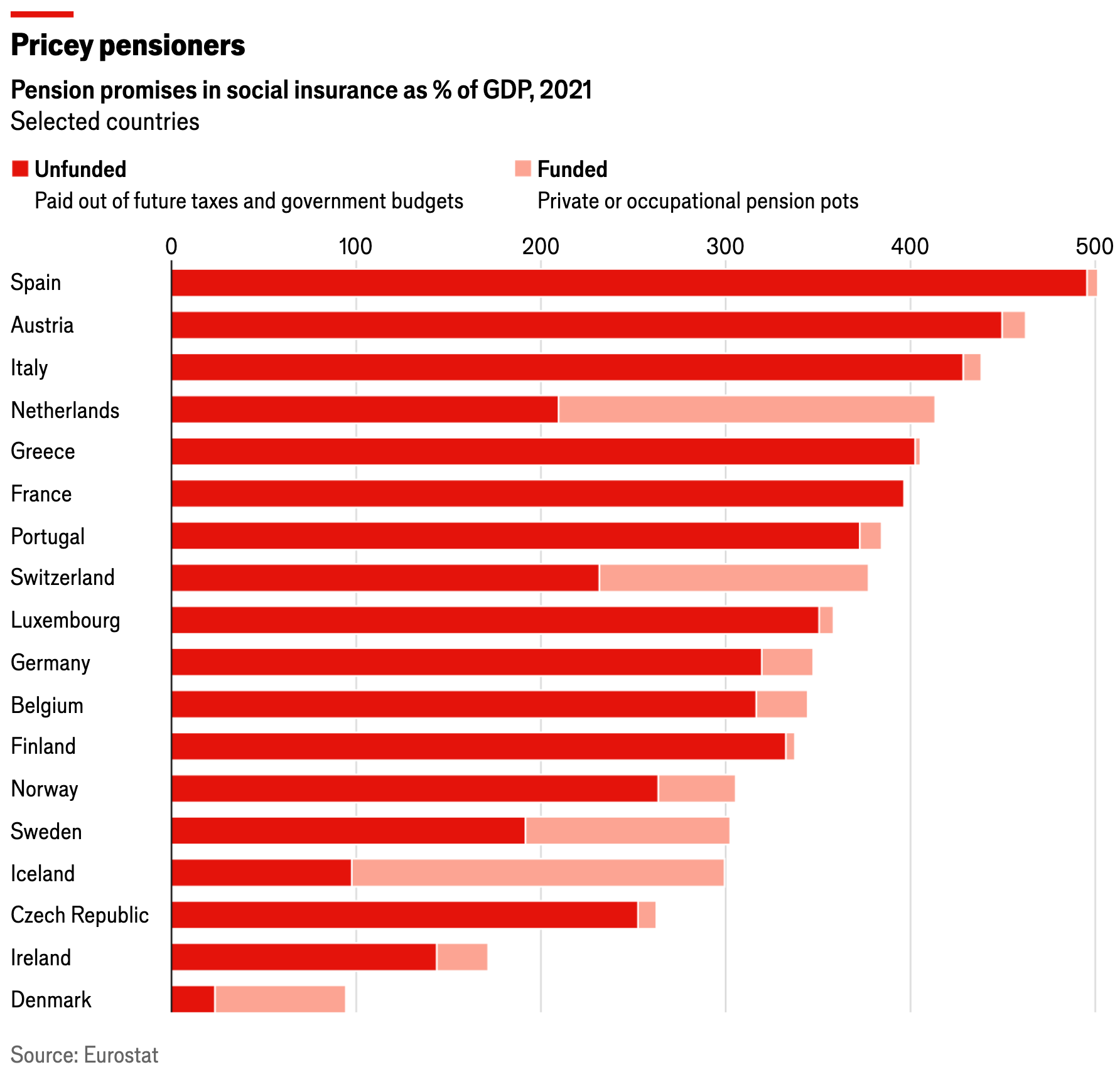
As climate change leads more Americans to rely on insurers of last resort, another type of safety net in Europe is also under pressure: public pensions. In many countries, pension promises are overwhelmingly unfunded.
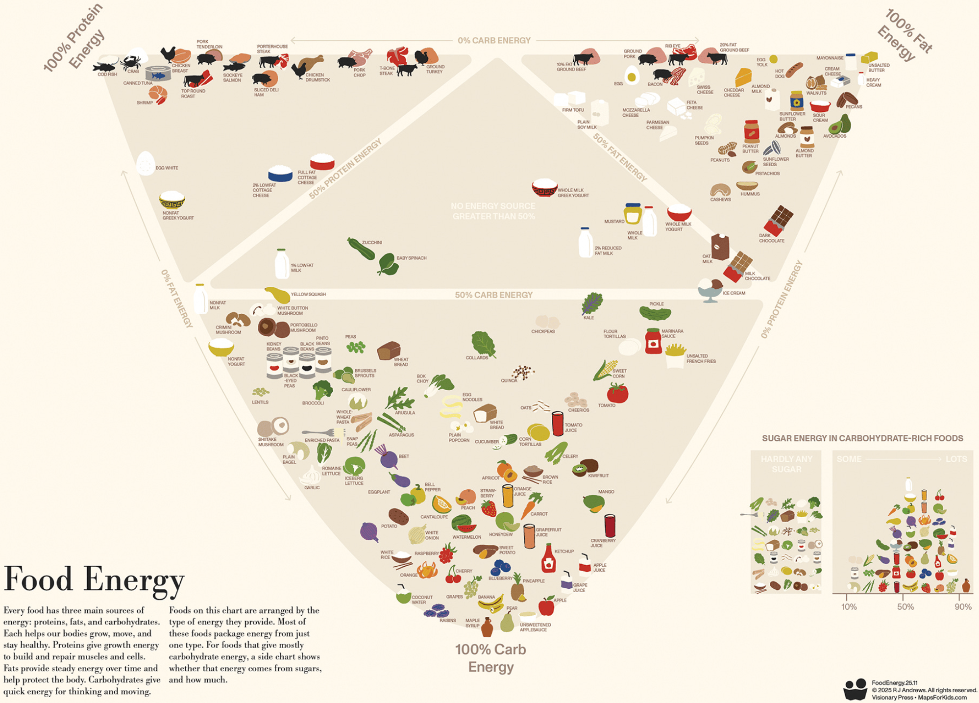
Food and charts are for everyone: from kids who want to learn about how everyday foods power our bodies to gourmets who want to know how far away the next Michelin star restaurant is.
![El Diario Sur: <a href="https://www.diariosur.es/culturas/gastronomia/restaurantes-estrella-pueblos-diminutos-clientes-vecinos-20251127125614-ntrc.html"><strong>Restaurantes con estrella en pueblos diminutos: cuando tienes más clientes que vecinos</strong></a><strong> </strong>[<em>Chart description: Distance to a Michelin star</em>], November 27](https://datawrapper.de/cdn-cgi/image/quality=85,width=2294,f=auto,fit=cover/https://kirby.datawrapper.de/media/pages/blog/data-vis-dispatch-december-2-2025/1135cc1038-1764667858/cleanshot-2025-12-02-at-10.30.17@2x.png)
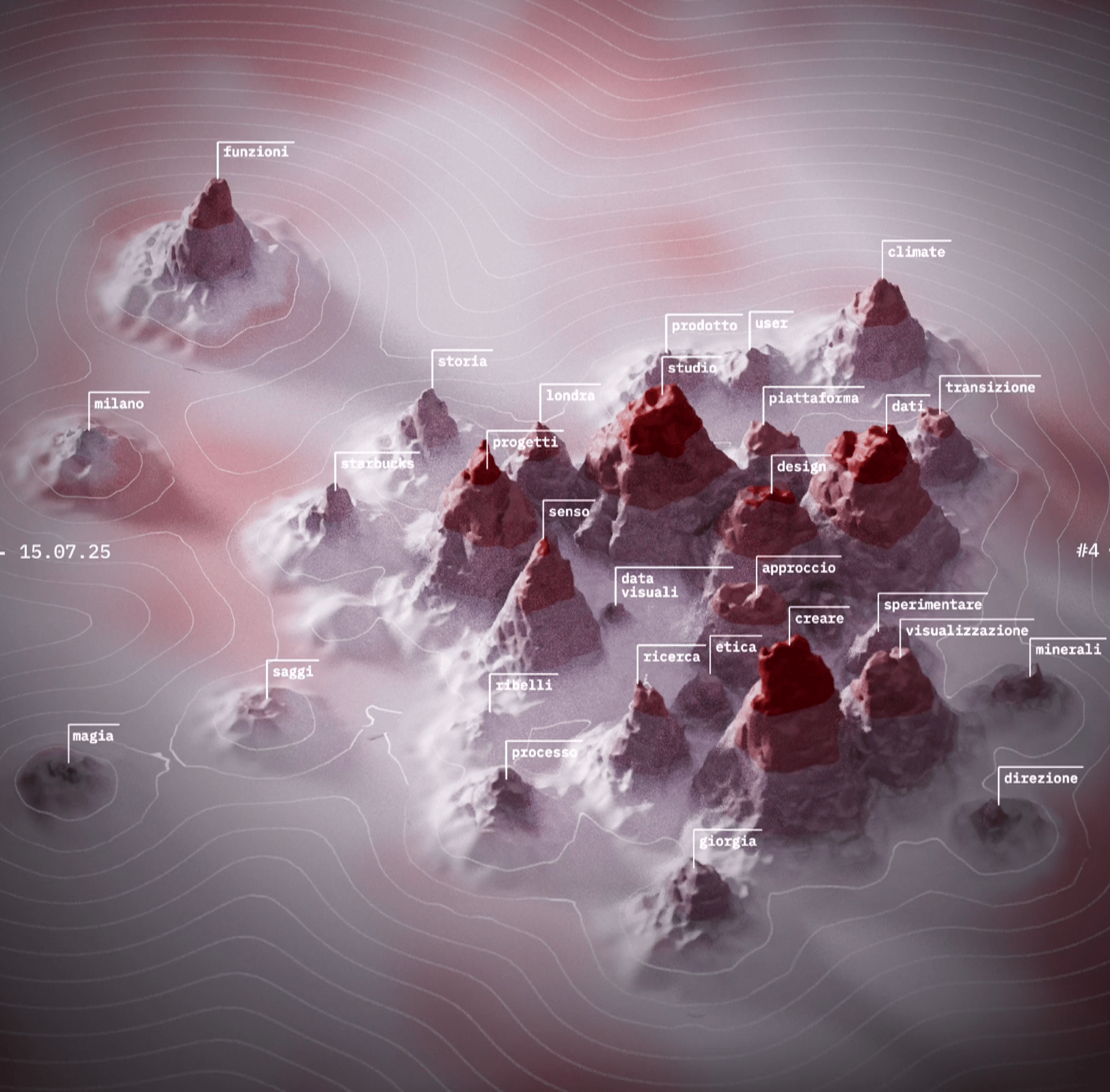
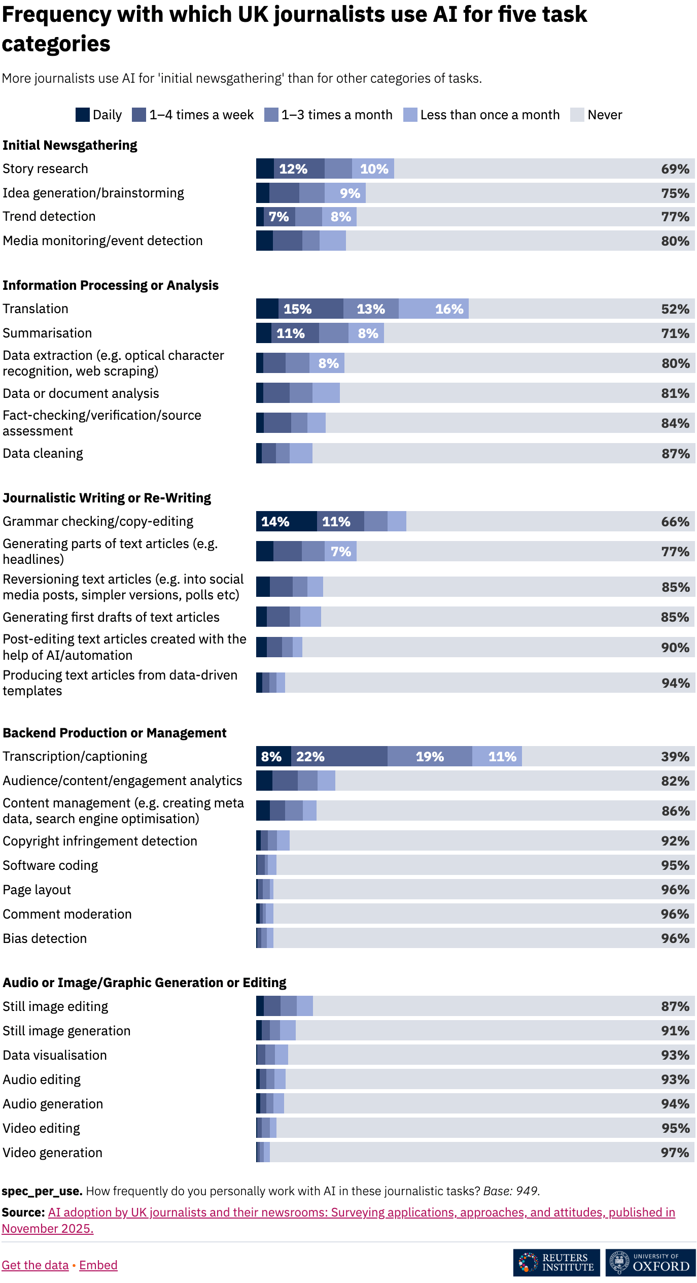
Let's take a look at the process of documentation. The Visual Agency put together a visual representation of the topography of a talk, and journalists from around the world were asked how they use AI in their work.
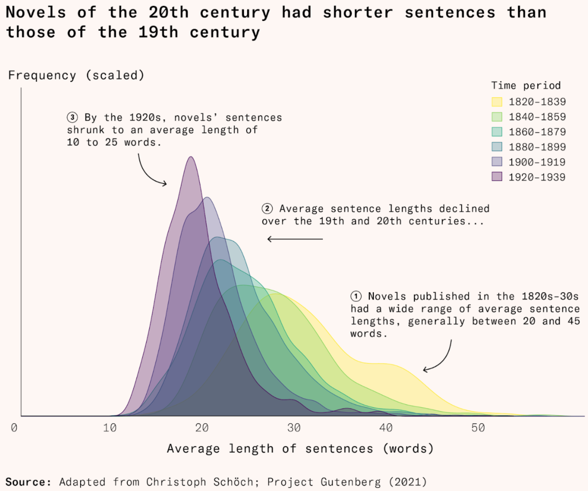
We conclude this Dispatch with entertainment: books are getting shorter and shorter. And if you're into riddles and charts, you'll love the Data Riddle Calendar that starts with December.
![Datacitron: "[1/24] And here's the first one! As suggested last year. Give your answer as the alt text of an image answering this post so people can keep guessing!" December 1 (<a href="https://bsky.app/profile/datacitron.bsky.social/post/3m6wwq4zeas2z"><strong>Bluesky</strong></a>)](https://datawrapper.de/cdn-cgi/image/quality=85,width=800,f=auto,fit=cover/https://kirby.datawrapper.de/media/pages/blog/data-vis-dispatch-december-2-2025/1e6de0f5cb-1764671148/bafkreigcuyiq4egerh6chzjrwzn6hwupcvyahcpsi73y6xszdmycr56ziu.jpg)
What else we found interesting
![ABC: <a href="https://www.abc.es/tecnologia/super-mario-anos-mickey-mouse-videojuegos-20251127131854-nt.html?ref=https%3A%2F%2Fwww.google.com%2F"><strong>Super Mario: los 40 años del Mickey Mouse de los videojuegos</strong></a> [<em>Super Mario: 40 years of the Mickey Mouse of video games</em>], November 27](https://datawrapper.de/cdn-cgi/image/quality=85,width=1962,f=auto,fit=cover/https://kirby.datawrapper.de/media/pages/blog/data-vis-dispatch-december-2-2025/41efc6a556-1764668937/cleanshot-2025-12-02-at-10.48.21@2x.png)
Applications are open for…
A cartographic design intern at Esri Creative Lab
A graphics reporter (deleted data project) at The Guardian


