Charting my charts

Shaylee here! This week, I was curious about how many visualizations I’ve created over the past few years, and what vis types I reach for the most.
You may have seen Weekly Charts breaking down the types of visualizations our users have created before, and this week, I want to dive into my own usage statistics. As a member of the support team, I make a lot of charts. On any given day, I might be creating charts for a training webinar to teach users how to get the most out of our tool, testing new features, trying to reproduce bugs to report to our developers, or, like today, writing a Weekly Chart!
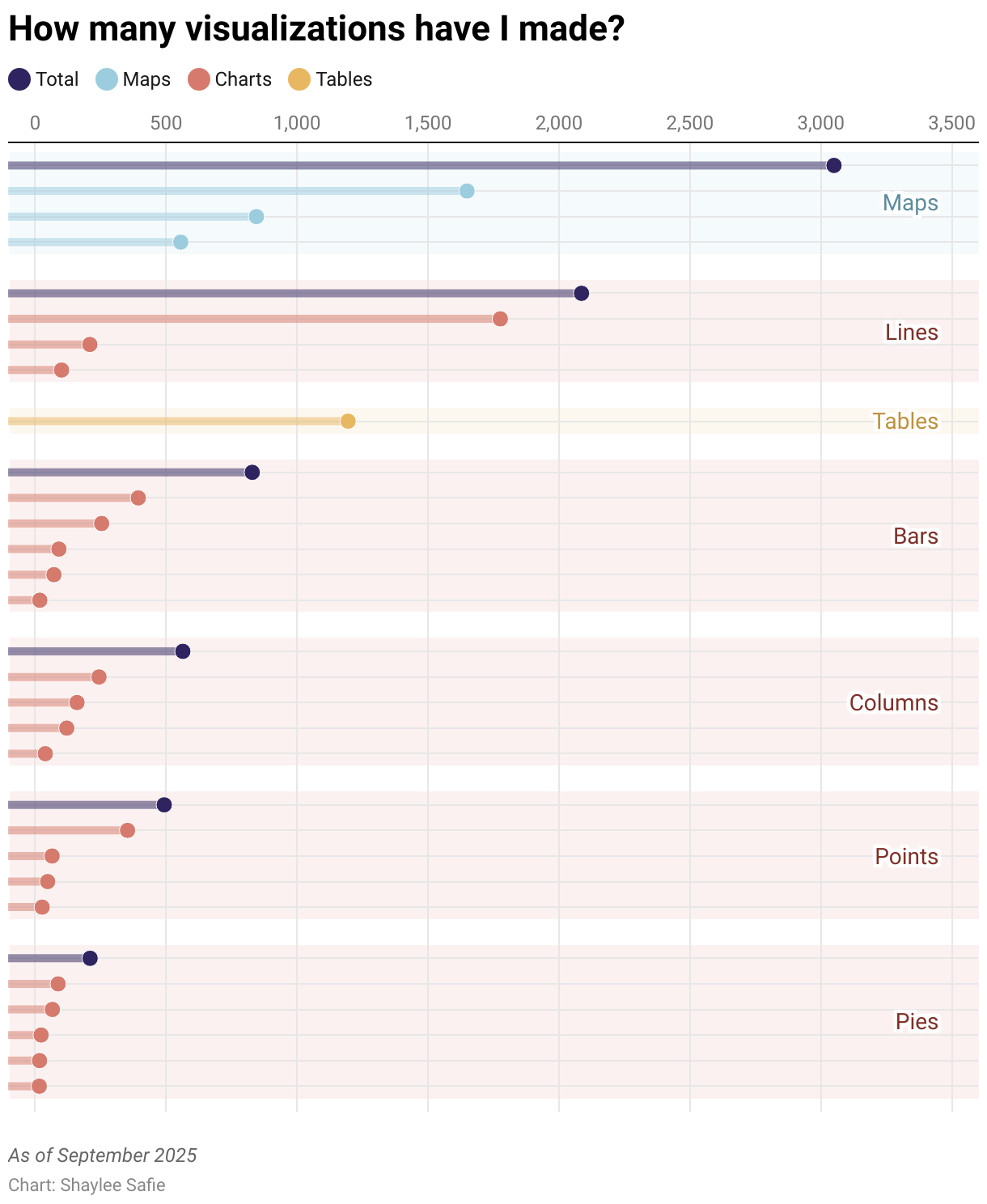
Over the course of nearly four years at Datawrapper, I’ve accumulated over 8,400 visualizations in my archive. I got that number from a GET request I sent to the Datawrapper API. The same request can also return the metadata of visualizations, including visualization type, and when a chart was created.
That inspired a bit more digging. Intuitively, I have an idea of what kinds of charts I’m most familiar with, but what’s the exact breakdown? Do I have a secret favorite, which contributes more to the 8.4k than I’d expect? I used one of my favorite chart types, a scatterplot-in-disguise, to visualize the sum total of my charting efforts throughout the years:
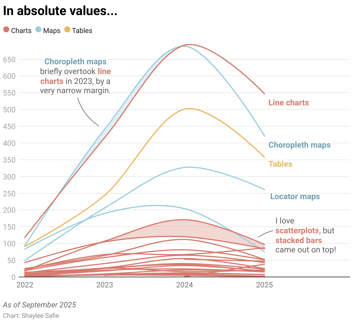
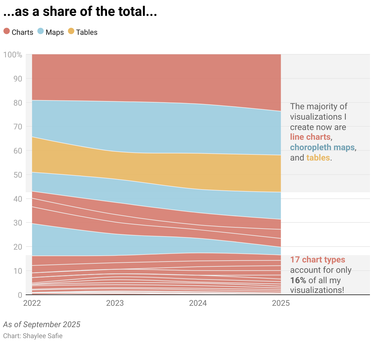
Beyond those raw total values, there are more insights we can uncover in this data. Remember when I mentioned I also had data on when each visualization was created? That detail allows me to map out (no pun intended) how often I hit the “Create new…” button. I was curious about a few different patterns, namely the absolute numbers of each chart type I created over time, their shares of my total, and their relative rankings.
How did my stats change over time?
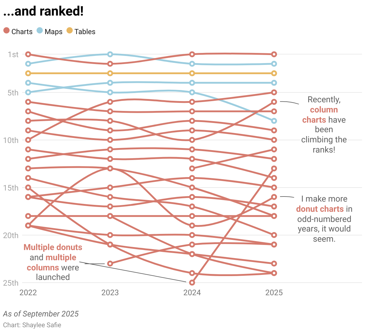
It looks like I do indeed have a few favored visualization types, which have been fairly consistent since I started at Datawrapper. The top five make sense to me, partially because they’re the types of charts I often demonstrate to users in training webinars. The ranking chart also shows patterns among the chart types I use the least, where there’s a lot more fluctuation compared to the (relatively stable) top five.
Through the absolute values chart, I noticed a clear pattern in my productivity. In 2024, I made the most visualizations by far, although 2025 isn’t over yet! Maybe I’ll make a lot more symbol maps, or multiple donut charts in the next few months?
As for the share of visualizations I create, I can see that my vis type choices have become a bit less diverse since 2023, even though there are now more vis types to choose from, such as small multiple line and column charts. This makes me want to challenge myself to reach for other chart types more often!
Looking back at what I’ve created over the years yielded some surprising results, as well as some not-so-shocking ones; I’m very familiar with our most popular vis types, like lines and tables, and I’d like to find more ways to utilize vis types that may not be the first to come to my mind. My homework: keep a closer eye on the River and the Data Vis Dispatch for inspiration!
That’s all I have time for today — I’ve got to get back to charting! Let me know what your most or least used chart types are in the comments, and make sure to come back next week to see what vis type(s) Marten decides to showcase in his Weekly Chart.