The perfect forecast that left me standing in the rain

Hi, I'm Jonathan. At Datawrapper, I'm responsible for the technical development of the website, blog, and Academy. In this weekly chart I’ll pay homage to a long lost friend — one of my favorite apps.
Do you know that feeling of helplessness mixed with frustration when your favorite indie app gets acquired — and immediately shut down?
For me that app was Weatherline, a beautifully simple weather forecasting app created by Ryan Jones of Flighty fame. I started using it in 2015 and it got acquired by an unnamed buyer in 2021 and disappeared from the App Store soon after, which left me quite literally standing in the rain.
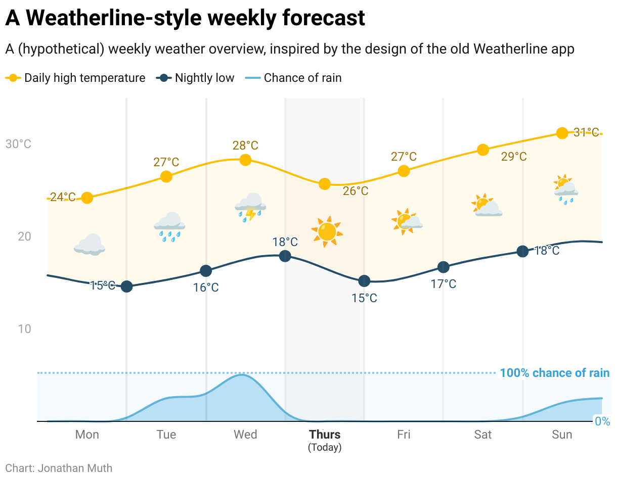
Weatherline didn’t offer a better forecast or fancy real-time precipitation data. What made it special to me was its beautifully simple, yet highly informative weekly weather chart (no pun intended).
The chart showed trend lines of daily high and low temperatures and relied on simple icons and color coding for sun, rain, and wind. It made weather glanceable — showing just enough to help me get dressed for the day and plan for the week.
I thought it would be a fun challenge to recreate this forecast style as a Datawrapper chart. And I managed to get pretty close, with the help of a few tricks.
What worked easily
The daily high temperature is recorded at noon, the low at midnight. Datawrapper’s new Connect all points feature lets both lines smoothly connect their own points with no gaps.
Area fills make it easy to show the change of precipitation and the daily temperature range developing over time.
Emojis in text annotations made for easy weather icons.
A few tricks
The precipitation forecast at the bottom of the chart uses a different unit of measure (0-100% chance of rain). To integrate it with my temperature data, I rescaled that forecast as if it were in °C. This also meant turning off tooltips, since they would show the meaningless rescaled values rather than the actual precipitation percentages.
The chart runs from noon to noon, which means my low temperature data didn’t actually span the entire timeframe. I added auxiliary lines (with line symbols disabled) to fill in the entire width of the chart.
I wasn't aiming for pixel perfection but for something true to the original in spirit. And while there are probably people at Datawrapper who could've taken this further, I was surprised by how close I got in just a couple of hours.
I wanted to try this not just as a homage, but also as an exercise to help me understand what made the original app so good. And I realized that what I appreciated most about Weatherline was what it left out. I don’t need to be overloaded with details; just give me an idea of what to expect when I leave the house and I'll be fine. In fact, Weatherline’s own tagline read "Your weather forecast in a simple infographic” — another reminder that the most effective visualizations don’t try to answer too many questions at once.
As I was finishing writing this, I came across a Reddit post that pointed out the FOX Weather app got a redesign in 2022 that incorporated many of the ideas pioneered by Weatherline. Maybe they’re the mystery buyer I can blame my woes on?


