Paula Guisado & Jaime Gutiérrez, DatosRTVE: "The overall quality of our team's work has skyrocketed"


Paula Guisado and Jaime Gutiérrez from DatosRTVE spoke at our Unwrapped conference about "Here's your graphic: how DatosRTVE created a systematic dataviz workflow for the breaking news team."
Paula is the head of DatosRTVE, the data journalism unit at the Spanish public broadcaster. Since arriving at RTVE, after several years working as a data and investigative journalist, she has focused on strengthening the team, creating internal and external dynamics for the data and visualization tasks and sustaining their individual and common growth. Paula will give the talk together with colleague and data journalist Jaime Gutiérrez, who played a big role in setting up the workflow DatosRTVE now has in motion.
Watch their talk here:
00:56 – Steps to a faster data vis workflow
04:43 – Automating the workflow in R
09:17 – Q: Enforcing charts (folder) structure?
10:38 – Q: Time it takes to make templates?
12:45 – Q: Dealing with units?
13:47 – Q: Team size & roles?
Full transcript
Introduction
Paula: Hello everyone! So we're going to talk about our workflow that we use to deliver quick data vis to the newsroom.
This is Jaime and myself. We work at RTVE, which is the Spanish public broadcaster. More specifically, we work for DatosRTVE, which is the data journalism unit, but it's also a visualization desk. We produce our own pieces with a focus on visual information for the digital newsroom. In this sense, Datawrapper has become a core part of our job and has allowed our graphic production to multiply. So we've come to have a really wide range of graphic production—many of them we create regularly.
Even though Datawrapper is super straightforward and allows us to create graphics quite quickly, we still need time to produce them. And sometimes we need to do that even more quickly.
Steps to a Faster Data Vis Workflow
Paula: There are many times when the newsroom needs graphics almost instantly. We acknowledge that uncertainty is inherent to journalism, especially to breaking news. We can't know beforehand exactly which charts we’re going to need the following day. But we do know there’s a news cycle, and some issues are more or less predictable. That’s the starting point of our workflow.
So, the first step is identifying that there's an opportunity—which is to be faster.
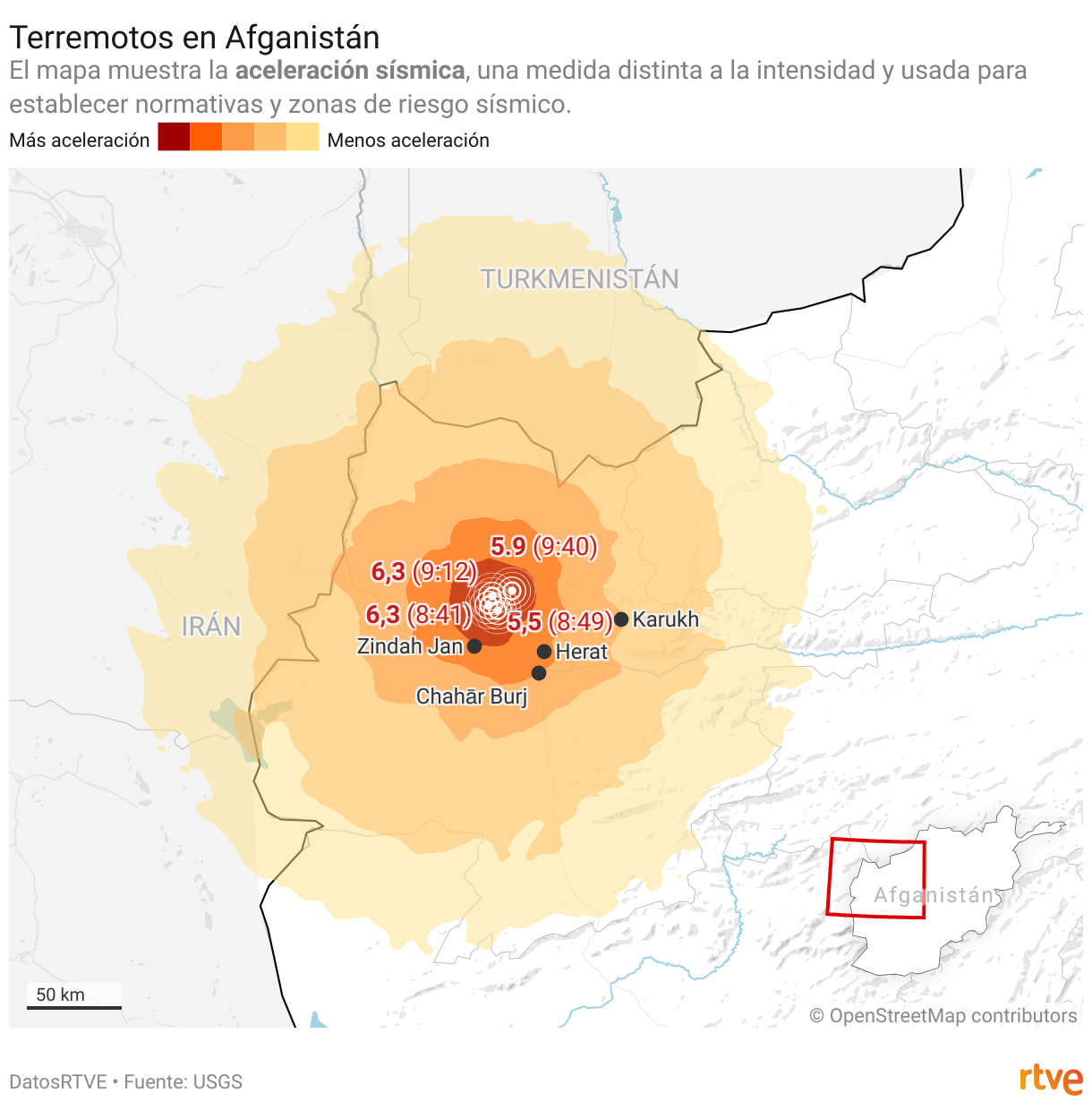
Faster with the news we can somehow be ready for. Think about periodic statistics like unemployment, or recurring issues like earthquakes or weather alerts. That’s the case you're seeing now on screen. We usually get an alert from the news desk, like “Hey, there's some new information about global warming.”
Then the breaking news team starts working on the first draft piece. In this case, they probably even have some embargoed information. In parallel, DatosRTVE works on the new data once it's available and creates the graphic. It's likely a graphic we've done before. The news piece with the text and the photo will come out within a few minutes—but often without the graphic, which will be added afterward.
So we've identified the chance to be faster. The second step is: how often do we have this problem? Is this happening a lot? Is it important for RTVE? Should we invest the time and effort to make this faster?
If the answer is yes, then we prepare. We create a folder. We have an organized system that we check constantly when new issues come up.
We make sure it's easy for everyone on the team to find, because the person who made the graphic originally might not be the one updating it later. So we pay a lot of attention to that.
Then we select the graphics. Sometimes we’ll need just two or three for a topic. Other times, it might be nine or ten that we want ready to go.
Once we decide on that, we analyze. We define the coverage we want, then we create the adult templates. That’s a super important step—it's what allows us to be fast. Once we're done, we just duplicate the template when needed.
After that, of course, we have to make sure the communication channels are ready. That’s a really important part. Otherwise, we might be creating graphics and no one even knows they exist.
We also have to make sure we’re making the graphics the newsroom actually wants. Sometimes we’re following the event very closely and we’ll know the data is ready before the news list does. Other times, we get the notice from them. It depends, but we have to stay connected so each part of the team knows what the others are doing.
And then, in some cases, we take it a step further and do automation with code. This is Jaime, and he’s going to continue from here.
Automating the Workflow in R
Jaime: Yeah, using templates is a really effective solution—but we realized it could be better if we automated, like Paula said. It makes sense for charts we update monthly. Our old Excel process could be adapted to be recurring. What we used to do in a spreadsheet, we now do with R, using the Tidyverse package and the Datawrapper API.
First, we download the data. We just need the dataset CSV link. Once we have the data, we clean and transform it to fit Datawrapper’s line chart format, which, as you know, is very specific.
In the code, we filter the time period, extract the year from dates, and create a month-day column that we call a plain date. Finally, we pivot the data so we have one column per year. That takes us from raw data to a clean dataset ready for Datawrapper.
Next, we bring that clean data into our chart template that Paula talked about. And that’s really easy thanks to MunichRocker’s DatawrappR package for R—you’ve probably heard of it.
We just need four functions to modify our chart through the API and get it online. Let’s go through them.
First, we copy our template. The function is literally called copy, so it’s easy to remember. You just need the chart ID.
Then we pass the clean data into the new chart, which already has all the styling and customization, so we don’t have to edit it after uploading.
Next, we change the title and annotations. That same function can modify lots of other things, but for our chart, that’s enough.
And finally, we publish and retrieve the embed code—which pops up right in the R console. You just copy it and send it to the team.
So once it’s set up, the process is super straightforward. You can do it over and over:
Open RStudio
Connect to your data source
Run your ready-to-go script
Save and publish the chart
This workflow lets us sync with the breaking news team—or even beat them sometimes. RTVE can publish last-minute stories already loaded with high-quality charts. We can push out multiple charts in minutes now. But it doesn’t end there.
We constantly reevaluate and improve the process. For example, we ask the breaking news team whether the charts are still useful or if they need new ones. We also send out reminders about what charts are available, because sometimes people just forget.
We try to build in everything we learn to make the process better. And we’re definitely taking new ideas from this conference. We're always learning. That’s pretty much how we work.
Thanks so much for your time—and now it's time for Q&A.
Q: Enforcing chart folder structure?
Elliot (host): Thanks! Super interesting stuff. You mentioned having big folders full of charts. How do you organize and enforce that structure?
Paula: We have a lot of conversations about it. We remind each other that the payoff is real—like, look how much better it is when we can go out with a piece that’s more than just a couple paragraphs. “Enforce” might be a strong word—we try to convince.
Jaime: Yeah, we talk a lot about how to organize the folder system. We spend a lot of time on it. It’s not static—it changes depending on the news. Topics shift, so the system is live and evolving.
Q: Time it takes to make templates?
Elliot: Cool. Laura asks: How long does it take to make all those templates?
Paula: We don’t make them all at once. We keep improving the system over time. We started with the obvious ones—like unemployment or monthly stats. First, we build the template. Then, if it makes sense, we go further and add code.
We grow this as we go. Like, “Hey, we have a bit of time—maybe we can prep this for next quarter.” It’s not always a priority, but we do it when we can.
Jaime: Yeah, usually the need becomes clear after doing the chart once. Then we just polish it, and we’re good. It grows naturally from our work—we don’t schedule it as a separate task.
Q: Dealing with units?
Elliot: Andres asks: How do you handle units and date formats used in Spanish-speaking countries?
Jaime: That’s always a headache, honestly. RStudio helps a lot—you can change the encoding pretty easily. In Spain, for example, we use UTF-8. If something isn’t in that encoding, you just tell R what it should be, and it’ll handle the data correctly.
Q: Team size and roles?
Elliot: Last one from Yanika: How big is your data team, and how are roles split?
Paula: We’re a pretty big team—eight people. We don’t split by role exactly; we’re all journalists and all growing our data skills. It’s more like we’ve developed beats: some of us focus on economics, others on social issues or politics.
One person is more technical—more into maps and coding—but we’re all learning. We’re getting better at coding and using more advanced tools. So we’re pretty interchangeable, which we’re proud of.
Elliot: Awesome. That’s all the time we’ve got. Thanks again for being here and for the presentation.
Paula: Thank you!
We asked Paula and Jaime some additional questions before their talk:
Paula, Jaime, what will you talk about?
Paula: A newsroom is, by definition, a place of uncertainty. But breaking news aside, there are many periodic, repetitive information updates that a newsroom awaits, from employment statistics to meteorological warnings. By using R Studio, the DatawRappr package, an organized folder system, and ad hoc templates in Datawrapper, we at the data journalism team at RTVE have developed a workflow for those recurrent graphics, which allows the breaking news team to get graphics for their news pieces quickly – saving time and offering the user more complete information right away.
How has it been integrating Datawrapper into your organization's workflow?
Jaime: Integrating Datawrapper into our organization's workflow has been nothing short of a game-changer! Since we hopped on the Datawrapper train four years ago, not only has the overall quality of our team's work skyrocketed, but it's had a ripple effect, elevating the standard of journalistic excellence across the entire organization.
Datawrapper has become a core part of our job and has allowed our graphic production to multiply. Paula Guisado, DatosRTVE, in minute 0:26 of her talk at Unwrapped 2024
Datawrapper isn't just a tool; it's the secret sauce in our recipe for success. It's become the linchpin of our digital breaking news, in-depth stories, and TV productions. The ease with which we can create compelling television infographics is nothing short of remarkable. Imagine being able to effortlessly showcase exactly what you envision, and then seamlessly translate that vision onto the screen with just a few clicks. It's like having a magic wand for visual storytelling!
Our workflow has become more efficient, more visually stunning, and, dare I say, more fun since we embraced Datawrapper. It's not just a tool; it's a catalyst for unleashing the full creative potential of our team.
What advice would you give to other Datawrapper users (or data visualizers in general)?
Paula: To scratch the surface. Datawrapper makes it so easy to come up with a pretty good result that it might be tempting to just go with the first visualization attempt: Why look further when it works? But Datawrapper has so many options for customization and allows for so many levels of complexity that there is always room for improvement.
By that, I don’t mean that you need to make graphics more complicated than they need to be. Less is often more, and keeping things straightforward is the way to go. But giving visualizations extra thought and taking advantage of such a powerful tool can be the difference between an okay graphic and a superb graphic.
How do you use Datawrapper in your team?
Paula: Regarding the account organization, every once in a while, the DatosRTVE team has an organization check for our general workflow and, of course, for Datawrapper. What do we do with this new topic? Do we still keep this other topic in a separated folder? Should we reconsider the way we use dates? It takes us some time to decide the best way to go – it’s usually a matter of days, actually –, but when there is a decision, we commit to it (until further notice). We now have thousands of graphics in our account. And I take pride in saying we can find almost each one of them.
Besides that, we try to keep our data visualization capacities growing by studying other professionals’ work, reading about the topic, and learning both new tools and tricks for the tools we already use. There are always more advanced users who keep pushing the limits and finding new and innovative paths. So we try to endure regular knowledge transmission among the team members to make sure our base level keeps rising.
What aspect of data visualizations would you like to explore more, and why?
Jaime: Diving into data visualization, one aspect that's been keeping me on my toes is climate change. It's not just about data; it's about conveying the urgency and impact of one of the most pressing issues of our time. Last year, I delved into the intricacies of climate and weather forecast predictions – not aiming for meteorologist status, but striving to better comprehend this transcendent phenomenon. The potential for groundbreaking visualizations in this space is vast, and there's a plethora of untapped creative opportunities waiting to be explored.
On a slightly different wavelength, I've found myself drawn to the world of color in chart design. It's not just about aesthetics; colour carries meaning, influences perception, and even addresses visual impairments. Colour isn't just about pretty charts; it's about creating a visual language that resonates with our audience. Navigating the maze of colour choices can be challenging, and while the Datawrapper Academy has been an invaluable resource for clearing doubts, I'm on a mission to discover a unique and recognizable colour scheme for DatosRTVE.
What's your favorite Datawrapper feature?
Paula: The constant improvement of the tool. It’s great to see how Datawrapper listens to their users, tries to build a community around it and keeps upgrading an already outstanding product.
We loved Paula and Jaime's talk at Unwrapped! You can find more about Paula on X and LinkedIn, and more about Jaime on LinkedIn. To find out more about Unwrapped and hear other great speakers, visit our blog.


