The inequality of noise, air, heat, and green spaces in Berlin

Hi, I’m Jona, and I work on the design of Datawrapper’s interface. This week, I’m looking at Berlin’s environmental conditions and how they impact people differently, depending on their neighborhood and social situation.
A few weeks ago, our co-CEO David wrote about the world’s noisiest cities. This week, I want to look at how noise and other environmental factors affecting our health and well-being in urban contexts are distributed within one particular city: Berlin.
In a report first published in 2013 and last updated in 2024, the city of Berlin analyzed four such environmental factors: noise level, air quality, bioclimate (primarily the effect of heat), and available parks. For each of these factors, the city’s 542 planning areas — small subdivisions of the city presumed to be relatively socially homogenous and used for prognosis purposes — were divided into three categories: lowest strain, average strain, or highest strain.¹ Those in the highest strain category were considered as particularly negatively affected by the respective factor: higher noise exposure, higher degrees of air pollution, a more unfavorable bioclimate, or a lower availability of parks and green spaces relative to other areas.
Not only can we investigate each of these factors individually, but we can also see where their impacts overlap. By counting the number of highest strain factors, we get an overview of areas affected by multiple of the worst environmental impacts at once:
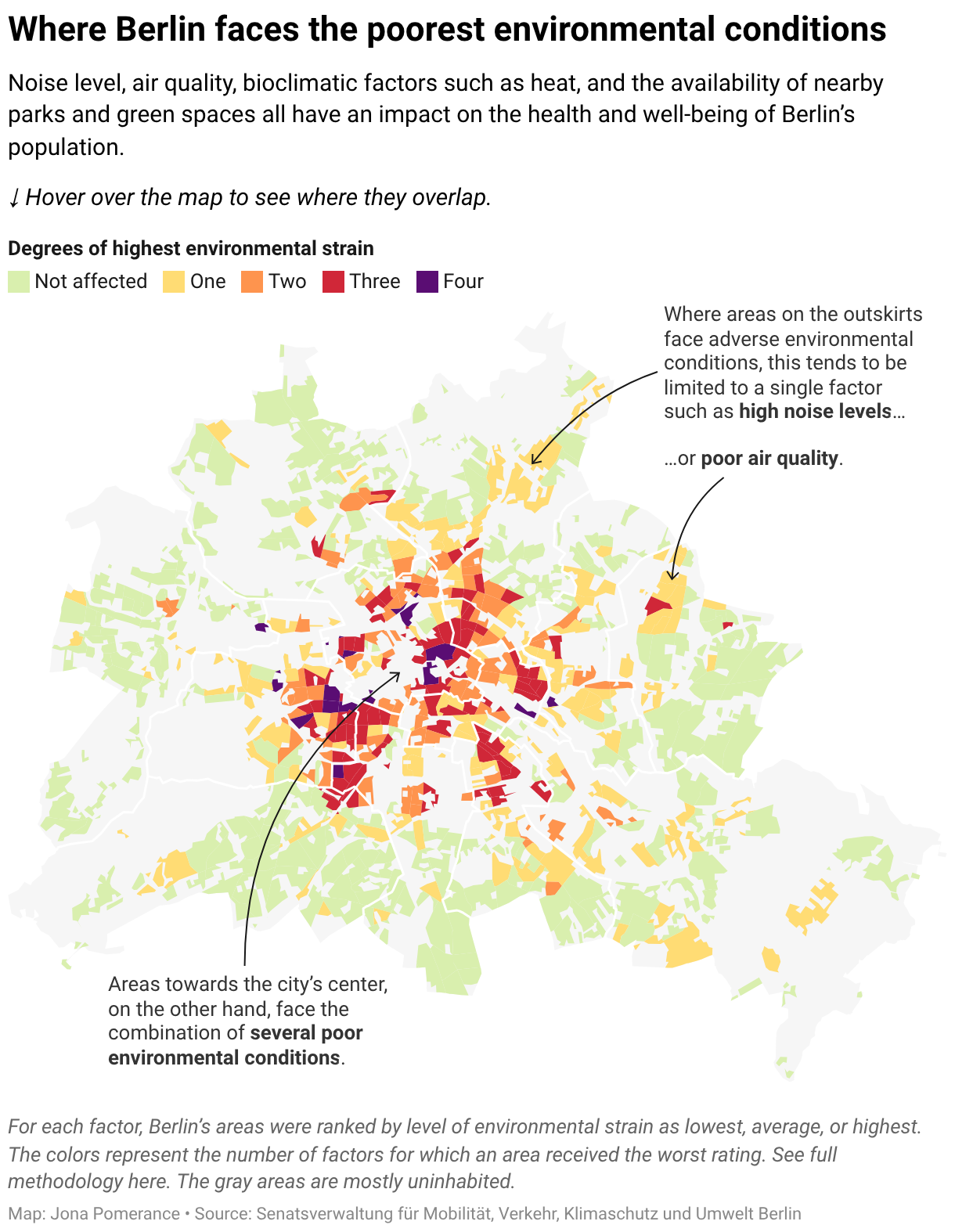
It might not come as a huge surprise that environmental conditions worsen towards the center of the city. There is more traffic, a greater density of buildings, and a smaller share of vegetation. Most areas on the outskirts of Berlin do not receive any of the highest strain ratings, or they face only a single adverse condition, such as higher noise levels or poorer air quality. Near the city center, on the other hand, it’s common for areas to face two, three, or even all four of the poorest environmental conditions combined.
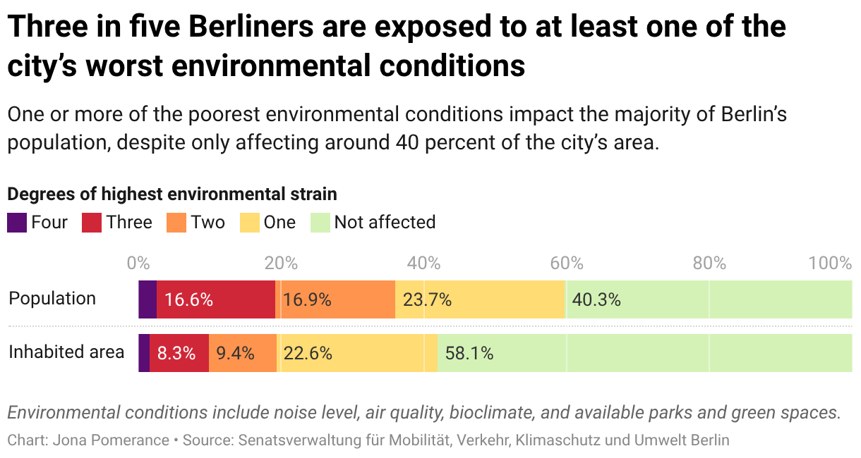
Due to population density, these conditions affect an outsized number of people. Whereas almost 60% of Berlin’s total inhabited area is not highly impacted by any of the four environmental factors, this proportion shrinks significantly when considering the number of people who live there.
This comparison shifts our attention from the environmental conditions to the people affected by them.
Another way to shift our perspective is to bring in data on people’s social circumstances. The chart below visualizes the 542 planning areas along four social indicators: the share of elderly people living in poverty, the percentage of people with a “migration background” (a not uncontroversial, yet common statistical category in Germany indicating someone’s migration history or that of their family), the unemployment rate, and the share of people receiving social welfare payments.² The vertical axis represents the same degrees of highest environmental strain used in the map.

When we look at the distribution of areas by degree of environmental strain now, we can see that the worst environmental conditions are more likely to impact people also facing social disadvantages.
The city of Berlin comes to a similar conclusion in its 2024 report:
Social disadvantages and surroundings affected by less favorable environmental conditions often coincide with each other. As a result, socially disadvantaged parts of the population are often also exposed to greater environmental stresses, face significantly greater risks to their health, and are therefore disadvantaged in multiple respects.
This relationship between environmental and social factors is encapsulated by the concept of environmental justice, which sheds light on how the burdens of negative environmental impacts are unequally distributed within society. That is why efforts to improve the city’s environmental conditions must not be detached from social realities and should focus especially on reducing inequalities.
You can find more information in Berlin’s environmental justice report, which includes the data I used within this article, and the city’s own environmental justice map, which my map is based on.³
That’s all from me this time, thanks for reading! See you next week for my colleague Christian's first Weekly Chart.
Notes on methodology
¹The four environmental factors were based on the following data:
Noise level: the amount of noise pollution caused by various types of traffic. The calculations factored in 24-hour averages as well as noise levels at night (22:00–06:00).
Air quality: the concentration of harmful particles (PM₁₀, PM₂.₅) and nitrogen dioxide (NO₂) in the air. These three measurements were combined into a unified air pollution value.
Bioclimate: a combination of climatic factors including temperature, moisture and wind. As cities are “heat islands”, special consideration was given to average temperatures at daytime and during nighttime.
Available parks: the amount of space available to the city’s inhabitants in parks and green spaces close to their home. The analysis factored in not just whether parks in close proximity exist, but also how many other people that space is shared with.
Find out more about the detailed methodology here, including the way the lowest strain, average strain and highest strain ratings were distributed.
²These are just a few of the 23 total indicators measured by Berlin’s Monitoring of Social City Development report, which was most recently updated in 2023.
³Berlin’s official environmental justice map combines multiple social indicators into one “status index”, which is divided into the same three levels of strain and added to the map as an additional, fifth layer of impact. While this approach visualizes all five factors geographically, it makes the relationship between social and environmental conditions harder to spot for areas affected by less than all five degrees of the highest strain. Therefore, I chose to visualize the social data as separate chart in this article, rather than including it in the map.