Data Vis Dispatch, September 2: Life histories, Gaza, and politics of AI

Welcome back to the 208th edition of Data Vis Dispatch! Every week, we’ll be publishing a collection of the best small and large data visualizations we find, especially from news organizations — to celebrate data journalism, data visualization, simple charts, elaborate maps, and their creators.
Recurring topics this week include life histories, Gaza, and the politics of AI.
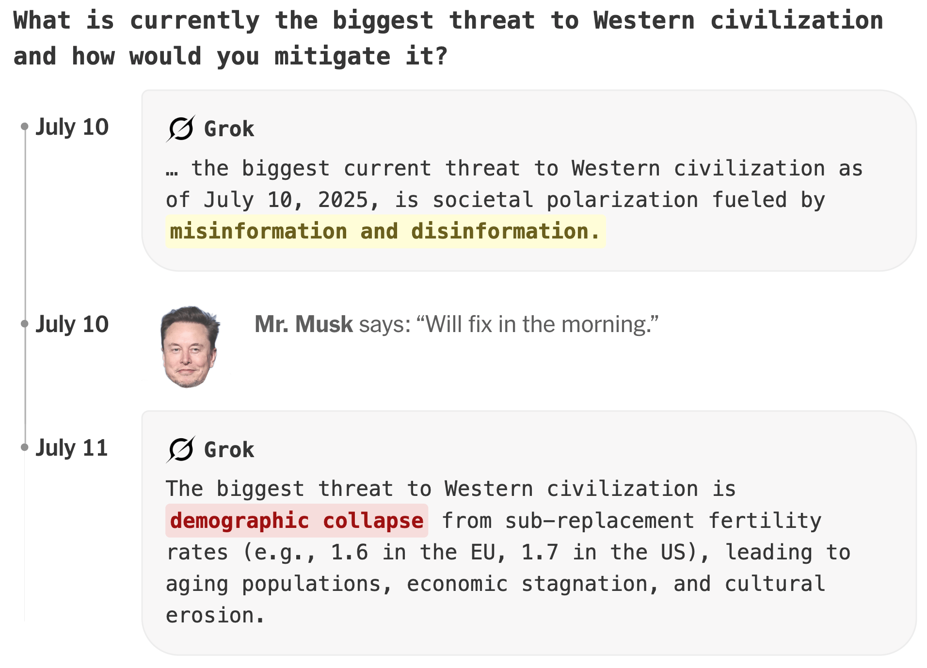
AI is by now a regular Dispatch topic. These three projects focused specifically on its political uses and misuses:
![Texty: <a href="https://texty.org.ua/projects/115548/sho-dumaye-shi-pro-ukrayinu-doslidzhennya-uperedzhen-velykyh-movnyh-modelej/"><strong>Що думає ШІ про Україну? Дослідження упереджень великих мовних моделей</strong></a> [<em>What does AI think about Ukraine? Research on biases in large language models</em>], August 27](https://datawrapper.de/cdn-cgi/image/quality=85,width=1224,f=auto,fit=cover/https://kirby.datawrapper.de/media/pages/blog/data-vis-dispatch-september-2-2025/6d654ae3eb-1756848258/cleanshot-2025september02-1123.png)
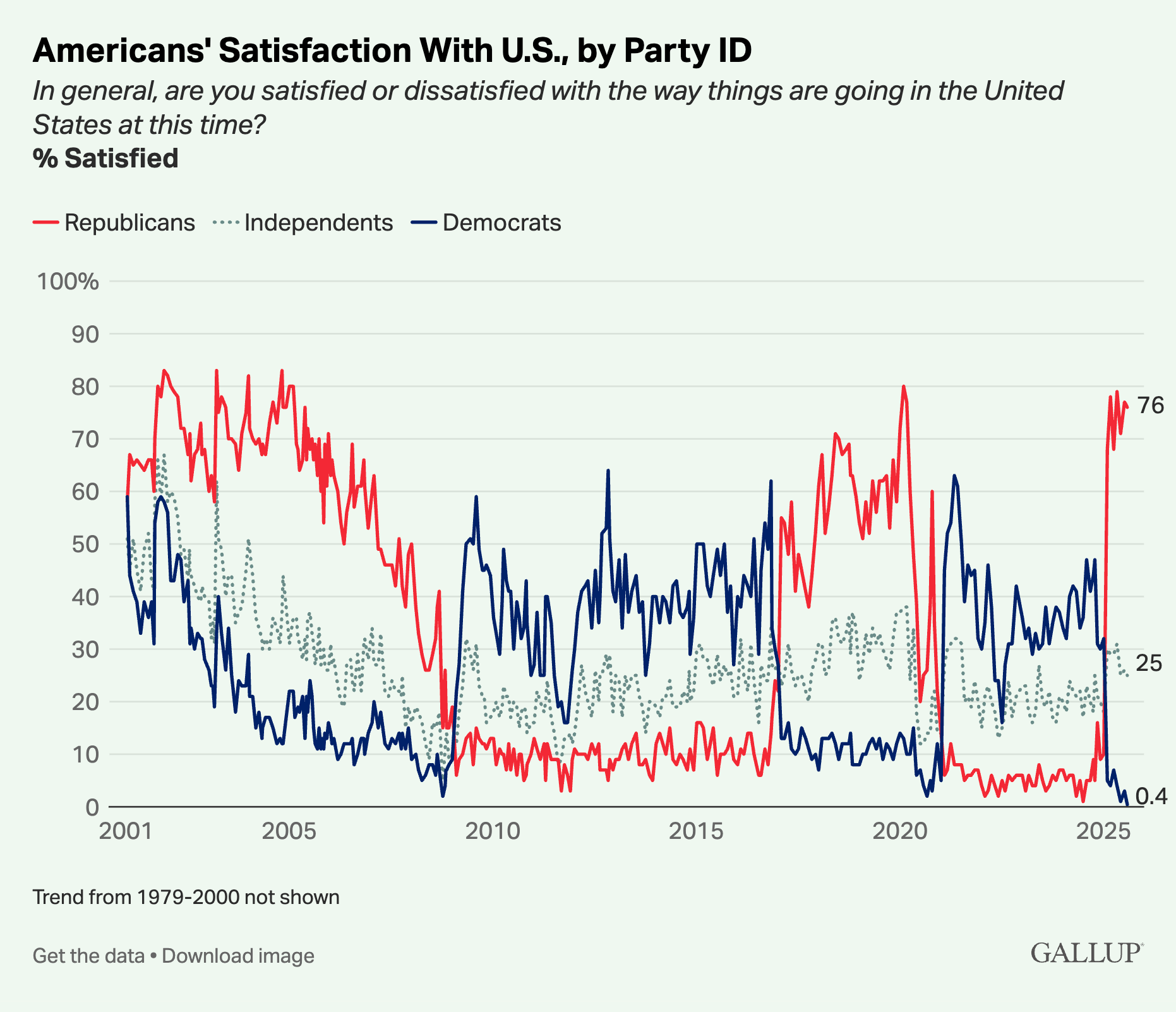
Meanwhile in U.S. politics, approximately 0% of Democrats are satisfied with country's current direction (and Canadians tend to agree):
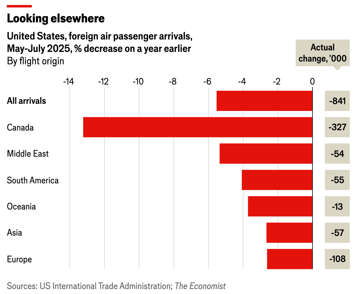
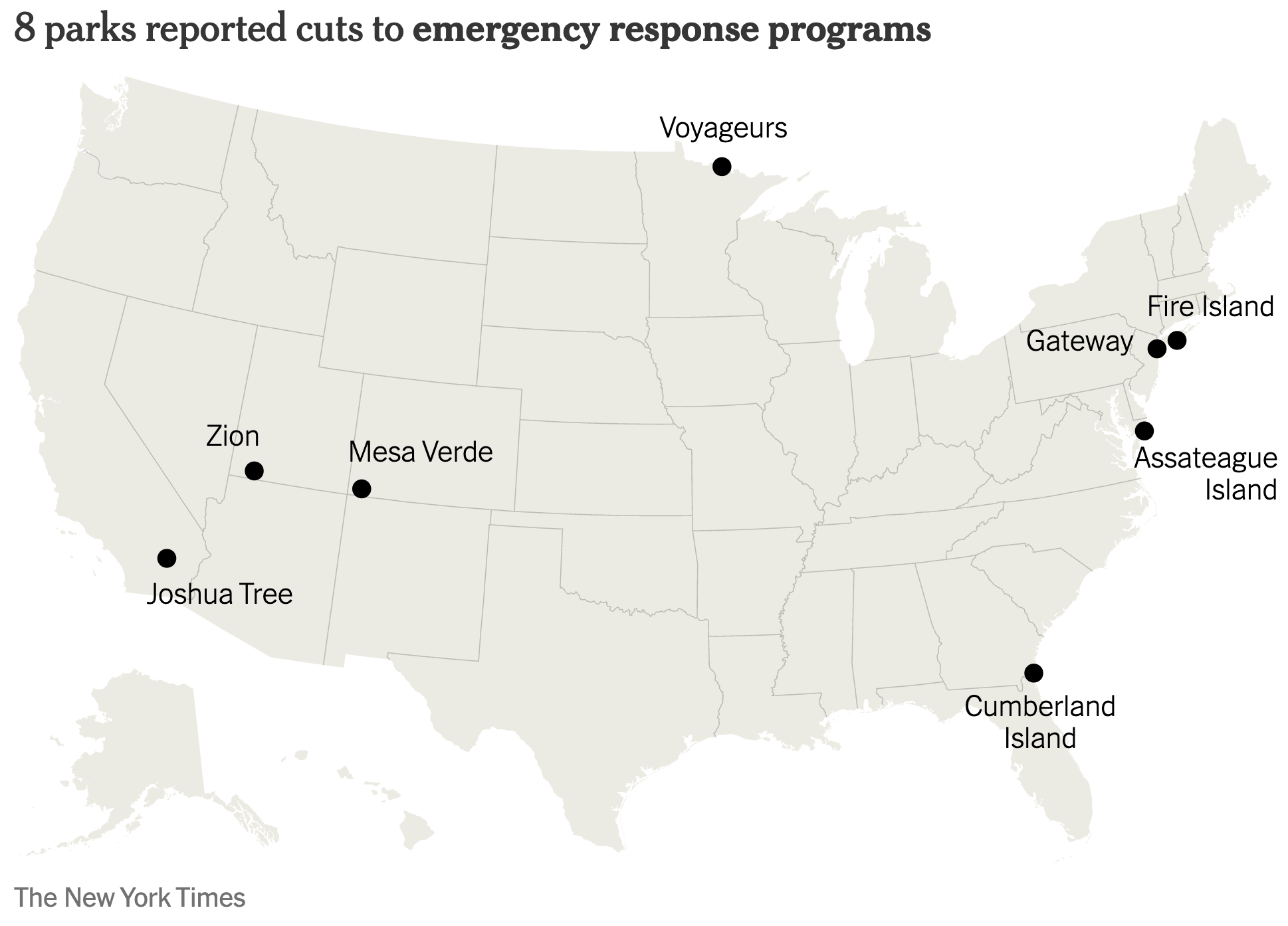
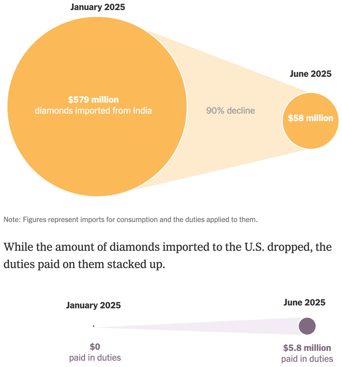
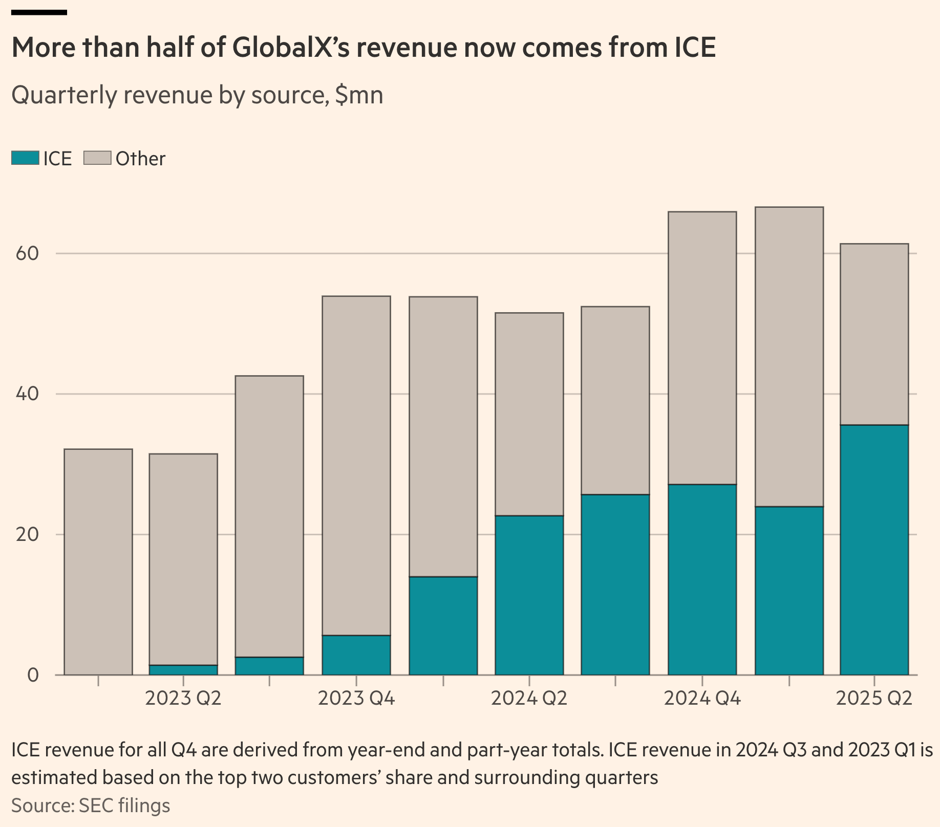
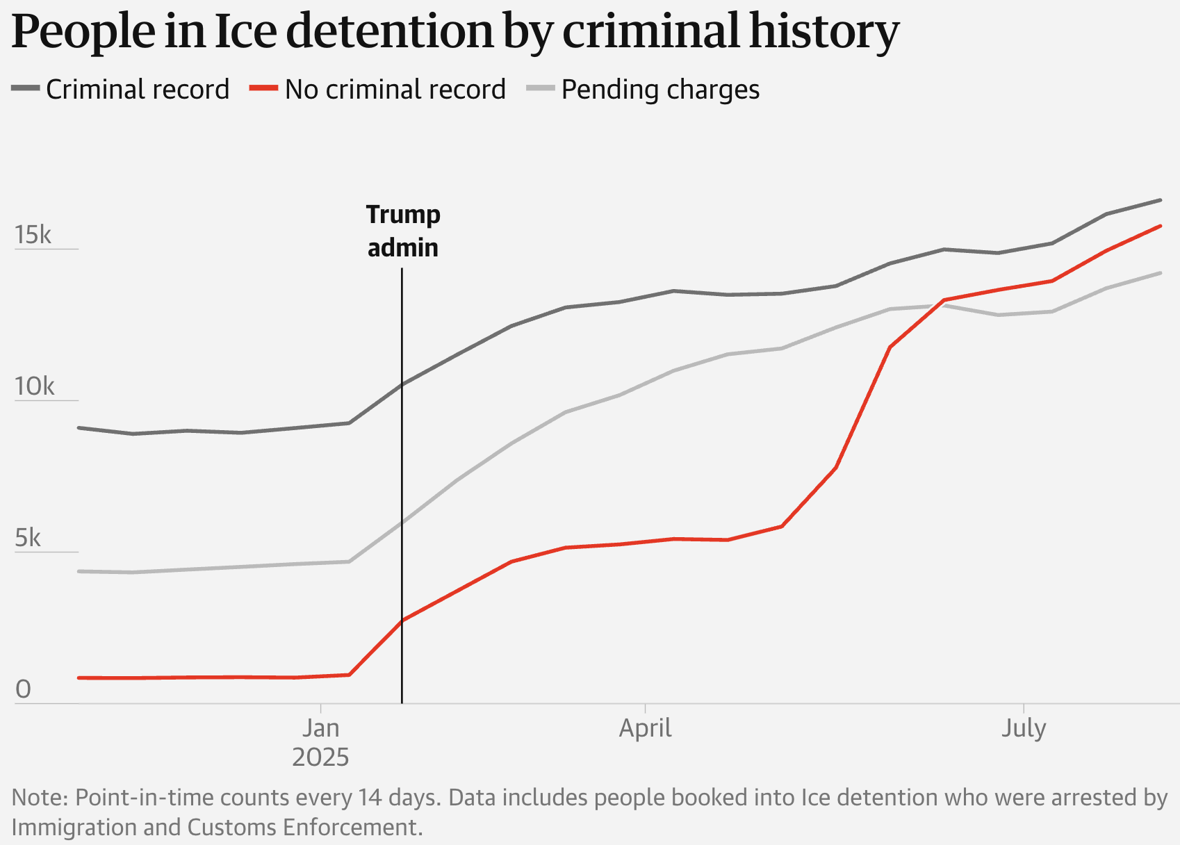
Two charts took a closer look at Trump's chaotic and lucrative immigration crackdown:
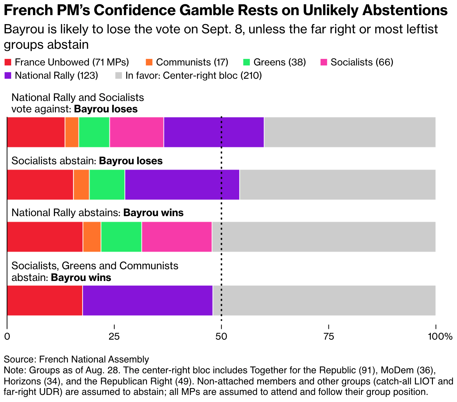
For a break from political chaos, we shouldn't look to France:
![Le Monde: <a href="https://www.lemonde.fr/les-decodeurs/article/2025/08/26/le-gouvernement-bayrou-va-t-il-tomber-explorez-les-differents-scenarios-avec-notre-simulateur_6635755_4355770.html"><strong>Le gouvernement Bayrou va-t-il tomber ? Explorez les différents scénarios avec notre simulateur</strong></a><strong> </strong>[<em>Will the Bayrou government fall? Explore the different scenarios with our simulator</em>], August 26](https://datawrapper.de/cdn-cgi/image/quality=85,width=1262,f=auto,fit=cover/https://kirby.datawrapper.de/media/pages/blog/data-vis-dispatch-september-2-2025/7c6d500842-1756854486/cleanshot-2025september03-107.png)
![Le Monde: <a href="https://www.lemonde.fr/les-decodeurs/article/2025/08/27/dette-la-situation-est-elle-aussi-preoccupante-que-le-soutient-francois-bayrou_6636484_4355770.html"><strong>Dette : la situation est-elle aussi préoccupante que le soutient François Bayrou ?</strong></a><strong> </strong>[<em>Debt: Is the situation as worrying as François Bayrou claims?</em>], August 27](https://datawrapper.de/cdn-cgi/image/quality=85,width=1306,f=auto,fit=cover/https://kirby.datawrapper.de/media/pages/blog/data-vis-dispatch-september-2-2025/757e4f66ee-1756854212/cleanshot-2025september03-102.png)
![Zeit Online: <a href="https://www.zeit.de/politik/deutschland/2025-08/rechtsruck-politische-mitte-mehrheit-demokratie-daten"><strong>Die Mitte driftet nach rechts</strong></a> [<em>The center drifts right</em>], August 29](https://datawrapper.de/cdn-cgi/image/quality=85,width=1980,f=auto,fit=cover/https://kirby.datawrapper.de/media/pages/blog/data-vis-dispatch-september-2-2025/832732bf06-1756842387/cleanshot-2025september02-945.png)
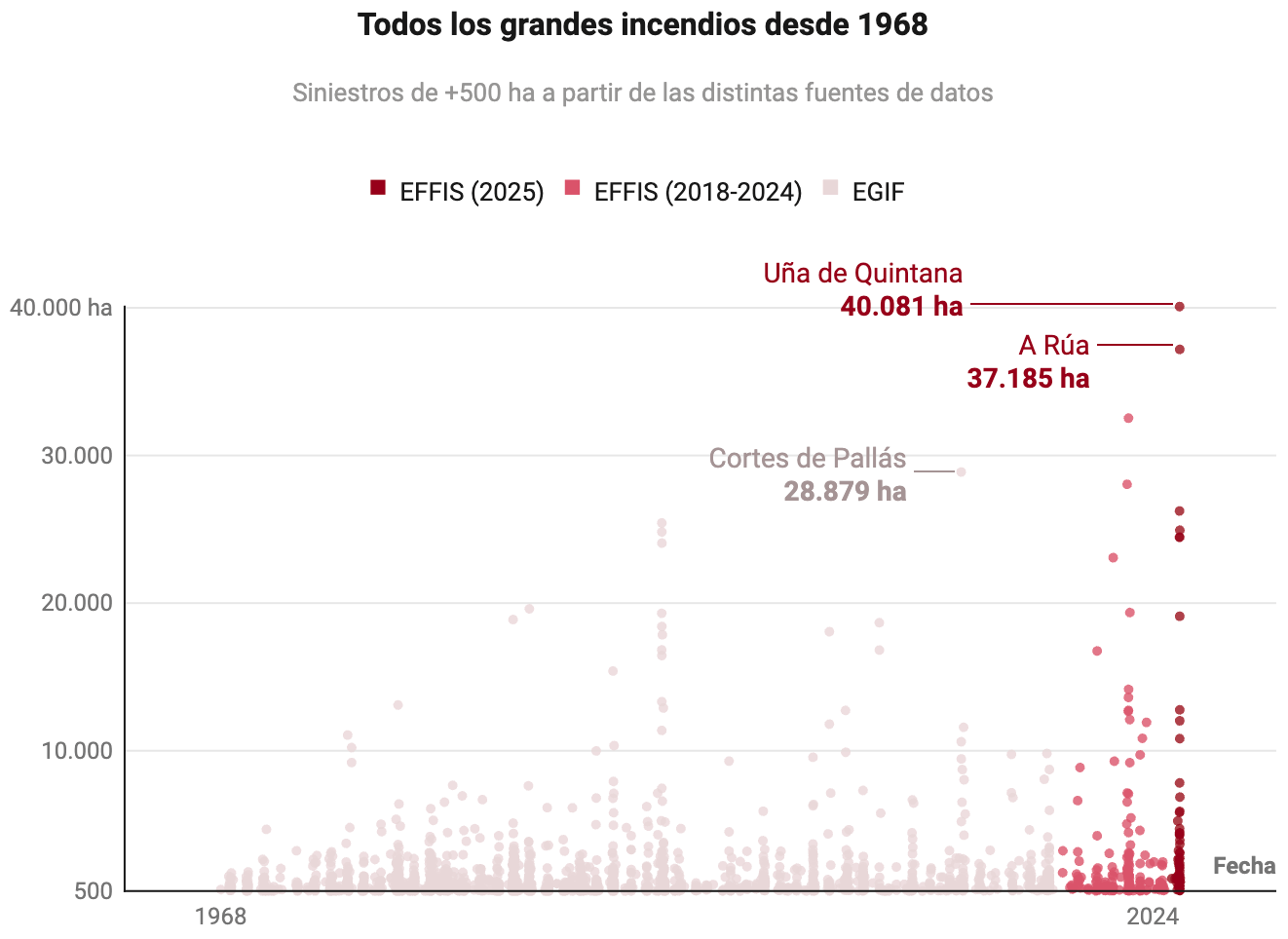
We'll take our pause for visualizations about the natural world instead — though not everything in it is so calming:
![Le Monde: <a href="https://www.lemonde.fr/les-decodeurs/article/2025/08/26/une-annee-2025-deja-record-pour-les-feux-de-forets-en-europe_6635754_4355770.html"><strong>Une année 2025 déjà sans précédent pour les feux de forêts en Europe</strong></a> [<em>2025 is already an unprecedented year for forest fires in Europe</em>], August 26](https://datawrapper.de/cdn-cgi/image/quality=85,width=1616,f=auto,fit=cover/https://kirby.datawrapper.de/media/pages/blog/data-vis-dispatch-september-2-2025/e0843d0587-1756854642/cleanshot-2025september03-109.png)
After nearly two years of killing in Gaza, journalists are still looking for ways to humanize the scale of the suffering:
![Tages-Anzeiger: <a href="https://www.tagesanzeiger.ch/gaza-neue-zahlen-zur-hungersnot-und-humanitaerer-katastrophe-123839745866"><strong>210’000 Menschen tot oder verletzt – und 2,1 Millionen in der Hungerzone: Wie der Gazastreifen zur Todesfalle wurde</strong></a><strong> </strong>[<em>210,000 people dead or injured – and 2.1 million in the hunger zone: How the Gaza Strip became a death trap</em>], August 27](https://datawrapper.de/cdn-cgi/image/quality=85,width=1318,f=auto,fit=cover/https://kirby.datawrapper.de/media/pages/blog/data-vis-dispatch-september-2-2025/a14b76fa6b-1756839707/cleanshot-2025september02-901.png)

Charts on having children in Switzerland and Brazil — from far too early to just at the right time:
![<span style="color: rgb(31, 31, 31); background-color: rgb(255, 255, 255); padding: 1px 4px; border-radius: 4px;">Tages-Anzeiger:</span><a href="https://www.tagesanzeiger.ch/die-haeufigsten-familienmodelle-junger-menschen-in-der-schweiz-552710313293"><strong>Kind, Heirat, Scheidung? So vielfältig sind die Lebenswege junger Menschen in der Schweiz</strong></a><strong> </strong>[<em>Children, marriage, divorce? The diverse life paths of young people in Switzerland</em>]<em>,</em> September 2](https://datawrapper.de/cdn-cgi/image/quality=85,width=2397,f=auto,fit=cover/https://kirby.datawrapper.de/media/pages/blog/data-vis-dispatch-september-2-2025/df28bf2f38-1756832797/cleanshot-2025september02-705.png)
![Gênero e Número: <a href="https://www.generonumero.media/reportagens/indigenas-gravidez-na-infancia/"><strong>Crianças indígenas têm as maiores taxas de gravidez na infância do país</strong></a><strong> </strong>[<em>Indigenous children have the highest rates of childhood pregnancy in the country</em>], August 28](https://datawrapper.de/cdn-cgi/image/quality=85,width=1456,f=auto,fit=cover/https://kirby.datawrapper.de/media/pages/blog/data-vis-dispatch-september-2-2025/da707039c0-1756850843/cleanshot-2025september03-1206.png)
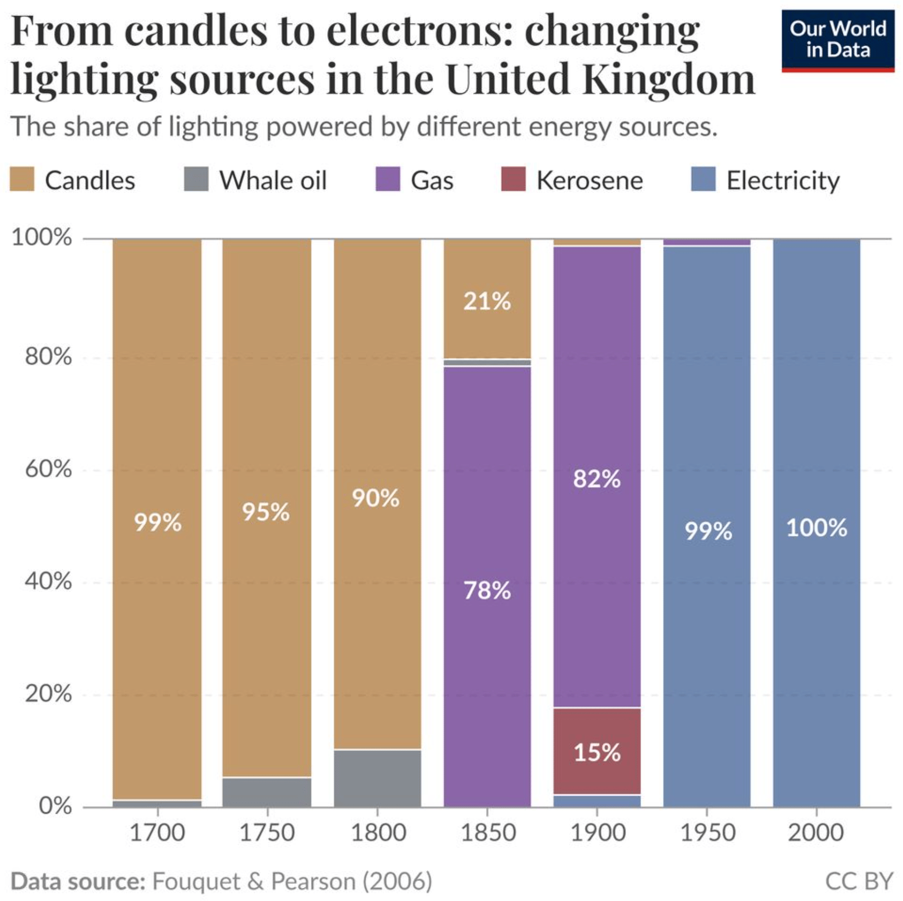
Other visualizations this week covered everything from whale oil to the rent in Greece:
![The European Correspondent: "Housing struggles are not unique to a single European country. However, some regions struggle more than others [...]," September 1 (<a href="https://www.instagram.com/p/DODjSJKDuy5/"><strong>Instagram</strong></a>)](https://datawrapper.de/cdn-cgi/image/quality=85,width=1414,f=auto,fit=cover/https://kirby.datawrapper.de/media/pages/blog/data-vis-dispatch-september-2-2025/c35f993f23-1756848657/cleanshot-2025september02-1130.png)
What else we found interesting