Data Vis Dispatch, May 27: Mental health, right-wing gain, and U.S. self-sabotage

Welcome back to the 194th edition of Data Vis Dispatch! Every week, we’ll be publishing a collection of the best small and large data visualizations we find, especially from news organizations — to celebrate data journalism, data visualization, simple charts, elaborate maps, and their creators.
Recurring topics this week include mental health, gains for far-right parties, and a grim outlook for U.S. science.
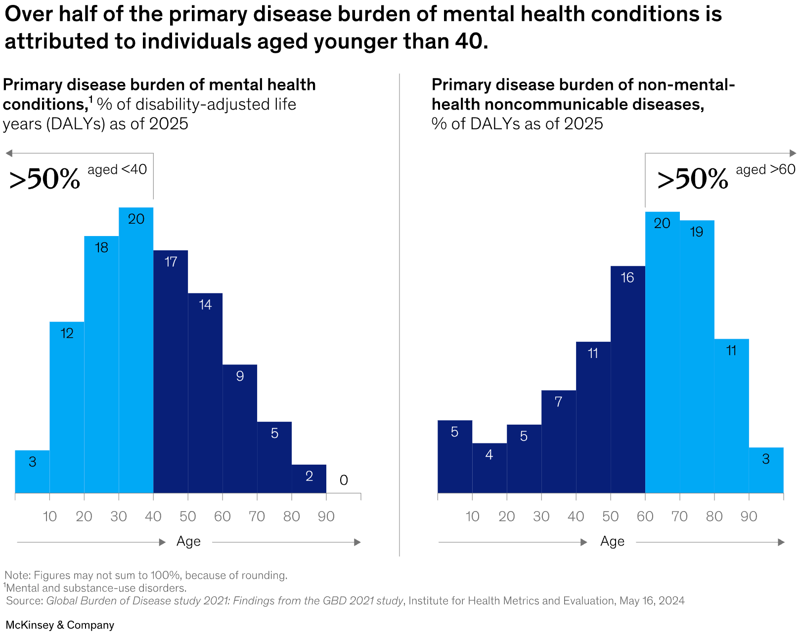
Last week, we found several nice charts on mental illness, many with not-so-nice implications:
![Sonja Kuijpers: "I suffered from a severe depression in 2018/2019 and I documented this by journaling / visualising my meds […]," May 22 (<a href="https://bsky.app/profile/sonjakuijpers.bsky.social/post/3lpqt46ctec2e"><strong>Bluesky</strong></a>)](https://datawrapper.de/cdn-cgi/image/quality=85,width=3338,f=auto,fit=cover/https://kirby.datawrapper.de/media/pages/blog/data-vis-dispatch-may-27-2025/dc94a11dc9-1748265607/cleanshot-2025-05-26-at-15.19.15@2x.png)
![Folha de S.Paulo: <a href="https://www1.folha.uol.com.br/equilibrioesaude/2025/05/atendimentos-relacionados-a-saude-mental-tem-pico-historico-no-rs-apos-enchente.shtml"><strong>Atendimentos relacionados a saúde mental têm pico histórico no RS após enchente</strong></a> [<em>Chart title: Mental health appointments and consultations in the Unified Health System, per month</em>], May 25](https://datawrapper.de/cdn-cgi/image/quality=85,width=1374,f=auto,fit=cover/https://kirby.datawrapper.de/media/pages/blog/data-vis-dispatch-may-27-2025/6db51c5398-1748249098/cleanshot-2025-05-26-at-10.44.40@2x.png)
![Diario Sur: <a href="https://www.diariosur.es/economia/trabajo/mercado-laboral-encuentra-cura-record-bajas-salud-20250526065819-ntrc.html"><strong>El mercado laboral no encuentra cura al récord de bajas por salud mental</strong></a><strong> </strong>[<em>Chart title: Mental health leave by age group</em>], May 26](https://datawrapper.de/cdn-cgi/image/quality=85,width=2283,f=auto,fit=cover/https://kirby.datawrapper.de/media/pages/blog/data-vis-dispatch-may-27-2025/52ac793f3c-1748249332/cleanshot-2025-05-26-at-10.48.20@2x.png)
![Our World in Data: "Suicide rates are higher in men than women […]," May 23 (<a href="https://bsky.app/profile/ourworldindata.org/post/3lpu4bmmkq32t"><strong>Bluesky</strong></a>, <a href="https://ourworldindata.org/how-do-global-statistics-on-suicide-differ-between-sources"><strong>Article</strong></a>)](https://datawrapper.de/cdn-cgi/image/quality=85,width=2153,f=auto,fit=cover/https://kirby.datawrapper.de/media/pages/blog/data-vis-dispatch-may-27-2025/9b02a02782-1748268960/cleanshot-2025-05-26-at-16.15.12@2x.png)
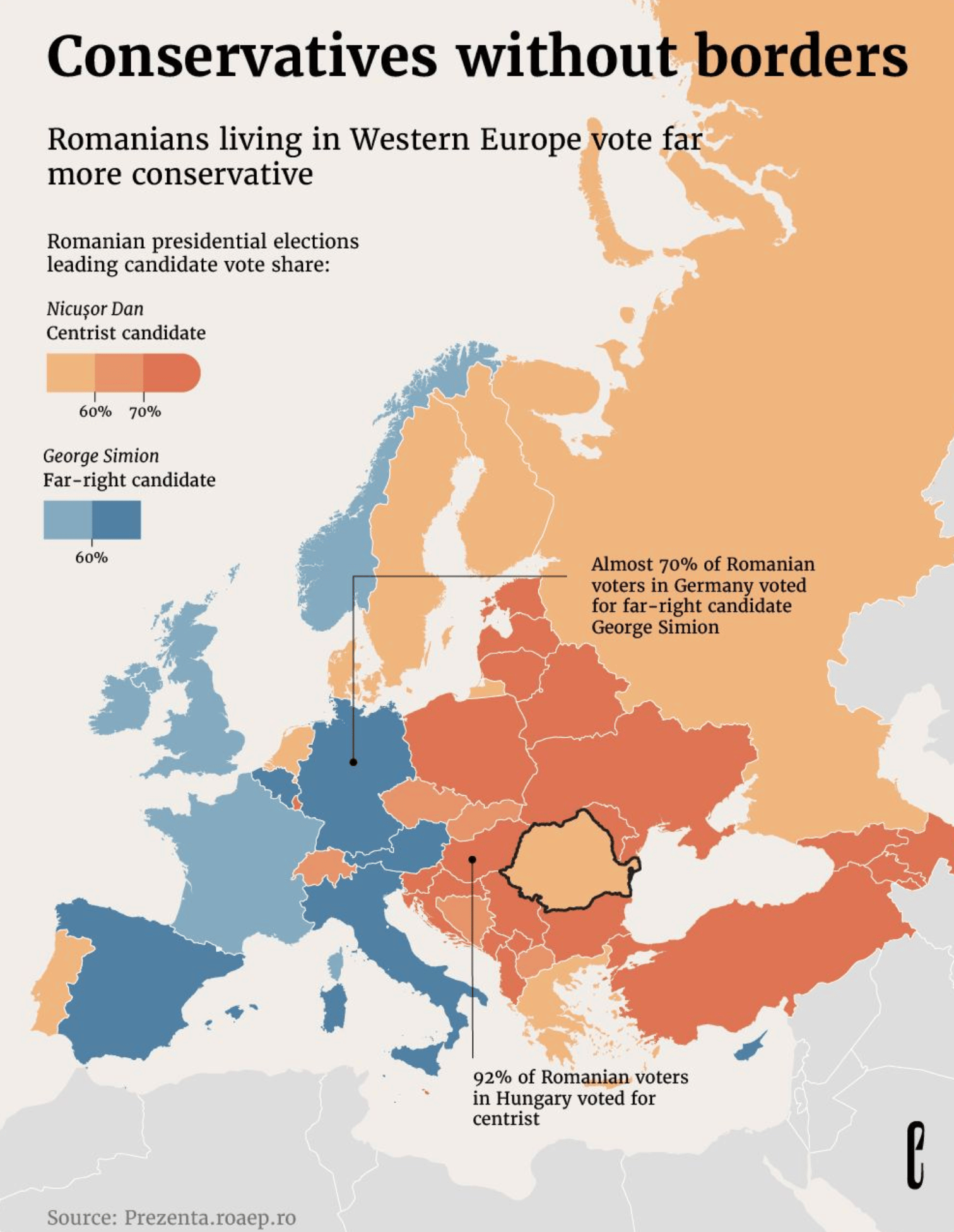
One reason for everyone's troubles might be found in the direction our political landscape seems to be headed:
![elDiario.es: <a href="https://www.eldiario.es/internacional/ola-ultra-gana-terreno-europa_1_12325987.html"><strong>La ola ultra gana terreno en Europa</strong></a> [<em>Chart title: The rise of the far-right in every European country</em>], May 24](https://datawrapper.de/cdn-cgi/image/quality=85,width=1990,f=auto,fit=cover/https://kirby.datawrapper.de/media/pages/blog/data-vis-dispatch-may-27-2025/9452a76144-1748262304/cleanshot-2025-05-26-at-14.24.42@2x.png)
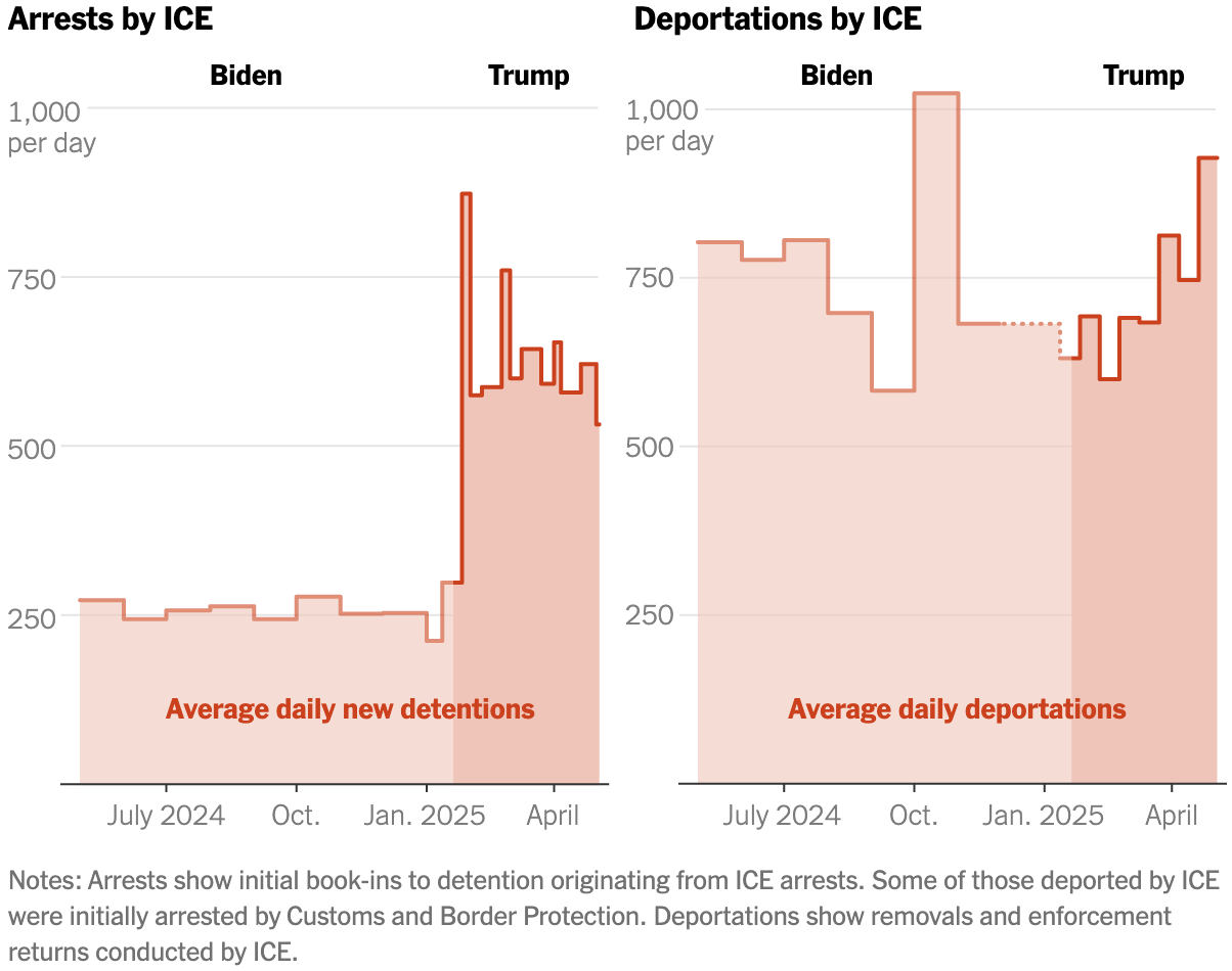
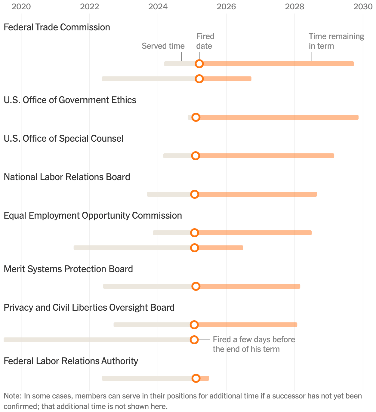
The New York Times ran several articles this week with simple charts about the Trump administration:
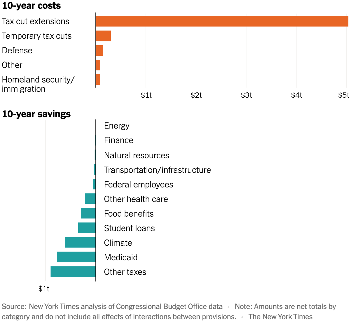
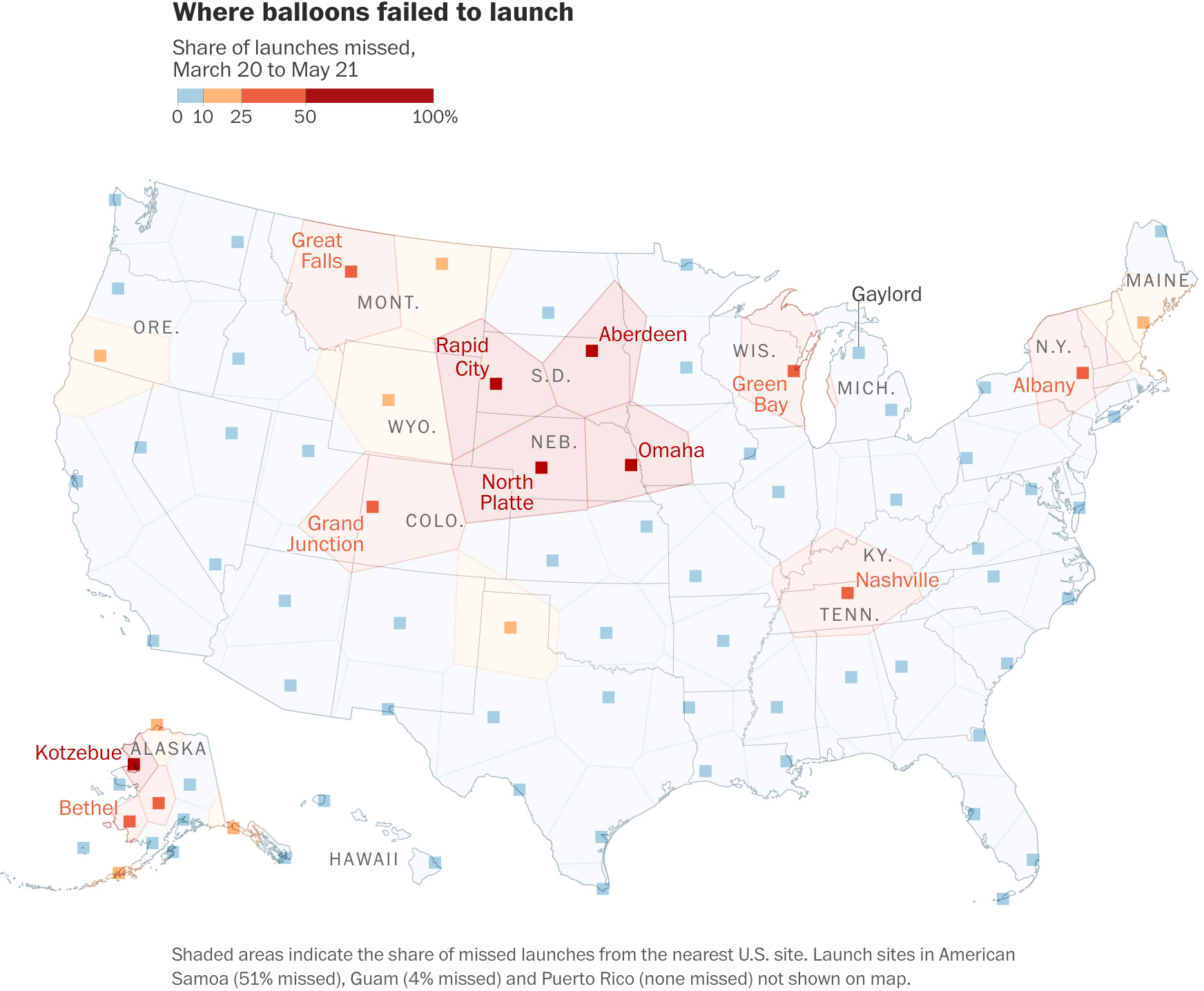
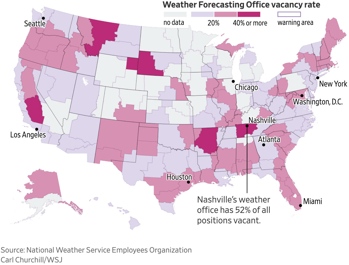
And as if that weren't enough, these visualizations illustrate the poor conditions facing U.S. science and healthcare:
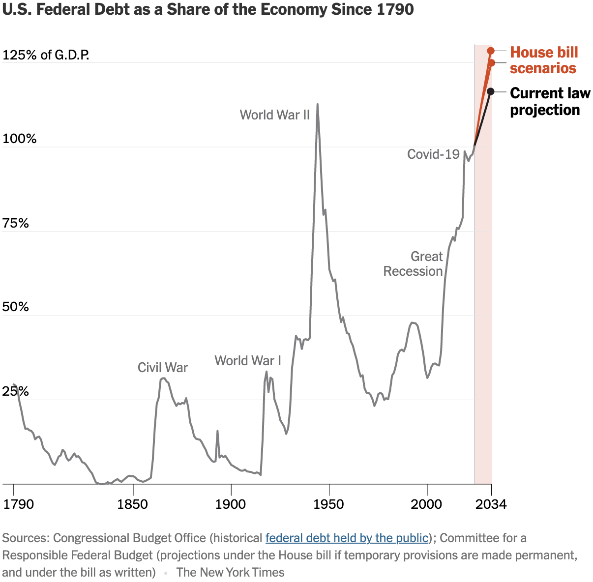
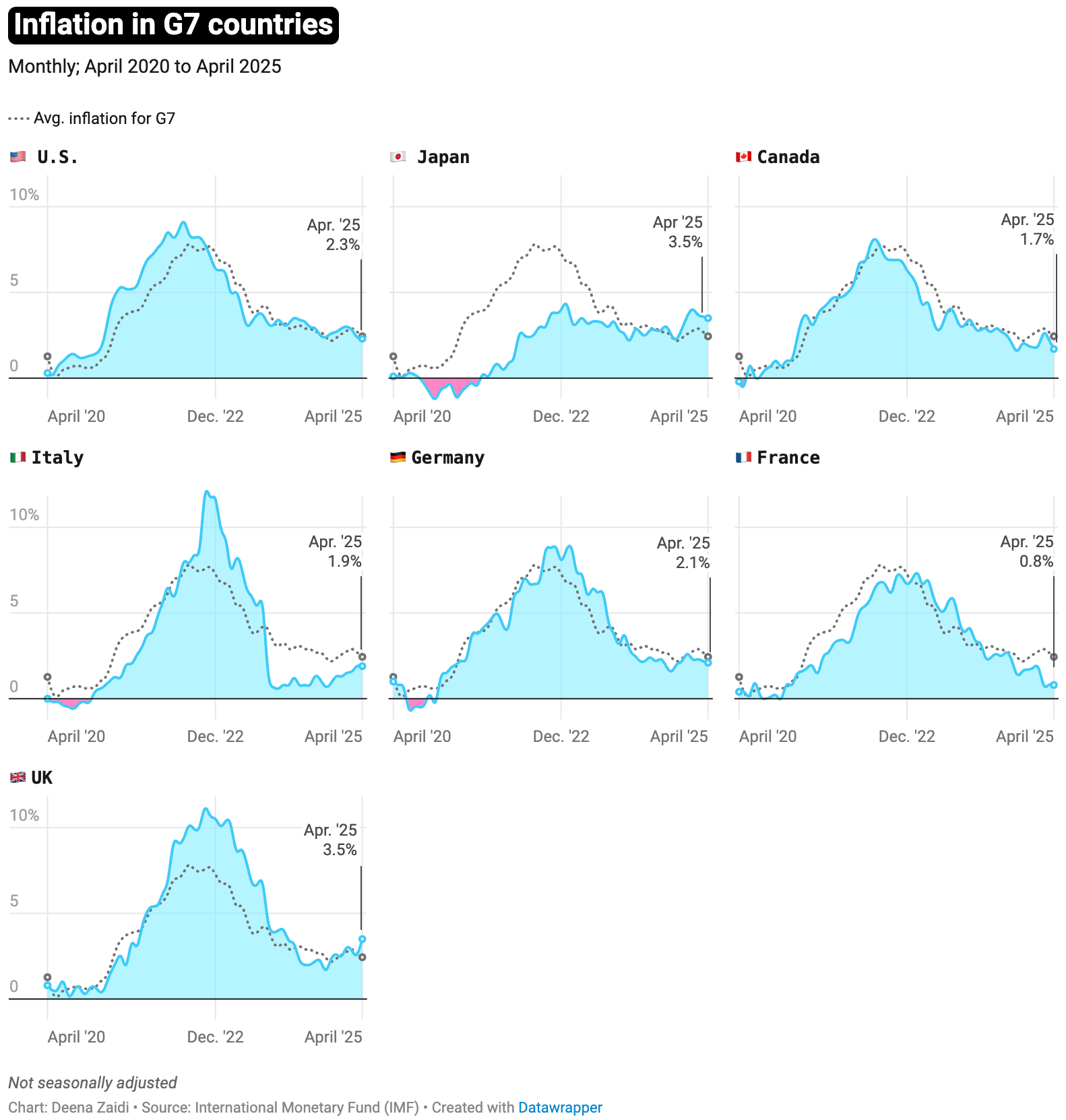
U.S. debt is also not looking too good, but at least inflation rates have improved again in many countries:
![Frankfurter Allgemeine Zeitung: <a href="https://www.faz.net/aktuell/wirtschaft/schneller-schlau/schneller-schlau-polen-der-uebersehene-nachbar-im-osten-110489083.html"><strong>Polen – der übersehene Nachbar im Osten</strong></a> [<em>Poland – the overlooked neighbor to the east</em>], May 26](https://datawrapper.de/cdn-cgi/image/quality=85,width=1376,f=auto,fit=cover/https://kirby.datawrapper.de/media/pages/blog/data-vis-dispatch-may-27-2025/4815a65b06-1748342012/cleanshot-2025-05-27-at-12.33.09@2x.png)
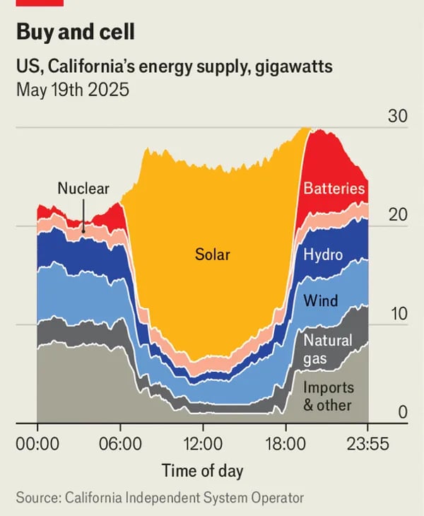
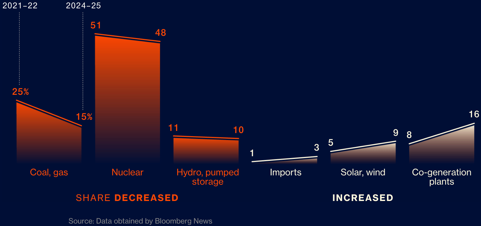
We were happy to be reminded that renewable energy is as viable as ever:
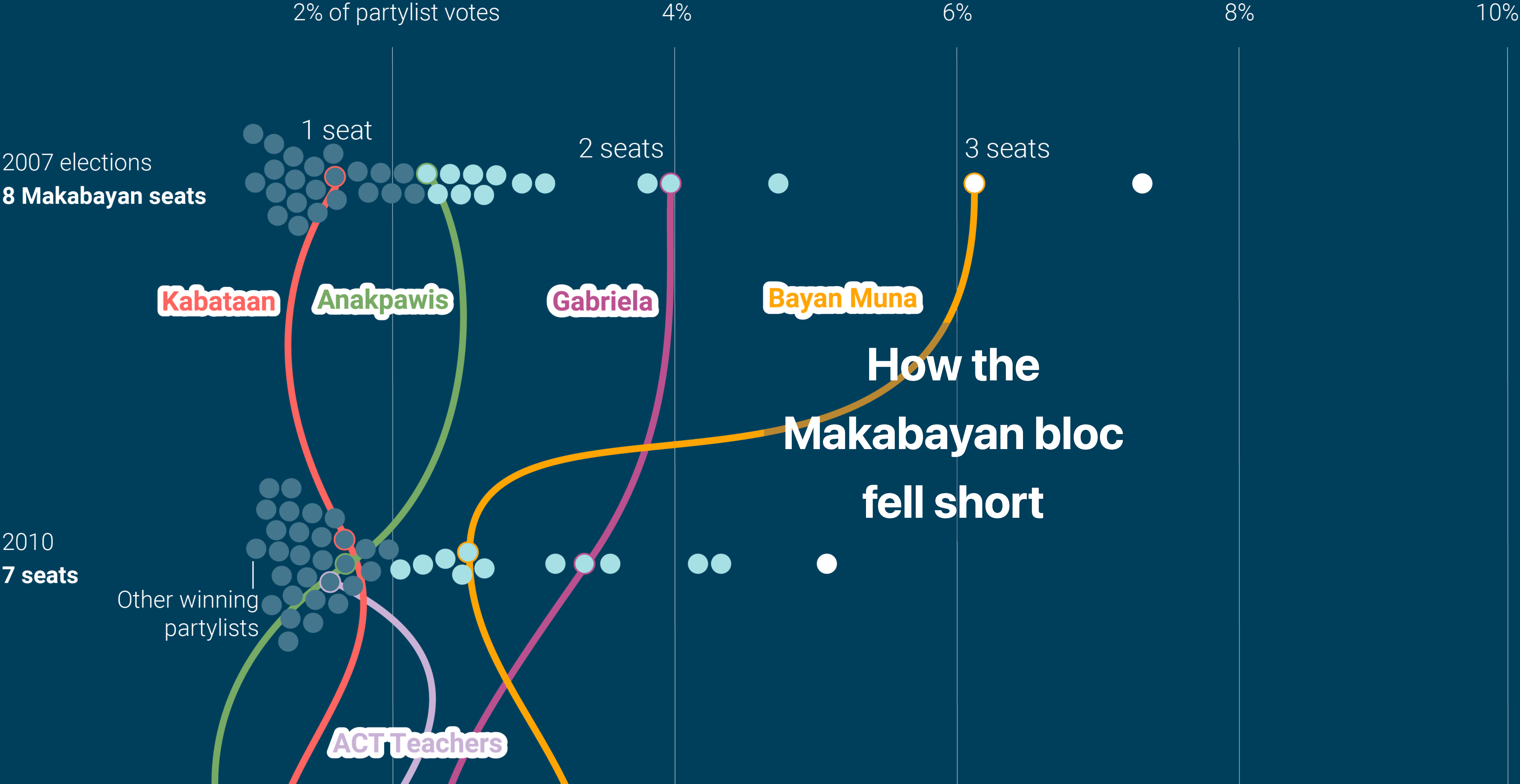
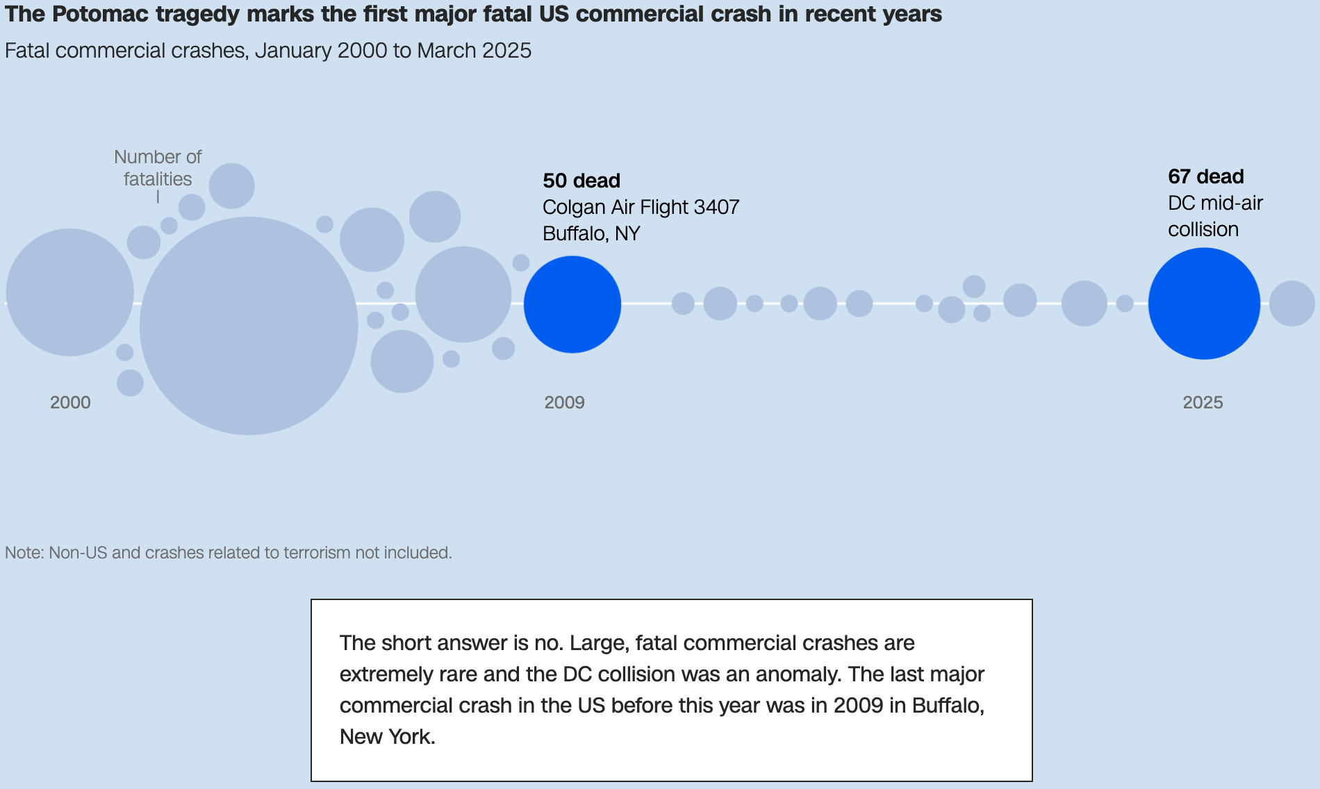
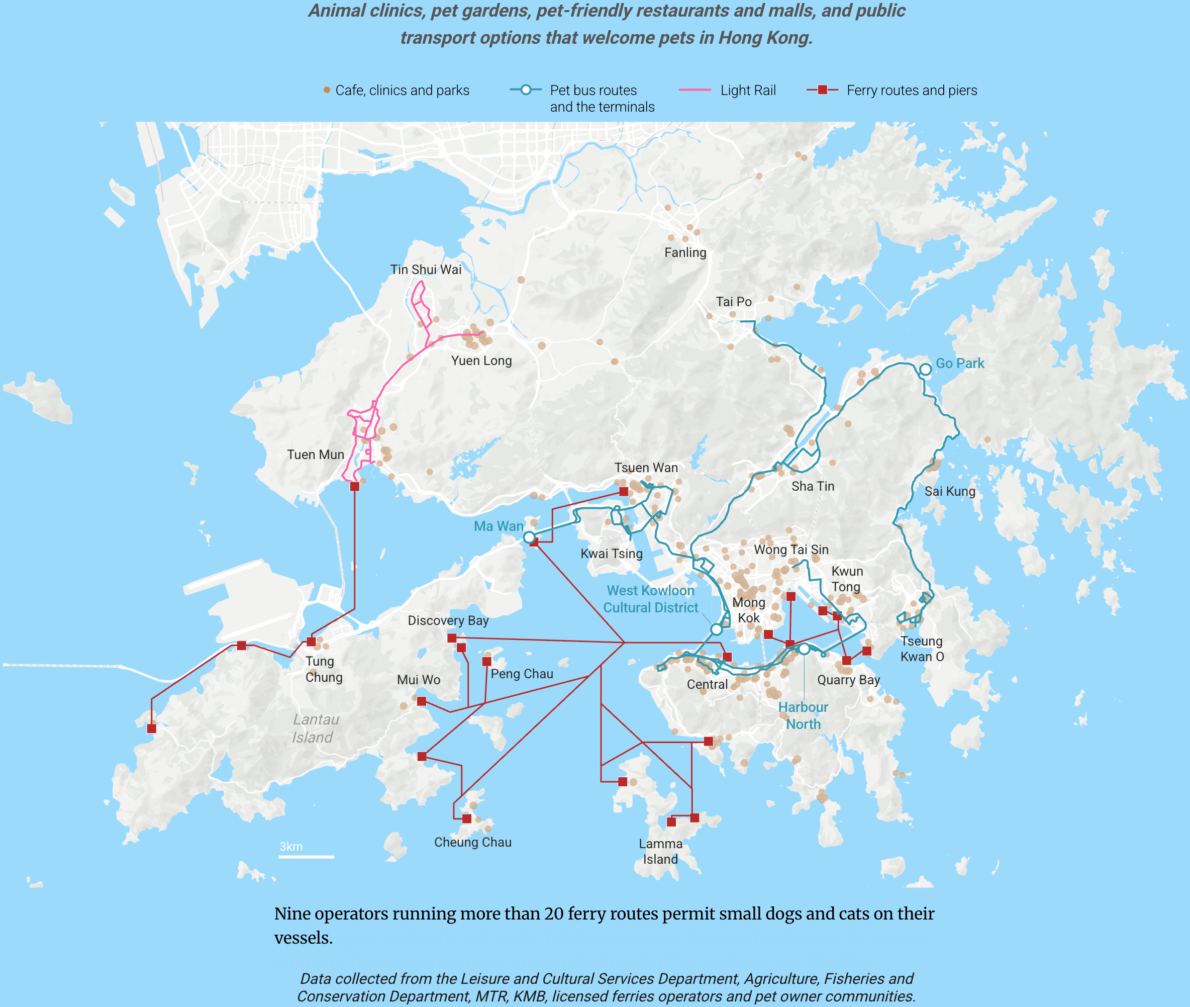
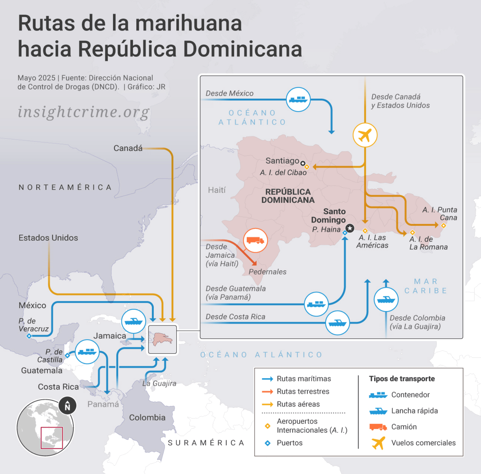
This week ends with Philippine politics, airline safety, pet travel, and drug smuggling:
What else we found interesting
Applications are open for…
A three-week journalism internship at Carbon Brief
A multimedia editor and database developer at The New York Times
A DC data reporter at The New York Times
A senior lecturer in computer science at giCentre, London
Help us make this dispatch better! We’d love to hear which newsletters, blogs, or social media accounts we need to follow to learn about interesting projects, especially from less-covered parts of the world (Asia, South America, Africa). Write us at hello@datawrapper.de or leave a comment below. Want the Dispatch in your inbox every Tuesday? Sign up for our Blog Update newsletter!


